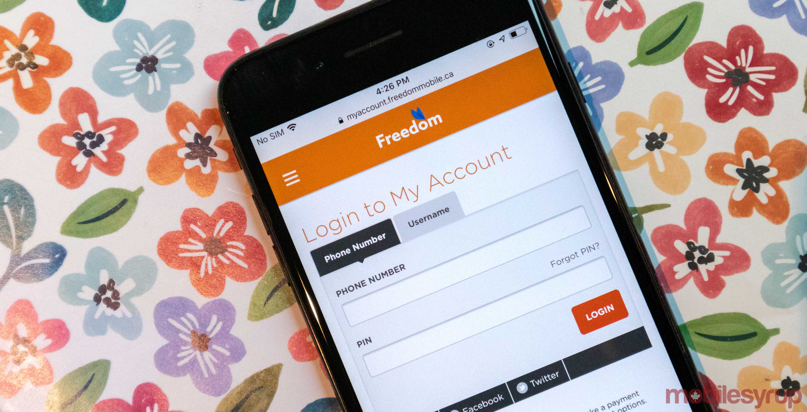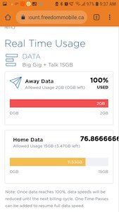
Freedom Mobile is treating its subscribers to a new user interface when they go online and check their data usage.
A Freedom customer posted a screenshot of the interface on Reddit. Overall, the update looks pretty clean.
Some users are commenting on the Reddit post and sharing that the website is still a bit buggy.
Overall, most users seem happy with the fresh look and the fact that it does a better job of showcasing how much of their 100GB Binge data is available too.
Image source: Reddit
Source: Reddit
MobileSyrup may earn a commission from purchases made via our links, which helps fund the journalism we provide free on our website. These links do not influence our editorial content. Support us here.


