The Pros
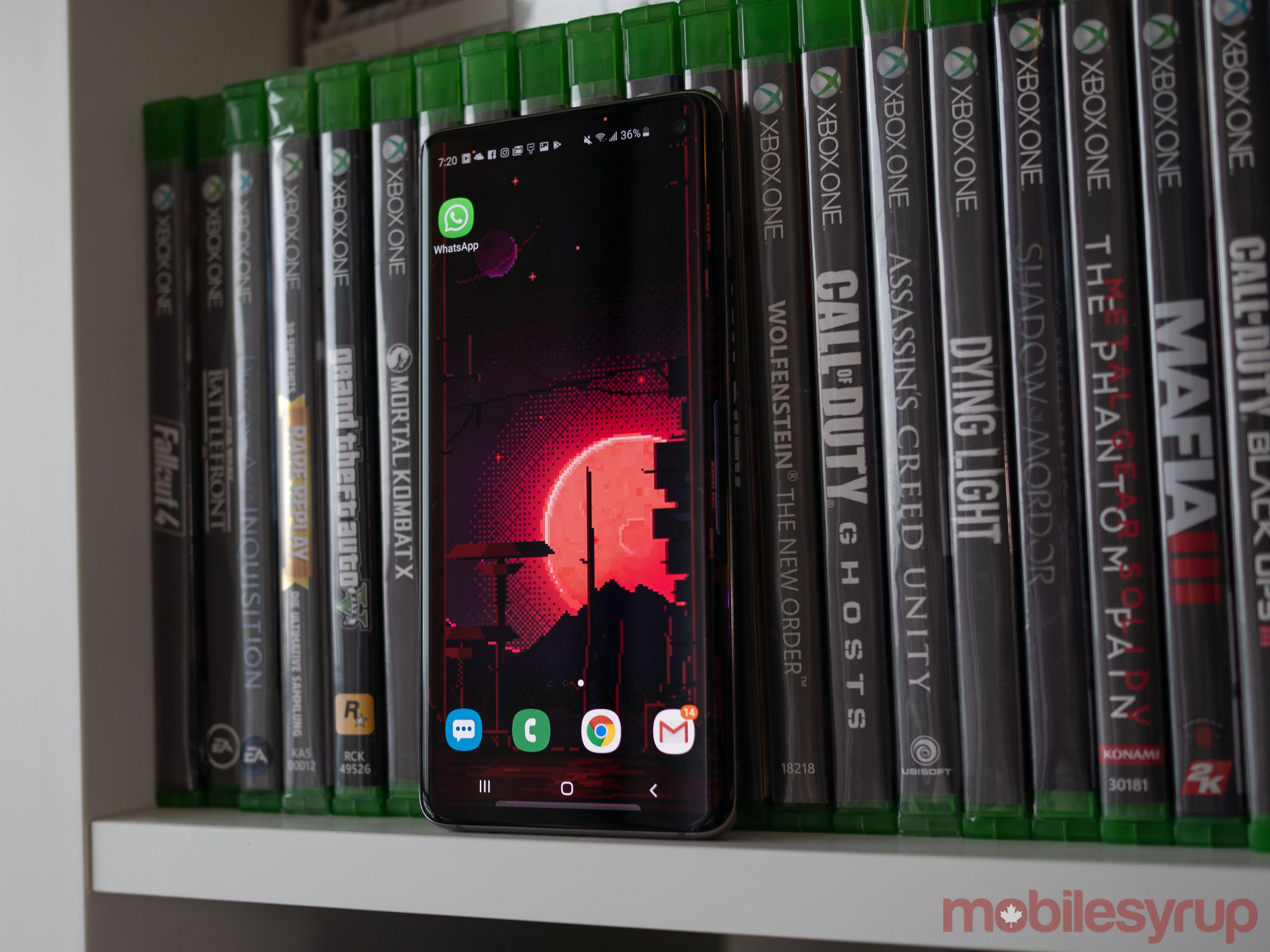
- Infinity-O hole punch is great
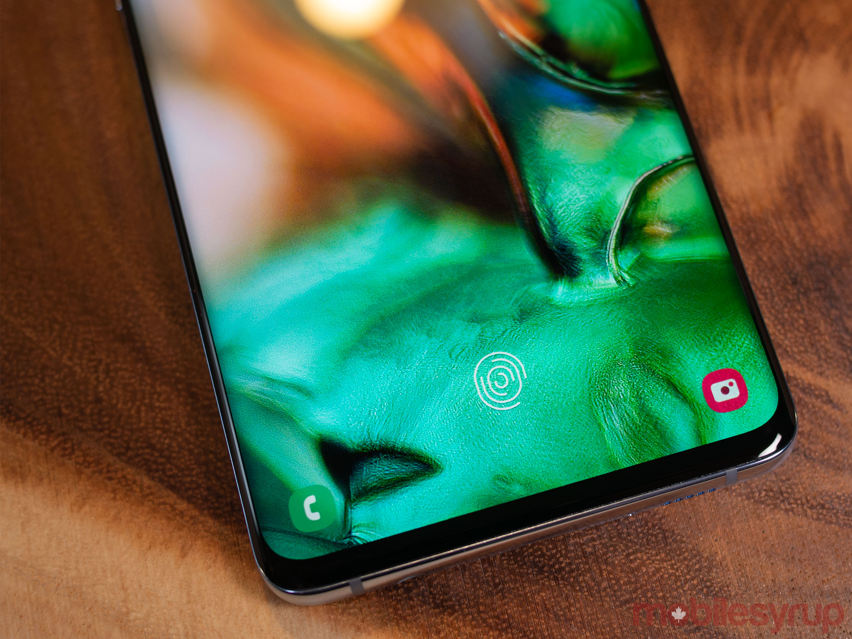
- In-display fingerprint sensor is impressive
- Most significant design change to the Galaxy series in years
The Cons
- Expensive outright pricing
- Curved edges still result in accidental touches
- Low-light performance lags behind the Pixel 3
Similar to Apple’s iPhone series up until the recent release of the iPhone X, the look of Samsung’s flagship Galaxy devices has slowly but steadily grown repetitive over the last few years.
Before you cite the various refinements the South Korean tech giant has made to the Galaxy line, including the ongoing game of ‘Where’s Waldo’ with the phone’s fingerprint sensor, I’ll describe a brief experiment I recently conducted.
I laid the Galaxy S7, S8 and S9 in front of a friend of mine who has a casual interest in smartphones. With the exception of the S7, he assumed the S8 and the S9 were the same handset, only in different colours. This is even after he picked up each phone and briefly examined it.
That’s not to say the Galaxy series hasn’t been attractive for the last few years. The Galaxy S9 was arguably one of the best-looking and performing smartphones of 2018.
That said, given Samsung has stuck with what is more or less the same design since the release of the S7, I was hoping for a substantial change with the tenth entry in the ‘S’ series.
“…I often describe the smartphone as Samsung’s iPhone X moment”
For the most part, Samsung delivered: the South Korean tech giant created a phone that looks different enough while including all the expected hardware updates. However, the S10 is not as substantial of a design shift as I initially thought it was.
When friends and coworkers have asked me how I feel about the S10, I’ve described the phone as Samsung’s ‘iPhone X moment.’ Similar to Apple’s first notched smartphone, the S10, S10+ and S10e are immediately familiar but they’re also more of a jump forward in terms of hardware and design than we’ve seen from the company in a while.

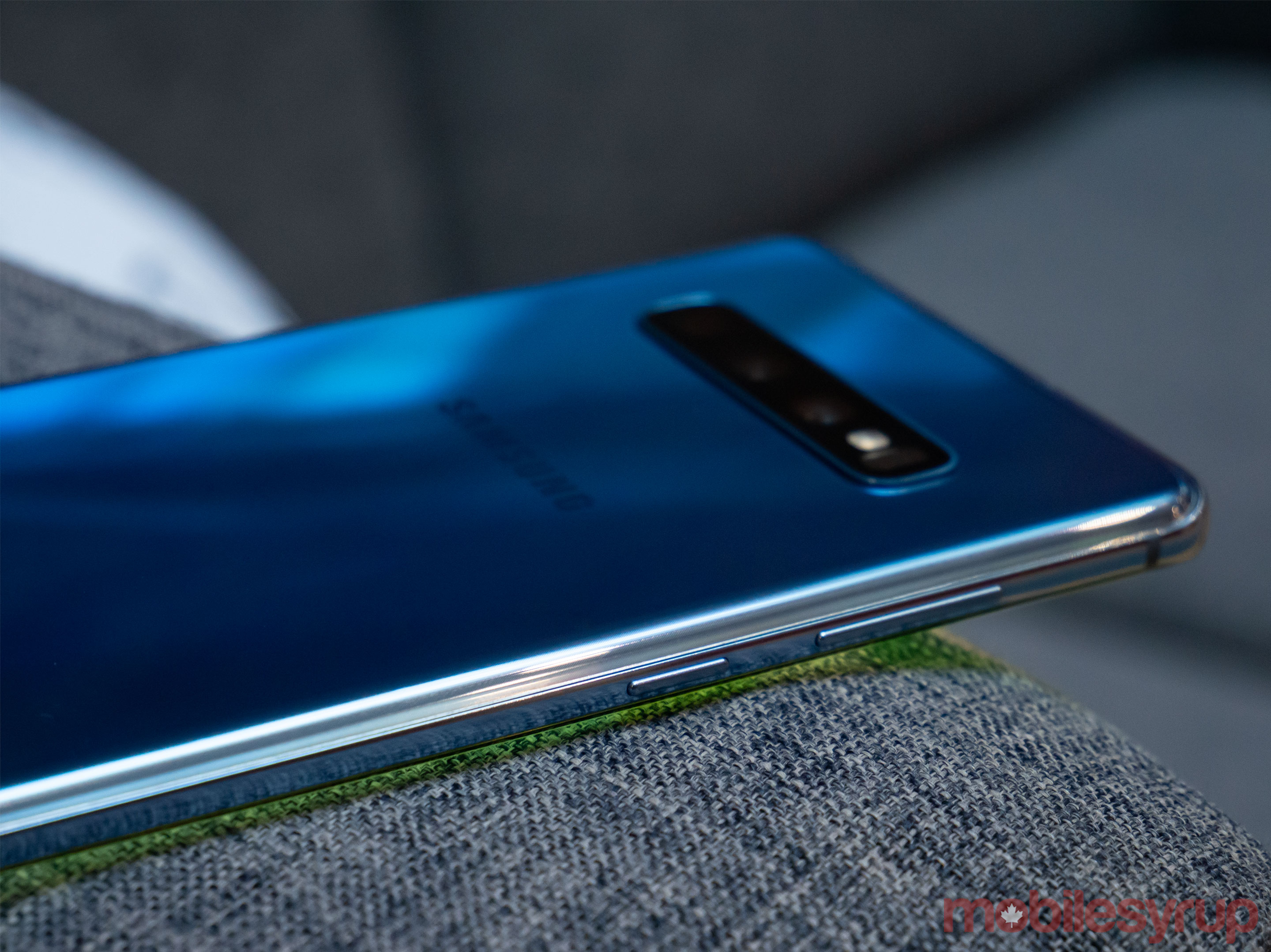
The aesthetic cues of Samsung’s last few devices are immediately apparent in the S10, including an all-glass body that, for better or worse, is still a fingerprint, smudge and grease magnet.
Despite more gentle curves, the S10 retains the sloped edges of the S8 and S9. As a result, it still frequently and frustratingly registers accidental inputs. Nearly every time I tried to watch a video on YouTube with the phone in landscape, I found I accidentally either paused playback or skipped ahead.
The first new thing most people will probably notice about Samsung’s S10 is the phone’s ‘anti-notch’ ‘Infinity-O’ display.

Rather than include a traditional display cutout as we’ve seen on other devices, Samsung has taken a more unique approach and punched a hole — or two holes in the case of the S10+ — through the smartphone’s display to make room for a front-facing camera.
Next, we have the ‘Ultrasonic’ in-display fingerprint sensor. I’ll go more in-depth into my thoughts about the S10’s in-display sensor later in this review, but to my surprise, the tech worked about as well as a traditional fingerprint scanner.
There are other notable upgrades, including a useful ultra-wide camera, bringing the total number of main cameras to three, Samsung’s surprisingly refined OneUI Android skin and more powerful internal hardware.
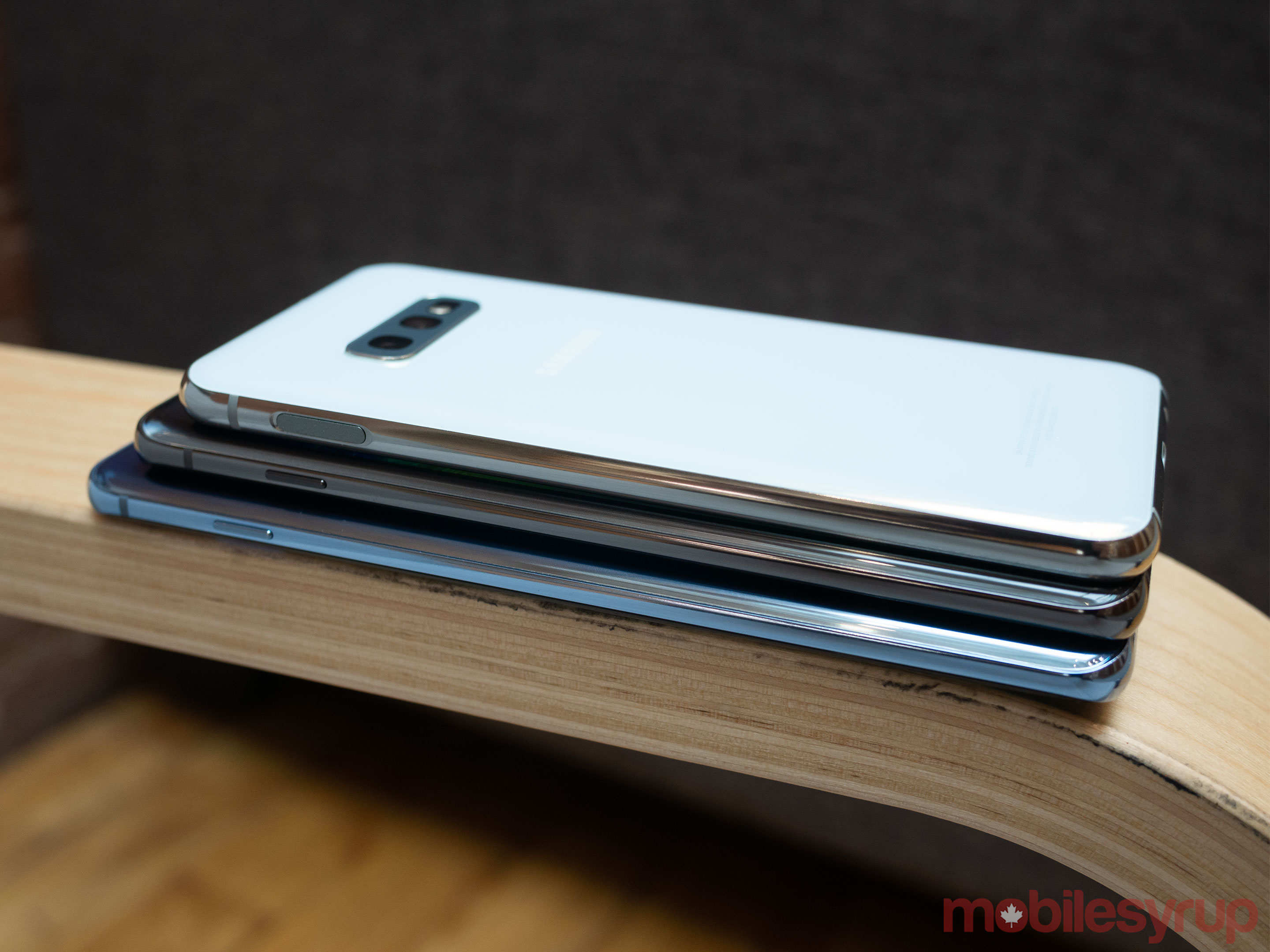
Overall, similar to last year’s S9, the S10 is poised to secure the position of best Android smartphone of 2019 — and we’re only three months into the year.
Note: this review will also look at the Galaxy S10e, complete with a separate score for the phone. The score at the bottom of the review reflects the S10 and S10+. It’s also important to note that the majority of this review is focused on my experience with the S10+, though I spent time with all three devices.
Samsung Galaxy S10
Samsung Galaxy S10+
Samsung Galaxy S10e
Display
6.1-inch Curved Dynamic AMOLED, 3,040 x 1,440 pixels, 19:9 aspect ratio
6.4-inch Curved Dynamic AMOLED, 3,040 x 1,440 pixels, 19:9 aspect ratio
5.8-inch Flat Dynamic AMOLED, 2,280 x 1,080 pixels, 19:9 aspect ratio
Processor
Snapdragon 855
Snapdragon 855
Snapdragon 855
RAM
8GB of RAM
8GB of RAM, 12GB of RAM
6GB of RAM, 8GB of RAM
Storage
128GB, 512GB (expandable up to 512GB)
128GB, 512GB, 1TB (expandable up to 512GB)
128GB, 256GB (expandable up to 512GB)
Dimensions (in.)
70.4 x 149.9 x 7.8mm
74.1 x 157.6 x 7.8mm
69.9 x 142.2 x 7.9mm
Weight
155g
175g / Ceramic: 198g
150g
Rear Facing Camera
12-megapixel (f/2.4) + 12-megapixel(variable f/1.5 - f/2.4)+ 16-megapixel (f/2.2)
12-megapixel (f/2.4) + 12-megapixel (variable f/1.5 - f/2.4) + 16-megapixel (f/2.2)
12-megapixel (f/2.4) + 16-megapixel (f/2.2)
Front Facing Camera
10-megapixel (f/1.9)
10-megapixel (f/1.9) + 8-megapixel (f/2.2)
10-megapixel (f/1.9)
OS
Android 9 Pie
Android 9 Pie
Android 9 Pie
Battery
3,400mAh
4,100mAh
3,100mAh
Network Connectivity
GSM/HSPA/LTE
GSM/HSPA/LTE
GSM/HSPA/LTE
Sensors
Fingerprint (in-display), accelerometor, , gyro, proximity, compass, barometer, heart rate
Fingerprint (in-display), accelerometor, , gyro, proximity, compass, barometer, heart rate
Fingerprint (side-facing), accelerometor, , gyro, proximity, compass, barometer, heart rate
SIM Type
Nano SIM
Nano SIM
Nano SIM
Launch Date
March 8, 2019
March 8, 2019
March 8, 2019
Misc
Colours: Prism Black, Prism White, Prism Blue | Wireless PowerShare2
Colours: Prism Black, Prism White, Prism Blue, Ceramic Prism Black, Ceramic Prism White | Wireless PowerShare
Colours: Prism Black, Prism White, Prism Blue | Wireless PowerShare
Display
Samsung Galaxy S10
6.1-inch Curved Dynamic AMOLED, 3,040 x 1,440 pixels, 19:9 aspect ratio
Samsung Galaxy S10+
6.4-inch Curved Dynamic AMOLED, 3,040 x 1,440 pixels, 19:9 aspect ratio
Samsung Galaxy S10e
5.8-inch Flat Dynamic AMOLED, 2,280 x 1,080 pixels, 19:9 aspect ratio
Processor
Samsung Galaxy S10
Snapdragon 855
Samsung Galaxy S10+
Snapdragon 855
Samsung Galaxy S10e
Snapdragon 855
RAM
Samsung Galaxy S10
8GB of RAM
Samsung Galaxy S10+
8GB of RAM, 12GB of RAM
Samsung Galaxy S10e
6GB of RAM, 8GB of RAM
Storage
Samsung Galaxy S10
128GB, 512GB (expandable up to 512GB)
Samsung Galaxy S10+
128GB, 512GB, 1TB (expandable up to 512GB)
Samsung Galaxy S10e
128GB, 256GB (expandable up to 512GB)
Dimensions (in.)
Samsung Galaxy S10
70.4 x 149.9 x 7.8mm
Samsung Galaxy S10+
74.1 x 157.6 x 7.8mm
Samsung Galaxy S10e
69.9 x 142.2 x 7.9mm
Weight
Samsung Galaxy S10
155g
Samsung Galaxy S10+
175g / Ceramic: 198g
Samsung Galaxy S10e
150g
Rear Facing Camera
Samsung Galaxy S10
12-megapixel (f/2.4) + 12-megapixel(variable f/1.5 - f/2.4)+ 16-megapixel (f/2.2)
Samsung Galaxy S10+
12-megapixel (f/2.4) + 12-megapixel (variable f/1.5 - f/2.4) + 16-megapixel (f/2.2)
Samsung Galaxy S10e
12-megapixel (f/2.4) + 16-megapixel (f/2.2)
Front Facing Camera
Samsung Galaxy S10
10-megapixel (f/1.9)
Samsung Galaxy S10+
10-megapixel (f/1.9) + 8-megapixel (f/2.2)
Samsung Galaxy S10e
10-megapixel (f/1.9)
OS
Samsung Galaxy S10
Android 9 Pie
Samsung Galaxy S10+
Android 9 Pie
Samsung Galaxy S10e
Android 9 Pie
Battery
Samsung Galaxy S10
3,400mAh
Samsung Galaxy S10+
4,100mAh
Samsung Galaxy S10e
3,100mAh
Network Connectivity
Samsung Galaxy S10
GSM/HSPA/LTE
Samsung Galaxy S10+
GSM/HSPA/LTE
Samsung Galaxy S10e
GSM/HSPA/LTE
Sensors
Samsung Galaxy S10
Fingerprint (in-display), accelerometor, , gyro, proximity, compass, barometer, heart rate
Samsung Galaxy S10+
Fingerprint (in-display), accelerometor, , gyro, proximity, compass, barometer, heart rate
Samsung Galaxy S10e
Fingerprint (side-facing), accelerometor, , gyro, proximity, compass, barometer, heart rate
SIM Type
Samsung Galaxy S10
Nano SIM
Samsung Galaxy S10+
Nano SIM
Samsung Galaxy S10e
Nano SIM
Launch Date
Samsung Galaxy S10
March 8, 2019
Samsung Galaxy S10+
March 8, 2019
Samsung Galaxy S10e
March 8, 2019
Misc
Samsung Galaxy S10
Colours: Prism Black, Prism White, Prism Blue | Wireless PowerShare2
Samsung Galaxy S10+
Colours: Prism Black, Prism White, Prism Blue, Ceramic Prism Black, Ceramic Prism White | Wireless PowerShare
Samsung Galaxy S10e
Colours: Prism Black, Prism White, Prism Blue | Wireless PowerShare
So what’s actually new?
First, I’ll take you through my journey with the S10’s in-display fingerprint scanner. My initial experience with the sensor was less than stellar. I added my fingerprint into the phone as the setup process required, only to find it was able to recognize my fingerprint approximately 40 percent of the time.
I spent two days spewing a stream of obscenities each time I tried to log into the S10, repeatedly asking myself how Samsung could release a feature this broken in one of its flagship phones. It turns out the particular pre-production S10+ unit provided to me was defective. The subsequent S10+ unit sent me experienced far fewer in-display fingerprint scanner issues — for the most part, anyway.

The new ultrasonic scanner works about every nine out of 10 tries. Given I’ve never been a fan of the S8 and S9’s small, awkwardly placed rear fingerprint scanners, I think the S10’s in-display sensor is a cut above its predecessors.
It’s worth noting it does take some time to build up the muscle memory required to repeatedly place your fingertip on the exact same location on the phone. After roughly a day and a half of using the S10 as my main phone, the positioning became second nature to me.
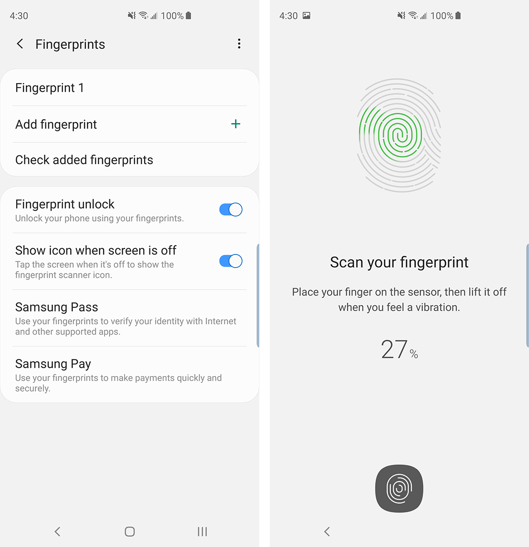
The ultrasonic scanner is also more reliable and secure than the optical in-display fingerprint sensor featured in the OnePlus 6T and Huawei Mate 20. Rather than authenticating a photo of your fingerprint, the S10’s sensor utilizes ultrasonic pulses to map your finger.
This means the scanner even works well under cold weather conditions, which is great for Canadians and was also an issue with the 6T.
The other standout feature most people will immediately notice about the S10 series is Samsung’s new Infinity-O display.

The cutout is smooth, crisp and far more preferable to a standard notch.
While I was initially concerned apps wouldn’t adapt to the feature, that hasn’t been the case. Most of the apps I’ve used during my time with the S10 have scaled to meet the display’s aspect ratio and camera cutouts.
More importantly — and this brings this back to my iPhone X moment theory — the ‘Infinity-O’ display gives Samsung’s S series a unique identity in the crowded smartphone space, especially in Canada.

It also simply looks cool, which isn’t something I’ve been able to say about a new smartphone design for some time.
Beyond the ultra-wide angle shooter that I’ll discuss at more length in the camera section of this review, the S10’s other notable new feature is reverse wireless charging.
This functionality makes it possible to wirelessly charge the iPhone XS Max, or any other Qi-compatible device, by placing it on the back of the S10.
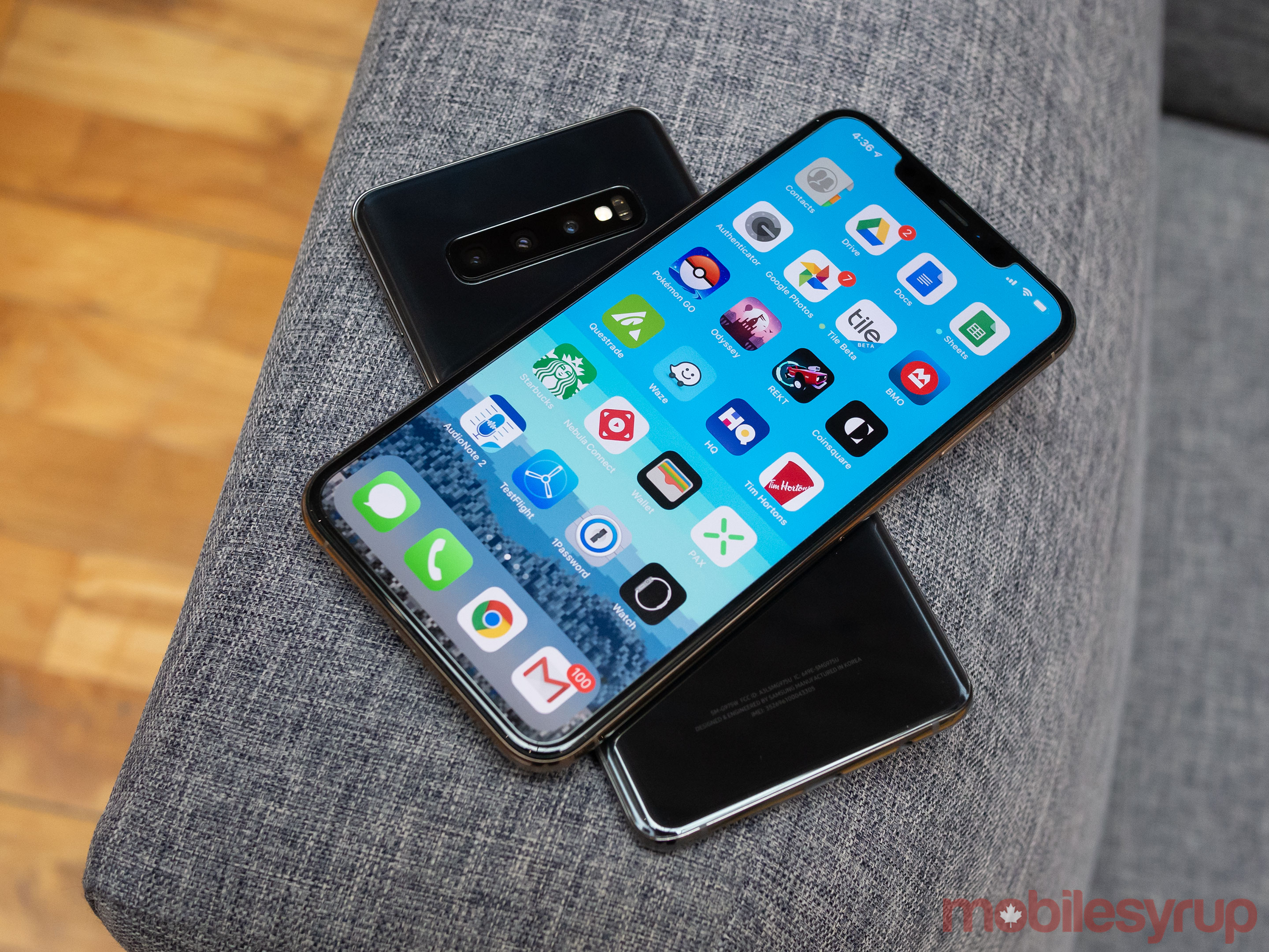
With a 5-watt output, reverse charging is incredibly slow. It’ll likely be rare for the average S10 owner to have two phones on them at a time, let alone a device that is also Qi-compatible.
The feature does work with other Qi compatible devices though, including Samsung’s recently released Galaxy Buds. Nevertheless, I think this is a useful, potentially highly-entertaining addition to the S10’s feature set.
It’s worth noting to activate the feature, which Samsung calls ‘Wireless Powershare,’ users need to enable it from the S10’s notification shade.
The rest of the specs
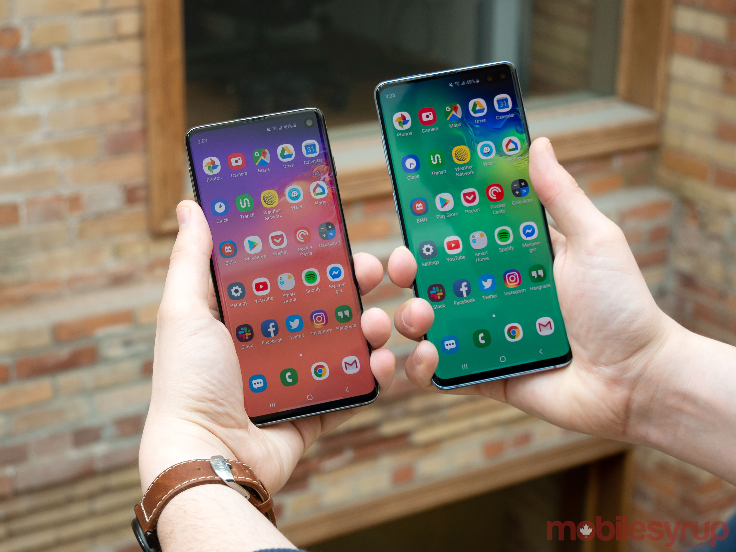
Now that most of the S10’s new, more exciting features are out of the way, let’s take a look at lineup’s other internal specs.
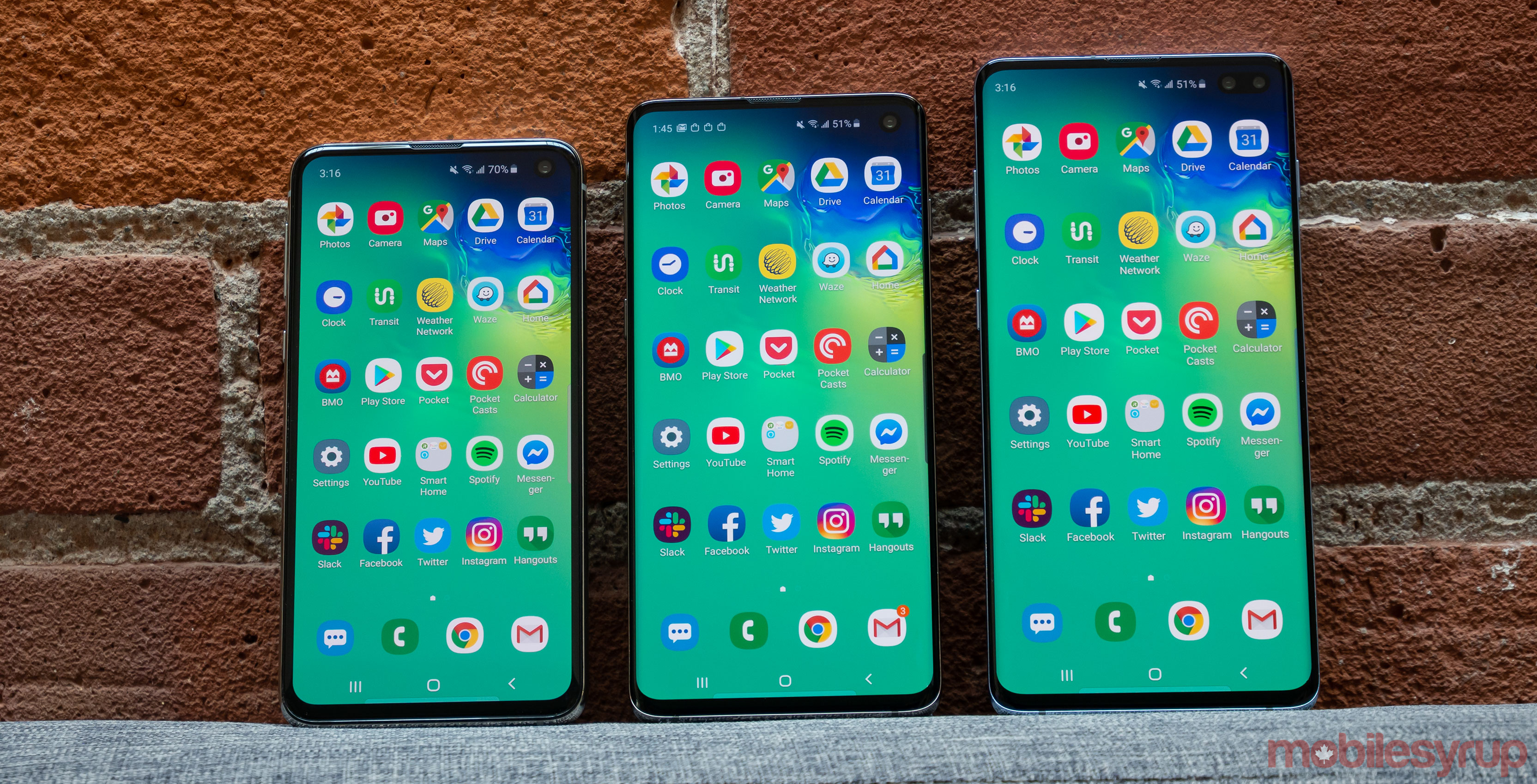
The S10+ measures in at 6.4-inches, while the S10 comes in at 6.1-inches. Both phones include HDR+ certified AMOLED displays that feature 3040 x 1440 pixel resolutions. The S10+ features a pixel density of 522 pixels per inch (ppi), while the S10 has a pixel density of 559 ppi.
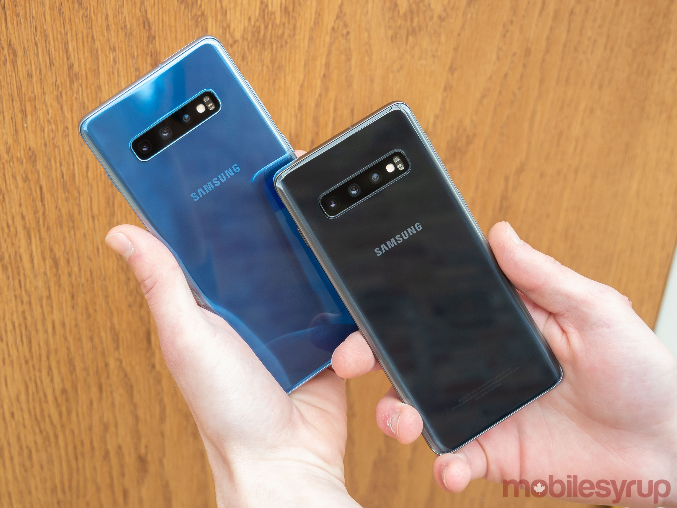
The S10 and S10+ include two of the best smartphone displays I have ever encountered. Colours look bright and vibrant, but as is typical with Samsung’s S series, far from true-to-life. If you were a fan of Samsung’s past displays, you’re going to like the S10’s screen.
The S10 comes in at 149.9mm x 70.4mm x 7.8mm and weighs 157g, with the S10+ measuring in at 157.6mm x 74.1mm x 7.8mm and the standard version weighing 175g, while the more expensive ceramic model weighs 198g. The weight difference between the three versions of the device is negligible, and generally, the S10 is a light device.
Speaking of the Ceramic S10+, this new, higher-end version of the larger phone comes in at an astounding $1,749 CAD. While I only briefly played with the ceramic version of the S10+, I didn’t find much of a difference between it and the more affordable, standard model.
This year with the S10, internal storage starts at 128GB, instead of 64GB, which is a good move on Samsung’s part. Both the S10 and the S10+ also come with different RAM configurations based on storage, which could confuse some consumers.
For instance, while the Galaxy S10 is available in 128GB of storage with 8GB of RAM and 512GB of storage with 8GB of RAM, the S10+ shakes things up a bit. The S10+ features 128GB of storage with 8GB of RAM for the standard version, and 512GB with 8GB or 1TB with 12GB for the ceramic iteration of the smartphone.
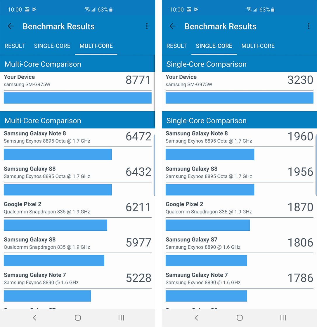
Performance wise, my experience across the board has been solid, as is typically the case with Samsung’s smartphones. I did encounter the occasional bout of lag when rapidly jumping between apps, and in two instances the S10+ completely locked up on me. It’s possible these issues could have occurred because I’m using a pre-production unit. Once I get my hands on a retail Galaxy S10 I will update this review with additional impressions.
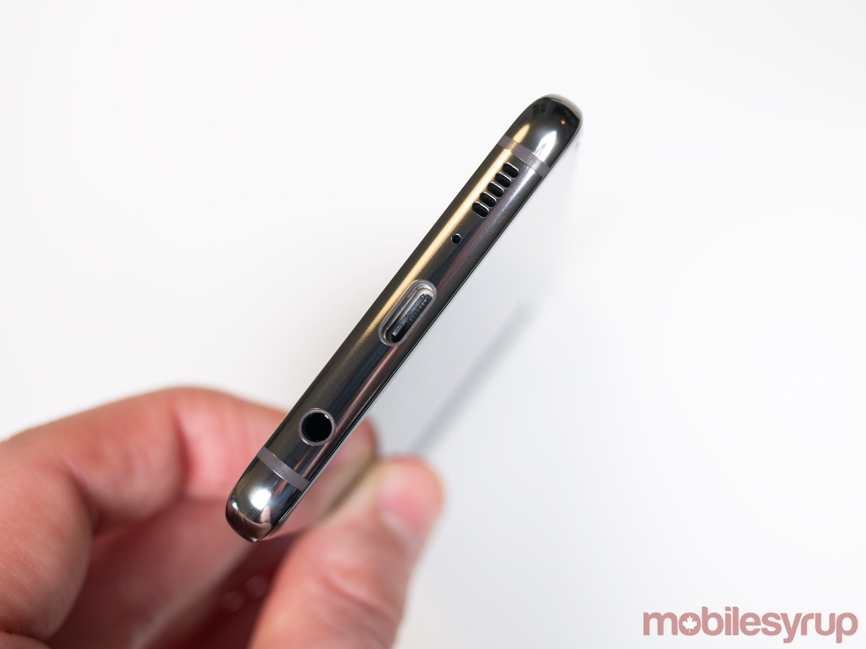
Other specs across the S10 line include 2Gbps gigabit LTE, Dolby Atmos surround sound support and Wi-Fi 6 compatibility. All three phones also feature Qualcomm’s powerful Snapdragon 855 processor in Canada and the U.S.
In terms of battery life, I found both the S10 and the S10+, which feature 3,400mAh and 4,100mAh batteries, respectively, came in at roughly a day of moderate use, despite the differing battery sizes.
And of course, fan favourite features like the standard 3.5mm headphone jack and expandable microSD storage are back once again across the S10 series.
Now, onto specifically the S10e.
So what is this S10e anyway?
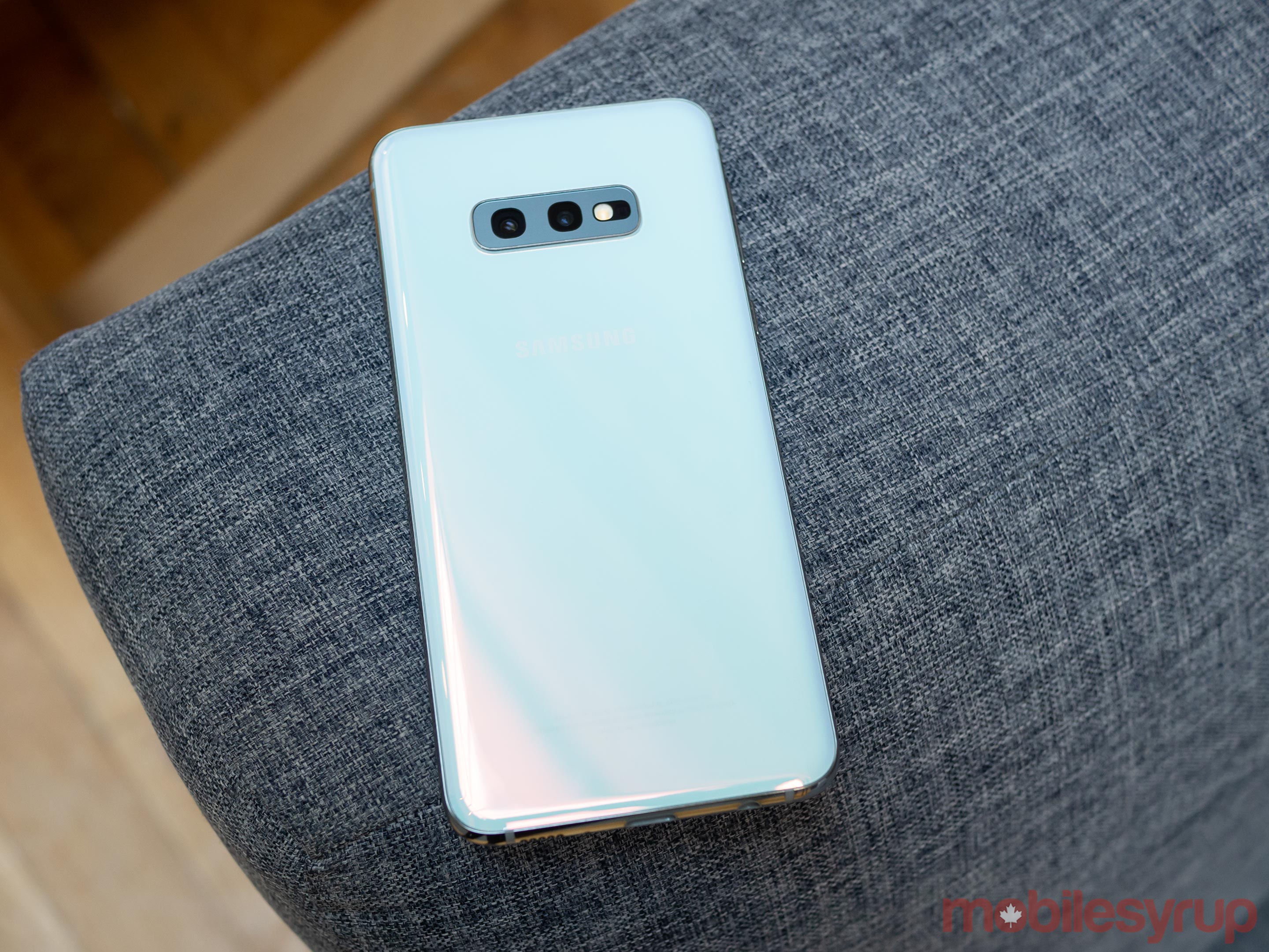
You probably noticed I referenced the S10e a few times earlier in this review. In many ways, the S10e is Samsung’s answer to the iPhone XR, Apple’s ‘entry-level’ but still expensive smartphone.
Though the S10e is slightly cheaper than the S10 and S10+, coming in at a decidedly not entry-level price of $1,019 CAD, it does feature some compromises.
For example, the phone is slightly chunkier than the S10 and S10+, and features bezels that are more substantial.
The 10e’s 5.8-inch display features a 2280 x 1080 pixel resolution, though the screen still looks great. I imagine most people won’t notice the resolution difference between the S10e and its two more expensive counterparts. The screen is even HDR10+ certified, just like the S10’s and S10+’s glass.
In terms of dimensions, the S10e comes in at 142mm x 69.9mm x 7.9mm. The phone also features a 3,100mAh battery and weighs in at 150g.
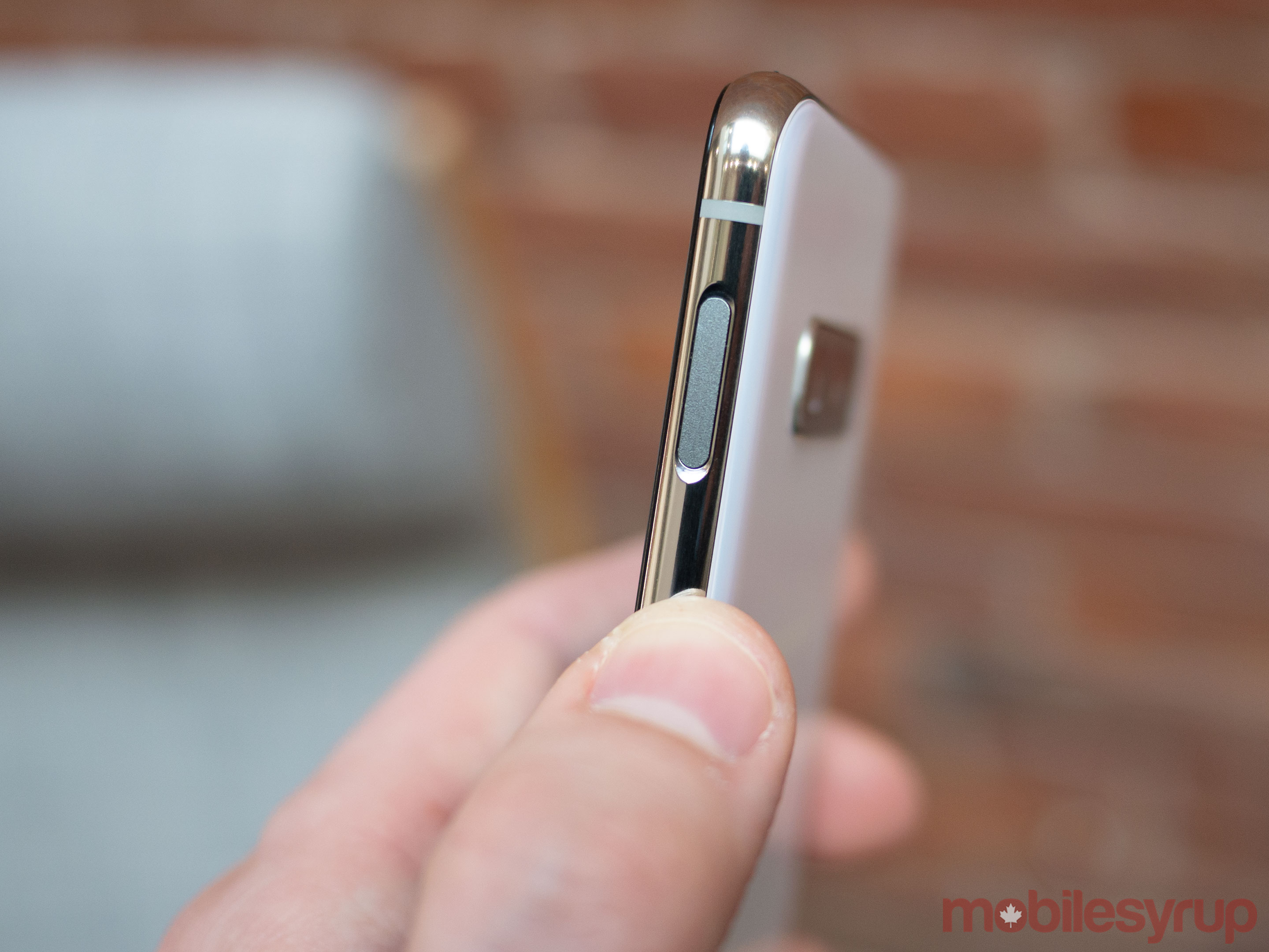
The most significant difference with the S10e over the S10 and S10+ is the fact that the phone doesn’t feature an in-display fingerprint sensor. In a first for Samsung smartphones in North America, the S10e instead includes a Sony-like side fingerprint sensor that also doubles as the handset’s power button.

In my experience, this fingerprint sensor is fast and responsive. You can also access the S10e’s notifications shade by swiping up or down on the scanner, which is a neat trick on Samsung’s part.
The other major difference with the phone is that it only features two rear cameras instead of three like the rest of the S10 line (more on this later).
Generally, I really like the S10e. Similar to the iPhone XR, I would even go so far as to say it’s the S10 device most people with interest in the S10 should purchase. However, like with Apple’s so-called entry-level XR, the only thing holding back the S10e is its expensive price tag. For only a few hundred dollars more you can pick up the sleeker, better-looking S10.
As a result, this will probably make the S10e a tough sell for most consumers, at least until the smartphone gets hit with an inevitable price drop.
Note: The score to the right only relates to the S10e.
The cameras
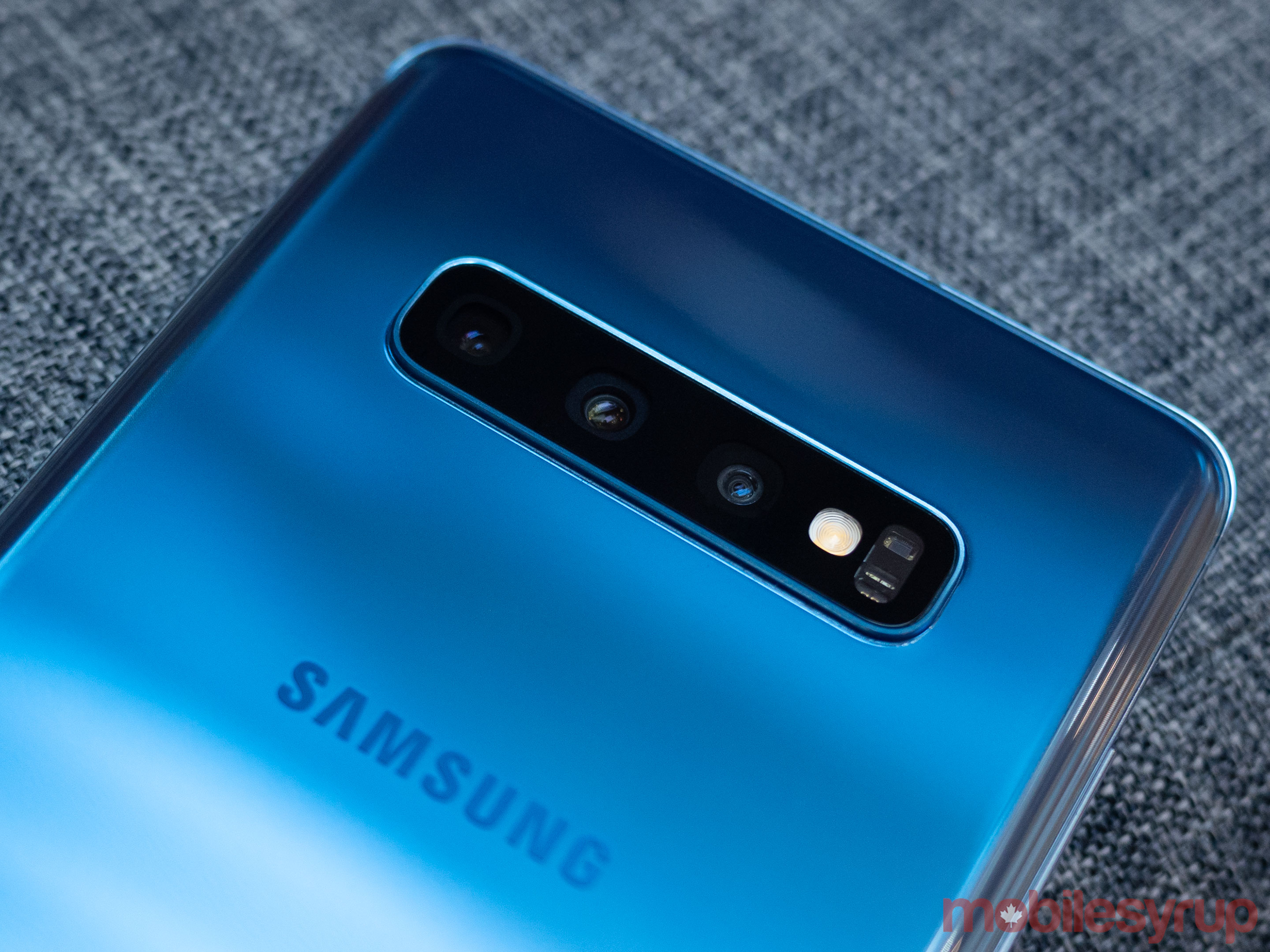
Right off the top, it’s important to note the camera experience with the S10 is pretty much the same as it has been with the S9 for the past year. As a result, this means the S10’s shooter takes excellent photos that feature a heavily processed look to them.
Colours are oversaturated, skin tones rarely reflect what a person actually looks like (especially if you view a photo on a non-Samsung device) and everything is too over-processed for my taste.
That’s not to say the S10’s array of multiple cameras is terrible, because that’s not the case. But if you’re the type of person who prefers images with a more look more true-to-life, Samsung’s S10 isn’t the smartphone for you.

It’s also worth mentioning that low-light performance with the S10 series remains decent but lags behind Google’s Pixel 3 when the phone’s ‘Night Sight’ wizardry is taken into consideration. This is even more apparent when you look at how blown out the S10’s highlights are under low-light (check out the example above).
Even across the S10 series itself, camera performance remains the same, which is a smart move on Samsung’s part. That said, there are a few notable differences between the S10 the S10+ and the S10e regarding camera specifications.
Let’s get into it: The S10+ includes a triple rear-facing camera array with a 12-megapixel sensor that features an f/2.4 telephoto lens, a 12-megapixel wide shooter with a variable f/1.5 to f/2.4 aperture and a new ultrawide 16-megapixel camera that features an f/2.2 aperture.
The S10+ also features two front-facing shooters, with one camera working as an RGB depth sensor allowing the phone to create various portrait mode effects via hardware rather than software.

The front cameras measure in at 10-megapixels and 8-megapixels, with an f/1.9 aperture and an f/2.2 aperture respectively. The S10, as expected, includes a nearly identical camera setup.
The rear-facing cameras are identical, with the front shooter only including a single 10-megapixel shooter with the same f/1.9 aperture.
“If you’re the type of person who prefers images with a more look more true-to-life, Samsung’s S10 isn’t the smartphone for you.”
First, let’s take a look at the difference between how the S10 and the S10+ handle portrait effects. Thanks to the S10+’s second RGB sensor, the smartphone’s portrait effects look more natural, whereas the S10’s feel more pronounced, processed and add a yellow-ish tone to skin when active (I take a closer look at this in my video review).
I don’t necessarily feel the S10’s take on bokeh is worse than the S10+’s, it just isn’t quite as subtle.

The S10e is where camera specs shift even more. The handset features a single 10-megapixel f/1.9 front-facing shooter and two rear cameras instead of three. The first back camera measures in at 12-megapixels with an f/1.5 aperture and the second is 16-megapixels with an f/2.2 aperture.
The new ultrawide 16-megapixels shooter featured in the S10, S10e and S10+ is useful, especially if you’re like me and find yourself taking landscape photos frequently, or if you’re trying to take a group shot with a number of subjects in the frame.
The only issue I have with it is it distorts the image to such a degree that it feels like I’m watching a ‘Beastie Boys” music video.
The other new feature at play with the S10 is video stabilization functionality Samsung is calling ‘Super Steady Mode.’
Although I rarely feel digital image stabilization works well, I was very impressed with ‘Super Steady Mode,’ particularly that the feature is available across the entire S10 line (there’s a quick sample of the feature in action above).
Cost is the most significant drawback
The S10 is a near perfect smartphone save for one important issue: it's extremely expensive. The S10e, Samsung's supposedly entry-level smartphone, is priced at $1,019, with the S10 coming in at $1,259 and the S10+ being priced at $1,419.
Any way you look at it, this is a substantial amount of cash to shell out for a smartphone, especially when there are comparable Android devices that are nearly as good at cheaper price tags. Still, in a sense, you really do get what you pay for when it comes to the S10. The overall experience the phone offers is stellar and for the first time in years, the new hole punch Infinity-O display has helped the Samsung's flagship find an identity of its own in the crowded smartphone market.
As is typical with Samsung's smartphones, as well as competitors like Apple, these premium features come at an equally premium price tag. That said, if you're willing to shell out the cash for one of Samsung's latest flagships, you'll almost certainly be impressed with what they have to offer.
Videography by Patrick O'Rourke and Bradley Bennett"You really do get what you pay for when it comes to the S10"
MobileSyrup may earn a commission from purchases made via our links, which helps fund the journalism we provide free on our website. These links do not influence our editorial content. Support us here.

