Slack is following after Facebook Messenger and implementing a dark mode on iOS.
The workplace messaging and collaboration platform added the new interface option in its iOS app beta.
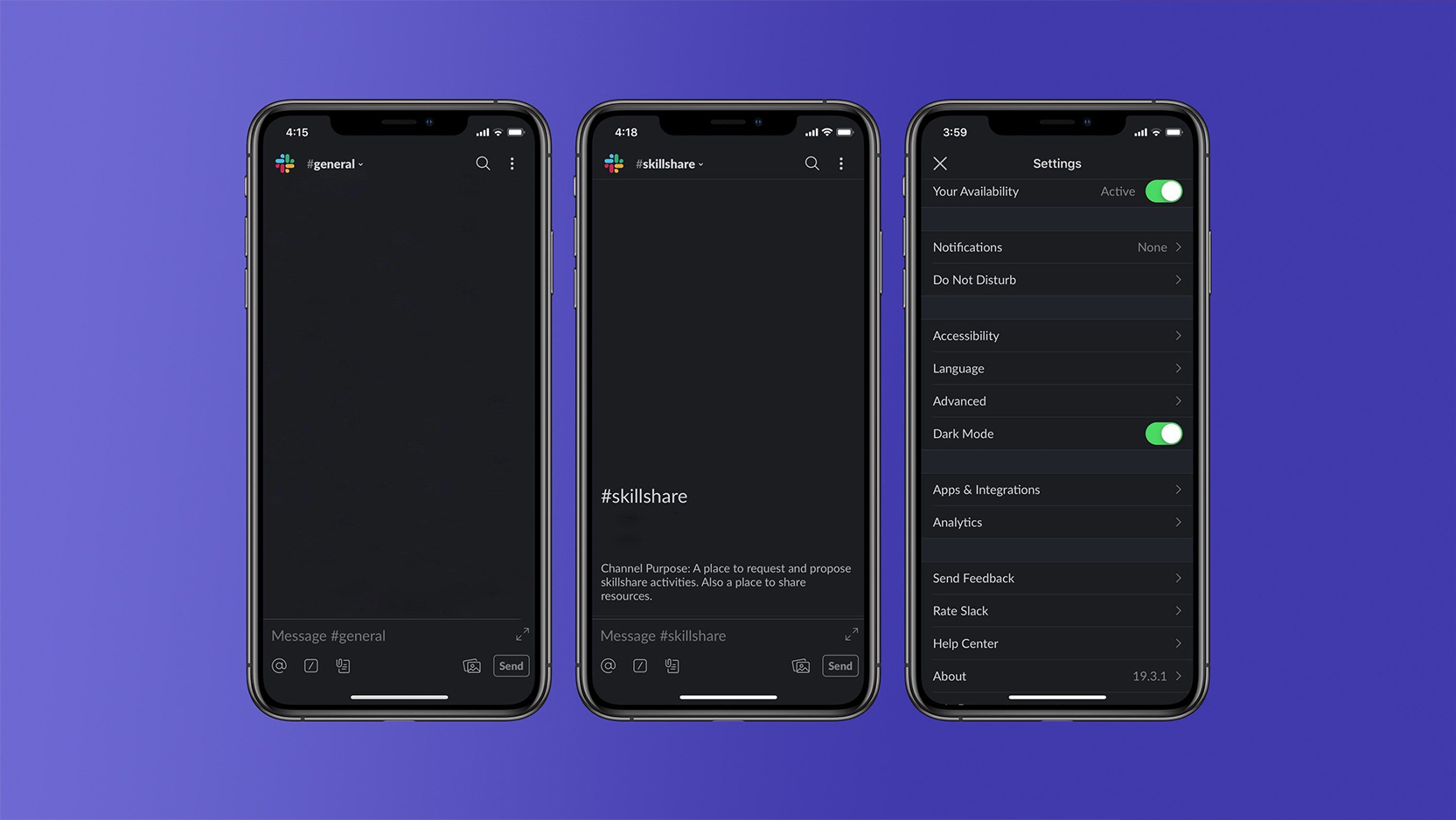
If you have the beta, you can tap the menu button (three dots) in the top, right corner of the Slack app, tap ‘Settings’ and then flip the dark mode toggle.
Like the dark modes of other apps, Slack’s turns the primarily white interface a dark grey instead. The text turns white or a light grey to maintain readability.
Unfortunately, it’s not a true-black interface like Facebook Messenger’s dark mode, which helps save battery on phones with OLED screens.

That said, it’s a welcome feature for sure. I use Slack often for work, and a dark interface I find helps me with eye strain. I currently use a browser extension to darken Slack on my laptop, but I have no such option on my phone.
With iOS 13 rumoured to bring a system-wide dark mode to iPhones, and Android Q rumoured to do the same, Slack may be trying to get out ahead with its dark mode. Hopefully more apps follow so I can enjoy just about every app in some form of dark mode.
If you want to try out the Slack beta, you can sign up here.
Source: 9to5Mac
MobileSyrup may earn a commission from purchases made via our links, which helps fund the journalism we provide free on our website. These links do not influence our editorial content. Support us here.


