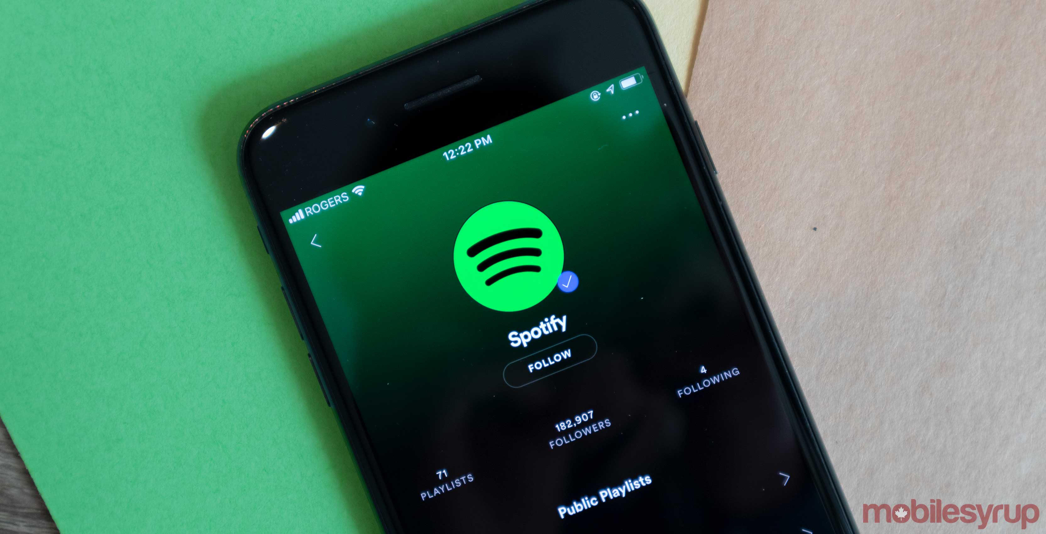
Spotify’s latest Android update brought several changes, including two issues: broken lock screen controls for some, and a terrible adaptive icon for all.
A variety of reports have cropped up noting that Spotify’s lock screen music controls no longer function for some users. So far, the problem appears to primarily affect Samsung devices, with Galaxy S8, S9 and S10 users posting reports. There are also reports of the issue affecting some Huawei devices, but there are less of those.
@SpotifyCares hi, for the longest time, I have been unable to use my lockscreen playback controls on my S8+, when using Bluetooth headphones. And I was only able to fix this issue when I rolled back to a earlier version of Spotify.
— Jazz Listener (@ListenerJazz) April 18, 2019
Thankfully, Spotify is looking into the issue. For the time being, the solution seems to be downgrading the app.
While broken lock screen controls are annoying, Spotify’s new icon is egregious, and it’s not clear if the streaming platform will change it back.
The company added a new adaptive icon earlier this month, which was partially a step in the right direction. Adaptive icons, for the unfamiliar, are app icons that support several different shapes, from circles to squares to the circle-square abomination, the ‘squircle.’ Users can pick their preferred shape in settings, and Android will adjust the icons to match.
Google will likely expand adaptive icons to affect other parts of Android in Q, but for now, it’s just apps. And apps like Spotify keep messing it up.
The problem with Spotify’s icon is that it was already a great circle icon, and needed adaptions for the other options, like square and squircle. Instead, Spotify took its excellent symbol and put a black border around it.
@SpotifyCares @Spotify whoever came up with the new android icon, is not a smart person. It's now smaller than all the other icons and looks hideous. Please revert before the small black background. Also, back, pause and forward dont work on lockscreen. Note 9, latest update.
— m (@TheRealMiroslaw) April 23, 2019
This creates two problems. The first is that Spotify’s icon now looks smaller than other symbols on your home screen, especially on a dark background. The second is that, well, it’s just ugly.
Spotify’s decision to use a black border is better than most others, like Facebook Messenger or Google Calendar, which fill in the extra space with a white border. But that doesn’t excuse it.
![]()
Instead, Spotify could have made the whole icon green, regardless of which shape people use. Alternatively, if Spotify is determined to maintain the integrity of its circular logo, it could use a darker shade of green, so the icon maintains a theme. Plus, that would solve the issue of the icon looking small on dark backgrounds.
Ultimately, it’s a small issue, but one I hope Spotify fixes.
Source: Twitter, Spotify Community Via: 9to5Google
MobileSyrup may earn a commission from purchases made via our links, which helps fund the journalism we provide free on our website. These links do not influence our editorial content. Support us here.


