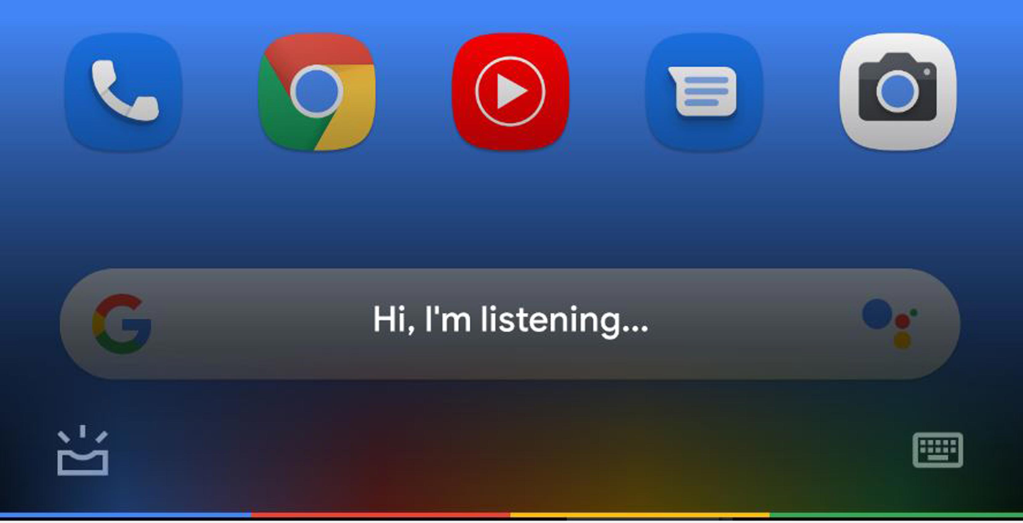
Google appears to be testing a new design for Google Assistant.
According to 9to5Google and a thread on Reddit, a few users are now using a Google Assistant design that looks very different from the Assistant we’re used to. This Google Assistant featured in ‘version 9.84.10.21’ of the Google app gets rid of the AI’s stark white overlay.
New look to the Google Assistant when you squeeze the sides. from r/google
Instead, the design sports a transparent overlay that darkens the bottom of the phone’s display and features text that reads “Hi I’m listening.” There’s also the Keyboard and Updates page options below the text.
Further, 9to5Google calls the Pixel light bar (a bar that features Google’s yellow, blue, green and red colours) that initially appeared on the Chromebook Pixel.
Additionally, 9to5Google was able to confirm the update by finding a matching string for “Hi I’m listening” in the Google app. The publication believes the original poster on Reddit was using Android Q.
This is a server-side update, so even if you have a Pixel 3 on Android Q and the latest version of the Google app, you still might not have this version of Assistant.
It’s unclear when or if Google will launch this variant of Assistant to everyone.
Image credit: Reddit (SentientKayak)
Source: 9to5Google, Reddit (SentientKayak)
MobileSyrup may earn a commission from purchases made via our links, which helps fund the journalism we provide free on our website. These links do not influence our editorial content. Support us here.


