The Pros
- Premium build
- Clean software with useful gestures
- Fast in-display fingerprint scanner
The Cons
- Lag and animation jank
- No wireless charging (unless you get a mod)
- Mods are expensive
Something is stirring in the smartphone market. If you’ve paid attention to trends and news over the last few years, you might have caught it. Flagships are becoming more expensive, and good phones are getting cheap.
Motorola has been one of the few manufacturers on the forefront of that trend. While other phone makers are steadily increasing the cost of their flagship phones, Motorola doubled down on lower-cost, midrange devices that offered customers unique features and things they could expect on high-end phones.
The Chicago-based, Lenovo-owned company exemplified this in its Moto Z line, which first launched in 2016. Now, four generations on, we have the Moto Z4. Looking back over the last few generations of Moto Z devices, you can see where Motorola began moving towards the midrange. The Z2, for example, offered a second ‘Play’ version of the phone with a less powerful midrange Qualcomm Snapdragon CPU. It’s worth noting, however, that the less powerful Play variants of the Z2, and its successor the Z3, were the only versions that came to Canada.
The Z4 marks a shift away from that strategy. Motorola went all-in on midrange this time around, simplifying the line — no more Play variants and other branding to confuse consumers. The Z4 feels like a more thoughtful, focused device than past Z phones, and I think it paid off.
Motorola was able to jam excellent features and hardware into the Z4 while making budget-saving cuts in other areas. The result is a device that, in most areas, rivals the big flagships without the eye-watering price.
Moto Z4
Motorola Moto Z3 Play
Moto G7
Display
6.39-inch IPS LCD, 2,340 x 1,080 pixels, 19:9 aspect ratio
6.01-inch Super AMOLED MaxVision display, 2160x1080 pixels, 18:9 aspect ratio
6.2-inch IPS LCD, 2,270 x 1,080 pixels, 19:9 aspect ratio
Processor
Snapdragon 675
Qualcomm Snapdragon 636
Snapdragon 632
RAM
4GB of RAM
4GB of RAM
4GB of RAM
Storage
128GB
32GB (expandable up to 2TB)
64GB
Dimensions (in.)
75 x 158 x 7.35mm
76.5 x 156.5 x 6.75mm
157 x 75.3 x 8mm
Weight
165g
156g
172g
Rear Facing Camera
48-megapixel (f/1.7, OIS, laser autofocus)
12-megapixel (f/1.7, 1.4um) + 5-megapixel depth camera
12-megapixel (f/1.8) + 5-megapixel (f/2.2)
Front Facing Camera
25-megapixel (f/2.0)
8-megapixel (f/2.0 and 84-degree wide-angle)
8-megapixel
OS
Android 9.0 Pie
Android 8.1 Oreo
Android 9 Pie
Battery
3,600mAh
3,000mAh
3,000mAh
Network Connectivity
LTE/UMTS/CDMA/GSM
GSM/HSPA/LTE
GSM/HSPA/LTE
Sensors
In-display fingerprint, accelerometer, magnetometer, gyro, proximity, ambient light
Fingerprint (side-mounted0, accelerometer, gyro, proximity, magnetometer
Fingerprint (rear-facing), accelerometor, gyro, proximity
SIM Type
Nano-SIM
Nano SIM
Nano SIM
Launch Date
June 13, 2019
March 26, 2019
Misc
Colours: Flash Grey, Frost White | Headphone jack
Colour: Deep Indigo | Compatible with Moto Mods |
Colours: Ceramic Black, Clear White| Splash resistant
Display
Moto Z4
6.39-inch IPS LCD, 2,340 x 1,080 pixels, 19:9 aspect ratio
Motorola Moto Z3 Play
6.01-inch Super AMOLED MaxVision display, 2160x1080 pixels, 18:9 aspect ratio
Moto G7
6.2-inch IPS LCD, 2,270 x 1,080 pixels, 19:9 aspect ratio
Processor
Moto Z4
Snapdragon 675
Motorola Moto Z3 Play
Qualcomm Snapdragon 636
Moto G7
Snapdragon 632
RAM
Moto Z4
4GB of RAM
Motorola Moto Z3 Play
4GB of RAM
Moto G7
4GB of RAM
Storage
Moto Z4
128GB
Motorola Moto Z3 Play
32GB (expandable up to 2TB)
Moto G7
64GB
Dimensions (in.)
Moto Z4
75 x 158 x 7.35mm
Motorola Moto Z3 Play
76.5 x 156.5 x 6.75mm
Moto G7
157 x 75.3 x 8mm
Weight
Moto Z4
165g
Motorola Moto Z3 Play
156g
Moto G7
172g
Rear Facing Camera
Moto Z4
48-megapixel (f/1.7, OIS, laser autofocus)
Motorola Moto Z3 Play
12-megapixel (f/1.7, 1.4um) + 5-megapixel depth camera
Moto G7
12-megapixel (f/1.8) + 5-megapixel (f/2.2)
Front Facing Camera
Moto Z4
25-megapixel (f/2.0)
Motorola Moto Z3 Play
8-megapixel (f/2.0 and 84-degree wide-angle)
Moto G7
8-megapixel
OS
Moto Z4
Android 9.0 Pie
Motorola Moto Z3 Play
Android 8.1 Oreo
Moto G7
Android 9 Pie
Battery
Moto Z4
3,600mAh
Motorola Moto Z3 Play
3,000mAh
Moto G7
3,000mAh
Network Connectivity
Moto Z4
LTE/UMTS/CDMA/GSM
Motorola Moto Z3 Play
GSM/HSPA/LTE
Moto G7
GSM/HSPA/LTE
Sensors
Moto Z4
In-display fingerprint, accelerometer, magnetometer, gyro, proximity, ambient light
Motorola Moto Z3 Play
Fingerprint (side-mounted0, accelerometer, gyro, proximity, magnetometer
Moto G7
Fingerprint (rear-facing), accelerometor, gyro, proximity
SIM Type
Moto Z4
Nano-SIM
Motorola Moto Z3 Play
Nano SIM
Moto G7
Nano SIM
Launch Date
Moto Z4
June 13, 2019
Motorola Moto Z3 Play
Moto G7
March 26, 2019
Misc
Moto Z4
Colours: Flash Grey, Frost White | Headphone jack
Motorola Moto Z3 Play
Colour: Deep Indigo | Compatible with Moto Mods |
Moto G7
Colours: Ceramic Black, Clear White| Splash resistant
High-end construction
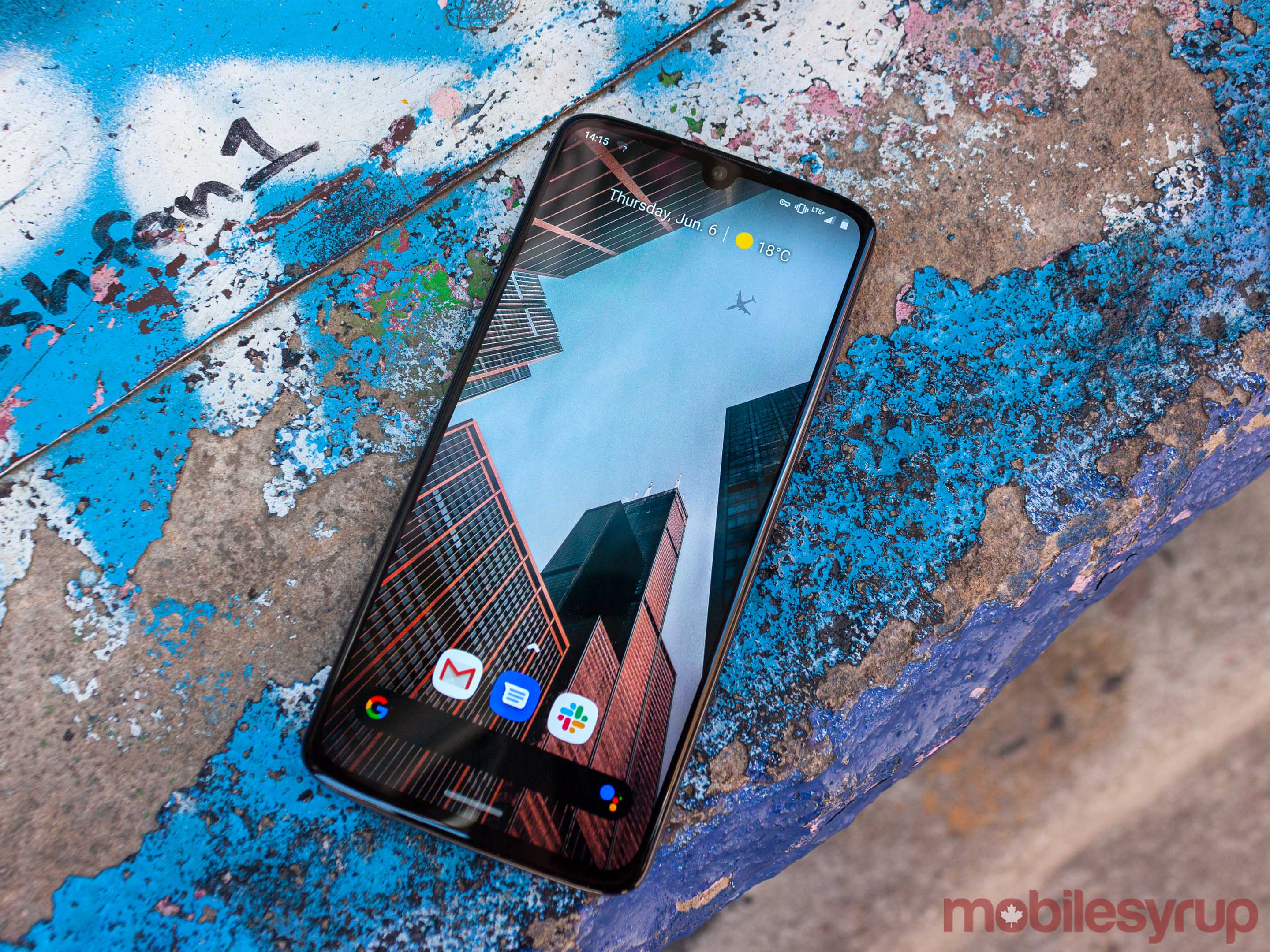
The Moto Z4 is a gorgeous device.
It follows the standard smartphone design — glass front and rear with an aluminum band wrapping around the outer edge of the phone. However, what makes the Z4 stand out is Motorola’s attention to detail.
To start, the rear panel uses an etched matte glass that Motorola claims is fingerprint resistant. I think a more apt description is fingerprint diminishing. Motorola provided me with the ‘Flash Grey’ version of the Z4 (the other colour being Frost White) to review. Smudges and fingerprints cover the rear panel of my unit. However, they’re certainly less noticeable than on a device with a more reflective finish. When I played with the white variant during my hands-on with the Z4, it showed even fewer fingerprints on the back.
Aside from the fingerprint issue, the matte glass has another significant advantage over standard glass: the feel. I hate using cases with my devices, but glass-backed phones often require a case — and not just because of fragility. Glass phones feel unpleasant in my hand, and using them at times feels like I’m trying to hold onto a bar of soap.
The etched matte glass on the back of the Z4 adds a subtle texture and grippiness to the phone that far surpasses other glass-backed phones I’ve used.
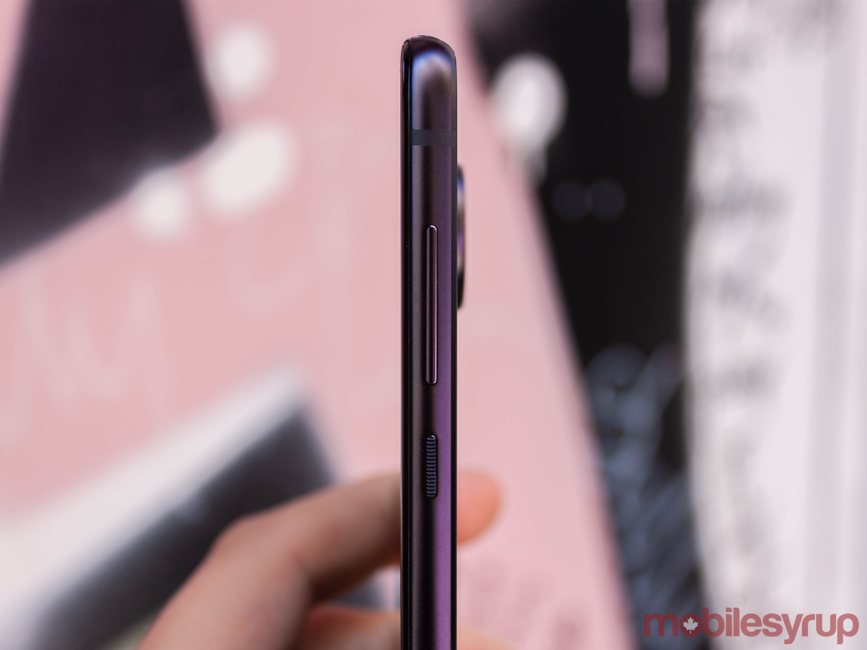
Another aspect of the design that makes the Moto Z4 feel excellent in hand is the ‘2.5D Edge’ Motorola included on the front. In other words, the glass edge around the screen curves subtly to meet the aluminum frame. Plus, the frame features a similarly shaped chamfer where it meets the rear glass. It makes the edges of the phone feel smooth and holding the device a pleasure.
Plus, the Z4 sports a P2i splash-proof nano-coating and offers a headphone jack — something you won’t see on many flagships these days.
Midrange heart in a premium shell
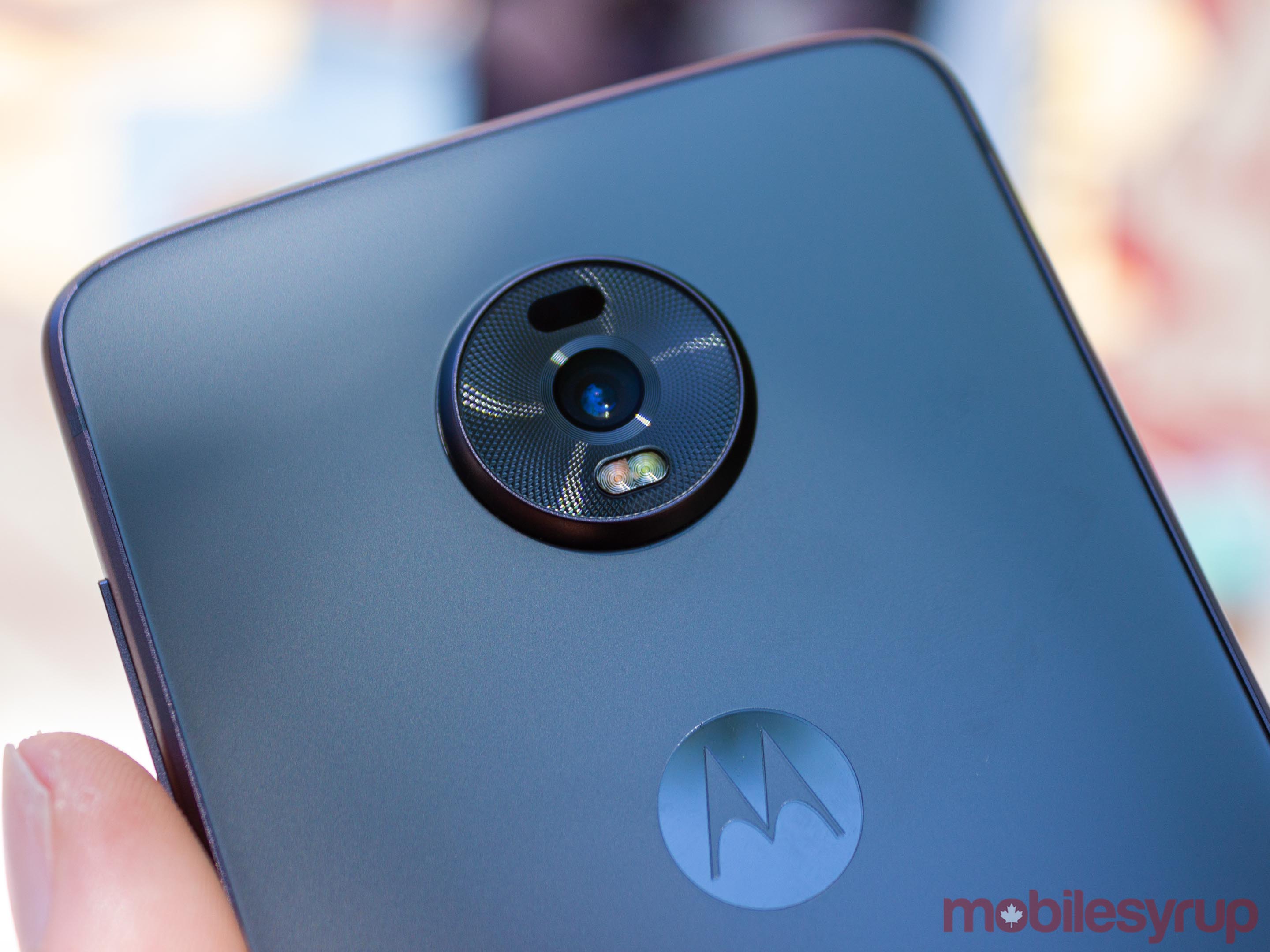
For all the excellence of the hardware, using the phone betrays a less-than-premium experience.
A Snapdragon 675 powers the Moto Z4 alongside 4GB of RAM, and if you come from a flagship Android phone, you will feel that difference. That’s not to say the 675 isn’t good though. In day to day use, it held up very well, handling all the video, web browsing and social media I threw at it. Instead, if you compare it to an 800 series Snapdragon, like the 845 in the OnePlus 6T or even the 835 in the Pixel 2 XL (both of which I had to hand when writing this review), the 675 isn’t as snappy.
Whether in loading apps or opening a web page, the Z4 never failed to complete the task. It just did so a little slower. When swiping around between apps, I found myself waiting just a little longer for things to load.
Animations were also janky more often than not, particularly in the multitasking menu. Swiping between apps usually caused the Z4 to stumble. However, I didn’t notice any significant app restarts with the device until I had opened over 12 apps, and even then, the restart was often faster than a cold start.
That said, other areas were almost always smooth. For example, the Z4’s one-button navigation system (more on this below) lets you swipe to switch to the last app you used quickly. The animation for this feature rarely stuttered.
My point is you shouldn’t pick up a Z4 expecting premium flagship performance. Frankly, you just don’t get that from the 675. However, the 675 is more than capable when it comes to the things most people use their phones for. Whether I was streaming music, answering a phone call or checking Twitter, it got done what it needed to get done. If it dropped a few frames or had to pause for a second or two while it loaded, so be it.
Unfortunately, that’s not a problem isolated to the Z4. Google’s recently released Pixel 3a and 3a XL offer up the same experience, despite receiving glowing reviews. At a certain point, the difference in speed becomes apparent, and the experience with the device suffers for it.
That said, the 675 is gentle on the battery, and I often found myself ending my day with between 30 and 40 percent battery remaining. More important, in my opinion, is the Screen on Time (SoT), which can really show how well a phone holds up. The Z4 often got me about five hours of SoT. To compare, that’s about an hour more than I got with the OnePlus 6T, my daily Android driver before I moved my sim to the Z4.
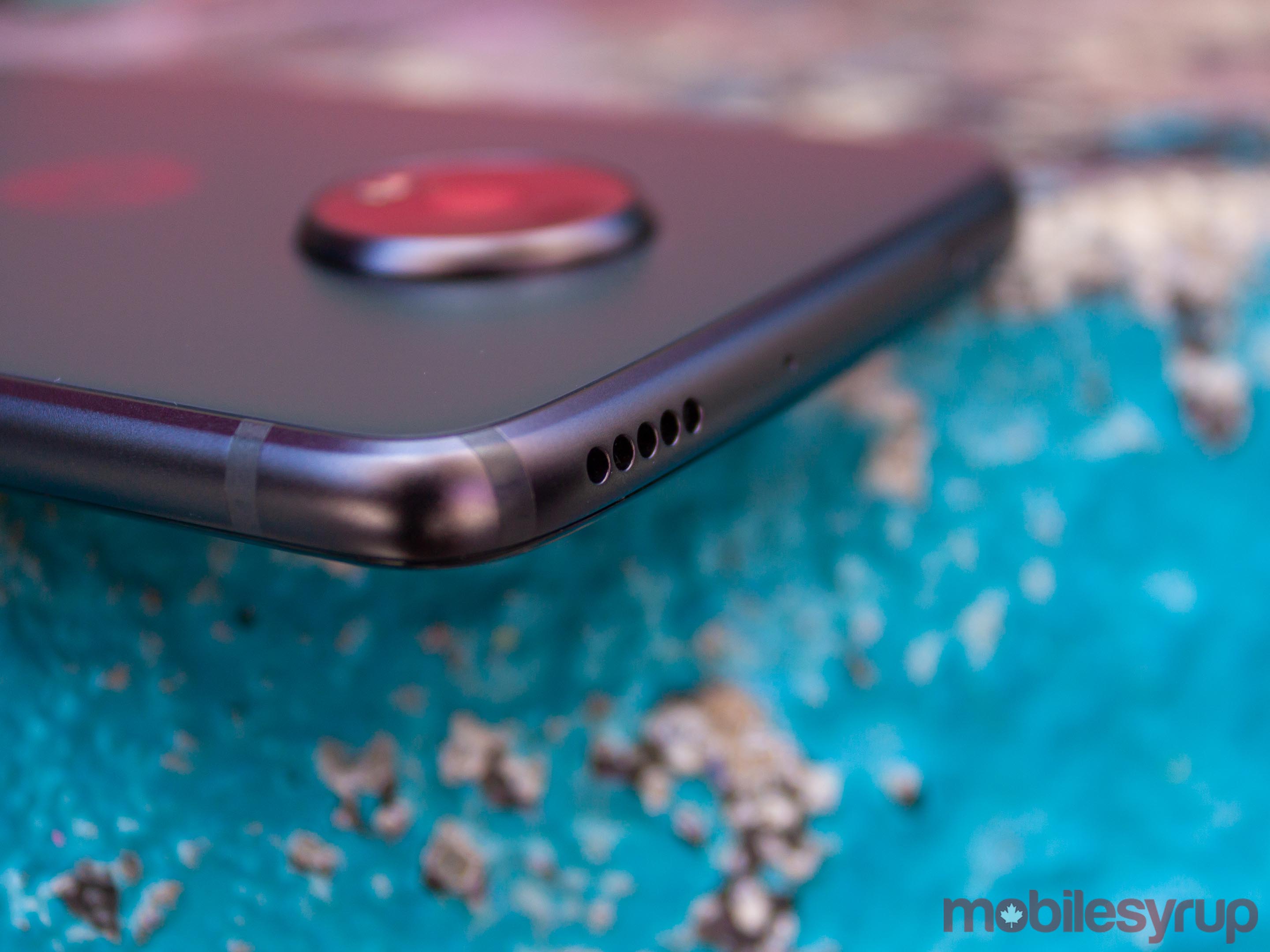
One last note on the hardware: the speaker placement is just weird. The Z4 has a top-firing speaker that can get decently loud, but by no means offers a great audio experience. It sufficed for watching the odd YouTube video, but that was about all. Maybe I’m accustomed to bottom-firing speakers, but the position of the Z4 speaker made audio sound weird, as if it was coming from the wrong place. I did appreciate that the top-firing speaker was away from my hand, so I didn’t accidentally cover it as often when watching videos.
Say cheese ?
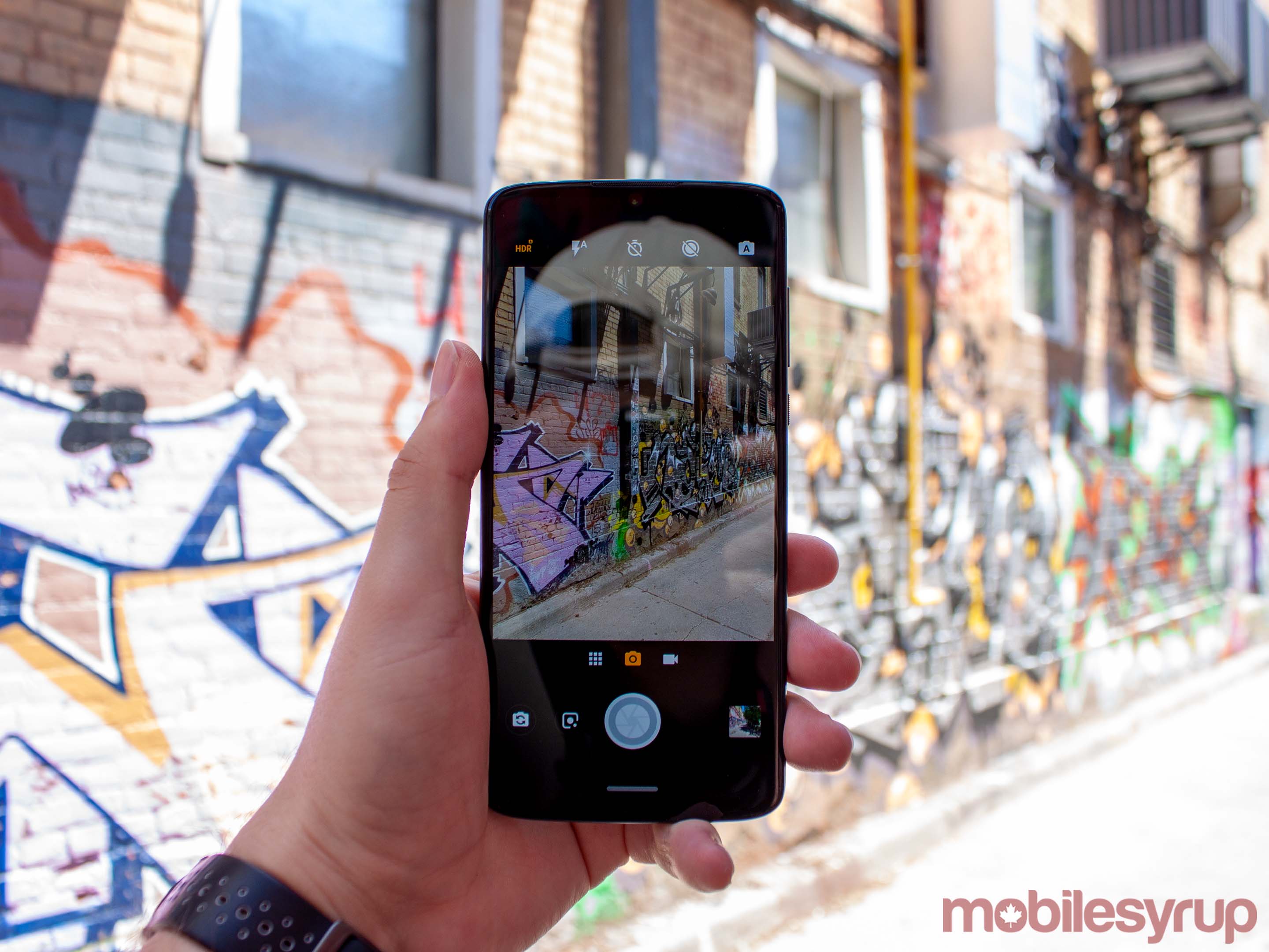
One part of the Moto Z4 that Motorola made a big deal of was the camera. Despite Motorola’s big talk, the Z4 camera wasn’t exactly impressive.
To start, let’s examine the hardware we’re working with. The phone’s rear shooter is a 48-megapixel sensor with a 12-megapixel output, which relies on what Motorola calls ‘Quad Pixel’ technology. What that actually means is the rear camera combines four pixels into one large pixel, so your photos come out as 12-megapixel photos.
Motorola says this helps capture more information, and the logic makes sense — larger sensor means more light is getting into the camera and it can capture more detail. Further, Motorola said Quad Pixel tech helped with low-light photography and with the phone’s ‘Night Vision’ feature, its version of the Pixel 3’s Night Sight mode.
In practice, it didn’t mean much. Primarily, I tested the camera using auto mode as that’s how most people will typically use their phone cameras. In most of my tests, which were outdoors on sunny days or in well-lit rooms, the Z4 produced some reliable results. I found in some cases, the photos lacked detail, and often the colours were far more saturated than I would like. When I did take the camera into more challenging situations, it still held up, but not as well as I hoped it would.
I think the below example of a photo taken with the Z4 compared against the same photo taken with a Pixel 2 XL is rather telling of some of the Z4’s issues. Colours aside, you can see more and sharper details in the 2 XL photo.
![]()
None of this is to say a Z4 is a lousy camera — it often took shots that surprised me with their quality. The average person would be pleased with the Z4’s output. However, I think other smartphone cameras will better serve anyone who cares about photography. The Z4 is good, but not the pinnacle of smartphone photography.
Bells and whistles
While the camera’s auto mode worked well enough for me, Motorola also jammed a lot of other software into the camera that’s worth talking about. For starters, the Z4 camera offers a relatively full manual mode that lets users tweak focus, white balance, shutter speed, ISO and exposure. The aperture is set at f/1.7.
While I appreciated the inclusion of the feature, I didn’t find it particularly useful. When I want to tune my photos precisely, I reach for my DSLR. If I’m grabbing my smartphone to take a picture, it’s because I need to take it quickly and it’s in my pocket. Manual mode, for me, doesn’t help in those situations.
Other software features include Night Vision, as mentioned above, portrait mode, ‘Cinemagraph Mode’ and plenty more. While some of the ideas behind the suite of software bonuses were good, I seldom found a reason to use them.
Take the Cinemegraph mode, which lets you record a short video, and then select an area that will move while the rest of the photo remains still. It was a neat idea, but I never felt like I needed the feature, and when I did try it, it didn’t work well enough to make me want to try again.
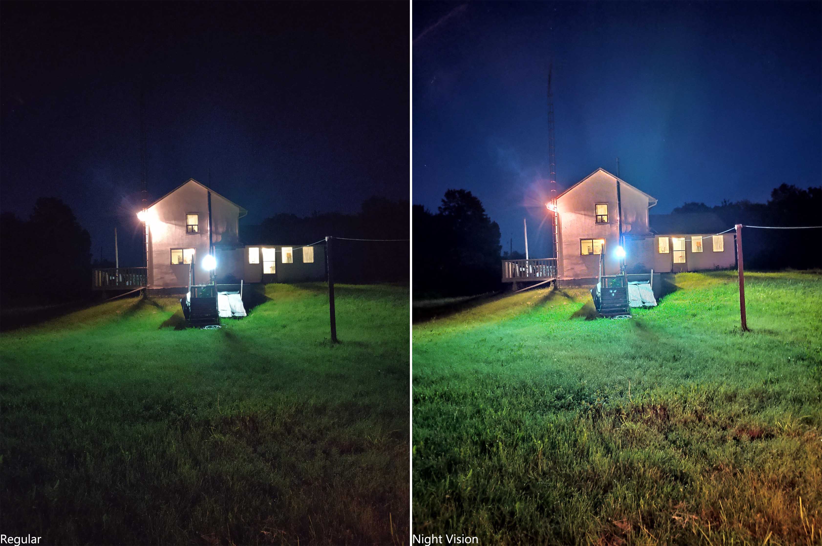
Night Vision was one of the more practical software inclusions, but I also found it didn’t work particularly well. It did brighten up my low-light photos quite a bit, but often scrubbed out details and made areas of my pictures incredibly noisy.
Portrait mode also produces decent results, but again, other phones do it better, especially with the special effects you can add on to each shot.

Moto Z4 portrait mode effects using selfie camera
I also have to take a moment to suggest that you don’t turn on Motorola’s beauty mode. I found it incredibly aggressive in its smoothing features, especially on the 25-megapixel Quad Pixel front camera.
The front camera’s real output is 6.25-megapixels, and as you can see in the group of portrait mode shots above, it does a number on my face and almost completely smooths out the forehead creases.
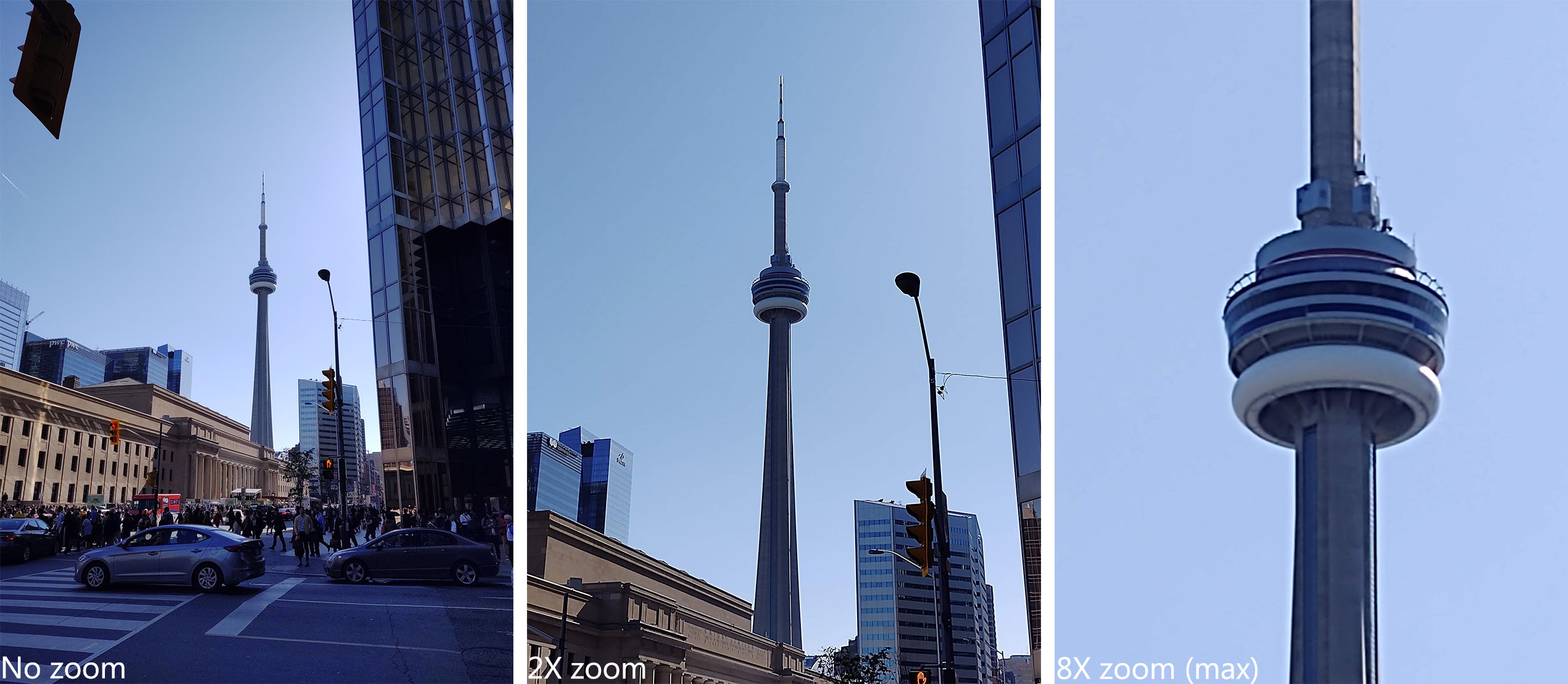
Finally, the camera offers a ‘High Res Zoom’ feature that automatically triggers when using a zoom greater than 2X. Supposedly, it restores detail and makes zoomed photos look more crisp.
In my experience, it does make things a little better, but it doesn’t save photos taken at a great distance.
The Motorola experience
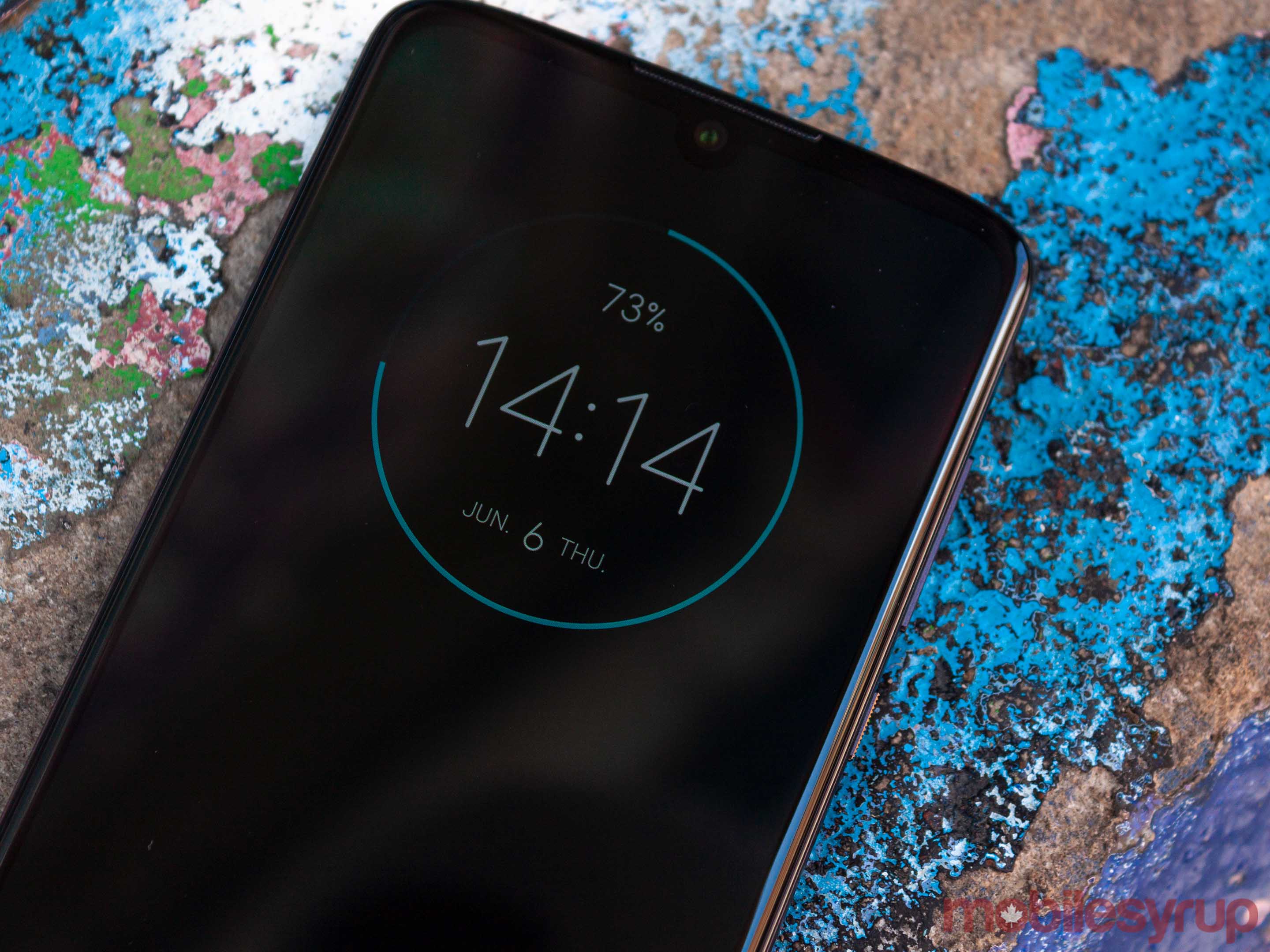
One thing I must give Motorola credit for is its largely untouched Android software. Android has come a long way since 2008 and, in most cases, is more than good enough on its own. Plus, in my experience, most manufacturer skins try to do too much and cause more significant issues down the road, like reduced update frequency and slower phones.
The Moto Z4 avoids all this by offering stock Android with some Motorola tweaks that elevate the experience. We’ll need to spend far more time with the Z4 before talking about update frequency, but it’s worth noting the company hasn’t had the best track record in the past.
Motorola’s gestures are back, with classics like twisting to open the camera or chopping to turn on the flashlight. There’s also a ‘lift to unlock’ gesture and an option to set the phone to Do Not Disturb by flipping it over.
There are several on-screen gestures as well, like a three-finger tap to save a screenshot or a ‘swipe to shrink’ gesture that decreases the display so you can reach everything with your thumb.
In my use, these all worked reasonably well, excluding the on-screen gestures which sometimes got confused. The screenshot gesture was particularly unreliable.
Another Motorola add-on that the Chicago-based company absolutely nailed is the gesture navigation system. While it isn’t new, I do want to take a moment to explain how it works and give it its due.
Motorola’s one-button navigation is the best take on gesture navigation I’ve seen yet, excluding maybe the new one Google is working on in Android Q. The Moto Z4 gives users a single line that acts as the home button — tapping it takes users to the home screen. However, users can flick up on the bar to open multitasking, or swipe on it to go back and switch between recent apps. By default, swiping right switches apps and left goes back, but I preferred it the other way — thankfully you can swap the swipe function in settings.
Not everything Motorola added was good
For all the good Motorola did with its gestures and navigation systems, there were a few areas where the company’s tweaks were problematic.
The worst offender was the experience of unlocking the phone.
Motorola was one of the companies that pioneered the always on display. Early implementations on Moto phones felt great — the ambient display felt integrated with the lock screen. Users could efficiently check notifications and jump directly into an app by swiping on the display.
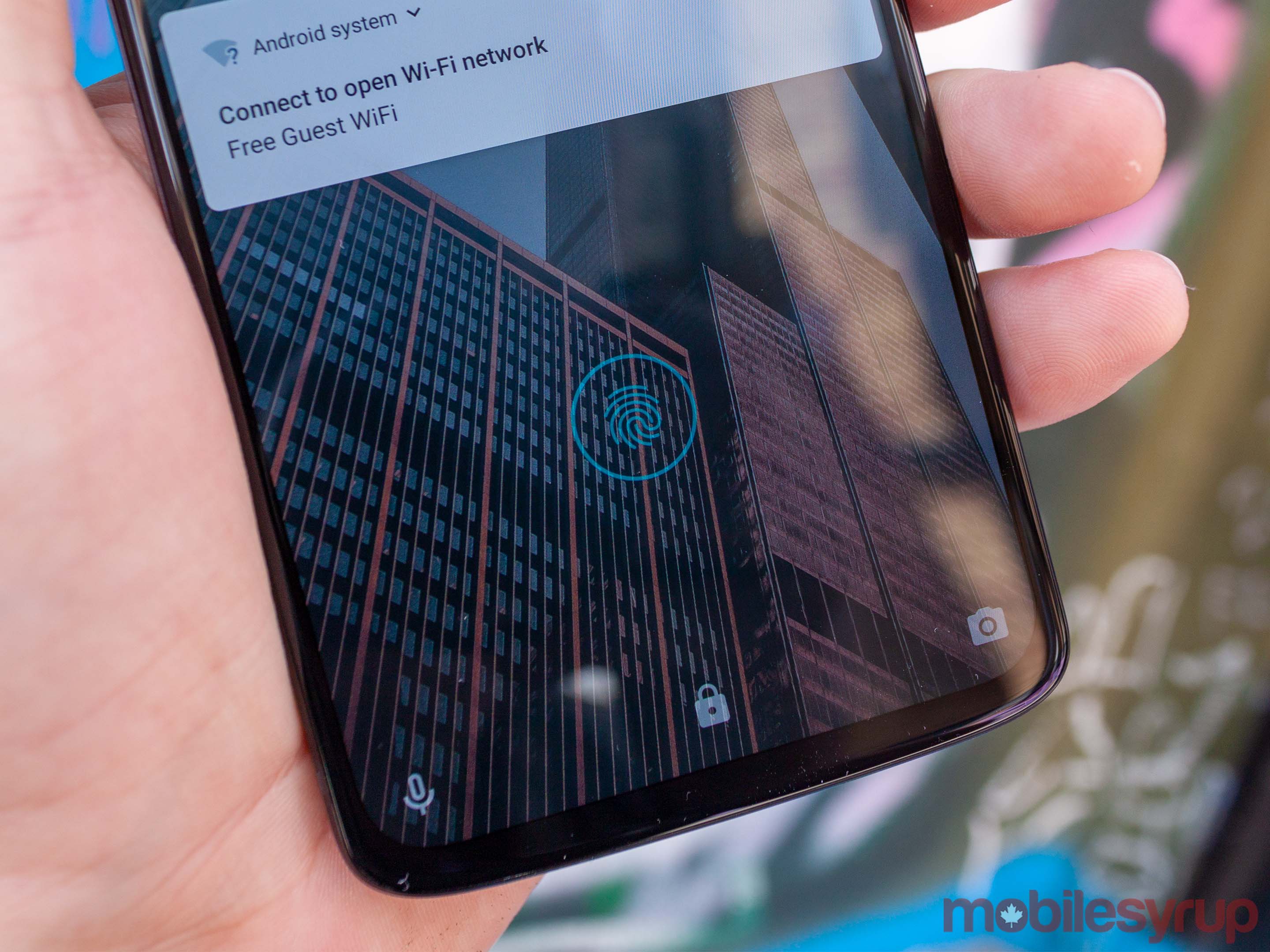
That integration is gone now. The Z4’s always on display — called Peek display — feels disjointed from the actual lock screen. Where past iterations felt like the lock screen, and ambient display worked as one, this time around it feels like the two are fighting each other. The addition of the in-display fingerprint scanner is the primary culprit, in my eyes.
For starters, the Z4 presents the fingerprint scanner on the Peek display, much like the OnePlus 6T does. It seems like a great idea at first, but in my experience, the scanner would read my fingerprint and unlock the phone, but wouldn’t open the phone, leaving me stuck on Peek.
Then, I’d have to lift my finger off the display. The circle where the fingerprint scanner was before becomes a circle with an unlocked lock icon. Pressing the circle again would open the device, or pressing the power button would bring you to the lock screen, and swiping would unlock the device. While this chain of events didn’t happen all the time, it happened enough that it became a nuisance.
Based on my experience with the Z4, it doesn’t appear to be a problem with the fingerprint scanner. In all other instances, the scanner operated as expected, and was surprisingly fast. Plus, if I bypassed Peek by pressing the power button when I picked up the phone, I had no issues unlocking it. Instead, the problem seems to be a bug with Peek itself. I’ve reached out to Motorola for more information about the issue.
Peek also lets users interact with some notifications. For example, when I got a text, I could press the fingerprint sensor — which showed a message icon — and swipe up and hold to view the message. Depending on the notification, I could also choose to dismiss it, reply to it or open the app. This, thankfully, worked well in my experience.
The Z4 also offers camera-based facial recognition to unlock the phone — not exactly the most secure, but fast and convenient. Unlike the fingerprint scanner, facial recognition worked flawlessly with both Peek and the lock screen and sometimes was so fast I didn’t even get my finger on the sensor before the phone unlocked.
It wouldn’t be Motorola without a few mods
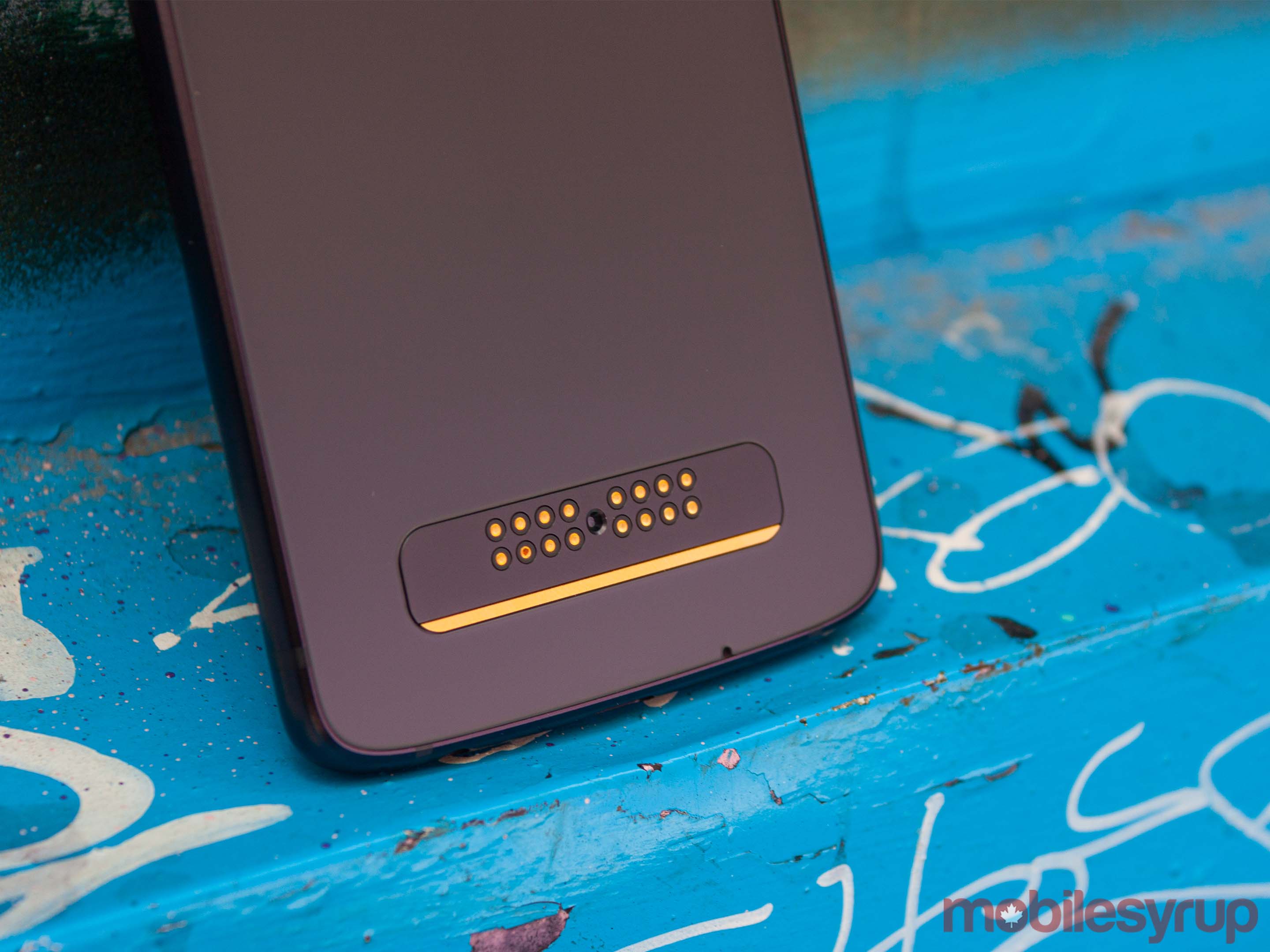
Last, but certainly not least, I want to talk about the mods. Moto Mods have been a staple of the Z series phones since 2016, for better or worse.
As I said in my hands on, Motorola promised three years of support for mods, but the Z4 marks the fourth year of support for the platform. While mods have caused some issues with Z series phones, such as restricting design innovation (Motorola can’t significantly change the physical dimensions of Z phones without affecting the mods), Motorola did make a case for keeping them.
According to the company, customers who used the Moto Mods were extremely satisfied with the experience and were more likely to recommend Motorola devices to friends and family.
With this in mind, it’s no surprise that Motorola decided to include a free mod with the Z4. It’s worth noting that it did the same with the Moto Z3 Play, but the mod was only available in the U.S., and the Canadian variant of the phone did not come with a mod.
The time around, the included mod is the 360-degree camera. It’s a cool, albeit impractical mod, as the camera module and backplate that connects to the phone are quite bulky. In other words, it’s something you won’t want to attach and leave on your phone.
Further, the novelty of taking 360-degree photos and videos wears off quickly if you don’t have a way to enjoy them. While you can view them just on your phone, it’s better to have some sort of VR headset, like the Google Cardboard.
Regardless, I can’t fault Motorola for including the mod and adding significant value to the phone. In Canada, the 360-degree camera mod alone is $359.99, so getting it for free with the phone really bumps up the value for the device.
Frustratingly, Motorola also shifts some typically standard features off the phone and onto the mods. For example, the Z4 doesn’t support wireless charging, but you can buy a mod that’ll give you the feature.
The price makes it…
At the time of writing, Motorola had no information on Canadian availability, beyond a vague “it’ll come later this summer.” Further, it was unable to share pricing information with me, saying it wasn’t available until closer to the phone’s launch.
Unfortunately, that puts me in the awkward position of judging this phone without knowing the price, which I think is a crucial part of the decision behind purchasing the Z4.
For now, I’ll use the U.S. pricing and the Canadian conversion as my basis and will update this later when I get the pricing information.
The Z4 will retail for $499.99 in the U.S. or about $663.74 CAD at the time of writing. Typically, it’s a little more complicated than just a straight dollar-to-dollar conversion, so I’d estimate we’d see a cost closer to $700.
At the very least, that would be ideal for consumers and Motorola alike. Arguably the biggest competition for the Z4 is Google’s Pixel 3a XL, which offers a very similar feature set at a very similar price; $649 CAD.
And for an extra $50, I think the Mozo Z4’s superior hardware makes it an excellent choice over the 3a XL. For one, the Z4 sports the Snapdragon 675, whereas the 3a has the 670. The differences are minuscule — Qualcomm manufactured the 670 on the smaller 10nm process, and it has a slightly faster Adreno 616 GPU, but the 675 uses newer Kryo 460 cores and has support for 48-megapixel cameras.
But the Z4 also offers a slightly bigger display, premium glass and aluminum construction, an in-display fingerprint scanner and more storage off the bat. And, of course, support for mods to add more things to your phone.
... or breaks it
If my estimate is right, I'd say the Z4 is worth the extra $50. However, last year's Z3 Play was $800 outright from some carriers and $700 from others, despite being the same $499 in the U.S. at launch. To me, that suggests we could see a higher priced Z4 in Canada this year.
That makes it hard to recommend over the Pixel 3a XL.
It's also worth noting that there isn't a smaller Z4 equivalent to match up to the Pixel 3a, and when you consider the top-notch camera and Google's commitment to quick Android updates, the budget-conscious shopper may not see a compelling reason to go for the Z4 instead.
Ultimately, the Z4 is a reliable midrange Android phone. It brings excellent and unique features to the table, has a solid -- but not great -- camera and is modular.
But if the price isn't right, those extras might not be enough to convince consumers to fork out for the Z4.
"The Z4 is an excellent midrange phone in a premium shell"
MobileSyrup may earn a commission from purchases made via our links, which helps fund the journalism we provide free on our website. These links do not influence our editorial content. Support us here.


