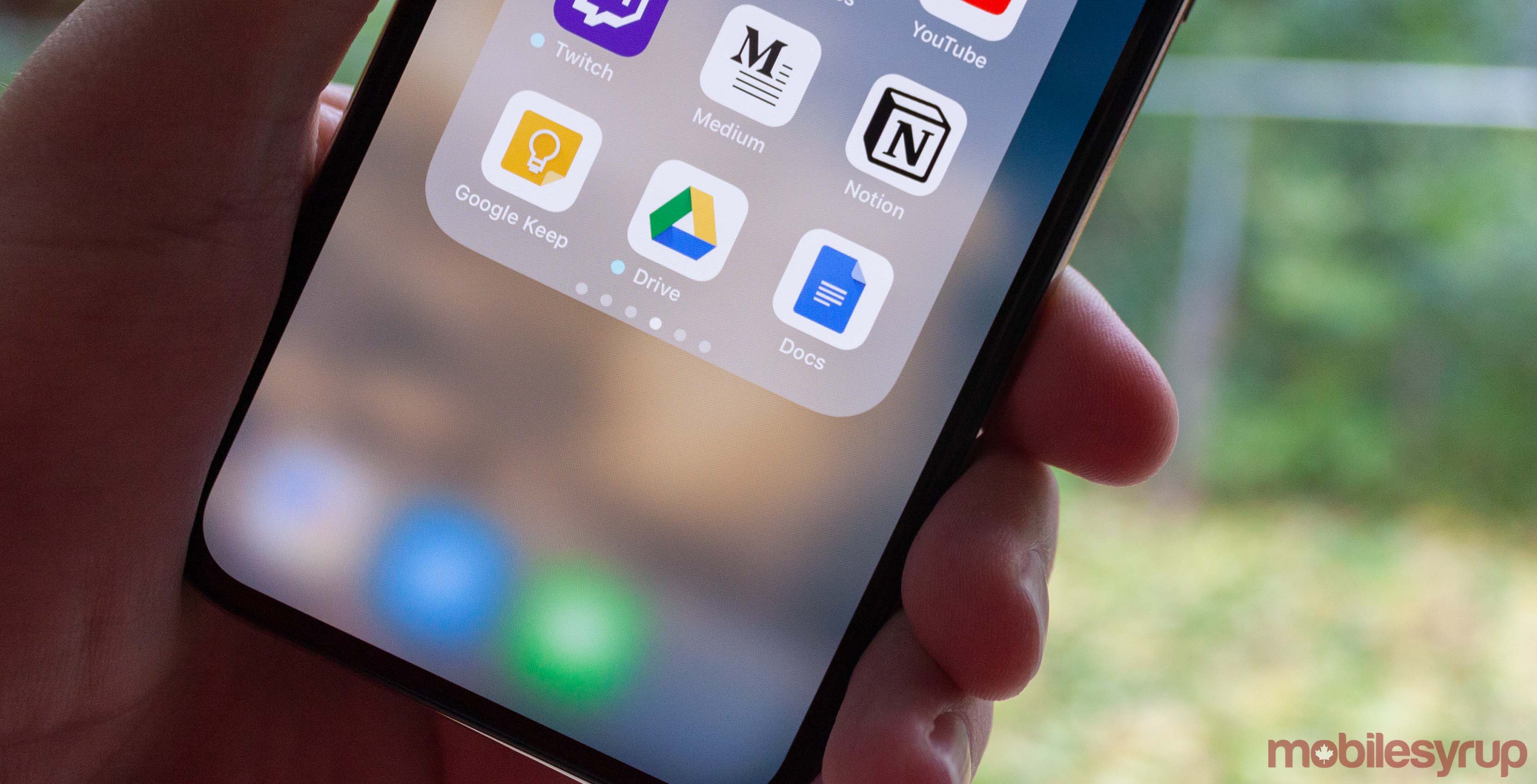
Google is currently on a refresh spree when it comes to its applications. More recently, Google Drive app received a material theme fresh on March 18th, and now Docs appears to be getting a taste of the new UI.
The new Google Docs removes the blue title bar and added an all-white design that contains a colourful Google Docs logo. Dark mode isn’t here yet, but a new set of icons have arrived, including a four-colour “+” button for creating new documents.
In the side panel, a white background that contains a profile picture and switcher has replaced the background image from the extinct Google+.
The template page also gets a white background instead of a grey one that existed in the older version.
Document editor doesn’t have many changes aside from having more white elements in the formatting bar. Document info screen is no longer showing link sharing, offline status or starring. These options might have been integrated into other menus.
Allocating more white spaces in Google Docs can be a signal for the eventual introduction of dark mode, which replaces all white spots with darkness.
Only a small amount of users running version 1.19.232.05 of Google Docs. You are able to download the Android APK here.
We are not able to replicate the UI changes here at MobileSyrup so it seems like a limited server-side test, just like the recent changes to Google App and Google Maps.
Source: Android Police
MobileSyrup may earn a commission from purchases made via our links, which helps fund the journalism we provide free on our website. These links do not influence our editorial content. Support us here.


