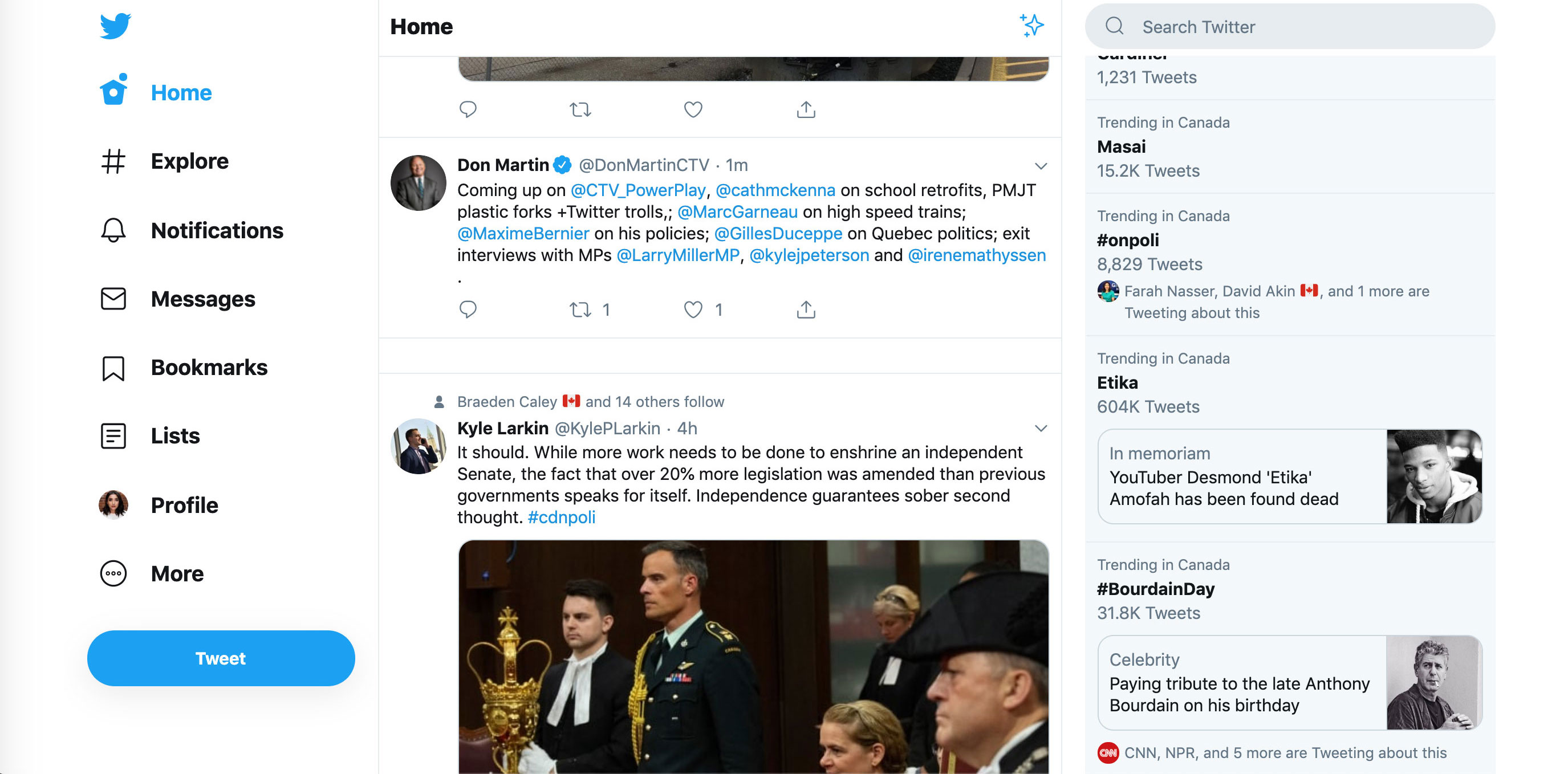
Twitter is already testing out a new desktop user interface after rolling out a revamped take on the micro-blogging platform back in January.
Twitter product manager Jesar Shah (@jesar) confirmed the update is rolling out in a recent tweet. MobileSyrup telecom reporter Shruti Shekar’s desktop Twitter UI has been updated with the new design. That said, no other member of the MobileSyrup team has received the update.
?We’re excited that some of you are seeing new experiences we’re testing for https://t.co/UKrbwu0trR. On behalf of our amazing team, @ashlie, @m7z, and I are going to give you a little bit more insight into what you’re seeing and why.https://t.co/mVMXnZhMrb
— jesar ? (@jesarshah) May 3, 2019
It’s unclear how many users have access to the new UI. Twitter’s new desktop look more closely resembles the iOS and Android version of the platform when the sidebar that includes ‘Profile,’ ‘Lists,’ ‘Bookmarks’ and ‘Moments’ is open.
If you’re included in the test and not fond of the new UI, you can always click on ‘More’ and switch back to the standard legacy version of desktop Twitter.
MobileSyrup may earn a commission from purchases made via our links, which helps fund the journalism we provide free on our website. These links do not influence our editorial content. Support us here.


