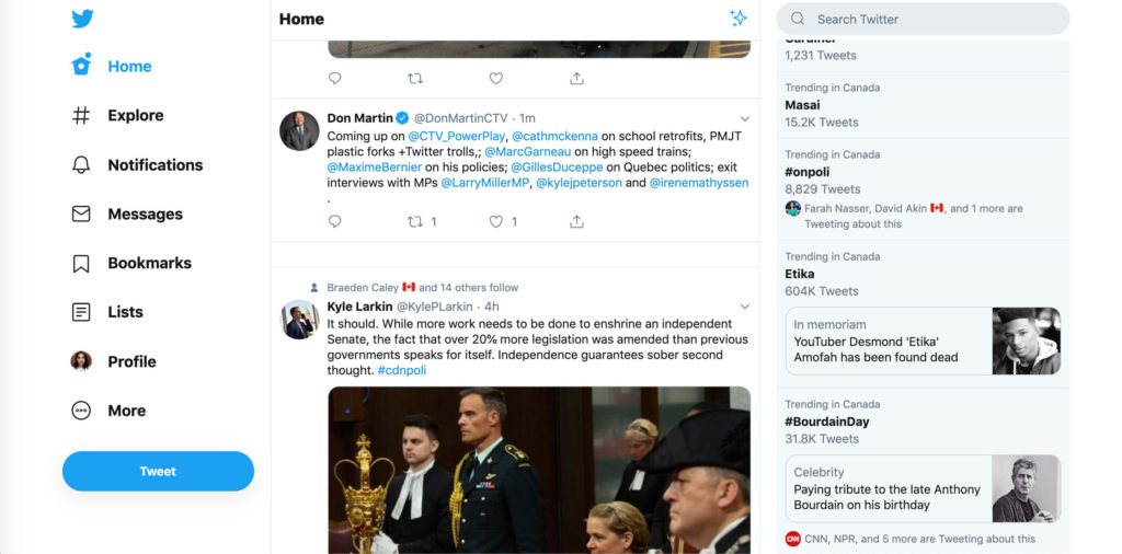
The desktop version of Twitter is going to start looking a whole lot different starting today.
Twitter said it’s been testing some of these aspects for a while and with the feedback it’s gotten, plans to make conversations easier to find and follow.
Users will now get to see more of what’s happening, so your ‘Explore’ page will have more live video and local moments “personalized for wherever you are in the world.” You’ll be able to get context with profile information within conversations and check out your ‘Top Trends’ in any view.
‘Bookmarks,’ ‘Lists’ and your ‘Profile’ will be more visible to the user and will have their own spot on the side navigation bar, this will make it easier and faster to jump between different tabs.
‘Direct Messages’ has been expanded so you can see your conversation and send messages from the same view. There is less hassle in switching between screens to send a message.
If you’ve got multiple profiles that you work from you’ll be able to switch between these accounts faster and directly from the side navigation bar.
You’ll also be able to access dark mode the dark mode themes Dim and Lights Out.
MobileSyrup reported on this new desktop user interface in June when Twitter was still testing it out with some users.
It’s worth noting that if you’re not fond of the new UI, you can always click on ‘More’ and switch back to the standard legacy version of desktop Twitter.
MobileSyrup may earn a commission from purchases made via our links, which helps fund the journalism we provide free on our website. These links do not influence our editorial content. Support us here.


