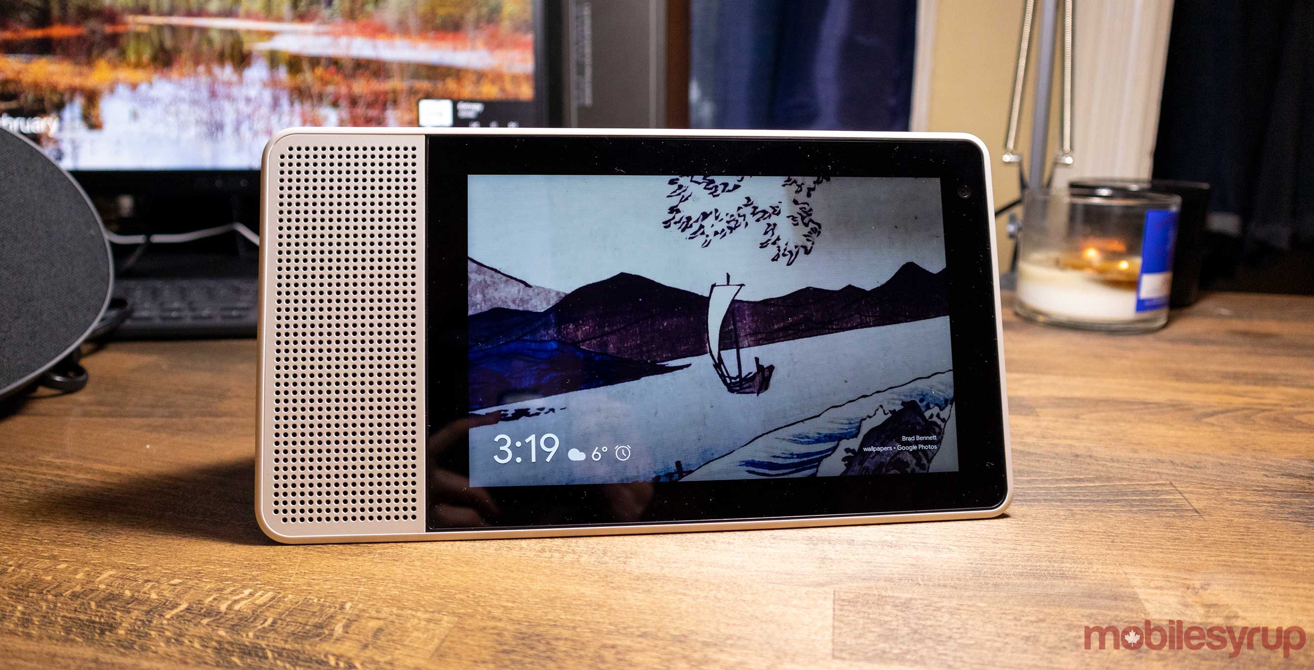
When Google introduced the Nest Hub Max in May, it brought along an updated home screen for the in-house smart displays. Now, the updated design is making its way to the Lenovo Smart Display.
Owners of Lenovo Smart Displays have reported on Reddit that the redesigned home screen is rolling out with the R12 over-the-air (OTA) update for the 8- and 10-inch models.
The redesign caused some controversy among users when it started hitting devices. Many users have complained about how the new design shows less information and uses a less-elegant layout than before.
For instance, when the user taps the screen, a ‘Top Stories’ tab will appear, blurring the background. Swiping the tab will turn the wallpaper into a solid colour. Further, the time and date now only shows the current day’s weather, instead of dedicating half a page to show a three-day forecast like before.
However, the new home screen design will make sense for any future device that features Face Match, like the Nest Hub Max. Face Match will be able to recognize the user and show personal reminders, Duo messages and more on the home screen without user interaction. Unfortunately, on devices without Face Match, the new UI isn’t a great addition.
Source: Reddit Via: 9to5Google
MobileSyrup may earn a commission from purchases made via our links, which helps fund the journalism we provide free on our website. These links do not influence our editorial content. Support us here.


