Google has pushed out a few small stealth updates that subtly tweak the look of icons and other aspects of its Messages app.
Primarily, the changes bring the iconography more in line with the style in Android Q, but Android Police notes that Messages now supports a transparent navigation bar as well. The latter piece is related to the new gestures in Android Q, but it isn’t clear when Google implemented the change.
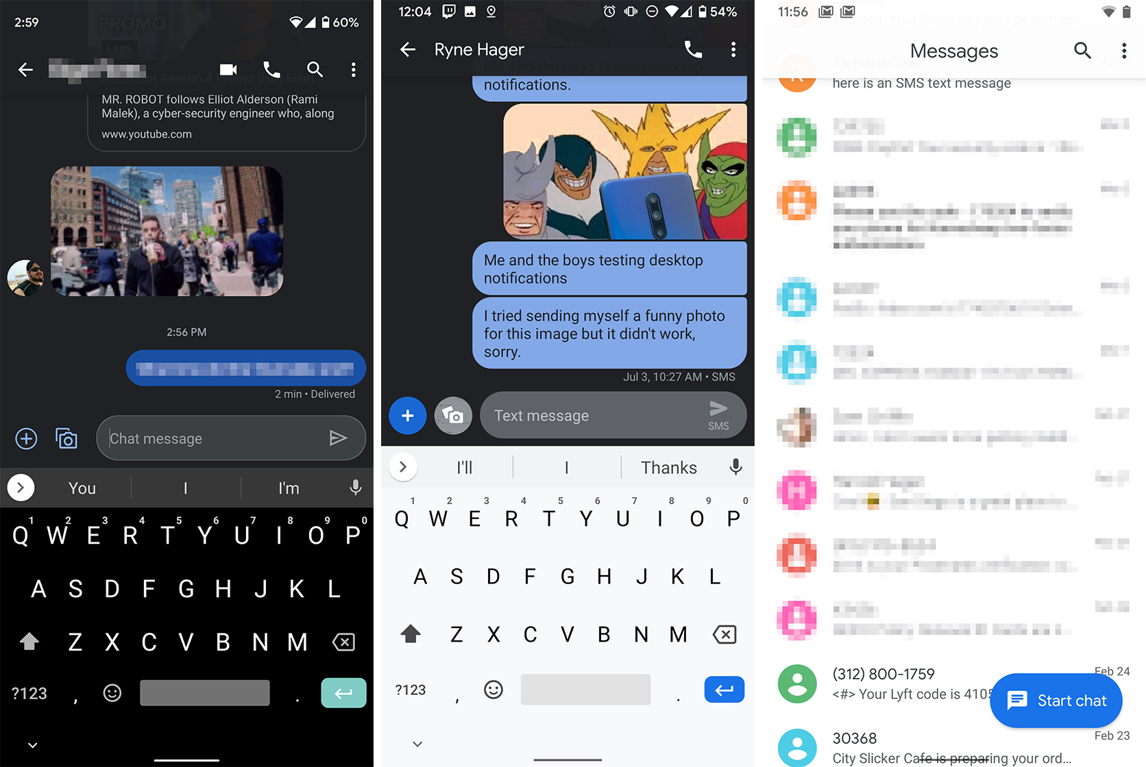
For the iconography, the main changes apply to the ‘attachment’ and ‘photos’ buttons. Both are now outlines, similar to how Android Q does its iconography.
Additionally, the text entry field also features an outline around it, instead of being a single solid colour like before. The send button is also an outline now. Interestingly, the new text entry field says ‘Chat message’ where the old style says ‘Text message.’ While it seems like an indicator of RCS, Android Police reports that the presence of Google’s messaging service makes no difference to this.
However, the change hasn’t reached every icon yet. The video and voice calling buttons at the top, for example, still sport the old design.

Left: New design, Middle: Old design, Right: Transparent navigation bar
The icon changes appear to be part of a server-side rollout. Updating Messages on my device didn’t produce the new icons, nor did switching to the beta version of the app. Some reports suggest the new icons show up on Messages version 4.6.375, which is the current stable version. Your mileage will likely vary.
As for the transparent navigation bar, this also is likely a server-side change, but it isn’t clear when Google enabled it. Android Police says Messages version 4.6.369 and up all support it, but that update came out about a month ago.
You can grab Message or its beta version from the Play Store here.
Source: Android Police
MobileSyrup may earn a commission from purchases made via our links, which helps fund the journalism we provide free on our website. These links do not influence our editorial content. Support us here.


