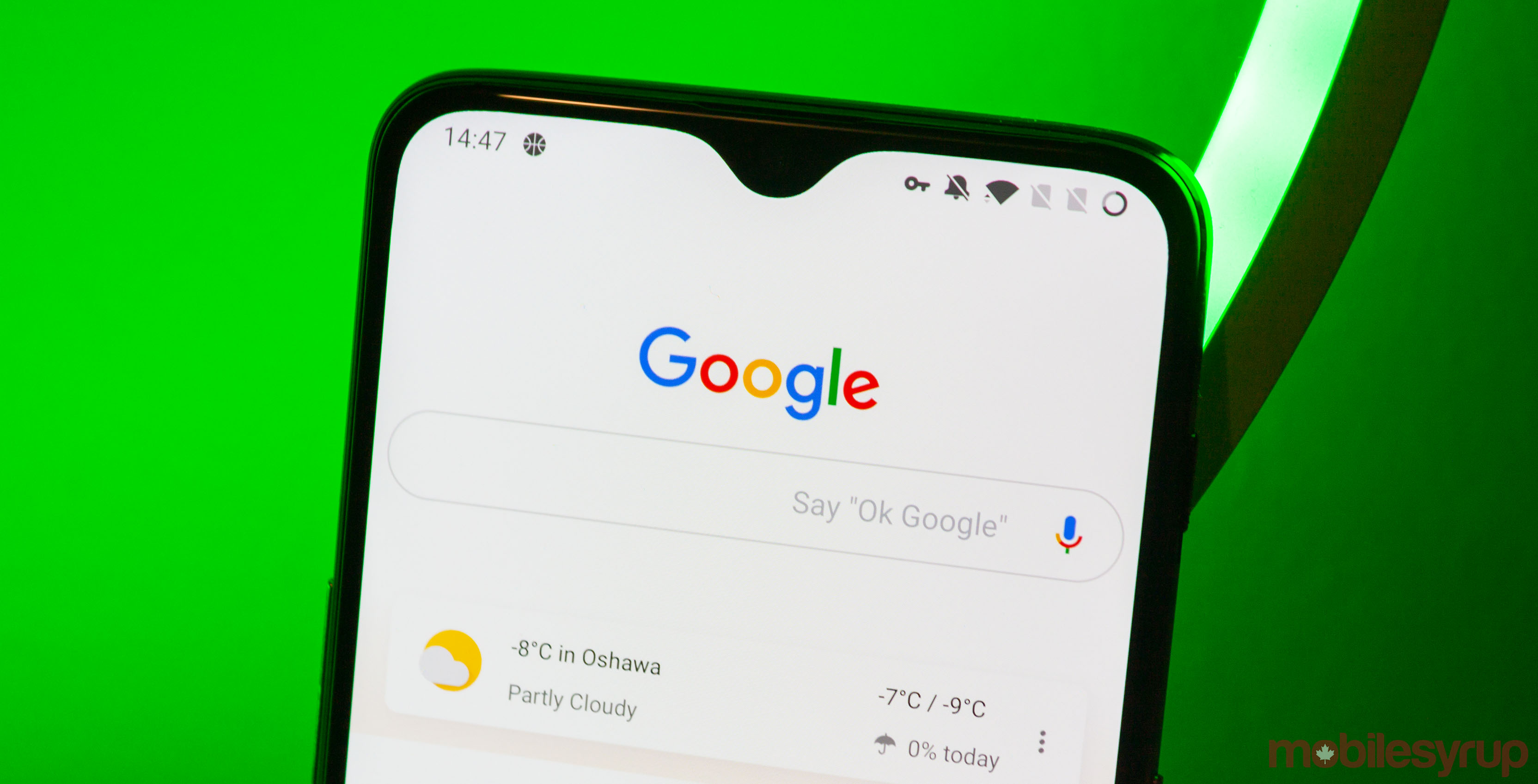
It seems that Google is quietly testing altered search bar designs on some users with Google app beta for Android, according to 9to5Google.
The publisher then explained three iterations that admittedly offer minor differences. The first one contains an “Ask any question” prompt in the search bar, while the second iteration has a magnifying tool icon along with the wake-up phrase “Say Hey Google.” In comparison, the third design retains the icon but has no words.
For the time being, all of them still maintain the pill-shaped search box with a grey outline that blends well with the white background.
9to5Google also pointed out that the magnifying tool icon showed up on the web and desktop Chrome’s New Tab page.
Furthermore, there was reportedly an additional variant featuring “a blinking cursor in the search field” that usually appears on desktops.
Other than those changes, Google added searches you’ve made before underneath the search bar to facilitate quicker search actions.
It is important to know that not everyone with the latest Google app beta will get to see the changes.
Source: 9to5Google
MobileSyrup may earn a commission from purchases made via our links, which helps fund the journalism we provide free on our website. These links do not influence our editorial content. Support us here.


