If you’ve been following along with the Android Q betas, you know that Google has made several tweaks and revisions to the gesture navigation system.
From my brief time with the new gestures, I’d argue that the system is in a better place than it was throughout the rest of the beta, and definitely better than the two-button gesture system introduced in Android Pie.
A lot of work went into designing the new system, and a new blog post from Allen Huang and Rohan Shah, product managers for Android UI, outlines how the new gesture system came to be.
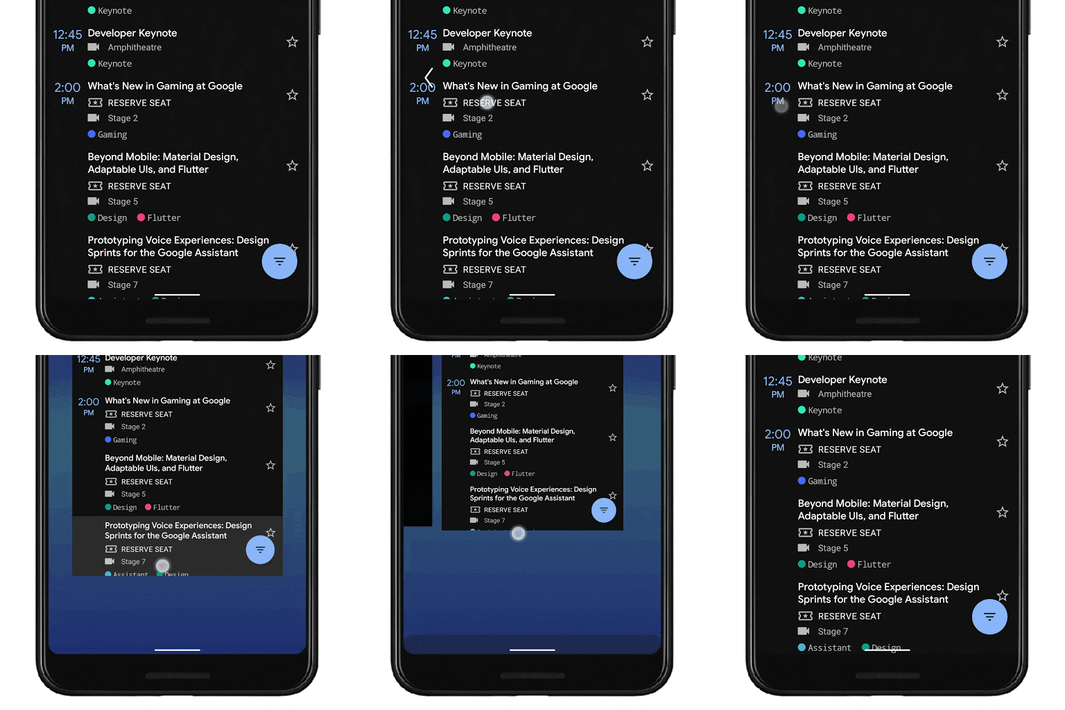
For the unfamiliar, Android Q’s new gesture system looks, at a surface level, more like the system found on iOS. However, when you dig into the gestures, there’s a lot more going on. The system offers a simple swipe-up on the navigation bar to go home or open recents, swipe-in from either of the bottom corners to trigger Assistant and finally, swipe from either left or right edge to go back.

Huang and Shah write that Google wanted to move to a gesture system for several reasons, such as offering more screen space to apps and creating a more immersive experience. The team researched gesture navigation and found gestures can be a faster, more natural way to navigate your phone.
Additionally, gestures are “more intentional” than software buttons, meaning users are less likely to activate them accidentally than a software button.
Gesture navigation isn’t perfect, but fragmentation makes it worse
For all the good, Huang and Shah noted that gestures have issues too: they don’t work for every user, can be more challenging to learn and can interfere with app navigation.
However, the biggest issue with implementing gestures is fragmentation. Different Android phones have varied gestures. OnePlus, Samsung, Huawei and Motorola, just to name a few, all implement custom and unique gesture navigation systems.
So, to get gestures to work on Android, Huang and Shah say Google worked with partners to standardize gesture navigation. Partners include Samsung, Xiaomi, HMD Global, Oppo, OnePlus, LG and Motorola. Going forward, the Android Q gestures will be the default gesture navigation system for all Q and newer devices. Additionally, the older three-button navigation style will stick around for users who can’t or won’t use gestures.
Interestingly, Huang previously said that Google wouldn’t force manufacturers to use the Android Q gesture system. It’s not clear if this has changed, or if Google is making manufacturers choose between gestures and the three-button navigation system.
Android Q gestures born of research
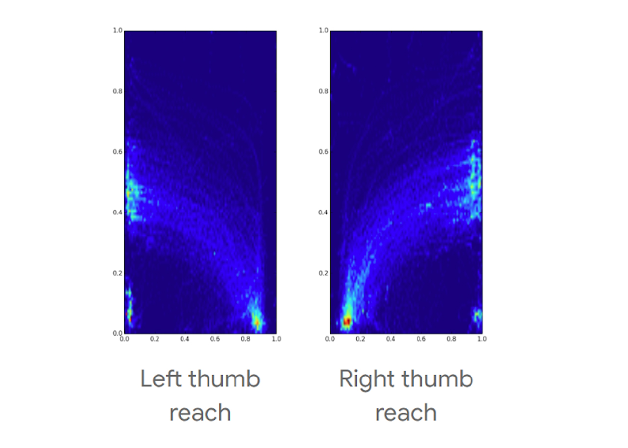
Google ultimately did a lot of research when it came to designing the Android Q gesture system. To start, the company created heatmaps to see how people interact with their phones, what the ‘reachability’ is. From there, it designed several prototype systems and tested them in studies to see how quickly users learned the system, got used to it and how they felt about it.
Huang and Shah point out that one of the priorities for the new gesture system was making the back gesture easy and ergonomic. Back has been a staple of Android navigation for years and, according to Google’s research, is used about 50 percent more than the home button.

Heatmaps showing where users can comfortably reach when holding a phone with one hand.
With that in mind, the Android team put the home and back buttons in the most reachable and comfortable areas for users’ thumbs.
In testing Android Q, users performed tasks involving home and back more quickly on average than with the other systems used in testing — including three-button navigation.
However, the testing also showed some areas where gesture navigation caused problems, and the Android team had to make tough decisions about how to handle the issues.
Gesture navigation makes significant tradeoffs
The first significant tradeoff the Android team made was to prioritize the home gesture over access to the recent apps screen (Overview). However, since users go to Overview about half as often as home, making the home gesture easier and faster makes sense.
Another tradeoff was with opening app navigation drawers, those side menus often called ‘hamburger menus’ because of the three-lined button used to open them. Huang and Shah write that about three to seven percent of users swipe to open that menu, depending on the app. This conflicts with the new back gesture.
The Android team tried a few ways to work around the conflict, but ultimately couldn’t create a way to keep both without affecting the reliability of the back gesture. As such, the back gesture won out, due to its importance. In other words, if you’re like me and use the swipe to open app menus, you’ll need to adjust for the new system.
Finally, the study revealed that it takes on average one to three days for users to adjust to the new gesture system. Once users adjust, however, the majority don’t want to go back. That said, Google will keep the three-button navigation system around for users who don’t like or can’t use gestures.
You can learn more about the research and work that went into designing the new gesture system on the Android Developers Blog. Further, there’s a detailed blog post outlining the changes for app developers.
Source: Google
MobileSyrup may earn a commission from purchases made via our links, which helps fund the journalism we provide free on our website. These links do not influence our editorial content. Support us here.


