The Pros
- More intuitive UI
- NFC tag for easier pairing
- CarPlay and Android Auto
The Cons
- Wireless charging only on highest trims
- No USB-C ports
- No Google Assistant via Bluetooth
Honda maintains an iterative approach with its HondaLink infotainment system, but the 2019 version takes a few key steps in the right direction.
One thing automakers are slowly getting better at with their respective systems is usability, especially as it relates to aesthetics. The new-look HondaLink follows the trend, featuring a simpler layout that looks better because of improved graphics.
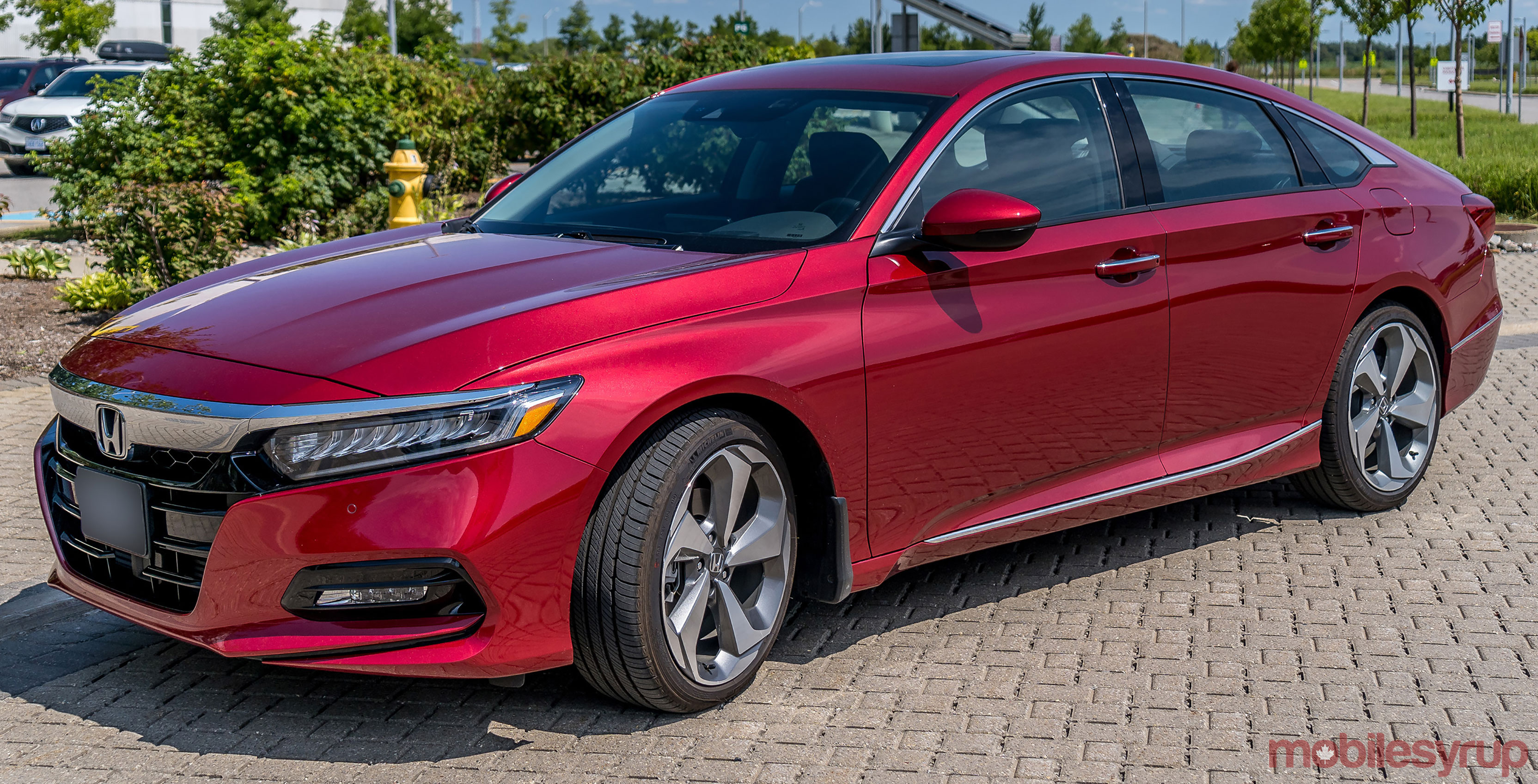
The current system isn’t in every Honda model just yet. I got to test it in a 2019 Accord Touring, but it also comes in the Insight, Pilot, Passport and Odyssey. There are worthwhile points in what Honda did here, and the room for improvement seems within reach.
The basics
When I previously tested HondaLink, the system had undergone a sea of change that included adopting a capacitive touchscreen as well as embracing Apple CarPlay and Android Auto. The user interface is one of the biggest differences this time, though it does go further than that.
One of the key changes was going back to a physical input for volume. When Honda overhauled things in 2015-16, it opted to go with a volume slider that both customers and reviewers maligned as being unintuitive. It’s gone now, replaced with a knob to more easily adjust how loud or low you want to hear. Steering wheel controls are still there.
Many of the foundational pieces remain, and for the most part, the system functions similarly. Some of the new elements, however, do add to the package in positive ways.
Connections and layout
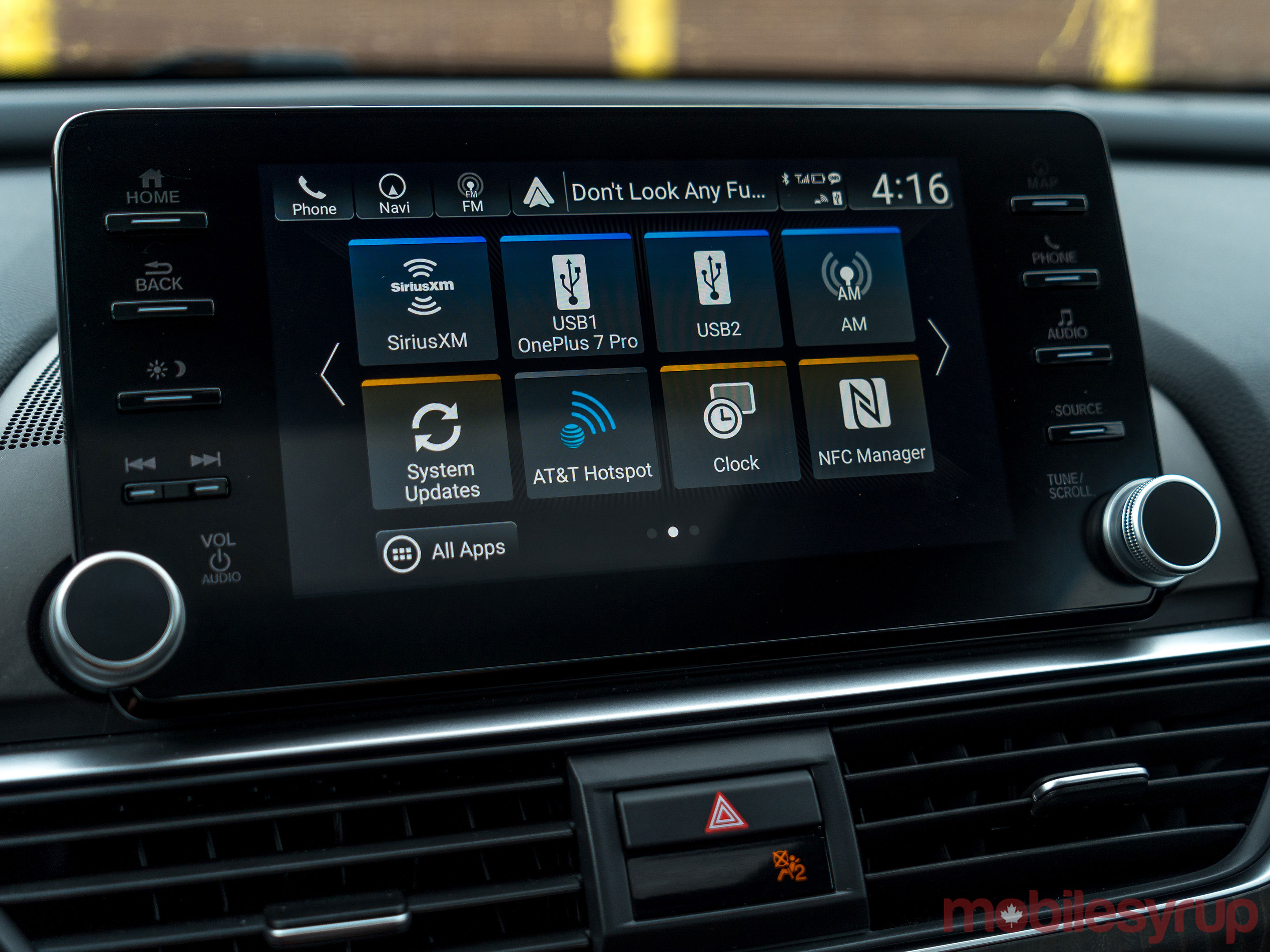
At the centre of it all is the 8-inch display, which seems to have a sharper resolution than the previous one. Part of that may be a credit to the improved UI that feels cleaner and easier to navigate. Icons are larger and sub-menus shorter, making it a little easier to get from point A to B within the system.
Flanking the screen on both sides are physical buttons acting as shortcuts to various software features. I liked it because it negated having to touch the screen all the time, and reduced the number of steps to get to something. I would argue the biggest difference is the volume knob, which Honda had already returned to last year.
Interestingly, Honda didn’t include USB-C ports in the Accord. While some other manufacturers have already embraced the popular port, traditional USB-A reigns here. What’s neat is that both the dash and centre console each have the same active port. Either one can interface with the system to run CarPlay or Android Auto. I tried to see if I could somehow run both at once, but it forces you to choose one.
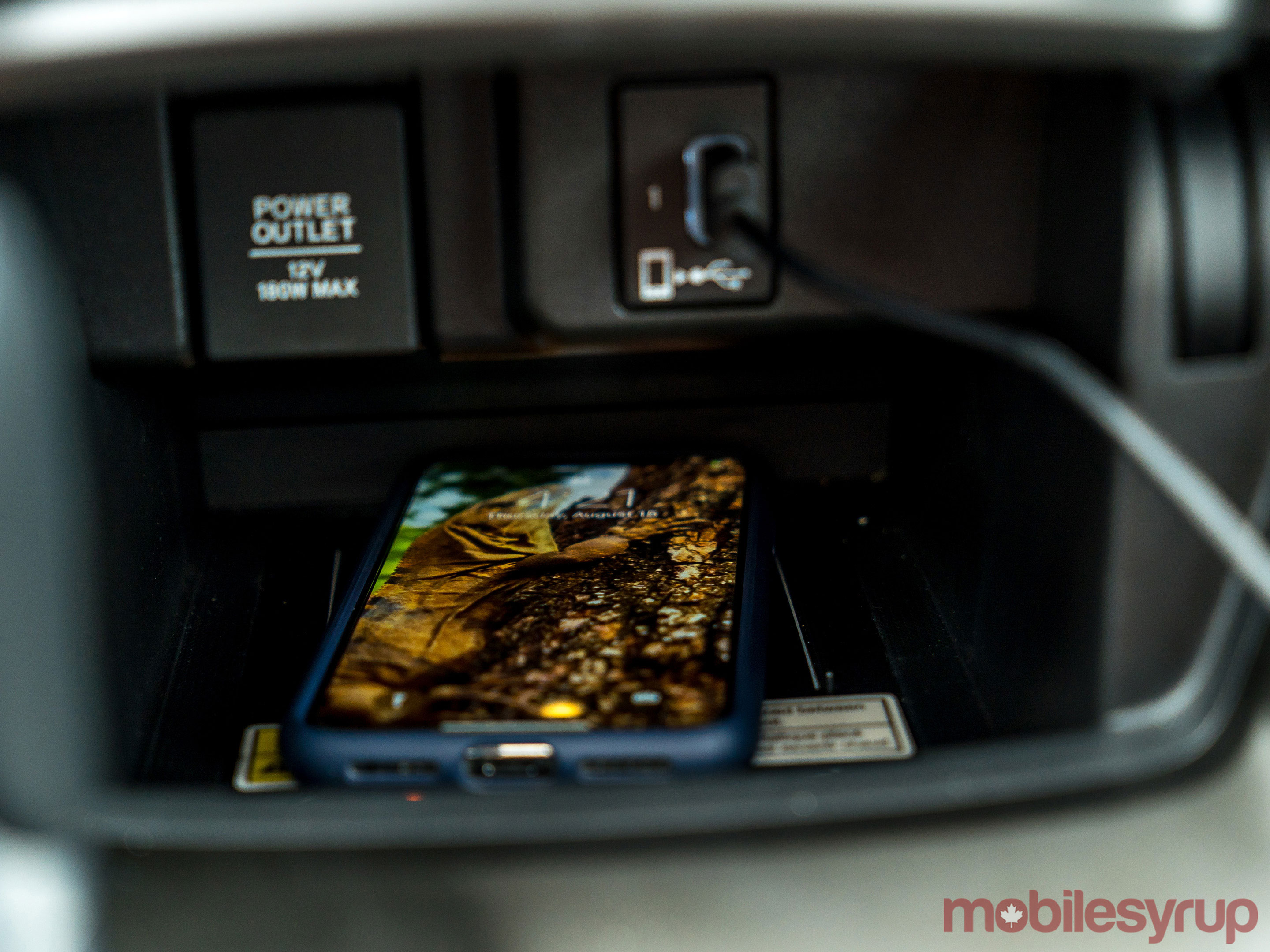
There are two USB-A ports in the rear-facing passengers there, though they’re only for charging. There is no aux-in jack, staying consistent with what the rest of the industry has been doing. The 12-volt socket is in front next to the dash USB port.
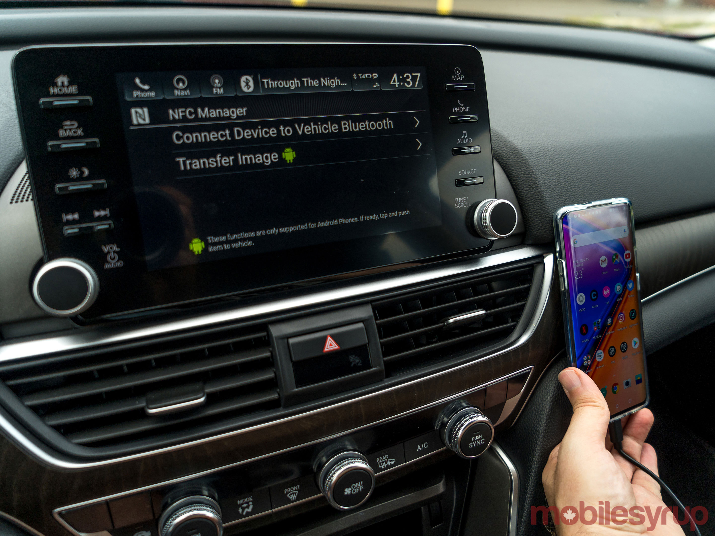
Honda embedded an NFC tag into the dash on the passenger side, and it proved to be a rapid way to pair a phone with the car. It didn’t work with an iPhone, as expected, yet was smooth with Android phones I tested.
I didn’t get a chance to test the in-car Wi-Fi hotspot for lack of a data bucket I could use, but it seems to offer the same thing others do. AT&T handles the connection and data, with the same pricing other cars have. It’s still 20GB for $200 prepaid over 12 months — still the best deal of them all, in my view. Like the others, you can also roam into the United States and not pay extra.
The wireless charging pad under the dash is a little recessed and not the easiest to access because of its proximity to the stick shift. It’s a limited feature in that it’s only standard in the Touring, Sport 2.0 and Touring 2.0 trims.
Voice and texting
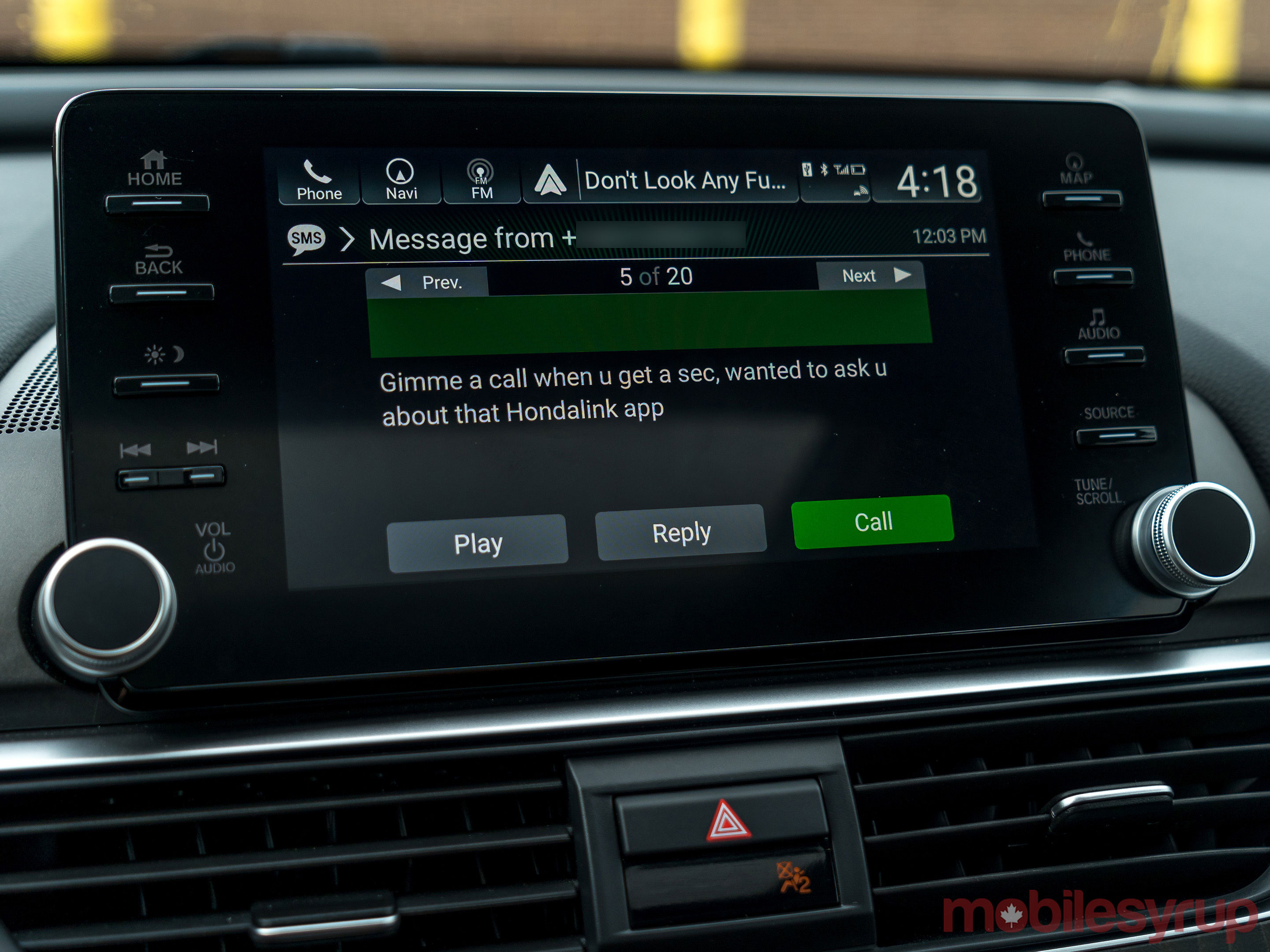
Things get a little interesting with Bluetooth. Unfortunately for Android users, Google Assistant doesn’t operate that way — it only works through Android Auto. That’s not the case with Siri, which pipes up when long-pressing the steering wheel’s voice button.
A short press brings up Honda’s own voice assistant, which lives within the car, so offers typically limited depth. That includes calling and texting, the latter of which comes with an unusual twist.
I was surprised to see that I could actually read incoming text messages in full — even while the car was in drive. Other legible incoming text functions I’ve tested in other vehicles often limit it to when the car is in park. I asked Honda Canada to confirm this was, in fact, a feature and not a bug, and was told it was the former, not the latter.

The system can read out incoming texts with a simple tap on the screen when they pop up. The messages app also maintains constant access to messaging, including the ability to respond.
Responses, however, are more of the canned variety, but I did get away with verbalizing basic ones. Siri and Google Assistant are far better at it, yet this is one of the deeper voice integrations I’ve seen in an infotainment system independent of those platforms.
CarPlay and Android Auto
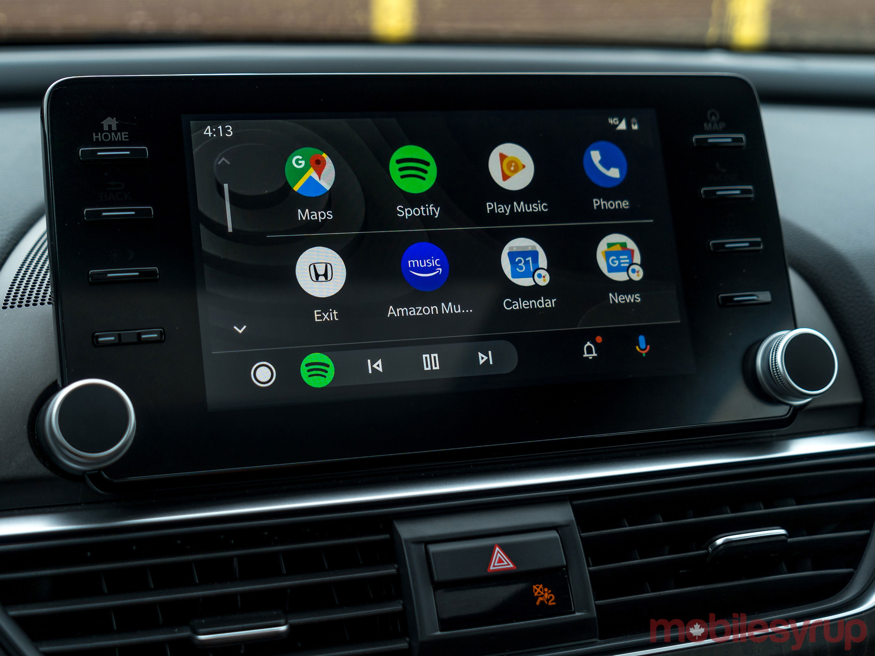
There weren’t many surprises here. With Honda having already supported both platforms going back to 2016, the Accord has included them since at least 2015 in some markets.
The big difference, at least for me, had little to do with Honda, and that was the new-look Android Auto. I had already opted to try it out prior to this test drive, and found it a significant improvement over the original UI. CarPlay will get its own little makeover when the next version of iOS goes live to the public.
Not all the physical buttons on the sides shortcut to anything on either platform. Instead, they leapfrog past them and go to HondaLink. For example, the ‘Home’ button goes to the HondaLink main menu, not the home screen for Apple or Google’s respective platforms. However, the back button seemed to backtrack within those platforms. Skipping or repeating tracks always works too.
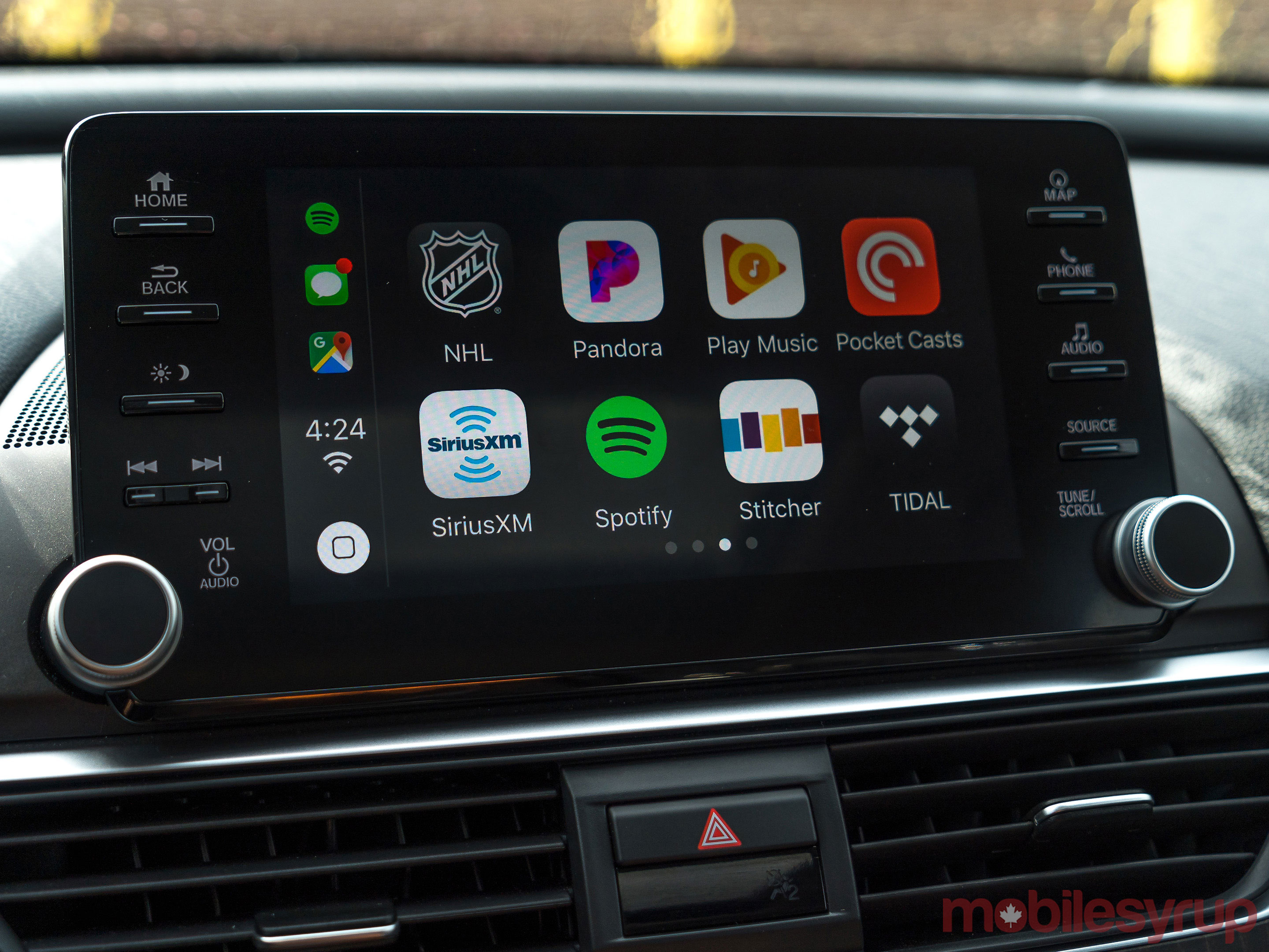
Honda will ultimately benefit from what these two platforms will look and function like when they’re both out of beta. Since they live on a phone, the automaker doesn’t have to do anything, and the improved UI only makes HondaLink look better.
HondaLink app
I wasn’t set up with a way to test out the HondaLink app for iOS and Android, which allows for some remote access to the car. The Accord Touring can access a variety of features within the app, including remote start, remote lock/unlock, Find My Car and stolen vehicle tracking and assistance.
Not all these features come free. After an initial trial period of 12 months, subscribing after that ranges from $99 to $369 per year, depending on what package you go with.
I should also note that Honda has a unique section that deals with APK files. There is a way to upload them, but it’s not clear how far this goes when it comes to sideloading apps. Honda says the files are “for internal use to manage the system,” without elaborating further.
Wrap up
The new-look HondaLink system is another example of how automakers are starting to figure out better UI experiences. While it is middleware providers that develop the backbone of the system, including the UI, it’s the automaker that ultimately decides what works best.
Honda drivers who have used the previous system will notice the positive changes here. It’s far from perfect, and not quite as bold or colourful as something like Mercedes-Benz’s MBUX system, but it’s a solid step forward.
"It’s far from perfect, and not quite as bold or colourful as something like Mercedes-Benz’s MBUX system, but it’s a solid step forward"
MobileSyrup may earn a commission from purchases made via our links, which helps fund the journalism we provide free on our website. These links do not influence our editorial content. Support us here.


