Google is starting to roll out a small redesign to its Home app, which forms a central hub to control smart devices like Assistant-powered smart speakers.
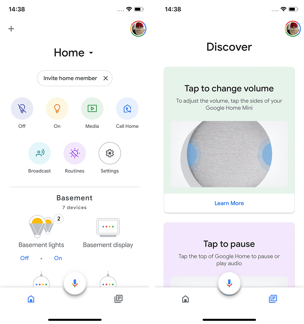
The refreshed app simplifies the interface by consolidating several of the tabs at the bottom of the app. Instead of four tabs like before, there are now two: a Home and Discover tab.
The Home tab remains mostly unchanged, except for some additional shortcuts at the top of the app. There’s now a media shortcut that shows all playing media across devices in a home. Additionally, there’s a shortcut for Wi-Fi control, which links to the new Nest Wifi. It shows all the devices on your network and lets you run speed tests and other diagnostics.

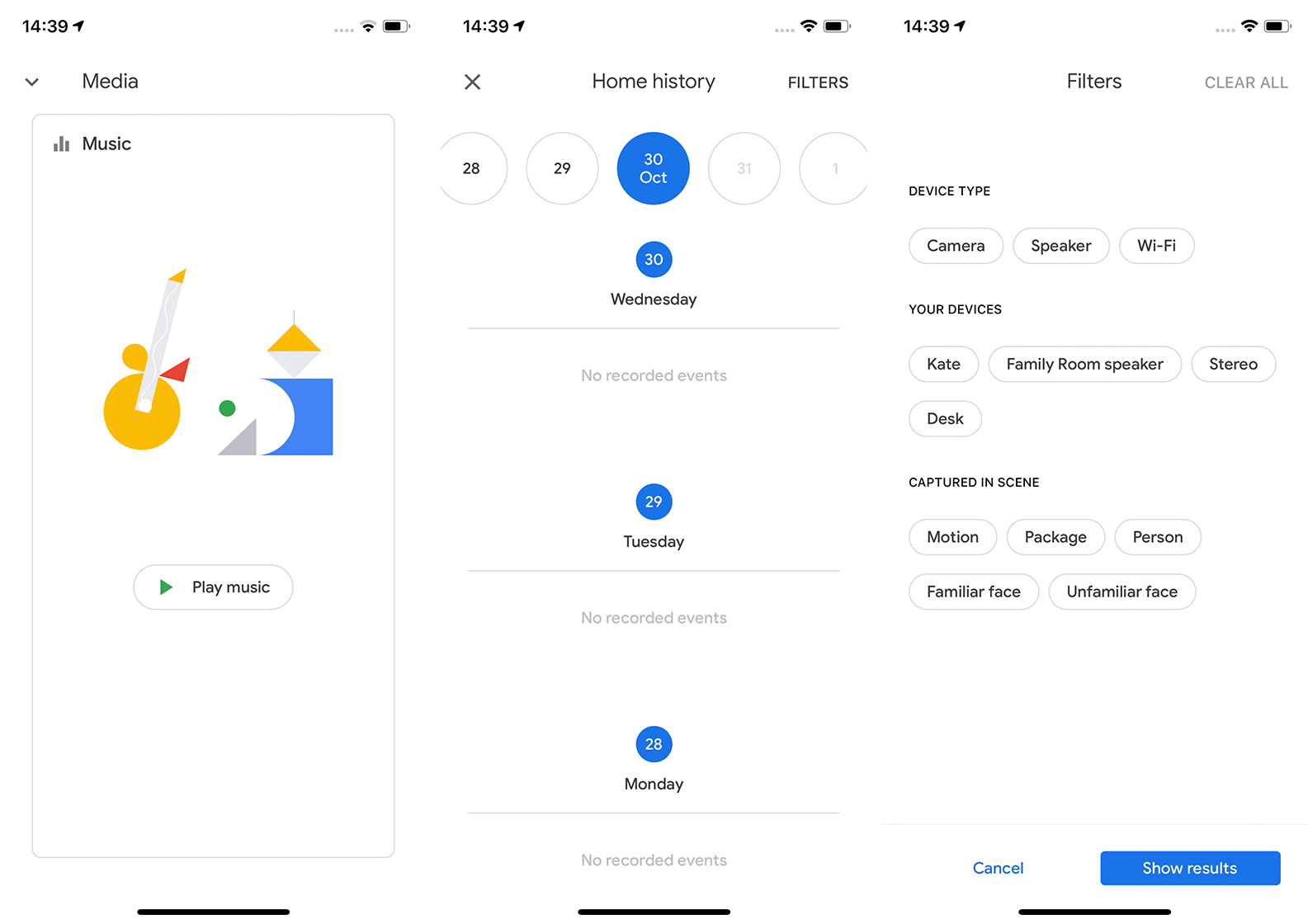
The new media segment, which leaked last month, makes use of a card-like UI. Each card displays the currently playing media for a given room along with playback controls, the source of the content and a ‘stop’ button.
The new Discover tab includes the new ‘Your home recap’ that details important events that happen in your home. This includes notifications about new users and devices as well as security alerts. Additionally, it shows video and audio clips and helpful suggestions.

On top of all that, Google added a ‘history’ feature to the Home app. You can access it by going to the settings menu and scrolling to the bottom and tapping ‘Home history.’ The page lets you search through past events in the home. You can also filter events by device or what the device captured.
The update should be hitting devices now. At MobileSyrup, it’s already showing up on iOS devices. On Android, however, it appears the changes are part of a server-side update and haven’t yet gone live.
Source: 9to5Google
MobileSyrup may earn a commission from purchases made via our links, which helps fund the journalism we provide free on our website. These links do not influence our editorial content. Support us here.


