While often not accurate to the final product, it’s always fun to see concept designs for upcoming operating system releases.
A recent iOS 14 concept shows off some ideas of what Apple could do with the next major release of its mobile phone OS.
YouTuber ‘the Hacker 34‘ put the concept together, which shows off some much-desired features in the new iOS. This includes refreshed icon designs for Apple’s default apps, an improved call screen UI and more.
While the quality of the new iOS icon look is subjective, I was a fan of what the concept showed. That said, I doubt we’ll see a redesign like this — if we see one at all — in iOS 14.
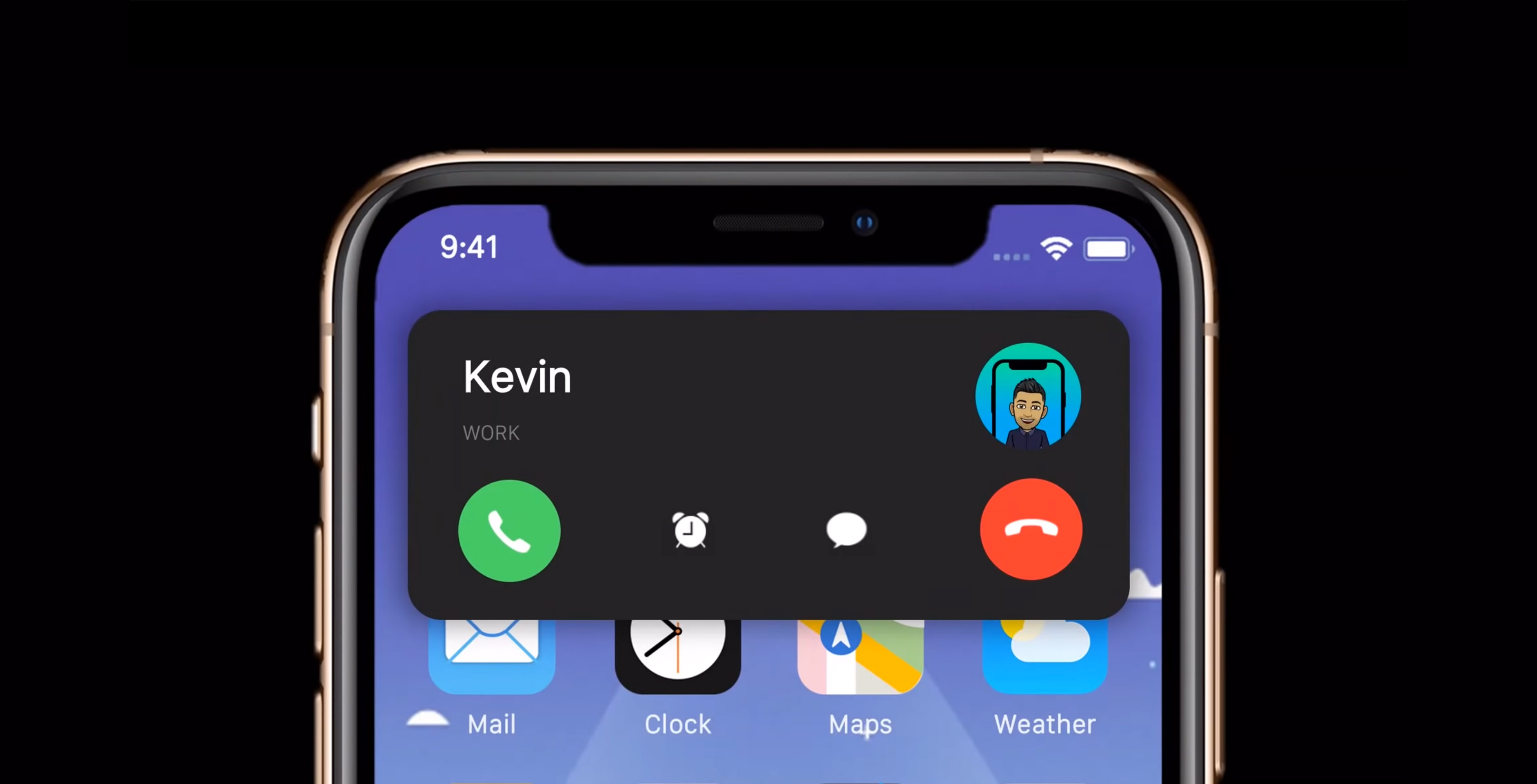
The new call screen UI, however, is definitely something we could see — and something we should see.
Currently, when you receive a call on iOS, it takes over the whole screen. If you’re trying to get something done and aren’t interested in taking a call, it can be quite annoying to have what you’re doing suddenly interrupted.
In the concept video, the call screen UI appears as a small card that slides down from the top of the screen. It includes an ‘Answer’ and ‘Decline’ button, as well as options to message or remind you about the call later.
It’s a much less intrusive system then what currently exists within iOS and hopefully its something that does come to iOS 14.
The concept also includes a look at how Apple could implement an always-on display in iOS 14, complete with Apple Watch-like complications.
It also shows off features like split-screen, drag-and-drop support and a customizable home screen, as well as the ability to set default apps.
While the iOS 14 concept is full of excellent ideas, I can’t see Apple adding many of them in a future update. Regardless, we won’t know what will come in iOS 14 until June’s WWDC, where Apple usually unveils its next OS update.
MobileSyrup may earn a commission from purchases made via our links, which helps fund the journalism we provide free on our website. These links do not influence our editorial content. Support us here.


