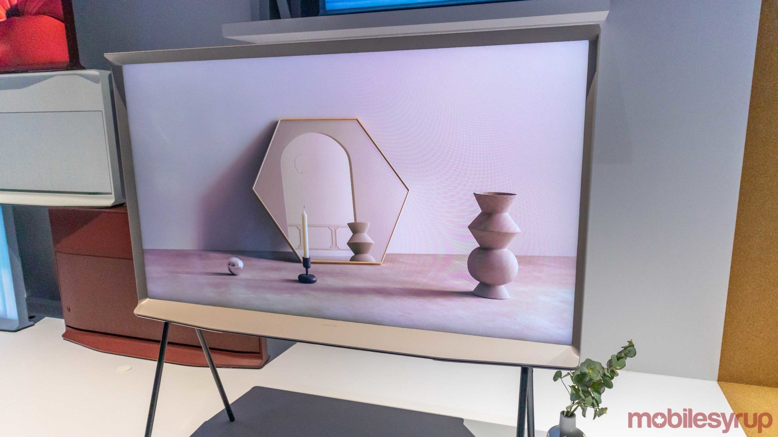
Samsung has been trying to change the look of the traditional TV for a while now with its Frame TVs, and at CES 2020, the tech giant showed off two low-key models that carry attractive designs that further this ideology.
The company began integrating TVs into rooms last year with the Frame TV and the first-generation Serif. The Frame featured a slim wooden frame and displayed paintings and photos passively to make it appear as wall art when the TV isn’t being used.
The Serif
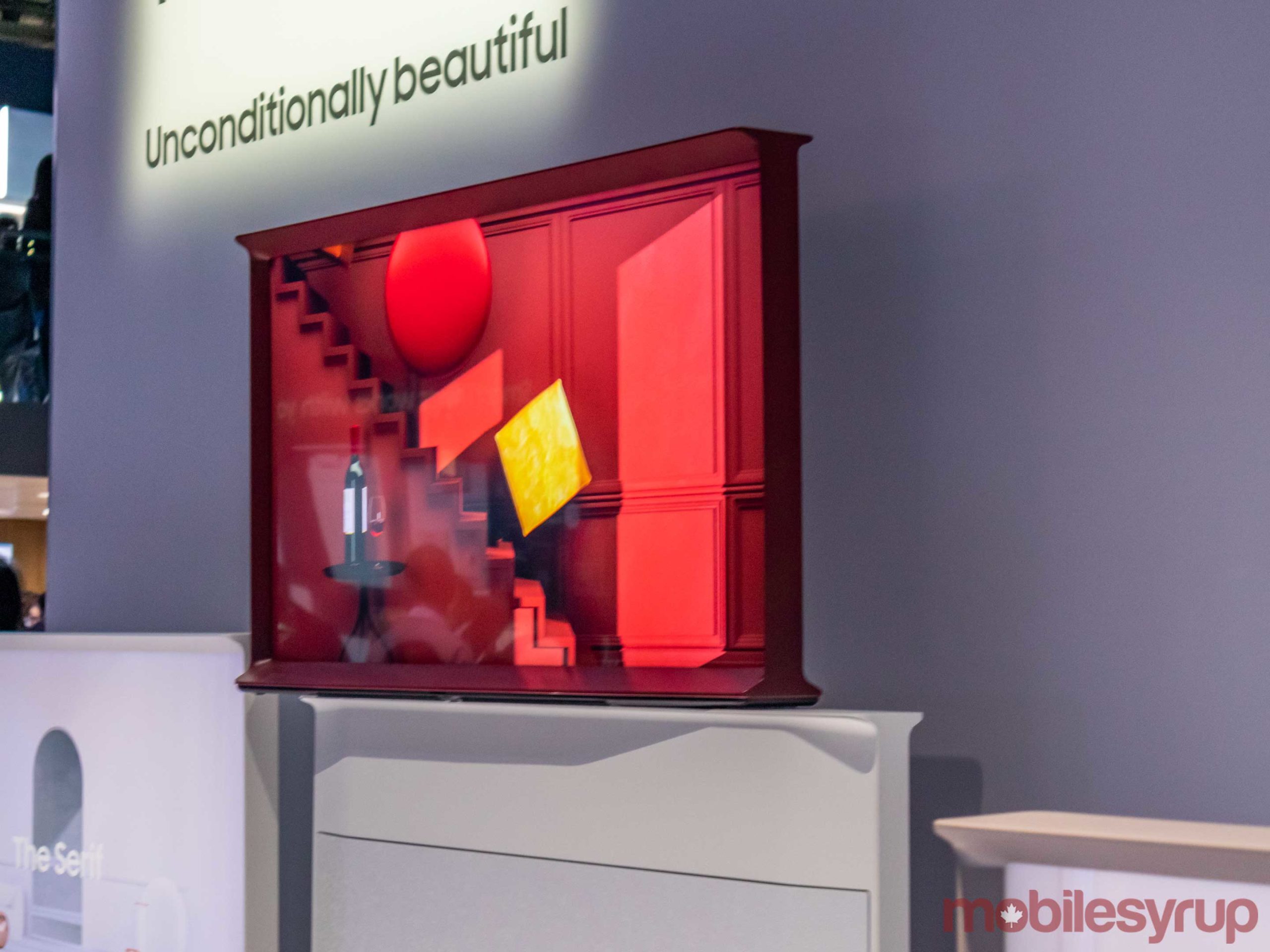
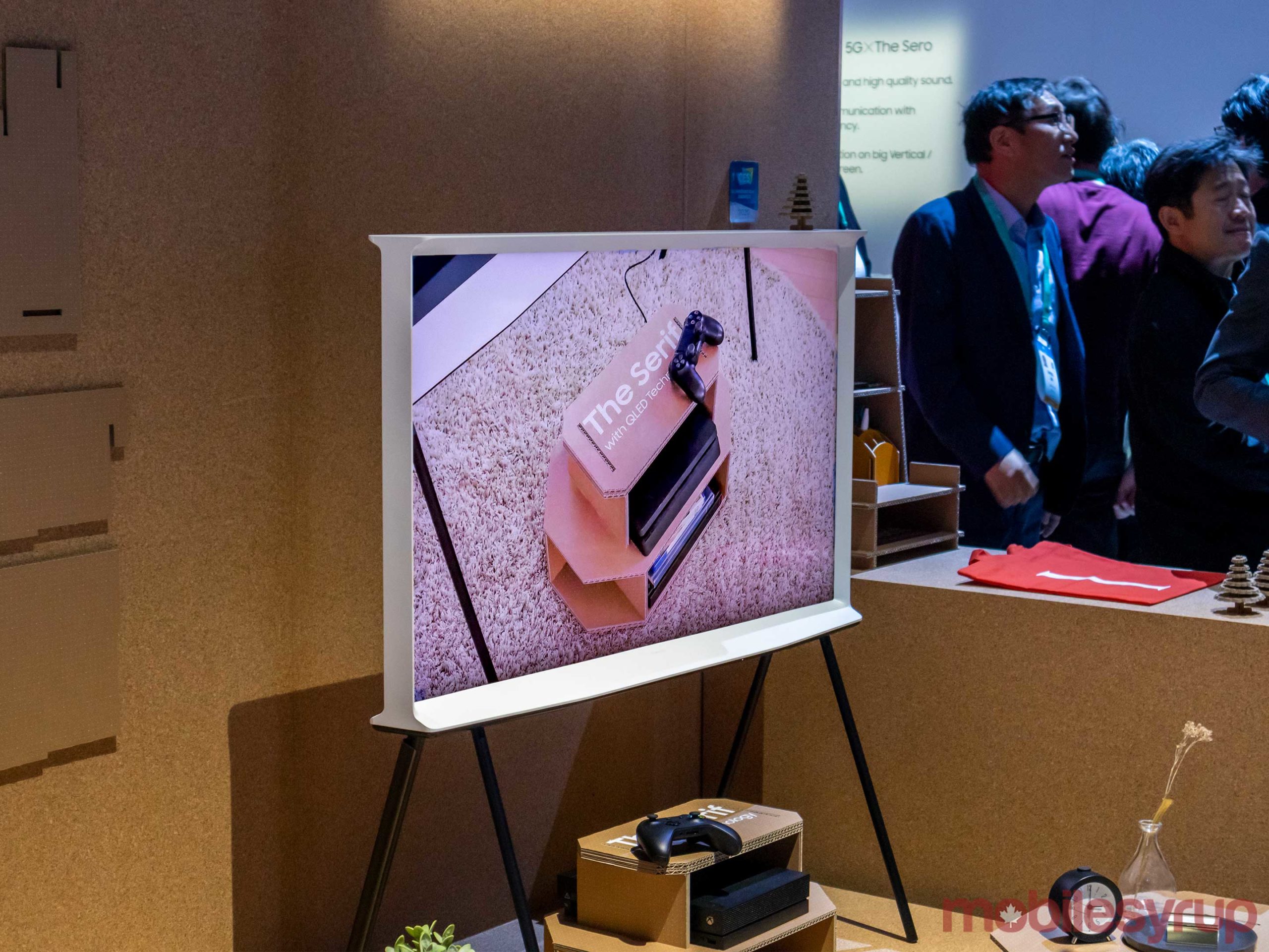
The TV that takes the Frame’s ideology to new places is the Serif. The television looks like a serif font ‘I’ from the side. This means that the top and bottom are wide enough that the television can stand on its own. In-person, the Serif reminds me of vintage wooden TVs from the 60s and 70s.
Even when the TV is on its stand, it looks cool and makes it seem like more of a design statement compared to the regular thin, black rectangles we’re used to now.
The serif even uses Samsung’s ‘Ambient Mode’ technology that makes the TVs wallpaper blend into the wall behind it.
Since the Serif aims to be a statement piece, it also features a decent looking back. The top third of the rear is still the wood case, with the bottom portion featuring a textured cover that’s the same colour as the TV’s case. Under the cover, Samsung hid all of the TV’s ports.
Samsung’s website only sells the TV in ‘White’ and ‘Dark Blue.’ At the show, the company showed off different shades of white and a burgundy design that looks stunning.
The Serif colour only comes in a few sizes: 43, 49, and 55-inches. As a result, the TV is designed with smaller spaces in mind.
The Sero
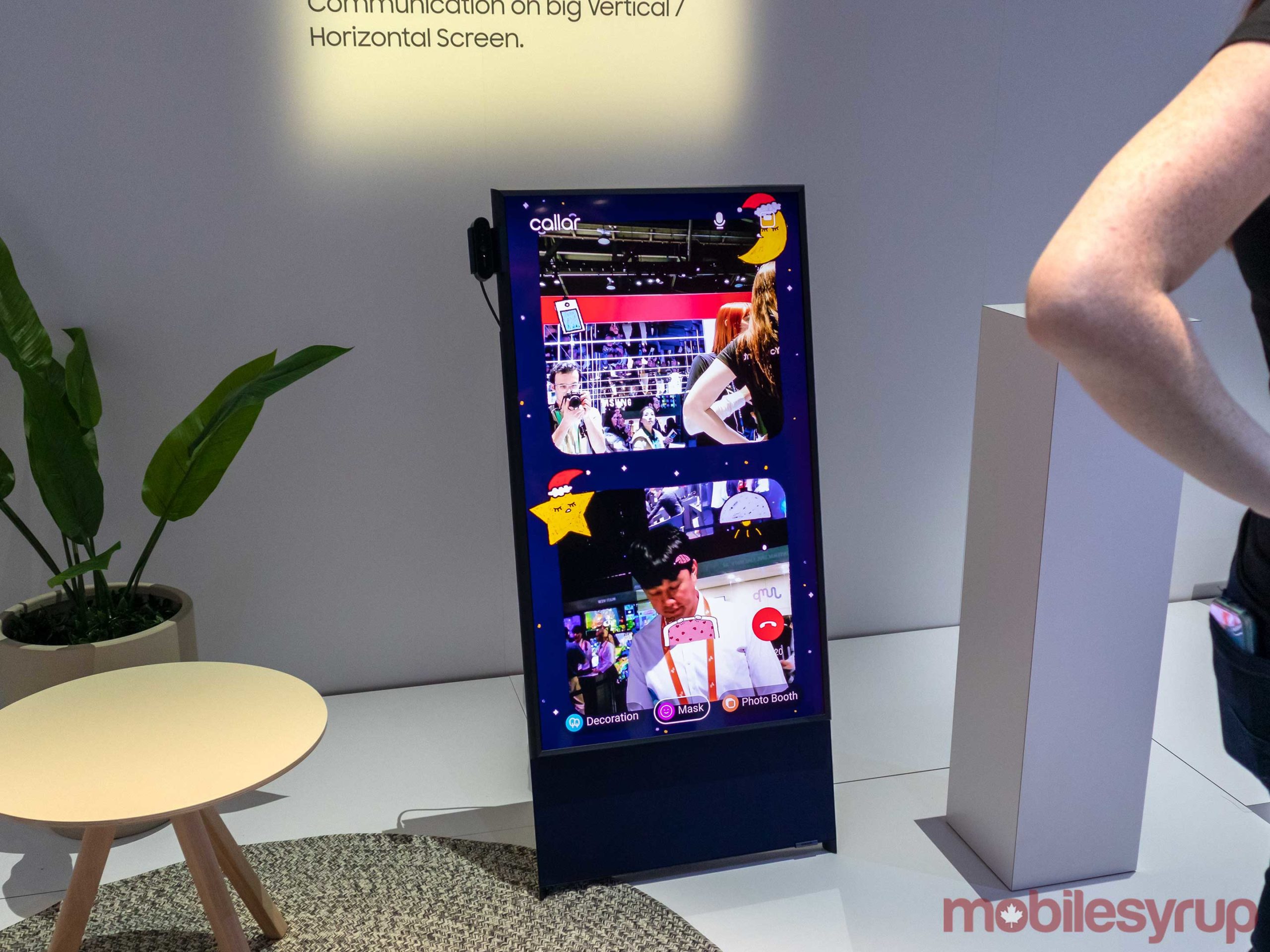
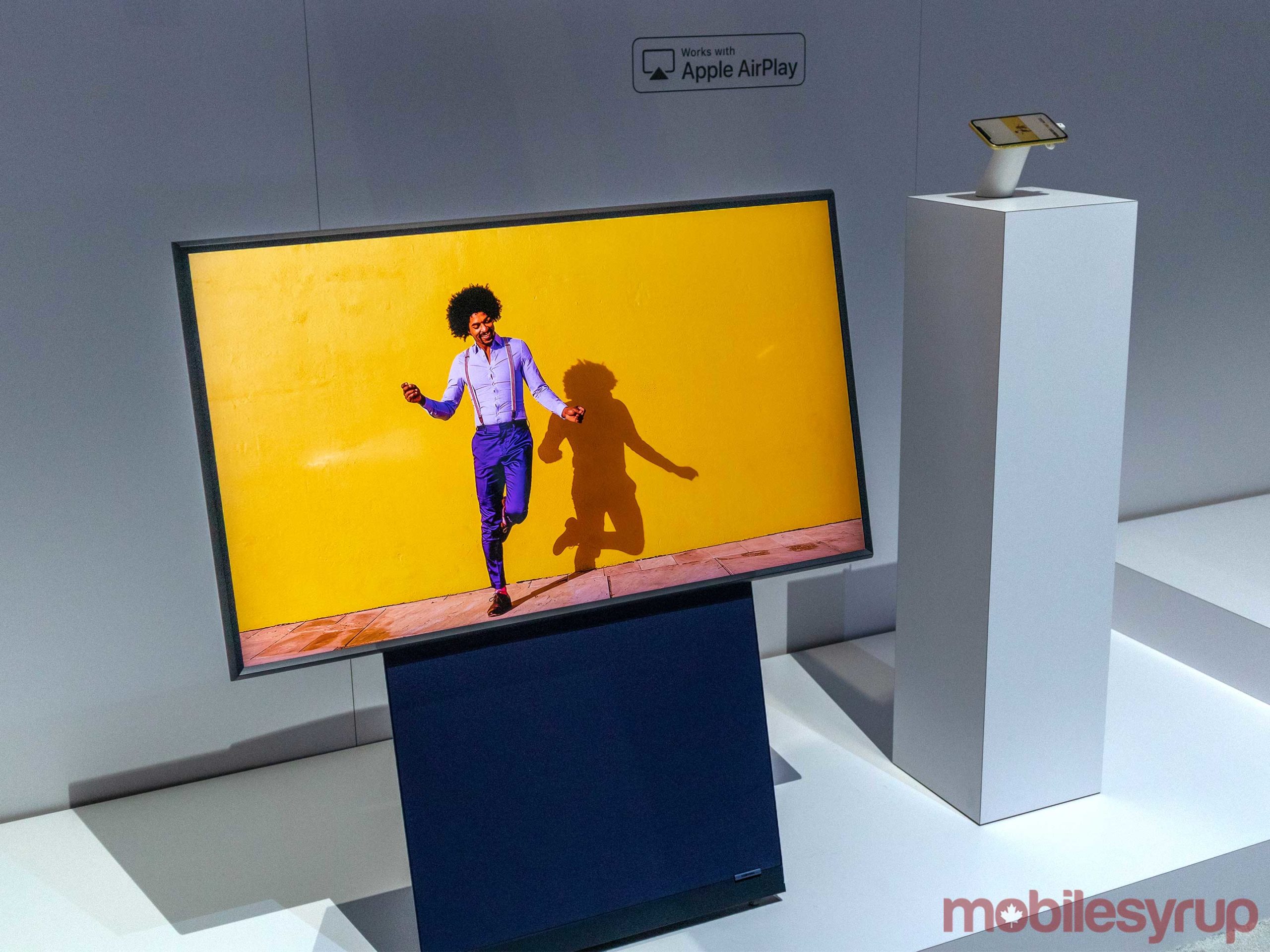
The Sero is a unique TV that features a very memorable design, but its main selling feature is that it rotates between portrait and landscape modes depending on what you’re watching.
The TV even connects to your phone, so when you’re watching vertical video, the TV switches to portrait mode.
Beyond its rotating gimmick, the TV has a pretty cool design as well. The television sits on a bit of an angle, so it looks like a small flipchart. I’m not sure how practical this is in practice, but it didn’t look out of place to me when I first saw it.
The TV’s stand is dark navy blue and gives off more of a futuristic design than the classically styled Serif.
The draw of such a large stand gave Samsung space to implement a 4.1-channel, 60-watt speaker system, which should give the TV decent sound.
After viewing these TVs, I couldn’t help but wish other manufacturers would start creating unique designs to rival the Frame, Serif and Sero.
While many TVs at CES showed off impressive technology, including 8K and super-thin OLED and Mini-LED panels, I wish there was a stronger push from manufacturers to create designs that look more like furniture and less like traditional televisions.
MobileSyrup may earn a commission from purchases made via our links, which helps fund the journalism we provide free on our website. These links do not influence our editorial content. Support us here.

