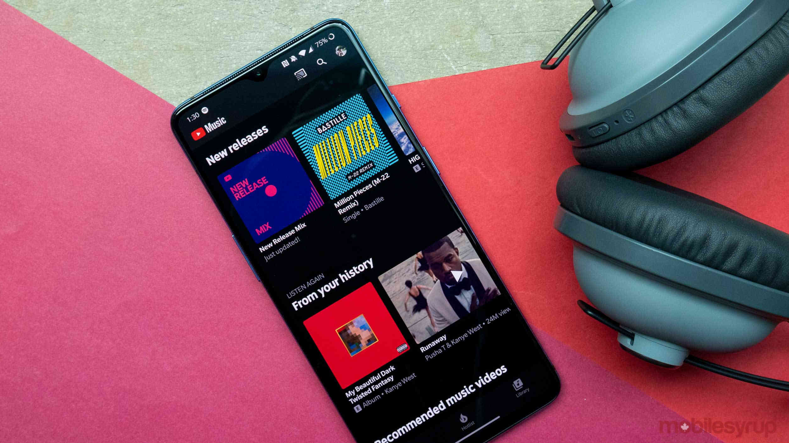
In a bid to become more like a traditional music streaming service, YouTube Music is rolling out an update that makes its ‘Library’ tab function more similarly to other apps.
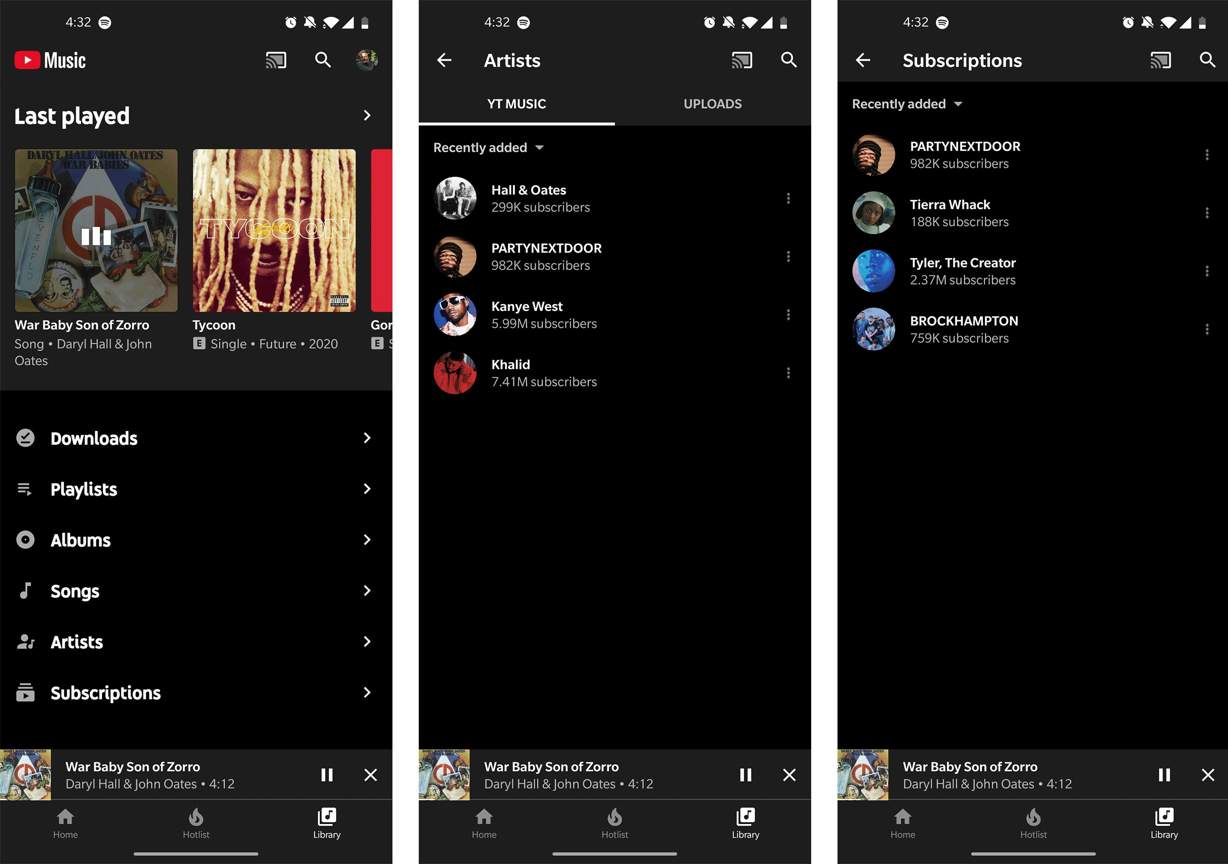
In the new update, there’s a ‘Subscriptions’ folder in the Library that opens up the ‘Artist’ folder exactly how you’d expect. Previously, to add a Musician to the Artist category, you needed to subscribe to them. Now, when users subscribe to an artist, they’re sorted under the Subscription label.
What does that mean for the Artist folder? It now works much the same as it did on old iPods. Each time you add a song or album to your library, the app adds that band to the Artist category. The only downside with this is that when you choose a singer in this section, it takes you to their YouTube Music page and not to a list of songs or albums you’ve saved by that artist.
In the end, this change might make a little more sense, but it doesn’t necessarily help people organize their music library. Instead, it just gives them two sections with similar artists.
Why is this so convoluted?
Organizing libraries is something all streaming services are taking a crack at, but none are perfect at it. I believe these apps struggle with this because before music streaming we all downloaded music locally. Now, modern music apps need to sort user content, service content, downloaded content, saved content and third-party playlists.
Back when you had an iPod, whenever you searched for Hall and Oates, the device knew you only wanted to search its internal storage. In 2020 people might want their downloaded version of Maneater, or they may want to stream a deep cut from some other album they’ve never listened to before.
Anticipating what users look for most and what’s more important to them is a tricky line for these streaming companies to walk.
What do the other major streaming services do?
Spotify took a very different approach with its library redesign last summer, with a renewed focus on podcasts and no real song organization folder.
Instead, Spotify sorts all of its users’ ‘Liked’ songs into a playlist called ‘Liked Songs.’ Spotify’s ‘Artist’ section is also populated with bands that the user specifically ‘Follows.’ In this regard, I like YouTube’s new implementation better, but neither is that intuitive.
Apple Music, on the other hand, does this the most naturally. Every time you add a song or album to your library, that artist also goes into the Artist category. There’s no messing about with Subscriptions or Follows; it just makes sense as a means to sort your music.
The simple fact that this update is rolling out gives me hope that YouTube will eventually focus more on making YouTube Music’s library better, but it still needs to iron out a few kinks.
Via: 9to5Google
MobileSyrup may earn a commission from purchases made via our links, which helps fund the journalism we provide free on our website. These links do not influence our editorial content. Support us here.


