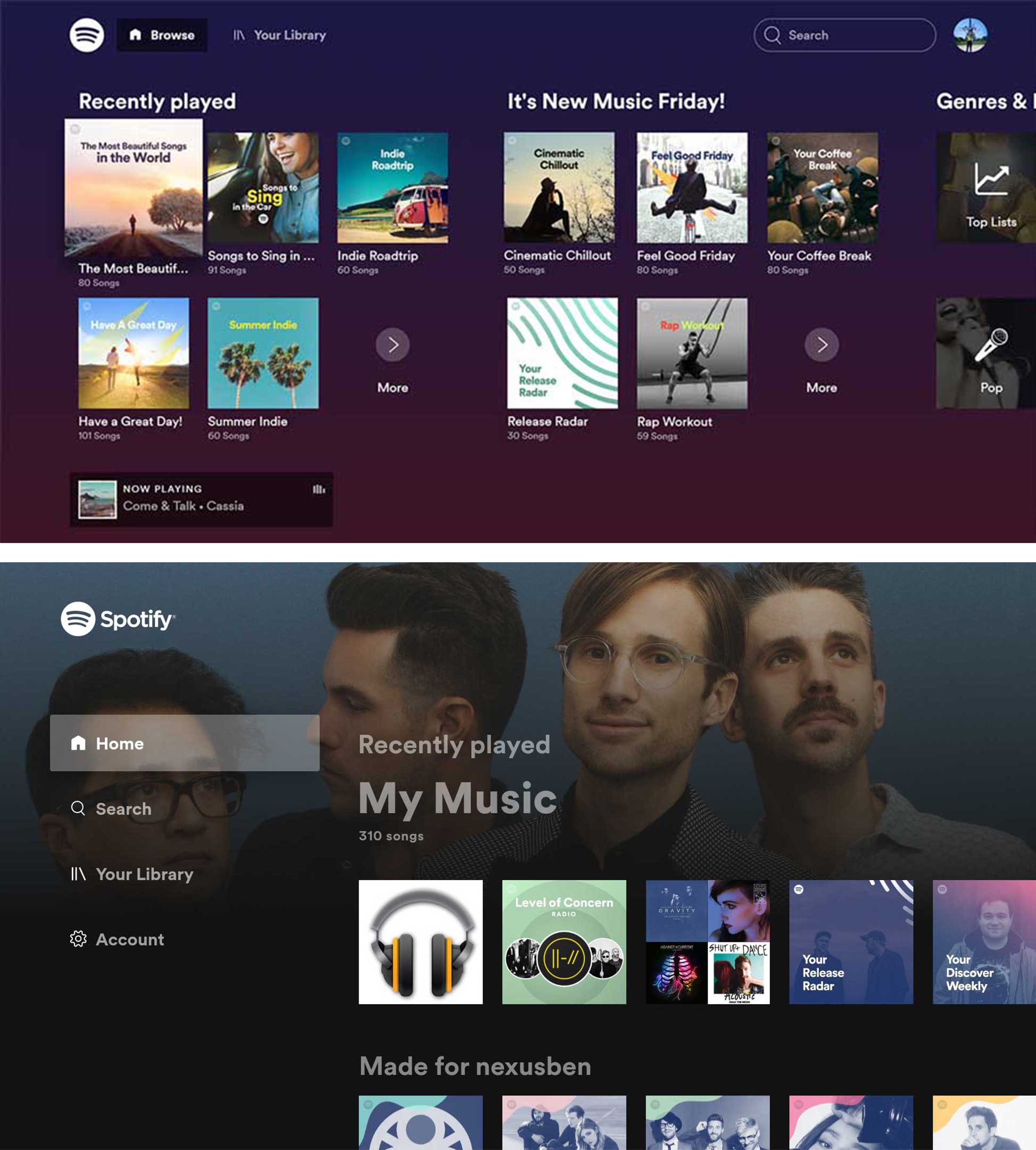
Spotify has updated its Android TV app with a slick new library interface that both looks nice and is more responsive.
The new version of the app includes background images based on the music you’re listening to and a new sidebar for more straightforward navigation. It includes quick ways to jump to ‘Search,’ ‘Your Library,’ ‘Settings’ and ‘Home.’ These should be pretty straightforward for anyone used to using the app on desktop or mobile.
The Home section is where you’ll find recently listened to tunes, recommended mixes, new songs and other random music.
The Library, of course, houses playlists, albums, songs and podcasts that you’ve saved.
Search now works more like it does on mobile by presenting you with a list of genres and moods to dive into if you don’t want to search for something specific. However, it uses the older style of tiles instead of the brightly coloured ones utilized on mobile.
The Settings menu is also straightforward since it just allows you to sign out and turn off the ‘Behind the lyrics’ feature if you’d rather not have the Genius integration.
The main negative about this update, according to 9to5Google, is that update doesn’t extend to the album, playlist or now playing screen so they still all move slowly.
Image credit: 9to5Google
Source: 9to5Google
MobileSyrup may earn a commission from purchases made via our links, which helps fund the journalism we provide free on our website. These links do not influence our editorial content. Support us here.


