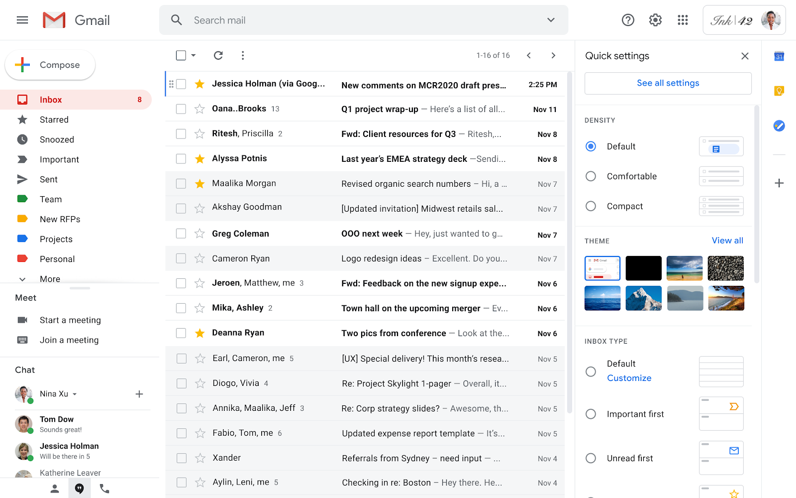
Google is rolling out a small change to Gmail on the web that should make it significantly easier to manage your inbox’s look and feel.
According to a post on the G Suite Updates Blog, Gmail on the web will feature a new quick settings menu that collects most of the customization settings into one accessible place. Further, the settings menu button — that familiar ‘cog’ icon — now resides in the top right corner next to your Google account icon and the button to access the search giant’s other services.
Aside from the new location, clicking the settings cog now opens the quick menu. The new menu is richer, more interactive and lets users quickly access themes, inbox tweaks and a prettier density picker. Additionally, the panel offers access to the ‘Reading Pane’ and ‘Email Threading’ options. Finally, the top of the panel includes a ‘See all settings’ button to access Gmail’s full settings menu.

The changes are certainly welcome and should make configuring your inbox much easier than before. It’s also worth noting that the new menu is similar to how Microsoft’s Outlook platform handles inbox customization.
Google says the new feature will roll out to both G Suite and consumer Gmail accounts at the same time. While the rollout has already started, it could take close to a month for it to reach everyone. The update process happens server-side, so there’s nothing you can do to speed it up, unfortunately.
You can learn more about the changes on the G Suite blog.
Source: Google Via: Android Police
MobileSyrup may earn a commission from purchases made via our links, which helps fund the journalism we provide free on our website. These links do not influence our editorial content. Support us here.


