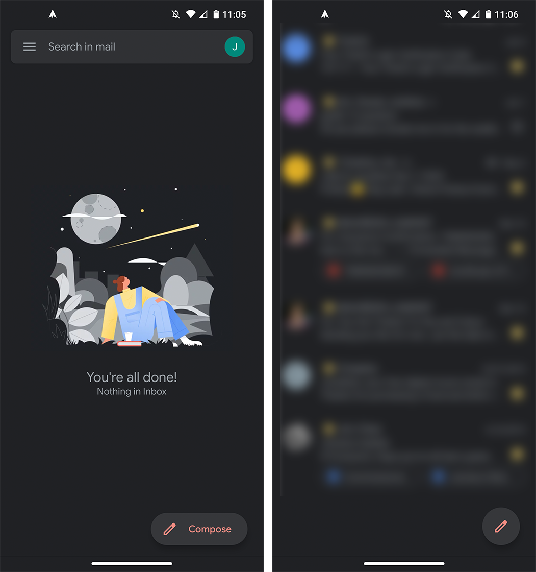
A small update to Gmail on Android is changing up how the compose button looks.
First spotted by 9to5Google, the small tweak brings the floating action button (FAB) used in Gmail in line with other FABs used in Android apps.
For those unfamiliar with the FAB, it’s a part of Google’s refreshed Material Design. FABs are prevalent throughout Android apps, residing as small buttons in the bottom right used to start a primary behaviour within an app. For example, Google Messages includes a FAB for starting a new chat while Twitter includes one for composing a new tweet.
Gmail has had a FAB for some time, but until now, it hasn’t quite followed the rules. Many FABs start as an oblong shape with text that explains what it does. Going back to Messages, the FAB shows a chat bubble icon beside the text ‘Start chat.’ When users start scrolling, it shrinks into a circle with just the icon.
Previously, Gmail’s FAB was just a circle with a ‘+’ icon sporting Google’s four colours: red, green, blue and yellow. It unfortunately wasn’t immediately clear what the button did.

Now, it starts with the oblong shape showing a pen icon followed by the word ‘Compose.’ Not only does it make the button larger and easier to hit, but it also makes the function much clearer. And, as with other FABs, it shrinks to just the icon when users scroll through their inbox.
All in all, it’s a subtle tweak but a welcome one nonetheless. It’s rolling out as part of Gmail ‘version 2020.05.17.313130477’ on the Play Store, so keep an eye out for that update. Gmail on iOS still sports the old FAB for now, but that will likely change soon.
Source: 9to5Google
MobileSyrup may earn a commission from purchases made via our links, which helps fund the journalism we provide free on our website. These links do not influence our editorial content. Support us here.


