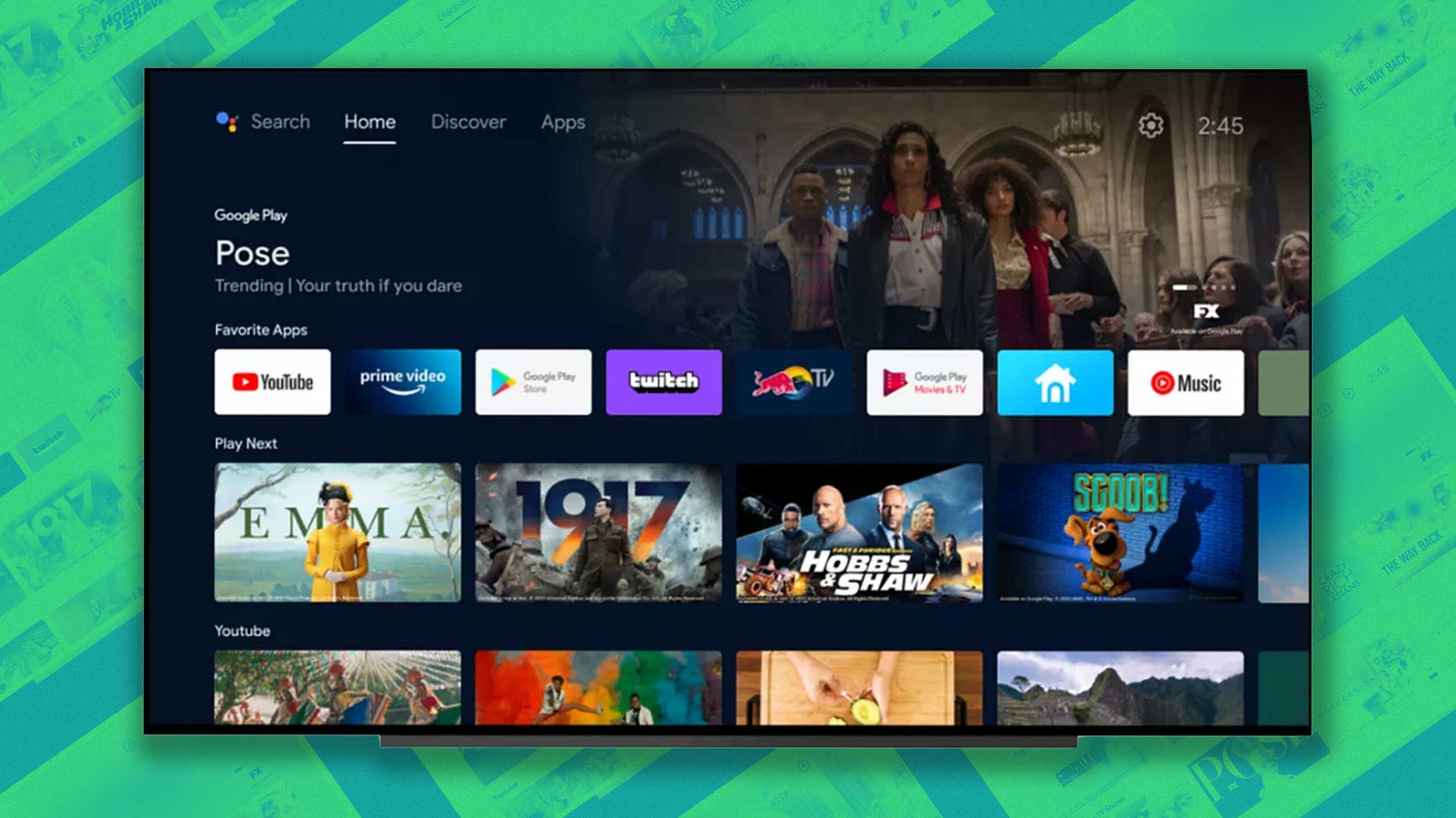
Google has started rolling out an update for Android TV systems to bring the platform’s layout more in line with Google TV.
At the same time, it’s a bit odd that Google decided even to release this update instead of just rebranding Android TV as Google TV and bringing along its features.
In case you’re a little lost, Google now has three smart TV operating systems: The new Chromecast with Google TV, Android TV and existing Chromecast devices.
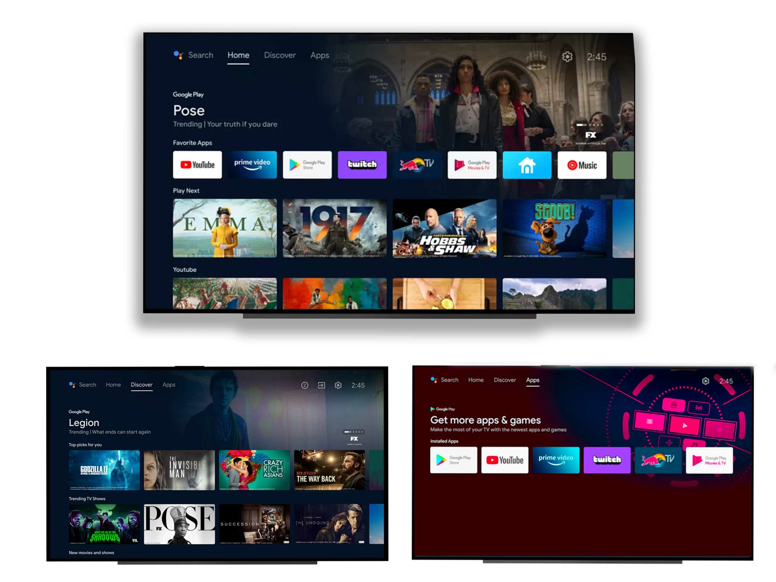
 The first thing you’ll notice about the new Android TV update is that visually it looks almost identical to Google TV. The main difference is that there are only four categories along the top of the screen instead of the six featured on Google TV.
Beyond the Search screen, there’s a new Android TV ‘Home’ display that shows users their favourite apps, content to watch and YouTube recommendations. Scrolling further down the page likely results in more content recommendations from various services.
The ‘Discover’ page is for finding things to watch, like trending TV shows/movies and content recently released. The final screen is just a collection of the user’s apps.
Overall, this seems like a weird sidestep for Google. That said, there’s a possibility it could have something to do with running the operating on older hardware. While it’s easy to be frustrated that Google has two TV-based operating systems, we can at least take solace in the fact that both are getting regular updates.
The update is rolling out in Canada, the U.S., Germany, France, Australia and other countries.
MobileSyrup may earn a commission from purchases made via our links, which helps fund the journalism we provide free on our website. These links do not influence our editorial content. Support us here.


