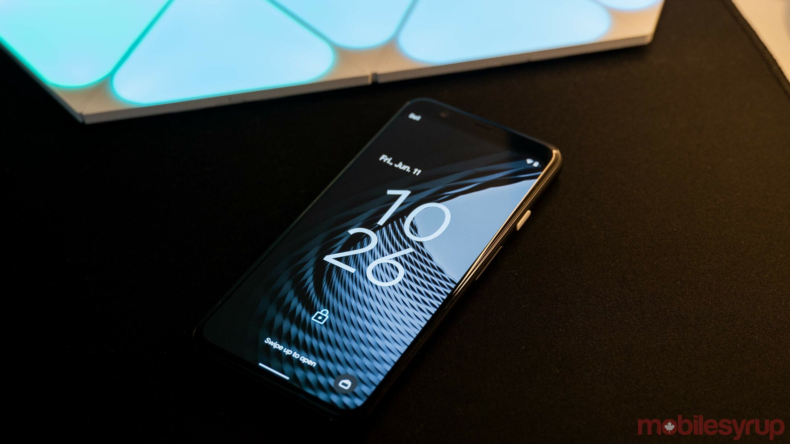
Google is looking for feedback on Android 12 Beta 2 from those running the software.
Those interested can fill out the survey here. It kicks off with a question about how satisfied users are with Android 12’s notifications, quick settings and the new volume panel.
As a refresher, all three of those changed significantly from Beta 1 to Beta 2. Notifications and quick settings now exist in separate sections, the latter sitting in a black space above the notification panel. Further, the quick settings buttons are more round in Beta 2. Plus, there’s that new ‘Internet’ toggle that combines Wi-Fi and data into one quick setting. As for the volume panel, Beta 1’s massive volume slider was swapped out for a slimmer, easier-to-read panel in Beta 2.
Of course, we can’t forget that the new Material You wallpaper-based colour theming system also went live in Beta 2.
Google’s survey asks users to rate satisfaction with things like stability, performance, battery, camera, Bluetooth, call quality, messaging, Wi-Fi and data connectivity and app experience.
There are questions about whether users would recommend Android 12 Beta 2 to other people and about ‘top issue areas.’ Depending on your top issue, the survey may ask for more detail in a follow-up section.
The survey should only take a few minutes to complete. If you’re trying the Android 12 beta, it’s probably worth taking the time to fill it out — feedback will help Google improve the beta and hopefully offer some guidance from users on which direction to take with new design elements and other changes.
Considering Android 12 Beta 2 is one of the most downloaded Android betas, there should be tons of feedback headed Google’s way.
You can access the survey here.
Source: Google Via: 9to5Google
MobileSyrup may earn a commission from purchases made via our links, which helps fund the journalism we provide free on our website. These links do not influence our editorial content. Support us here.


