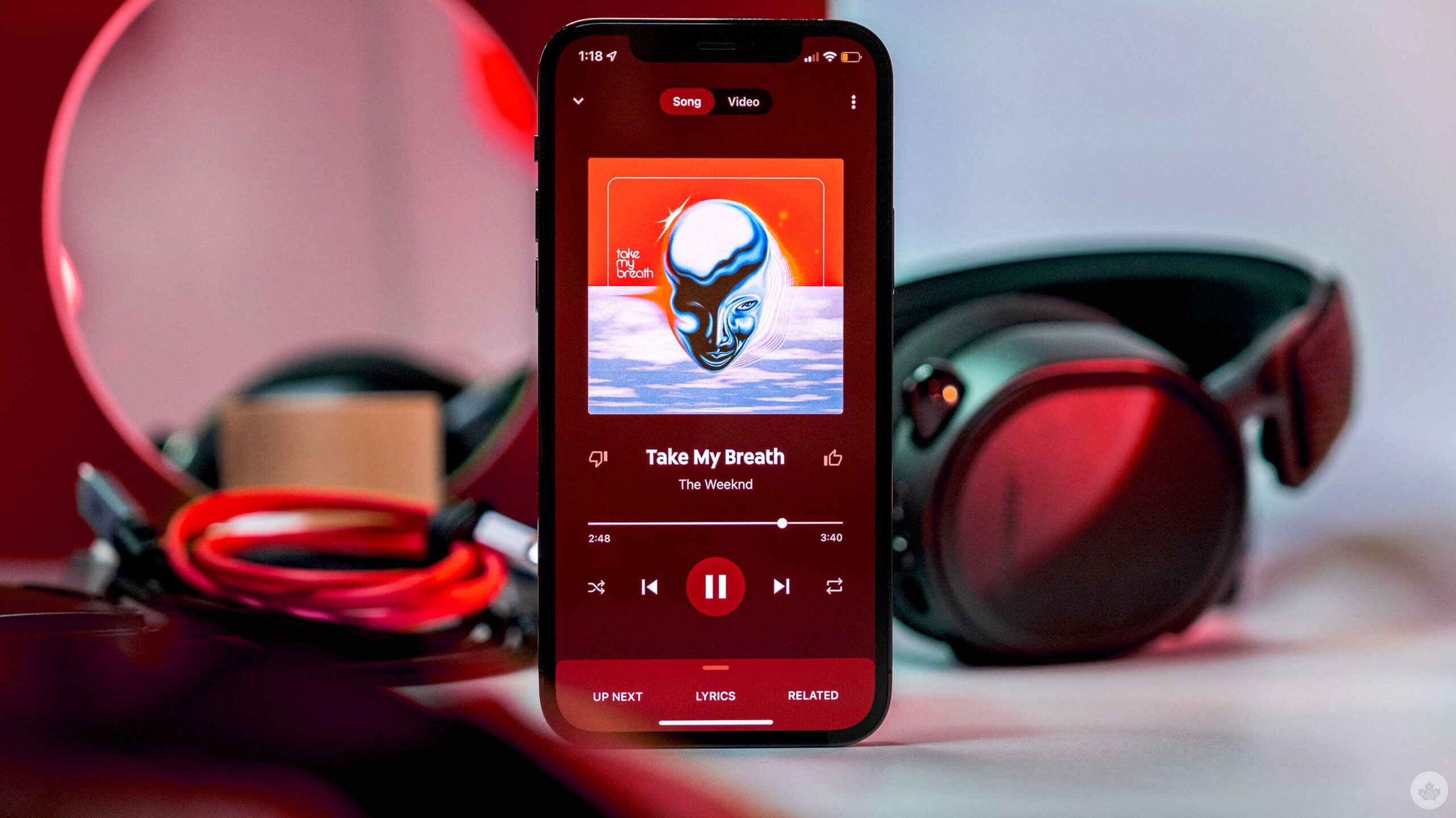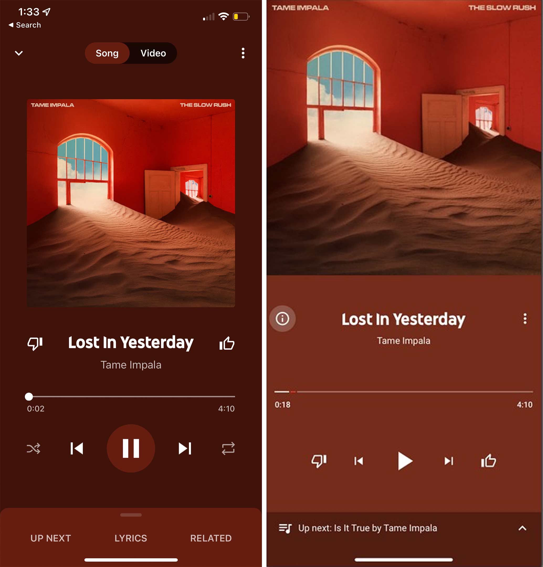
After a weirdly long rollout, it finally seems like all iOS users can now access the new design of YouTube Music.
This update doesn’t change much within the app, but it does bring the Now Playing interface more up to par with modern music streaming apps.
Google began redesigning YouTube Music on Android all the way back in March 2020, so it’s really disappointing to watch one of the biggest tech companies in the world struggle to keep both of its mobile apps the same in terms of looks.
We actually first reported on this update rolling out to iOS users in March 2021, but since then, Google has really slowly rolled it out. In July 2021, 9to5Google reported that a wider rollout was beginning, then weirdly enough, on August 8th, it appeared that Google pulled the new look from the app.
Now here we are on August 23rd, and it appears the app is updated to include the new Now Playing screen. You can read more about it here.
Source: 9to5Google
MobileSyrup may earn a commission from purchases made via our links, which helps fund the journalism we provide free on our website. These links do not influence our editorial content. Support us here.


