iOS 15 is here, so saddle up your iPhone and start downloading the latest update to try out all of the new features. This year’s update is overall pretty bland, especially compared to the new hotness that is Material You over on Android, but it’s a worthwhile update nonetheless.
Below I highlight a few of my favourite new features and what I like about them based on a few weeks I’ve spent with the latest iOS 15 beta, but before that, let’s go over how to install the update. As with all iOS updates, simply navigate to your Settings app, open the ‘General’ section and select ‘Software update.’
The update is compatible with smartphones as old as the iPhone 6s and the iPhone SE.
What is this new Focus mode?
The most noticeable iOS 15 update is the new look for notifications. This time around, the app icon with each notification is larger to make it easier to see at-a-glance which app is begging for your attention.
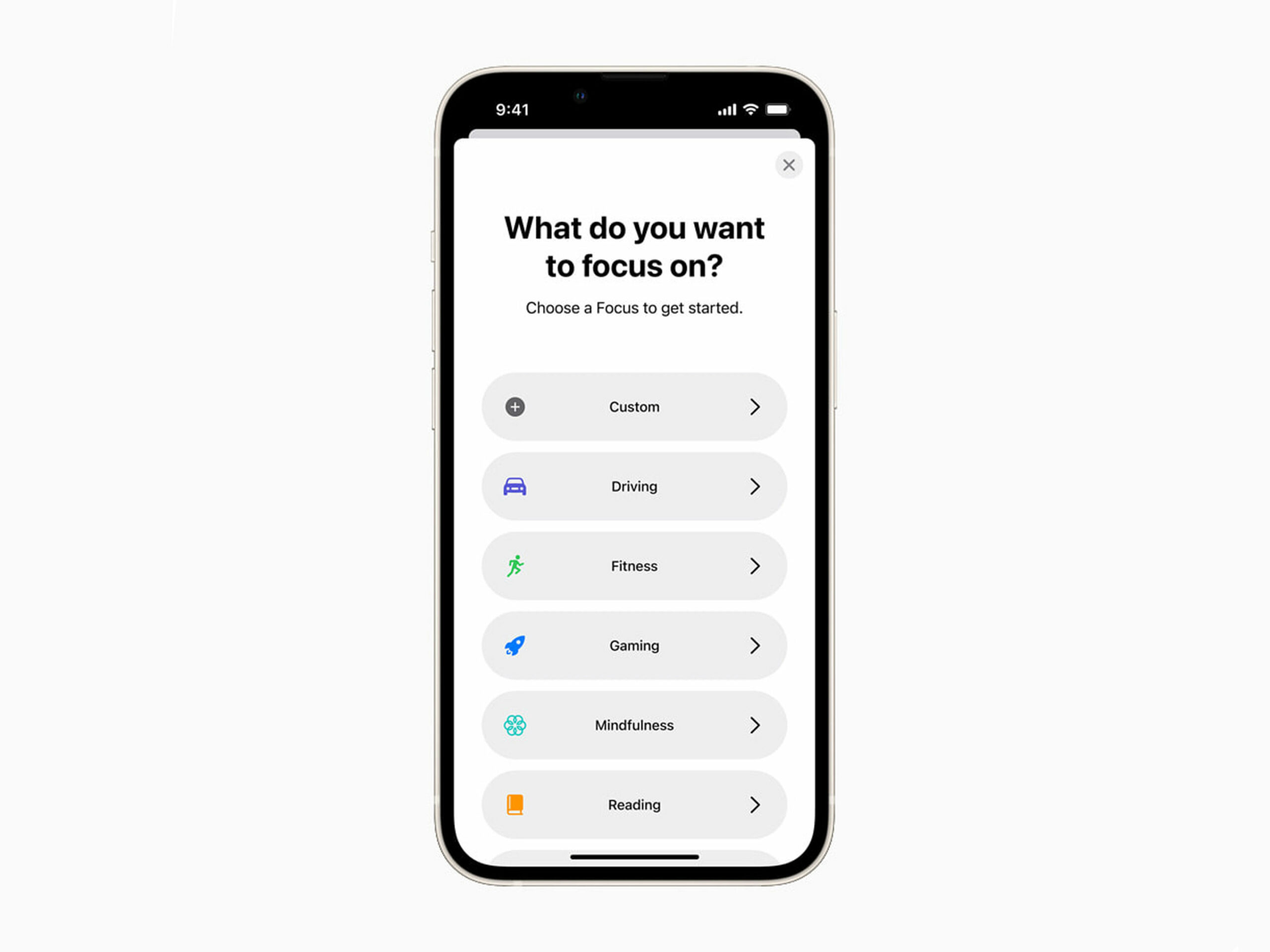
Beyond that subtle visual flourish, there’s a new ‘Focus’ button within Settings and Control Center (the menu that allows you to change screen brightness and play/pause music playback). When you open this, it shows you a few new notification filters that can block preset apps during specific times. You need to set this up on your own, but once activated, it can be useful for blocking social notifications during work hours and work notifications during social hours.
FaceTime invites Windows and Android to the party
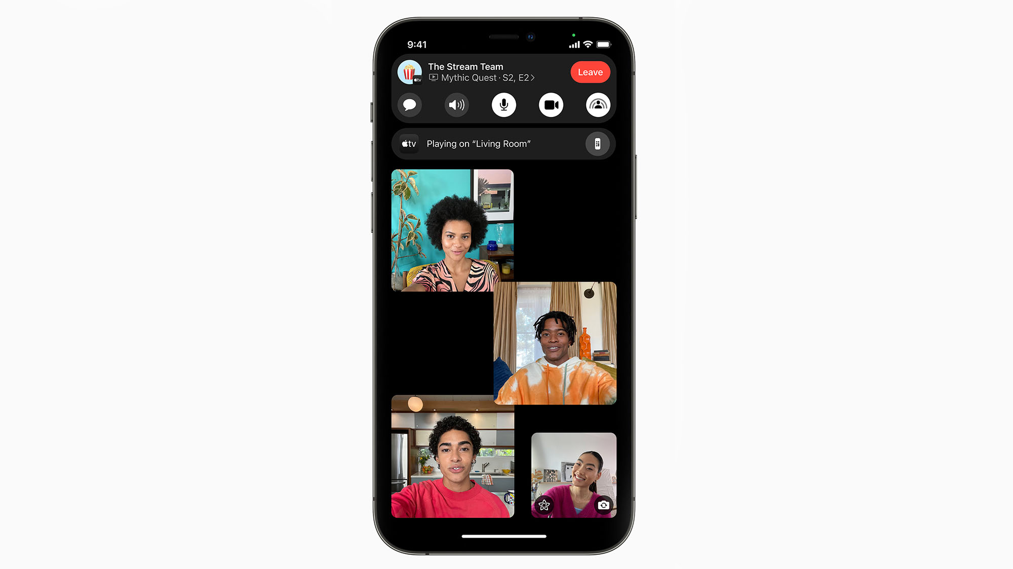
Perhaps the part of iOS 15 that will be used the most is a new FaceTime feature that allows users to set up chatrooms that you can invite people to with a link. This is just like how Zoom, Google Meet and Teams all work, putting FaceTime on slightly more level footing with those competitors. It also allows FaceTime users to invite Android and Windows users for the first time.
To be clear, non-Apple users can only be invited to a FaceTime chat; they can’t start one.
On top of all this, Apple has also added some new layouts to Facetime to make it easier to see everyone in a chat at once.
The new iMessage updates take a bit to get used to
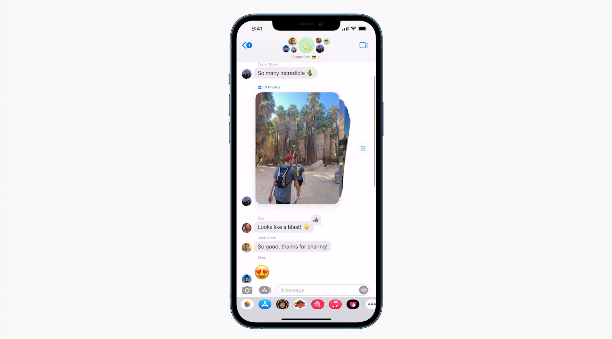
One of the more subtle updates that’s come with iOS 15 is a new form of iMessage. For the most part, the app looks the same, but now, when you send or receive multiple photos, they get stacked in the chat instead of all displayed at once.
This looks nicer, but you can easily mistake it for just a single photo if you just glance at it.
One of the more exciting updates that seems cool but might not catch on is the new ‘Shared with you’ sections within Safari and Photos. In each of these sections, you can see links or pictures that people have sent you via iMessage, so you can quickly open them or check them out later.
Copy text from anywhere
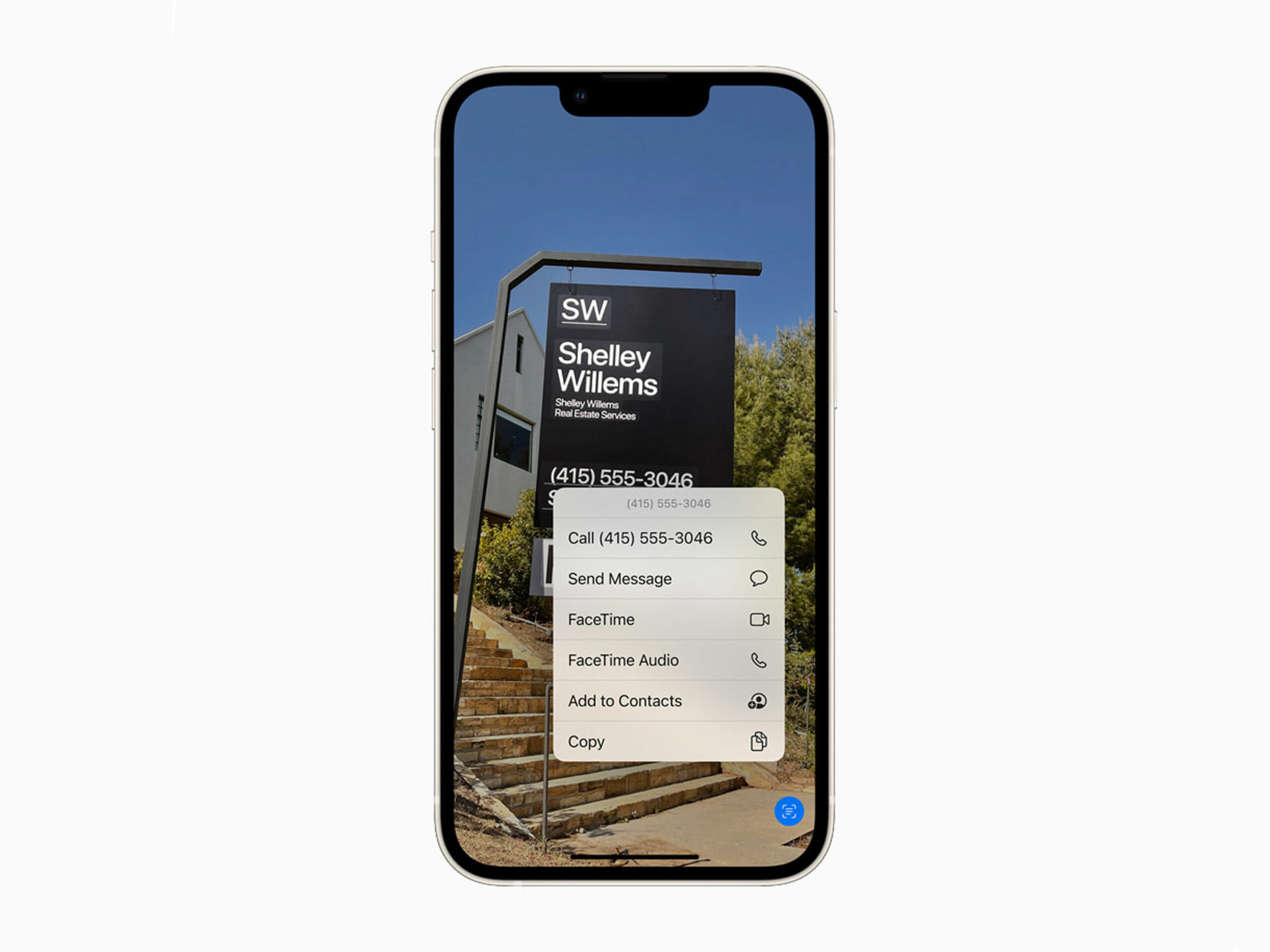
One of the sleeper updates added in iOS 15 is the ability to copy text from pretty much anything.
Within the Photos app, you can click on a little icon in the bottom right of each picture to copy text from within the photo. If you’re in Safari, you can tap and hold onto text in images and, in pretty much every case, the phone will be able to copy it accurately.
You can also highlight phone numbers to instantly call them or addresses to get directions in Maps.
Spotlight search is the real way to get around your iPhone in 2021
If you’re not already utilizing the power of Spotlight Search on iPhone, you should really start with iOS 15.
When you pull down on the home screen in the new update, you can search for pretty much anything now. This includes the web, your photos, contacts and messages, among many other sources. You can even now use it from the iOS lock screen.
Auto translate
The iOS translate app can automatically detect when a person is speaking and will begin translation immediately. Since you can also select text in images and other things in iOS 15, you can also translate them quite easily.
This isn’t the new Safari iWanted

The new design is on the left and the old is on the right.
When Apple first revealed iOS 15 and its other software updates earlier this summer, it planned to revamp the look of Safari on all of them. While I was really excited about these visual changes, the world, apparently, was not.
The first version of iOS 15 safari was a simple bubble that floated at the bottom of the screen. If you tapped on the bubble, you could search using Google. There was also a three-dot menu and a button to see all your open tabs. Swiping across the bubble also allowed users to jump through all their open tabs quickly. This functionality, thankfully, is still in iOS 15.
The search bubble didn’t last, and instead, Apple replaced it with a much more accessible and technical-looking bottom navbar. While this version might not look as nice, it’s likely going to be a lot easier for people to adapt to.
MobileSyrup may earn a commission from purchases made via our links, which helps fund the journalism we provide free on our website. These links do not influence our editorial content. Support us here.


