The Pros
- New design
- Solid battery life
- Full suite of tracking features
The Cons
- Some headline features not available yet
- Lacklustre clock options
- A few bugs
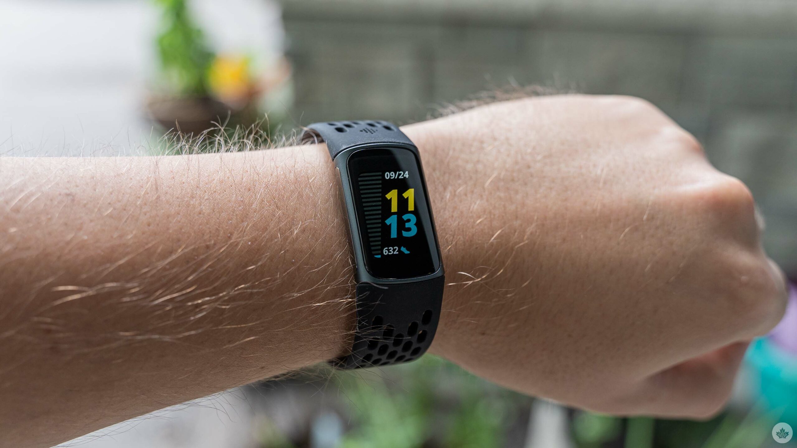
At the end of August, Fitbit unveiled its revamped Charge 5 fitness tracker. Since then, I’ve had the opportunity to test out the redesigned tracker for a couple weeks and, so far, it’s one of my favourite the company has released.
The Charge 5 boasts several significant changes both externally and internally. On the surface is an all-new design that borrows heavily from Fitbit’s recently released Luxe tracker. Inside, the Charge 5 now offers electrodermal activity (EDA) and electrocardiogram (ECG) apps, just like the Fitbit Sense smartwatch.
“…I will say that I prefer the Luxe to the Charge 5, but the new Charge is still a significant improvement over the Charge 3/4.”
In fact, as an intermittent Fitbit Sense user, I felt right at home on the Charge 5. While some of the smartwatch’s ‘smarter’ features were missing, the Charge 5 managed parity on most fitness tracking features.
However, while the Charge 5 is good, it’s not perfect. I experienced a few issues with some of the functionality of my review unit, but nothing I’d consider a deal-breaker for most people. The worst bug I encountered was a problem with the alarm. I am a serial snoozer, but the Charge 5 has made an effort to break that habit by simply not stopping the alarm when I press snooze.
Fitbit confirmed to me that the issue is a touch sensitivity bug and that the company’s working on a fix. Although, if you don’t use the Charge 5 as an alarm clock (or if you don’t use snooze) you won’t encounter the issue.
Fresh new look
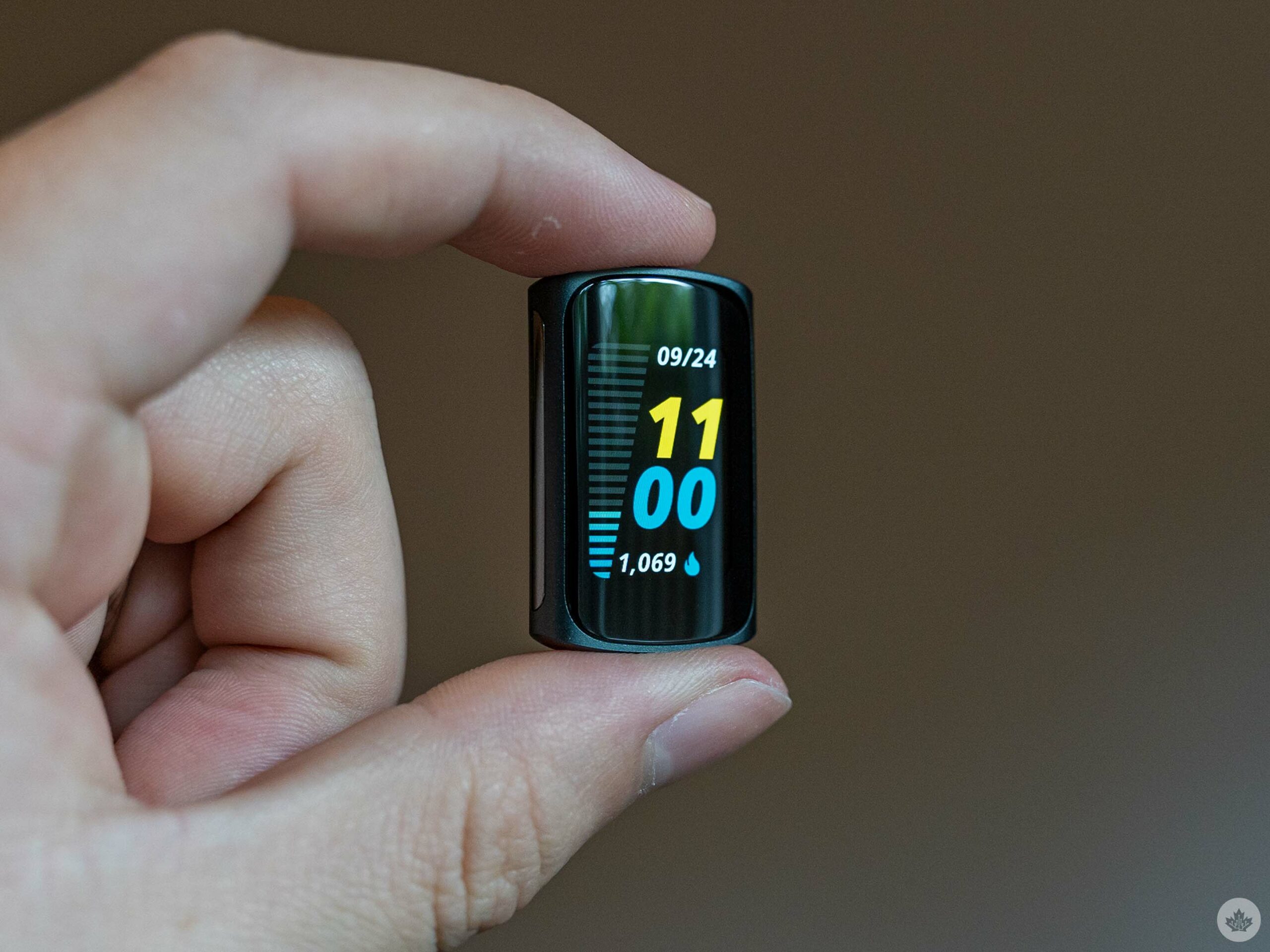
Let’s kick things off with the most noticeable change: the new design. The Charge 5 boasts a significantly upgraded look compared to previous Charge trackers. It’s a welcome change, especially compared to the Charge 3 and 4, which kept the same design.
More than just looking nice, the Charge 5 looks much more modern. When I tried the Charge 3 and 4, it felt like I had some unsightly bundle of technology strapped to my wrist. The Charge 5, on the other hand, offers a sleek, subtle aesthetic. It’s not flagrantly techy like other trackers, and I felt like I could get away with wearing it to a fancy occasion with the right strap.
As far as looks go, I will say that I prefer the Luxe to the Charge 5, but the new Charge is still a significant improvement over the Charge 3/4.
Technicolour dream clock
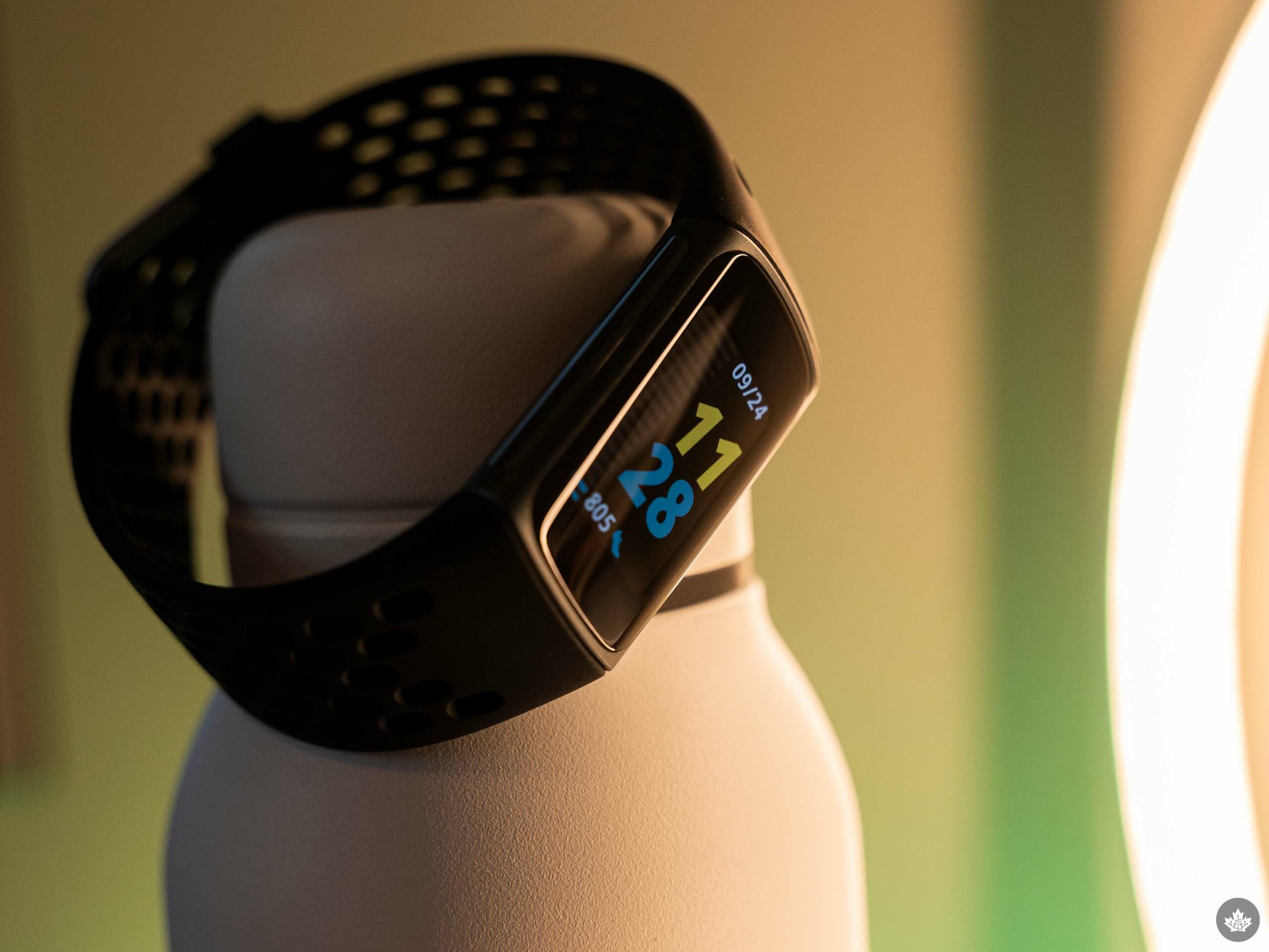
The other significant new visual feature with the Charge 5 is its excellent new colour AMOLED display. It’s a huge step up from the boring monochrome OLED panel on past versions of the tracker.
Unfortunately, the colour screen doesn’t add a lot to the Charge experience beyond looking nicer. That’s not necessarily a bad thing, although I do think that Fitbit could have put together some nicer clock face options to highlight the feature.
The default face, ‘Continuum,’ does a pretty solid job showing off the Charge 5 display thanks to the series of lines on the left side of the face. The lines display progress for various health metrics, such as steps taken or activities completed. As the lines fill up, the colour shifts from blue to yellow.
However, other clock face options available in the Fitbit app have less colourful elements on display. Most pick one or two main colours for the clock face or for a health metric, and that’s about it. It’s a minor complaint, but I’d love to see Fitbit offer more stylish, colourful clock face options in the future.
New navigation, old problems
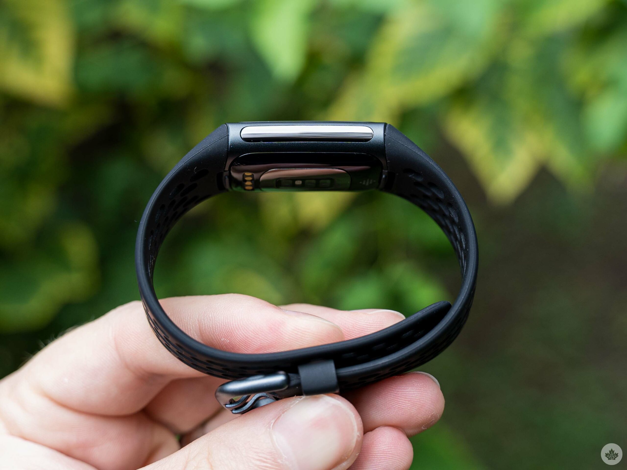
As much as I like the new Charge 5 design and screen, it, unfortunately, suffers from the same navigation issues as the Fitbit Luxe. Like the Luxe, the Charge 5 ditches the inductive side button seen on previous Charge devices. Although, at least the Charge 5 replaces the side button with the electrical sensors for the EDA scan app, rather than putting nothing there like the Luxe.
I was never a big fan of the button, but it did provide a convenient way to navigate the device (pressing it would take you back to the previous screen). Without the button, Fitbit offers a new swipe-based navigation. Users can swipe the screen either up, down, left or right to move between different screens. It works but doesn’t feel great on such a small display.
“As with the Sense, I didn’t find the EDA particularly helpful.”
Fitbit also added a double-tap gesture that takes you to the main clock screen. Again, this works, but it doesn’t feel great. Plus, there were a few times where the double-tap would activate whatever option was on screen instead of going back.
Again, a minor issue, but I worry that some people might struggle. This is especially true for people coming from older Fitbit trackers that had the button or less tech-savvy people.
EDA, ECG and more
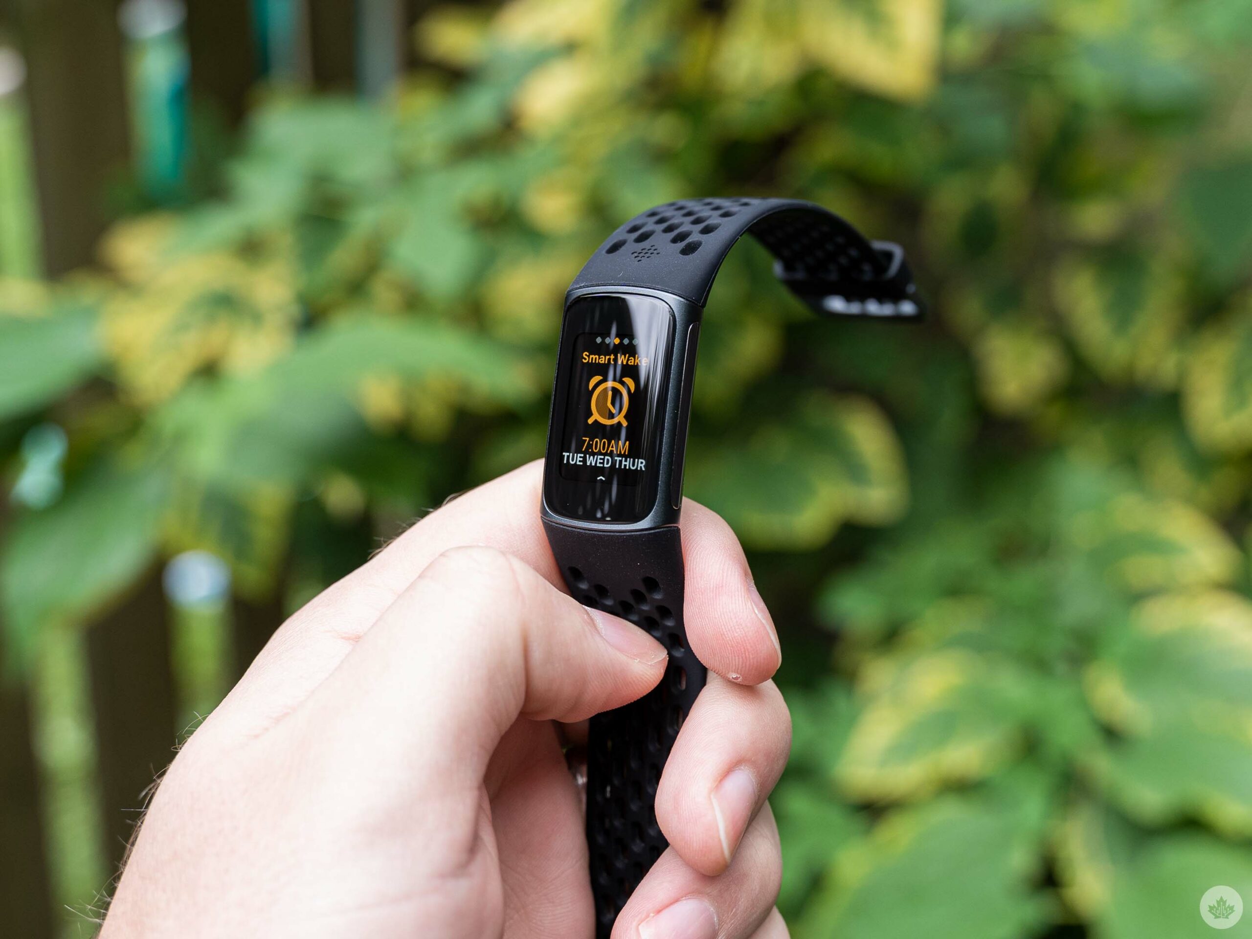
As mentioned above, the refreshed Charge 5 design paved the way for new internal features like the EDA and ECG scan apps. EDA specifically requires two metal strips, one on each side of the tracker.
Charge 5 users can access EDA scans by swiping from the clock face to the EDA scan page (on my Charge 5, that’s either one swipe left or five swipes right). Once on the EDA screen, users can tap to start a scan, which involves holding the Charge 5 with your thumb on one metal strip and index finger on the other. The Charge 5 walks users through the process step by step.
If you’ve had a chance to try the EDA scan on Fitbit’s Sense smartwatch, the experience is very similar here (although the Sense lets you do shorter one-minute scans compared to the three-minute scan on the Charge 5). You effectively hold the tracker for the duration of the scan and focus on your breathing, then the tracker gives you feedback on your stress responses and lets you log how you feel. The data all gets sent to the Fitbit app on your phone to review later.
As with the Sense, I didn’t find the EDA particularly helpful. Perhaps it’s because I’m a relatively laid-back individual, but I just rarely logged a high number of stress responses. It was also rare that taking the time to do an EDA scan was helpful. Still, if you’re a stressed individual, access to the EDA scan might be a welcome feature.
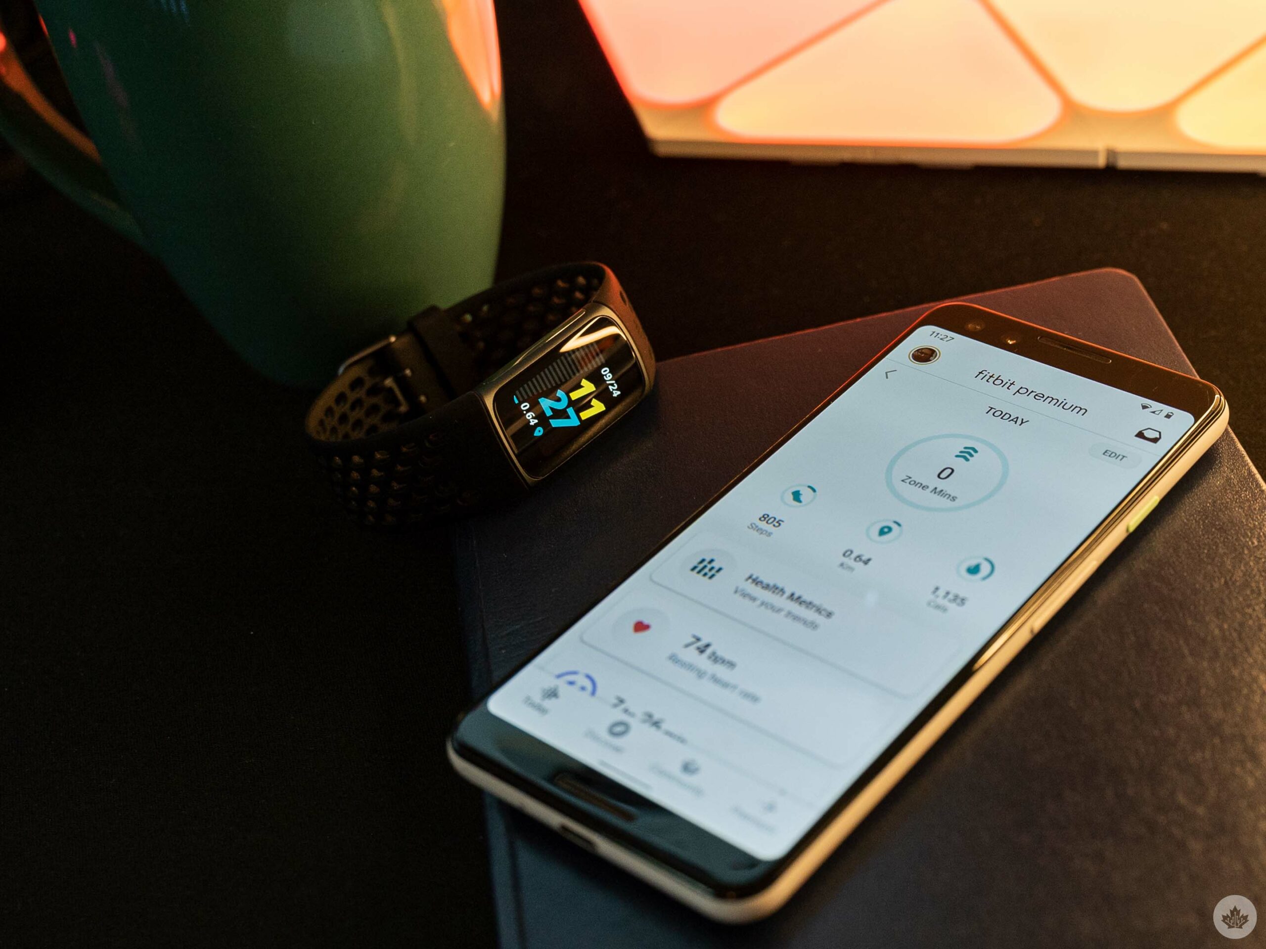
Unfortunately, the other major new features Fitbit touted, ECG and Daily Readiness, weren’t available when writing this review. Both features are slated to ‘come soon’ to the Charge 5. ECG is already available on the Sense, and I’m sure it’ll work similarly on the Charge 5, while Daily Readiness will come to the Charge 5, Sense, Versa 3 and 2, Luxe and Inspire 2 devices in a future update.
As usual, I’d recommend against buying a product based on the promise of future features. If you’re interested in Daily Readiness or ECG capabilities, at least wait for them to arrive before pulling the trigger on the Charge 5.
Solid battery life despite the changes
I’ve also been impressed with the battery life so far on the Charge 5. I completed a full charge on the tracker when I first set it up on September 9th, and in the two weeks since then, I’ve only had to recharge it once. As I write this, the Charge 5 sits at 39 percent battery, which will carry me through at least one more day, if not more.
Fitbit promised seven days of battery life on the Charge 5 despite making the tracker 10 percent thinner than the Charge 4. I was wary of the change, but so far, the battery life has proven as good as, if not better than, the Charge 4.
“The only thing I missed from the Sense on the fitness side was the altimeter for stair tracking.”
I will note, however, that using GPS features can significantly impact the battery. If you’re the type of person to use GPS capabilities frequently, you likely won’t get the full seven days out of the Charge 5 battery.
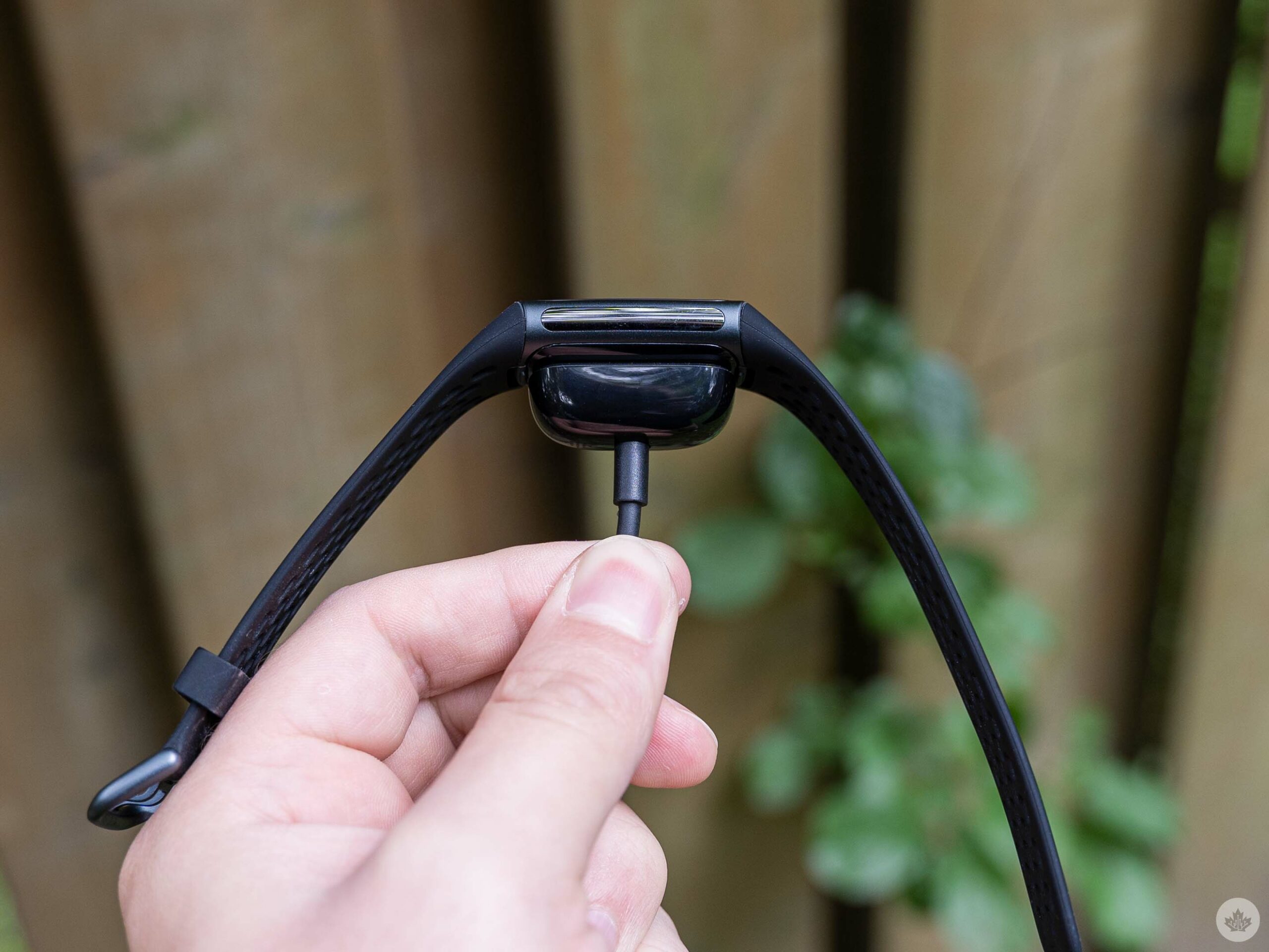
And, when you do have to charge the Charge 5, you no longer need the absurd plastic clip that previous models used. Like the Luxe, the Charge 5 connects to the charger using magnets. I do with the magnets were a little stronger since it’s easy to bump the Charge 5 off the charging connector, but I’ll still take this over that awful clip-on charger.
A great all-round tracker
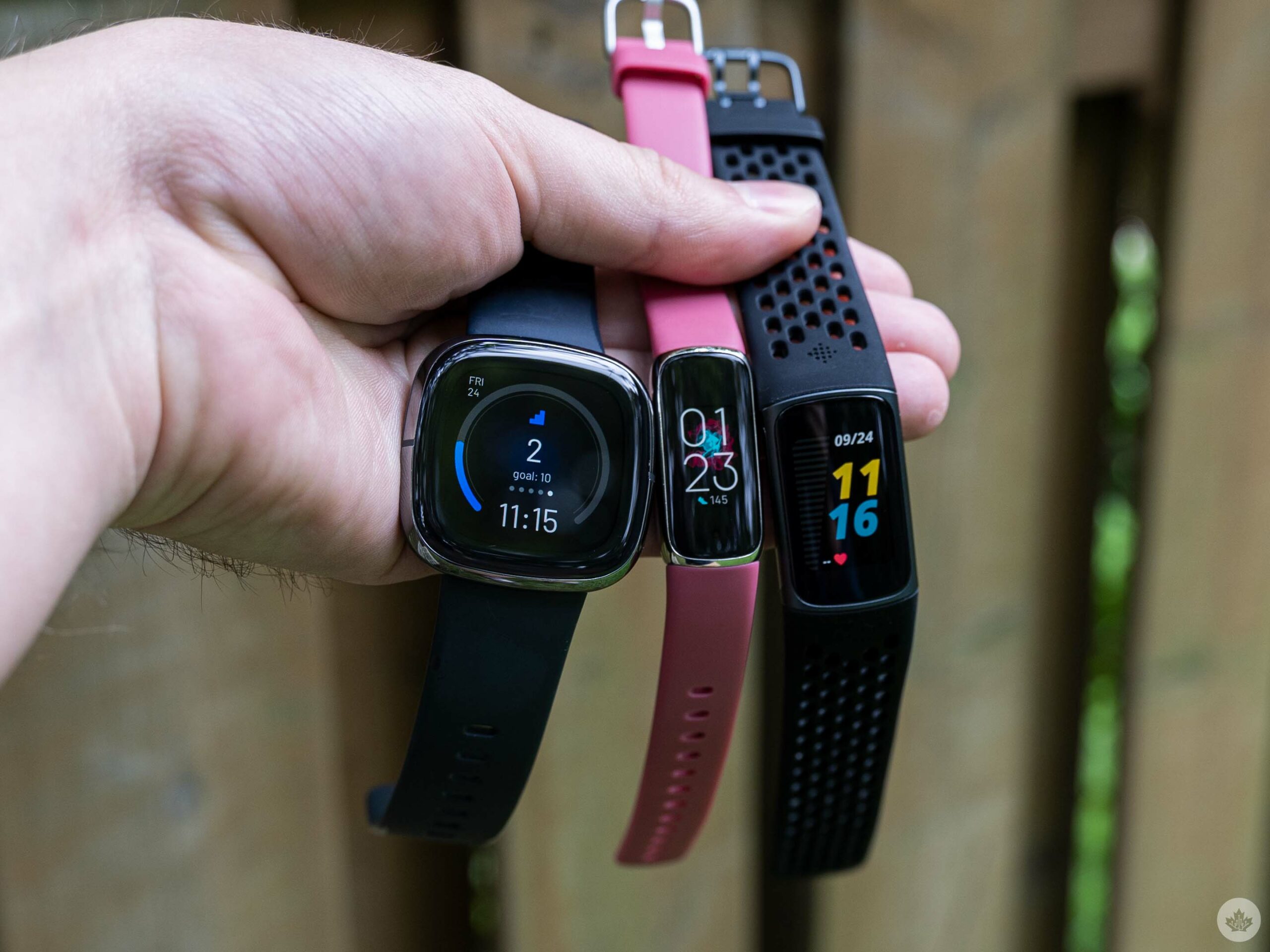
Whether or not the Charge 5 will work for you comes down to what you want out of tech on your wrist. Coming from the Fitbit Sense smartwatch, I found I didn’t miss some of the more advanced smart features like on-wrist Google Assistant or calls. Frankly, I just didn’t feel a need to use any of those things, and I appreciated the extra battery I got on the Charge 5 compared to the Sense.
At the same time, if any of those smart features are things you value, the Charge 5 probably isn’t the right choice for you. The only thing I missed from the Sense on the fitness side was the altimeter for stair tracking. However, that goes the other way too, with the Charge 5 only really offering built-in GPS as an advantage over the slightly less expensive Fitbit Luxe.
In other words, I’d break down Fitbit’s current offerings like this: If you want the ultimate in fitness tracking and smart features, the Sense is the best choice (and also the most expensive at $399.95). Alternatively, you could consider the Versa 3 or 2. I’m not familiar enough with either watch to advocate for them, but I think if I were to put out the extra money for a Fitbit smartwatch, I’d go for the pricier Sense to make sure I get everything the company has to offer.
What do you need from your wrist-mounted tech?
The Charge 5, however, offers near parity to the Sense on health features while lacking some of the more significant smart features. If you don't need those, you can save a bunch of money with the $229.95 Charge 5.
Finally, those who like the Charge 5 but don't want the built-in GPS capabilities can grab the Luxe for $30 less.
The Fitbit Charge 5 is available in 'Black/Graphite,' 'Lunar White/Soft Gold' or 'Steel Blue/Platinum Stainless Steel' colours from Fitbit's website or retailers like Best Buy and Amazon.
"The Charge 5 is a great middle ground with plenty of health features and some smart features without a hefty price tag"
MobileSyrup may earn a commission from purchases made via our links, which helps fund the journalism we provide free on our website. These links do not influence our editorial content. Support us here.


