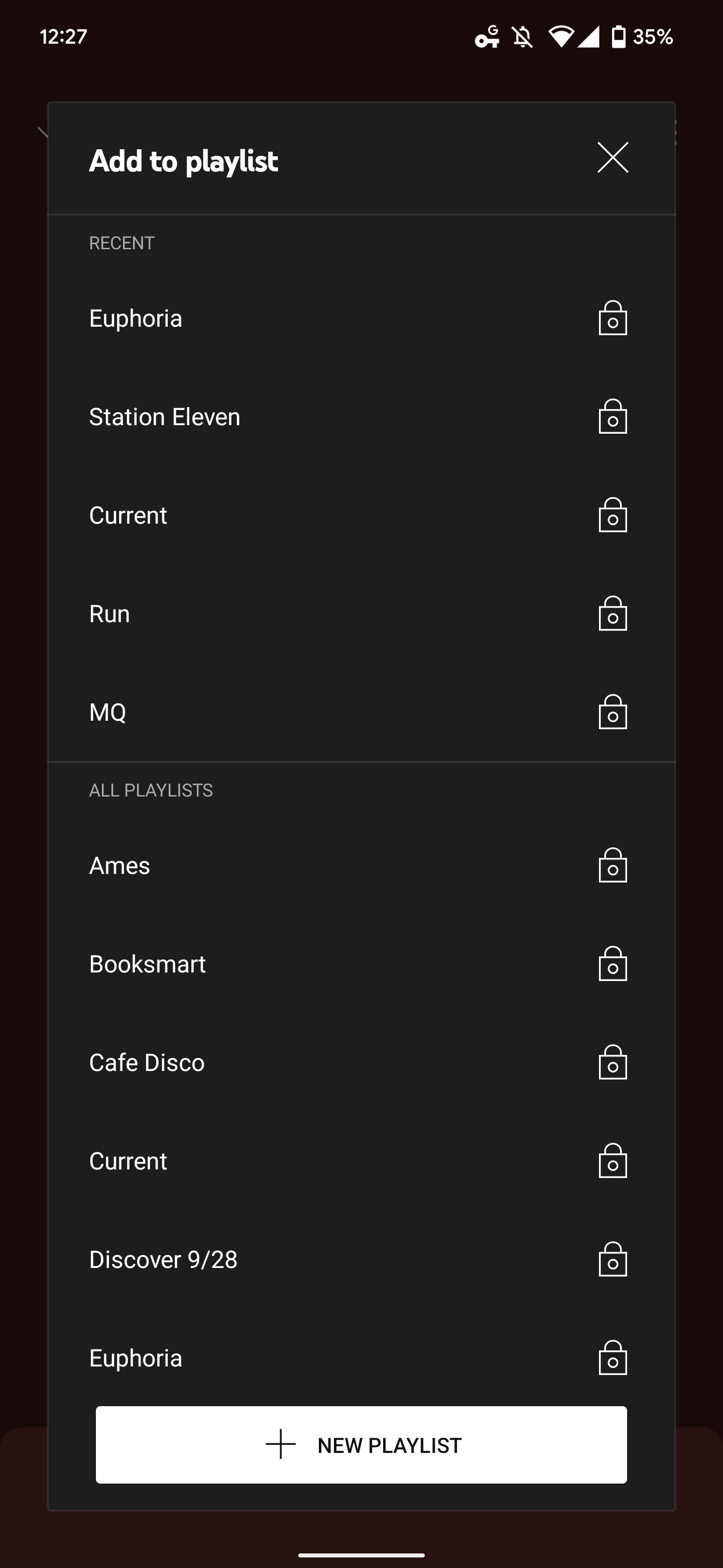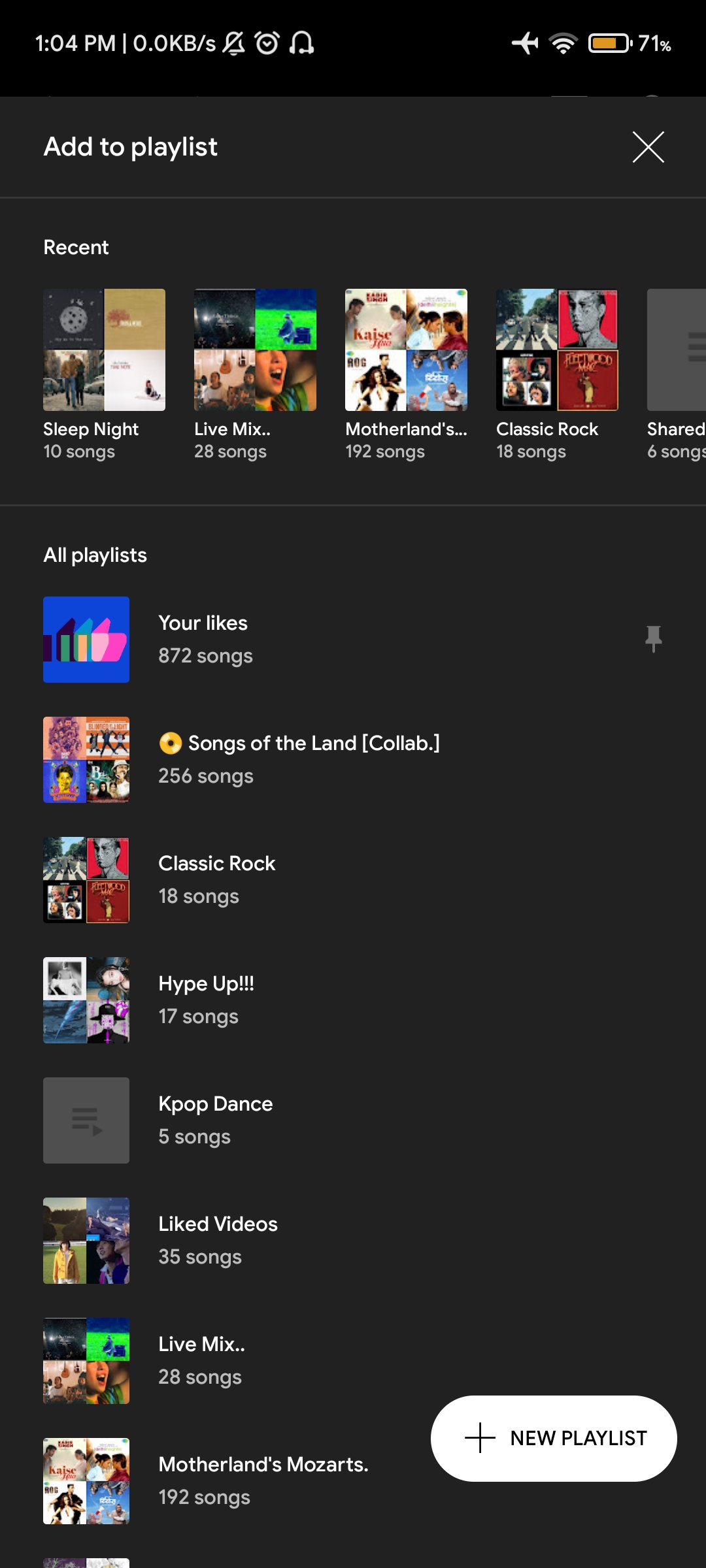
Google is testing a new ‘Add to Playlist‘ user interface for its YouTube Music Android app, as first spotted by Reddit user ‘Vishal_Kaul.’
While not a major update, it does spice up YouTube Music’s rather mundane playlist interface from simple black screen, to a bold, artwork-heavy page that shows the number of tracks in each playlist and features a new floating ‘add new playlist’ button.
The in-testing interface also features your recently played playlists right on top with its cover art in a carousel layout, making it easy for users to scroll through playlists they normally would play the most.
Check out these before and after images of the ‘Add to Playlist’ user interface, courtesy of 9to5Google:
While the new interface does look elegant, one user on Reddit has reported that they are having trouble scrolling through the new interface.
Google is likely to polish up the interface if and when it decides to officially roll the update out.
Source: Vishal_Kaul (Reddit)
MobileSyrup may earn a commission from purchases made via our links, which helps fund the journalism we provide free on our website. These links do not influence our editorial content. Support us here.


