I’ve been at MobileSyrup for the past five years and following the website for at least two years before that. That said, we’ve been around since December 2007 — a fact that many people likely don’t realize.
Over the last (roughly) 15 years, MobileSyrup has gone through a variety of site designs.
This week we’re looking back at the various website homepages with the power of ‘Wayback Machine.’
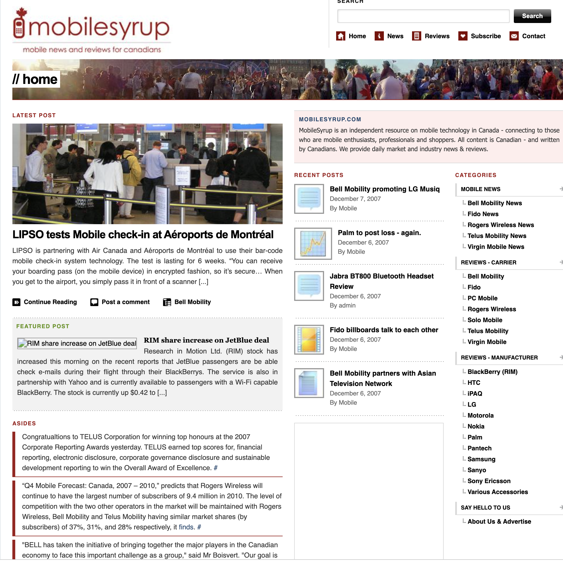
December 7th, 2007
This is the first website design, and man does it look old.
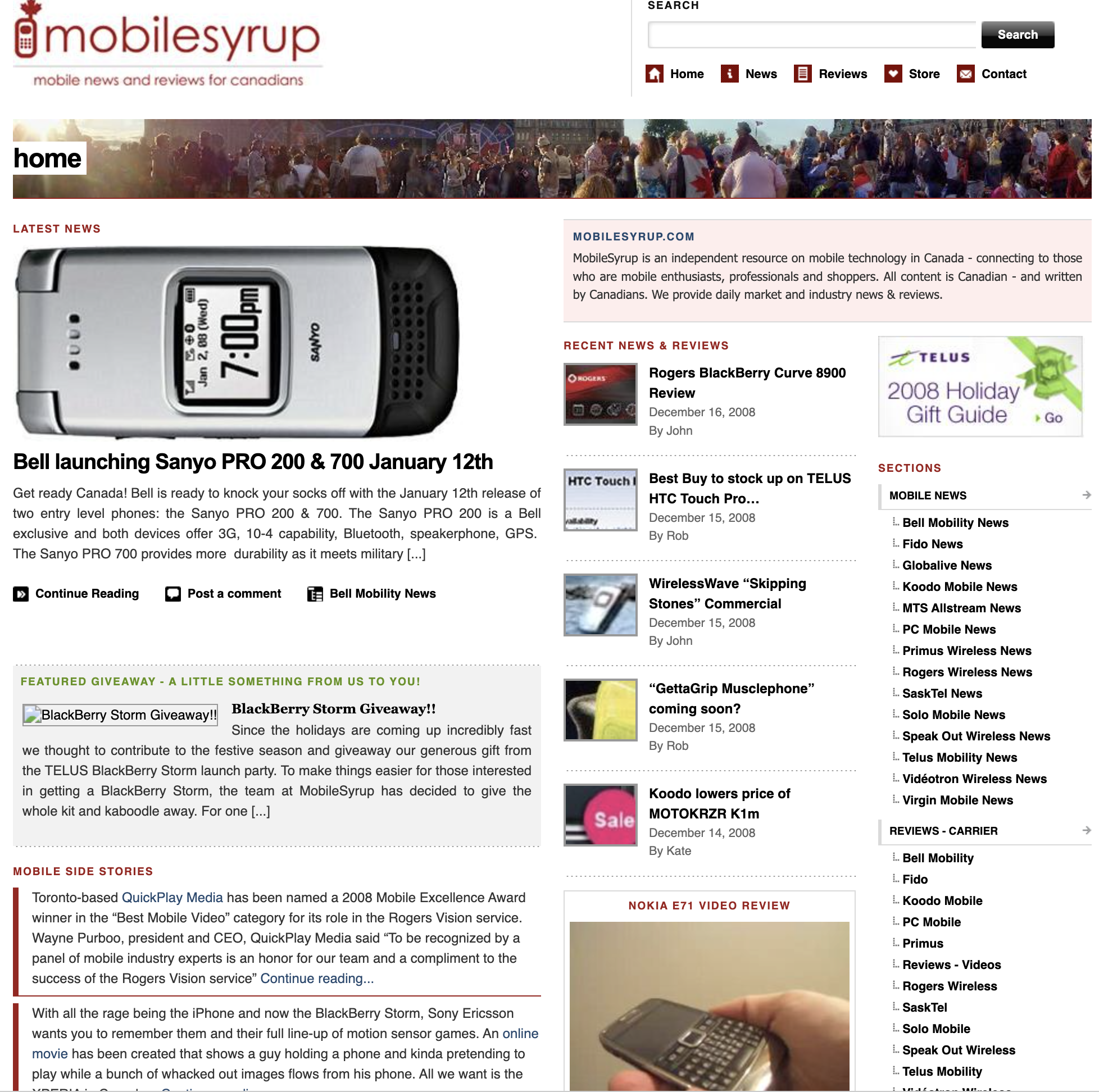
December 16th, 2008
We were doing a BlackBerry Storm giveaway, which was a very cool and highly sought-after phone at the time. Higher up on the right, you can see that the most recent review was the BlackBerry Curve 8900.
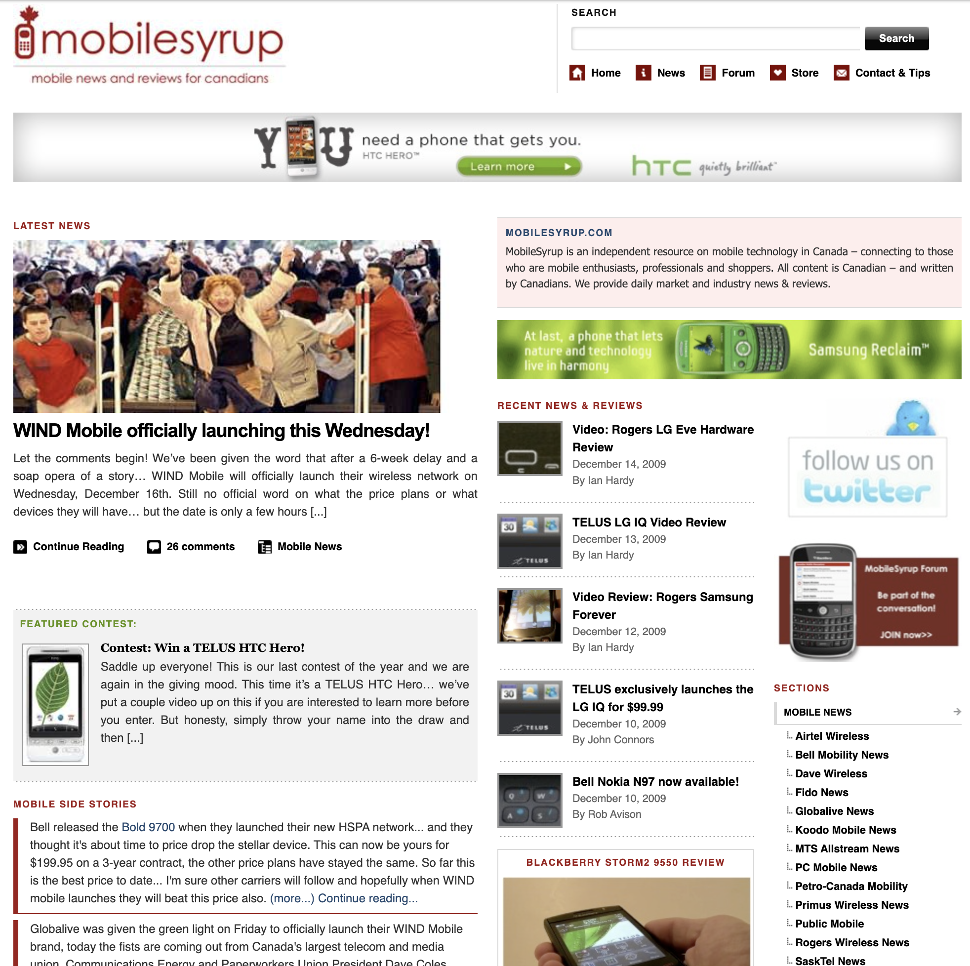
December 1st, 2009
The design certainly does stay like this for a while.
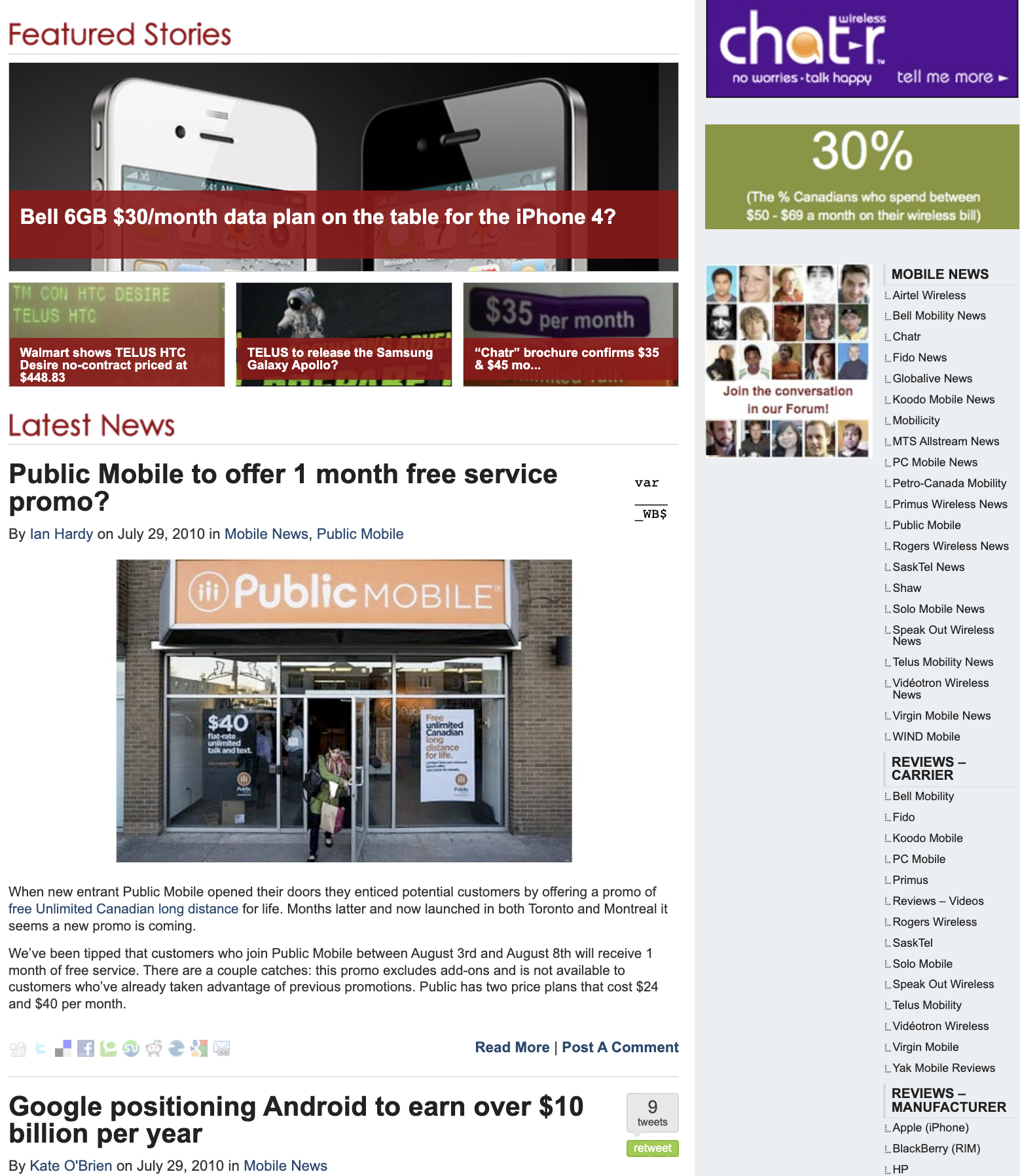
July 29th, 2010
Finally, in 2010 MobileSyrup’s look changed. This design added a blog roll style with highlighted ‘Feature Stories.’ The site still looked decidedly old by today’s standards, of course.
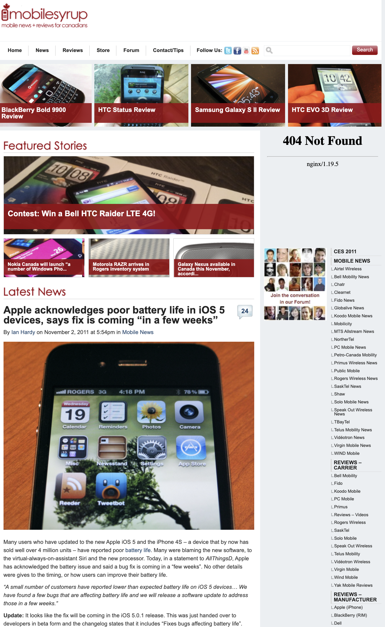
November 3rd, 2011
It looks like there’s a slight design change with the reviews at the top. There’s also a ‘404 Not Found’ message, an error that surely caused our former publisher, Ian Hardy, to lose his mind.
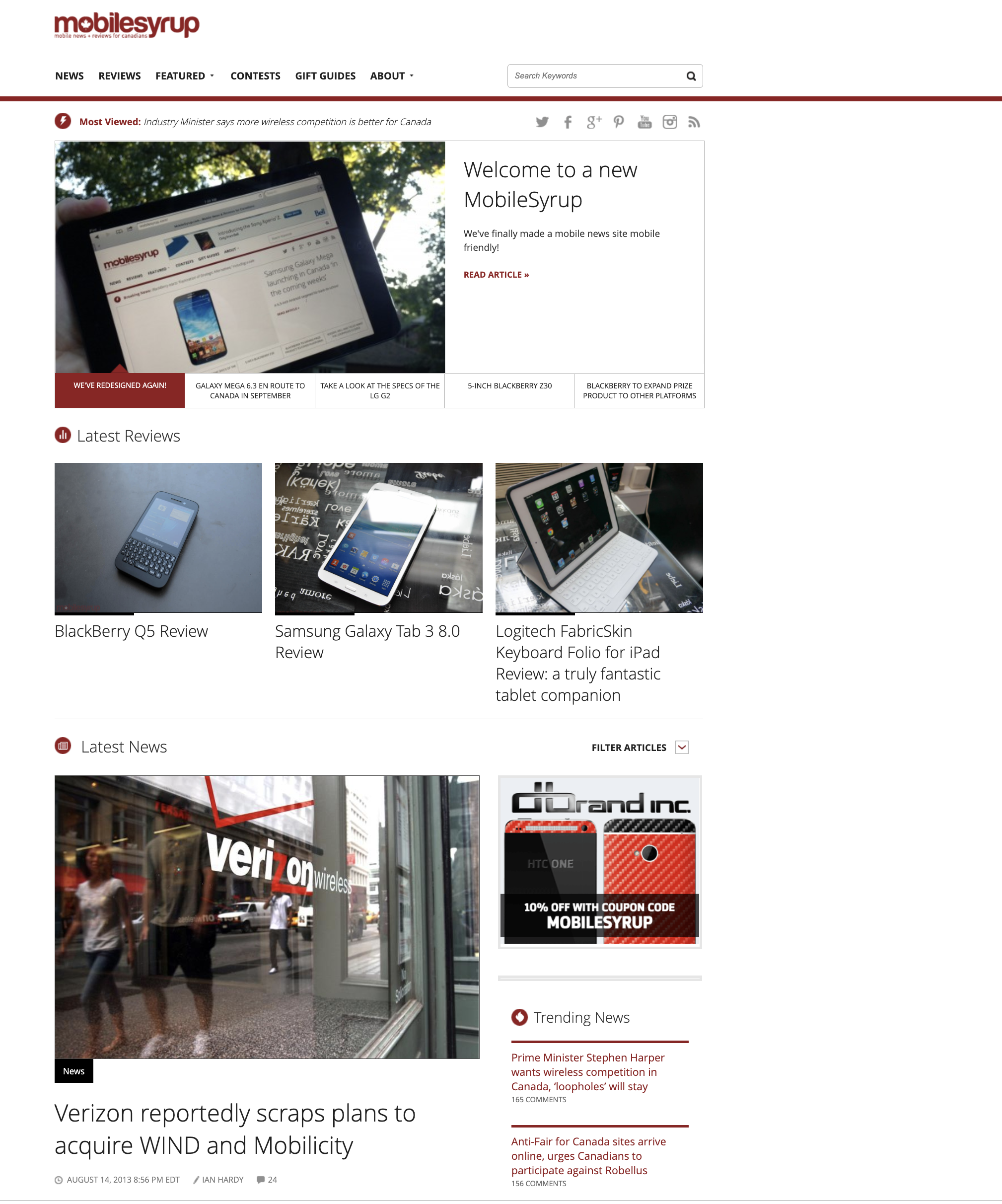
August 15th, 2013
In August 2013, we see a huge change to the website. The logo looks similar to the MobileSyrup logo we have today. The overall design looks more modern, with the feature sidebar going through a blog roll. The website is also now mobile-friendly.
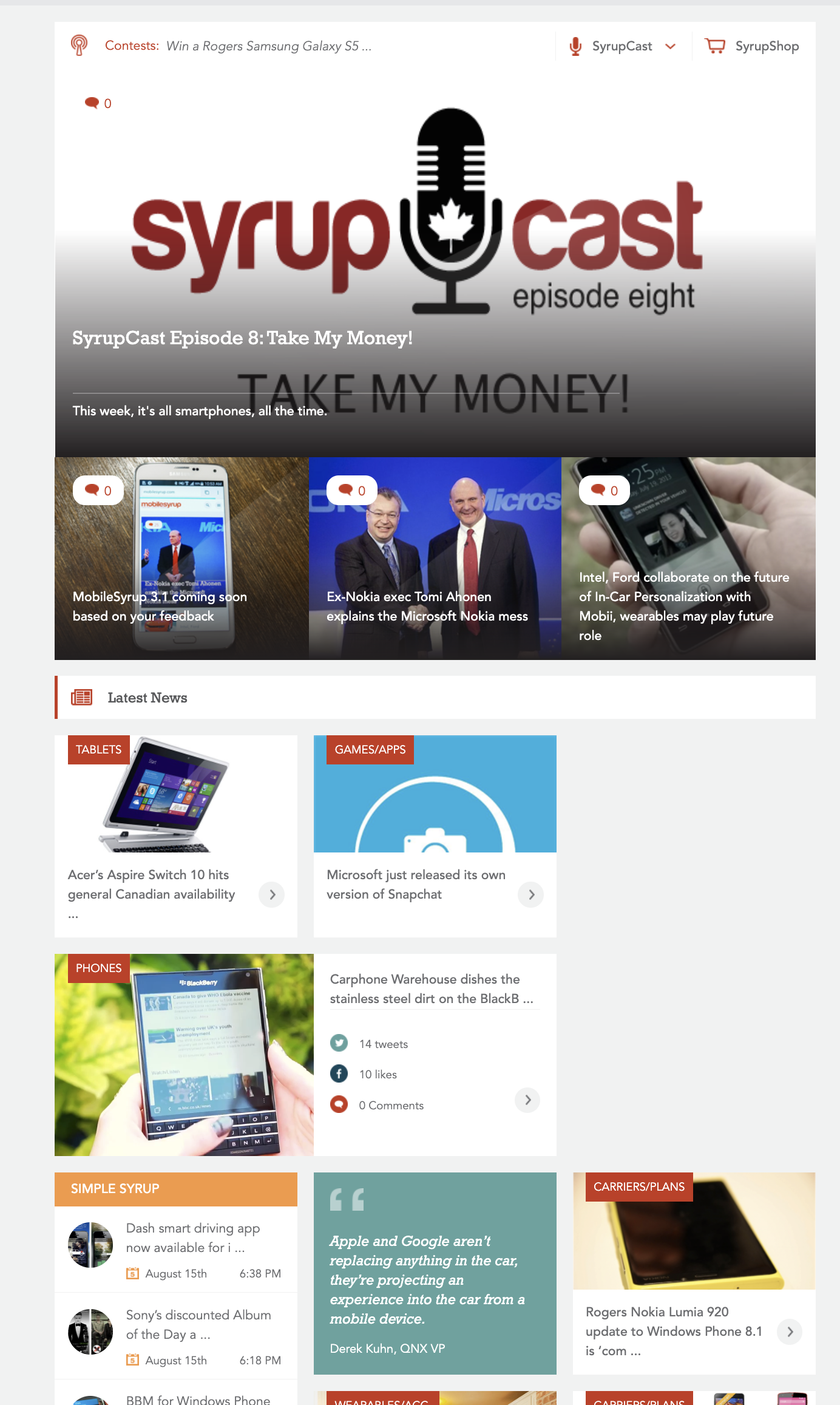
August 16th, 2014
A year later, MobileSyrup made another change primarily based on reader feedback and streamlined the homepage’s blog roll to be more simple. An article in the feature section mentions that users found this redesign rather confusing.
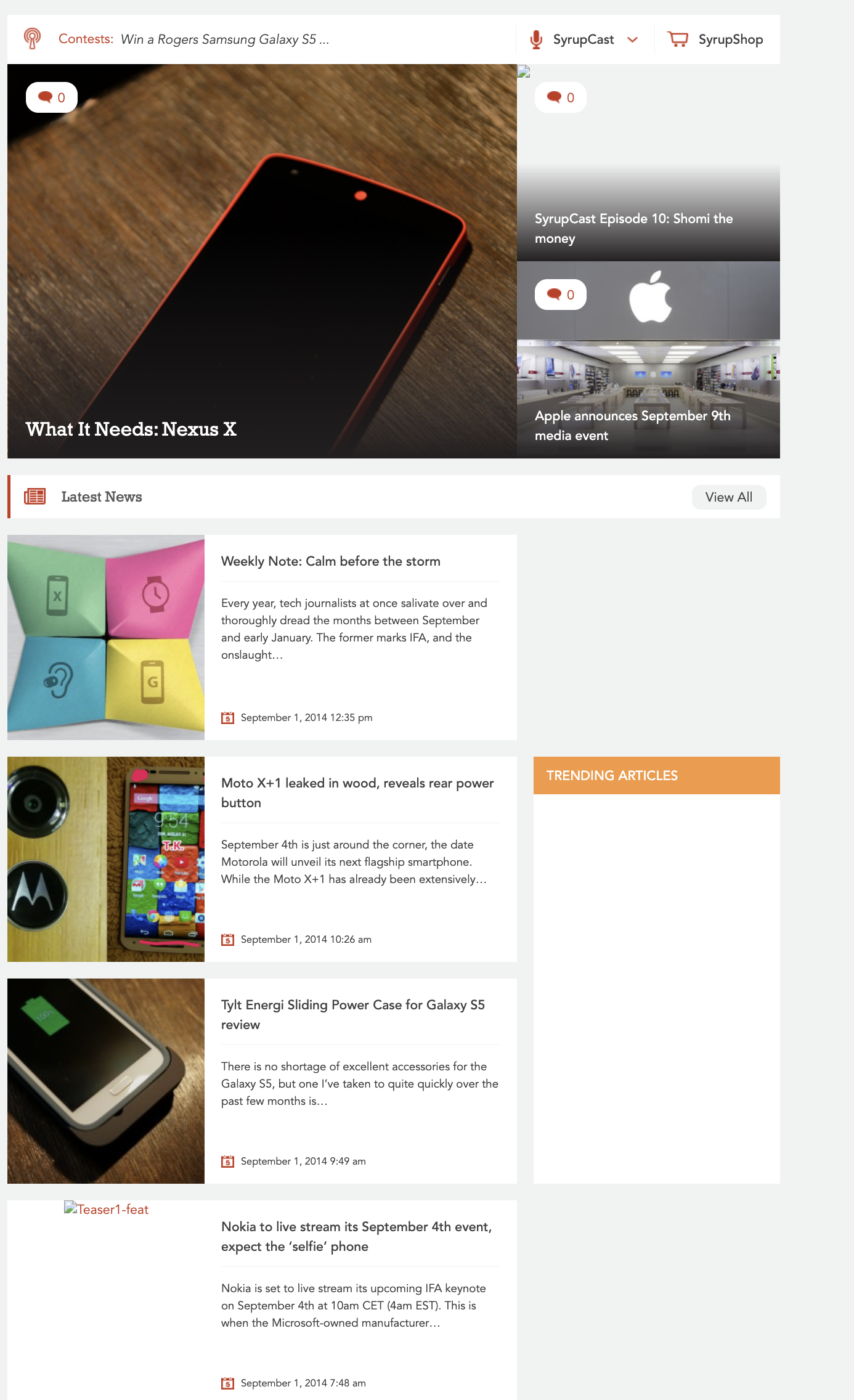
September 1st, 2014
Two weeks later, MobileSyrup went with a slightly different redesign. Instead of the tile format, there’s now a regular-looking blog scroll. The featured section is also slightly changed and similar to our current one.
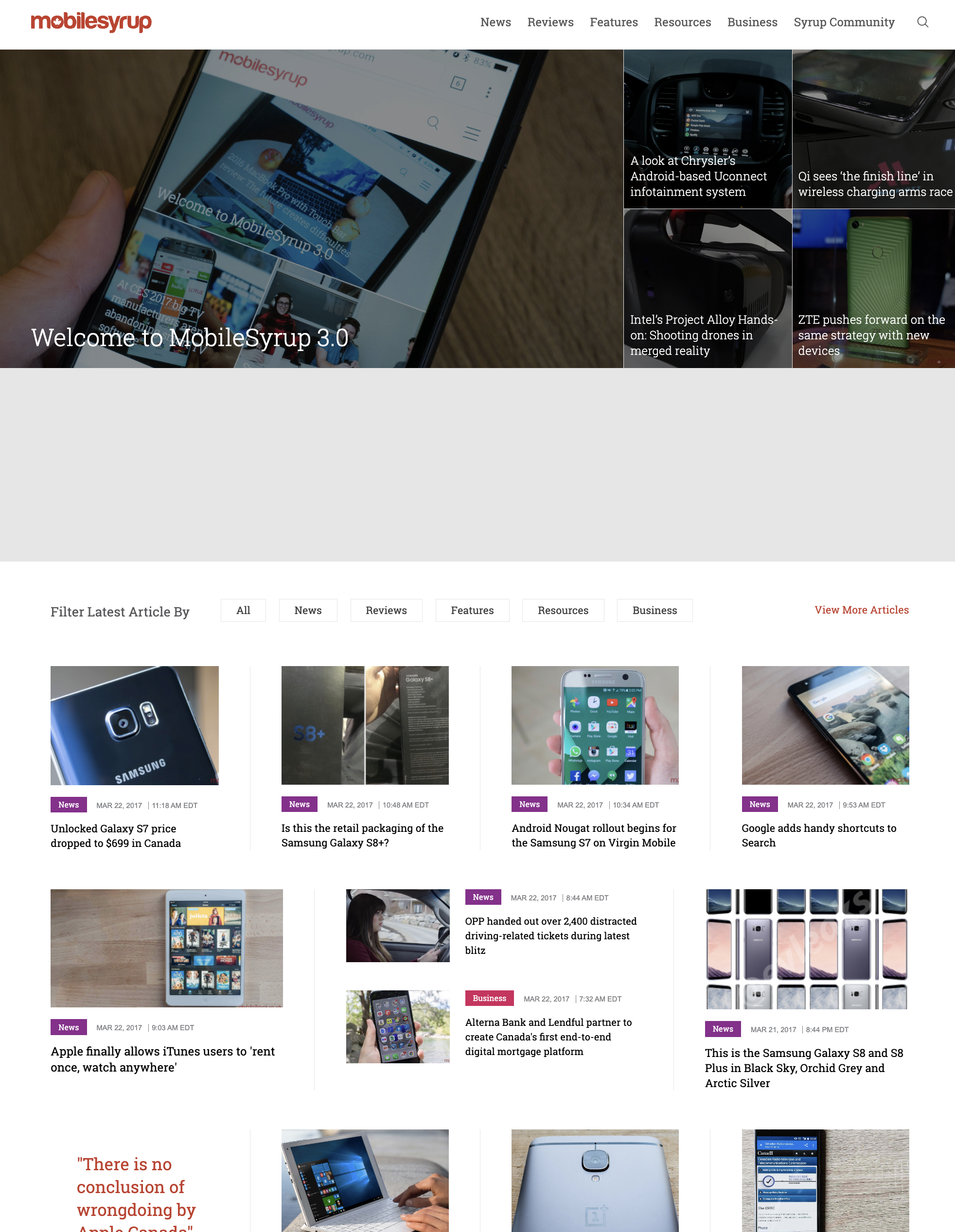
January 7th, 2017
MobileSyrup stays pretty much the same for a couple of years before a big change was made.
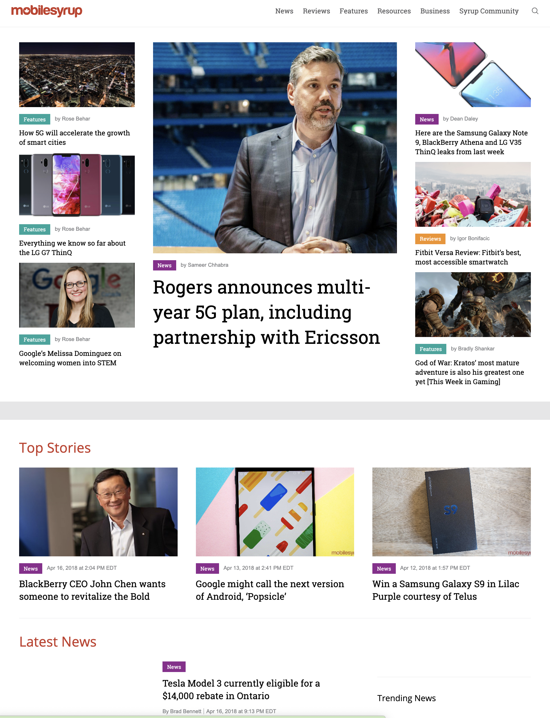
April 17th, 2018
Around April 17th we see another design change that moves us very close to our current design.
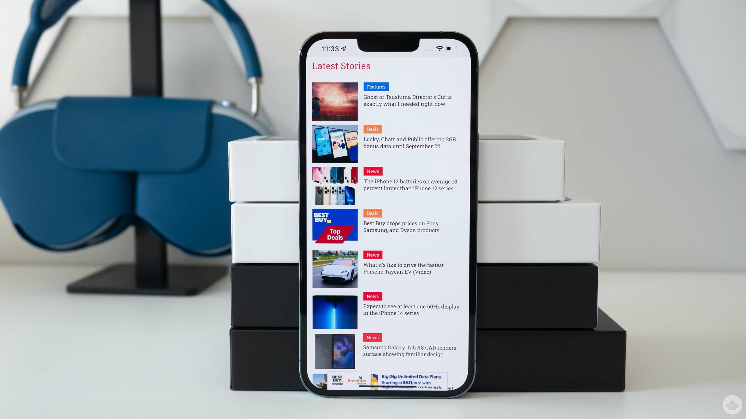
August 5th, 2021
MobilesSyrup doesn’t really change much after this beyond our refreshed logo and a few other minor design flourishes (at least, not yet 🔥).
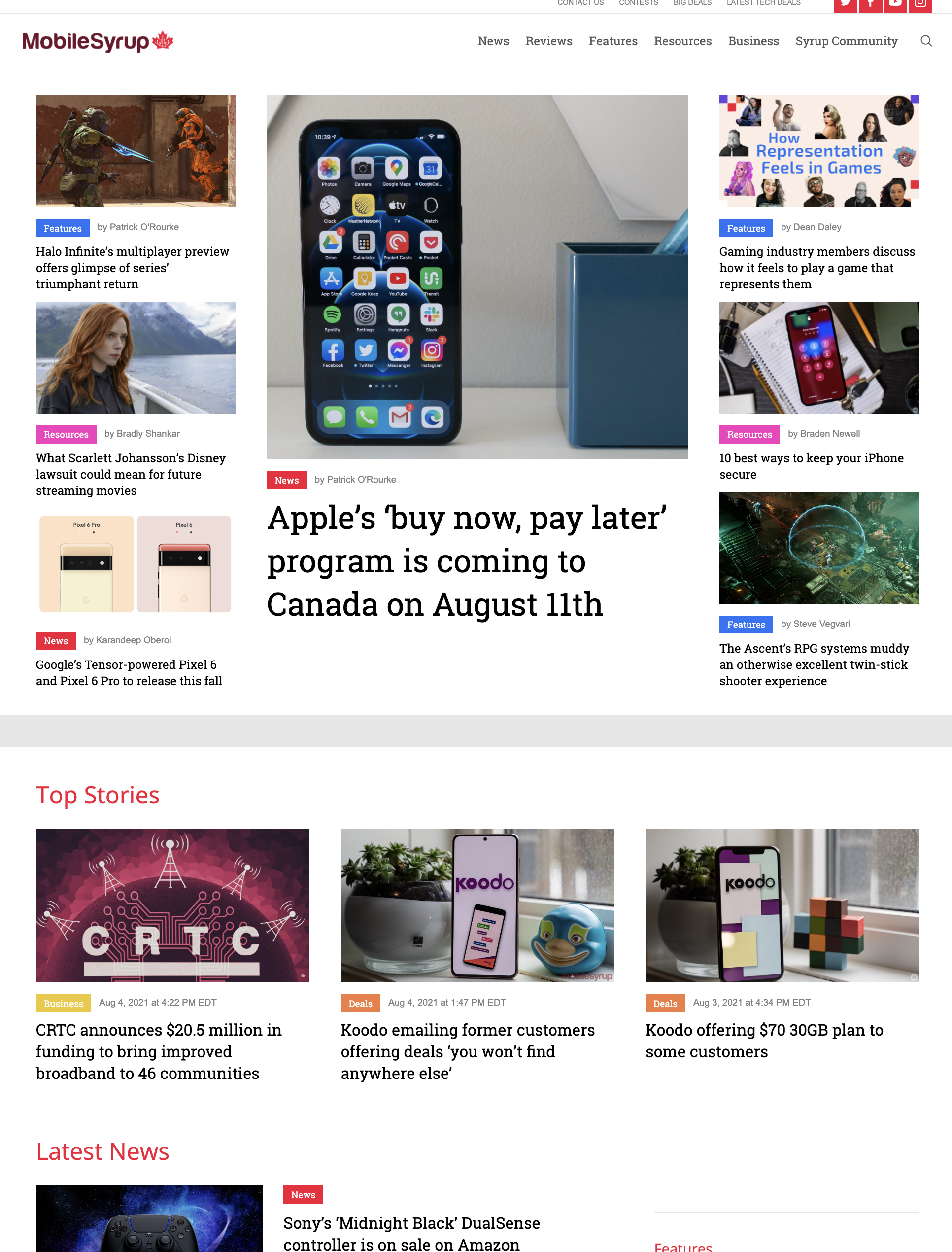
What do you think of MobileSyrup’s various designs over the years? Which was your favourite, and how do you like our current design? Let us know in the comments below.
MobileSyrup may earn a commission from purchases made via our links, which helps fund the journalism we provide free on our website. These links do not influence our editorial content. Support us here.

