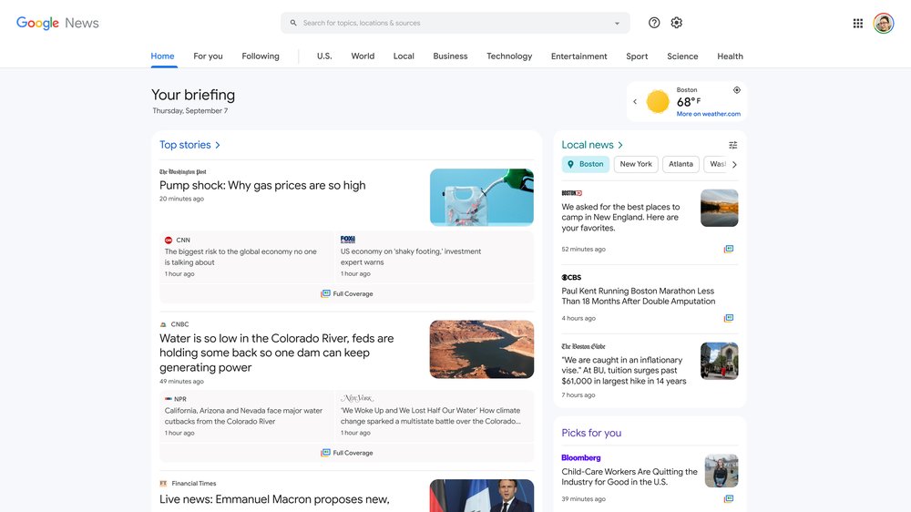
Google News for desktop got a sleek new look and a couple of new features.
The search giant detailed the update in a blog post on June 22nd, complete with pictures of what’s new. When you first go to Google News on the web, you may see a prompt asking if you’d like to try the new look.
First up, the new design moves the various categories, like ‘For You’ and ‘Tech,’ from the sidebar to a new top navigation bar. Next, the ‘Home’ segment now features ‘Your briefing’ with news tailored to you. This includes ‘Top stories,’ including ‘Full Coverage’ to bring multiple articles about a topic together.
There’s also a new ‘Local news’ section that shows top stories from specific areas, such as Toronto. Users can freely add regions to this section and cycle through them by clicking the different buttons.
Below that is ‘Your topics,’ which features stories in various categories like ‘World,’ ‘Business,’ ‘Tech,’ and more. This section is also customizable, letting users pick and choose topics to feature.

Image credit: Google
Overall, the new look feels much less like a feed of stories and more like a digital newspaper with various sections focused on different stories and topics.
Beyond the change to how Google News looks, Google also detailed in its blog that it expanded the ‘Fact Check’ section. Fact Check highlights the debunking of viral claims from organizations like ‘Full Fact.’ However, The Verge notes that Fact Check remains hidden at the bottom of the page (I couldn’t even find it on my Google News page).
If you’re curious to learn more about the new Google News website, you can check out Google’s blog post here.
Image credit: Shutterstock
MobileSyrup may earn a commission from purchases made via our links, which helps fund the journalism we provide free on our website. These links do not influence our editorial content. Support us here.


