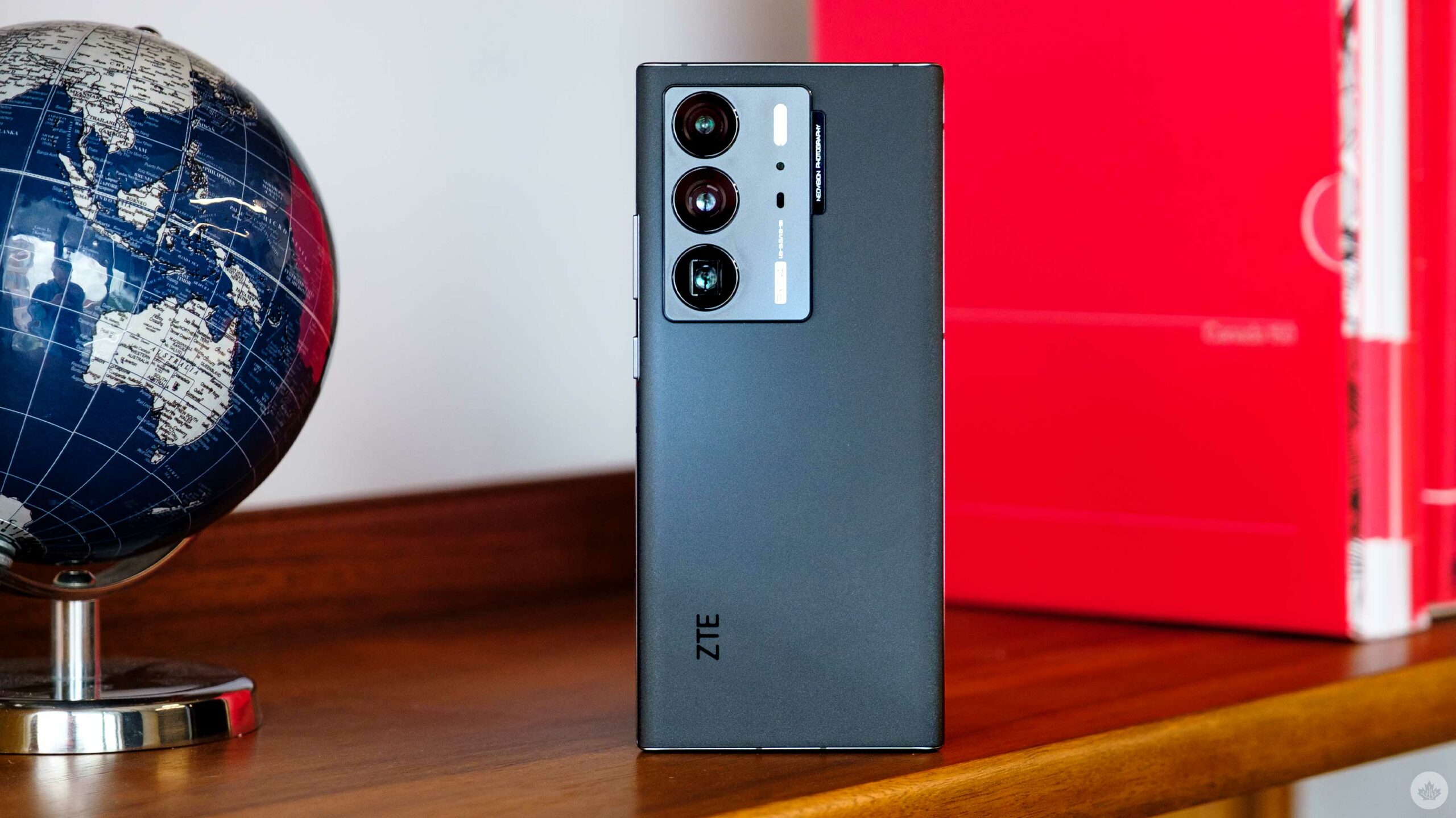
ZTE has been slowly fading from the Canadian phone landscape over the past few years, but the company’s latest flagship, the Axon 40 Ultra, has at least one interesting trick up its sleeve.
Like last year’s Axon 30, the Axon 40 Ultra features an under-display selfie camera that gives the phone an impressive screen-to-body ratio unobstructed by any notches or cutouts. There’s no denying it looks fantastic, but similar to last year, it comes at a cost.
That said, the primary camera, fast charging specs and its Qualcomm Snapdragon 8 Gen 1 chipset add up to create a compelling phone — at least it would be if a Canadian carrier sold it.
Unfortunately, the Axon 40 Ultra is only available directly from ZTE for roughly $1,000 CAD.
A phone falling part
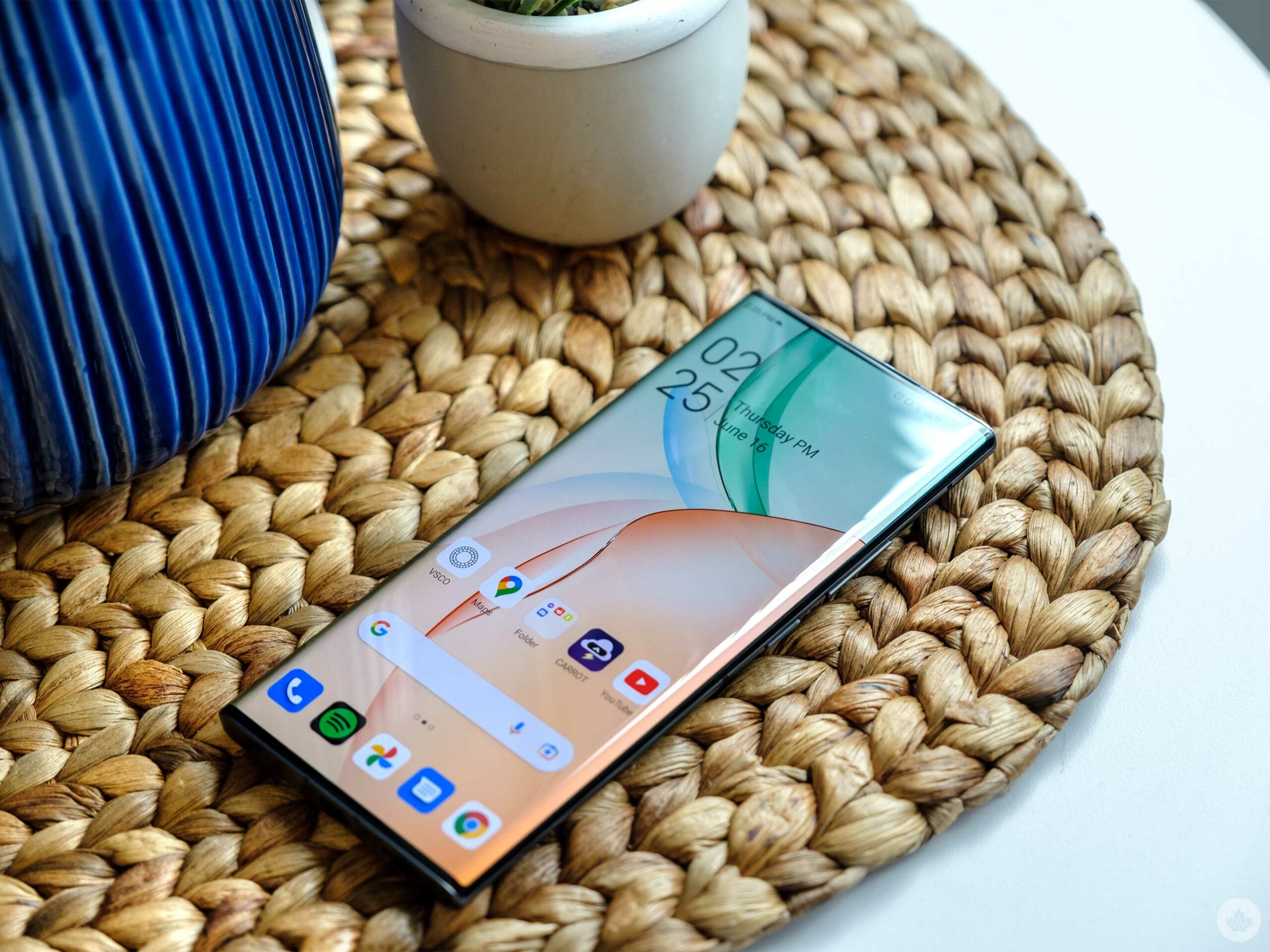
The Axon 40 Ultra does look good, I’ll give it that.
I wanted to like the Axon 40 Ultra when I first unboxed it. The phone’s design felt thin and comfortable in my hand. Plus, this year I was able to use a third-party launcher, the Niagara Launcher. It’s not that I hate ZTE’s MyOS launcher, but it’s fairly basic, and the folders open up towards the top of the screen, making them annoying to use with a single hand.
Another frustrating quirk is that there are numerous ways to customize the clock on the home screen, the always-on display and the lock screen. However, few options match up across all three. It’s a small thing, but being able to have a more unified design would go a long way towards helping this phone feel more premium.
After a few hours of testing, I was happy to see ZTE utilizing a few parts of Material You’s adaptive colour principles. But the first software update I applied scaled this back considerably. I could only find it working in the Google Keyboard after that, but it seemed strangely inconsistent even then.
When I first hopped into the camera app, I found it a bit overwhelming, but the lens setup and the ‘Street mode’ struck me as interesting.
However, then I opened the Axon 40 Ultra’s photos app…
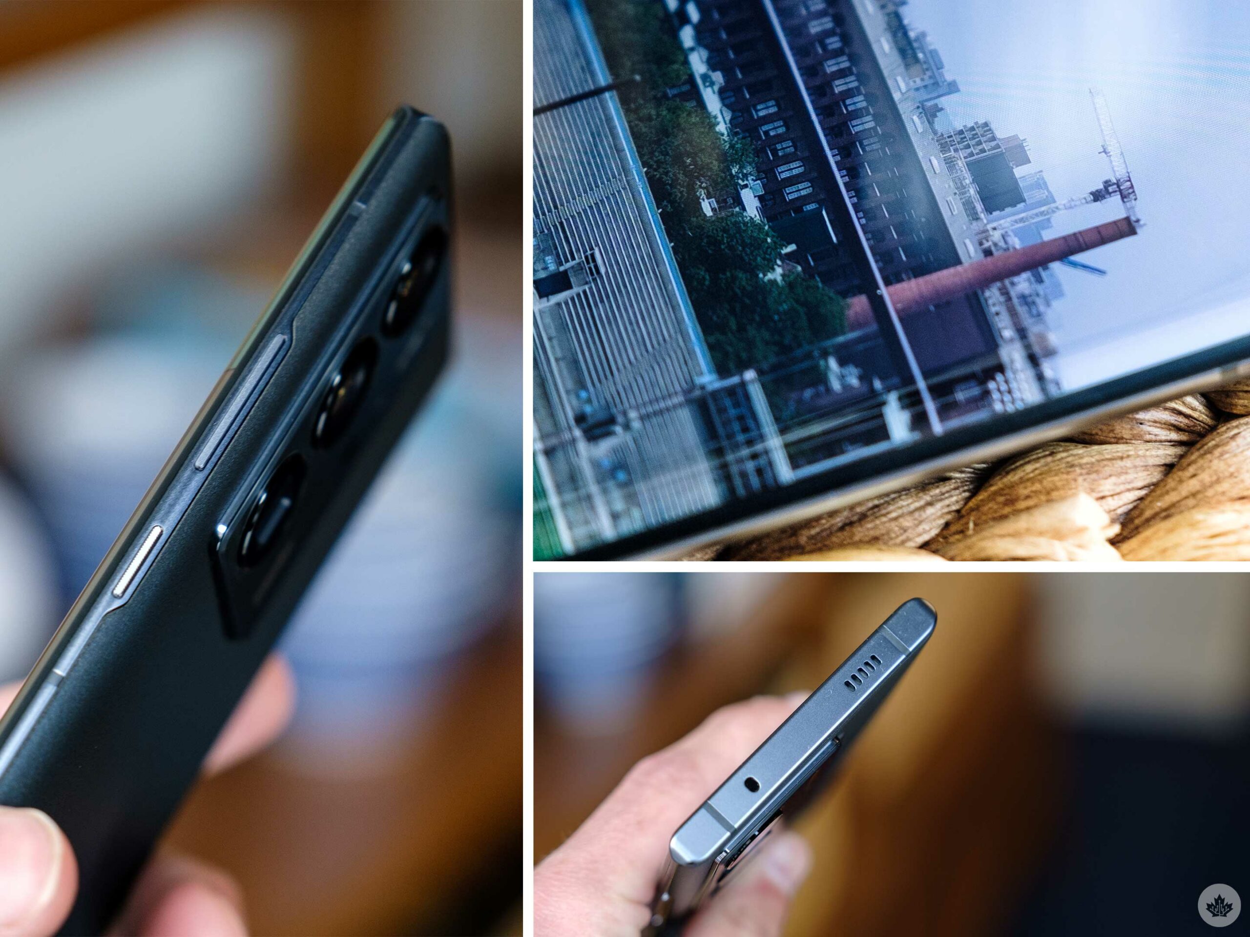
Immediately I noticed something strange. Every photo looked like it had a subtle grain filter. You need to pixel peep a bit to notice it, but once I made note of it, I couldn’t unsee it. It permeates everywhere, from the lock screen to all the apps. This is disappointing since ZTE’s marketing hyped up the new 120Hz 10-bit screen this year.
The best way to explain the effect is that it looks like the screen has a subtle texture, almost like a thick piece of cardstock. It’s actually kind of nice when reading content on white backgrounds since it looks a little more like paper, but it’s bizarre for every other use. I’ll also concede that under some lighting conditions, it’s less intense.
My other main gripe is less with the Axon 40 Ultra, and more with ZTE as a company. Last year I spent time testing the Axon 30 Ultra and the standard Axon 30, and while I had my issues with the software, I initially walked away impressed. But then, when I went to re-test the smartphone roughly eight months later to prepare for this new ZTE Axon 40, both were broken. The Axon 30 Ultra’s battery had swollen and pushed the back plate up, and while there were no obvious give-aways as to what happened on the Axon 30, it won’t charge anymore, so I expect its battery is also busted.
There’s an argument to be made that if you use a phone often and maintain a steady cycle of charges/discharges of its battery, this won’t happen. But it’s also worth pointing out that every other device in my phone drawer (some of which are years old) still function. I will update this review in six months regarding the status of the smartphone’s battery.
Camera tests
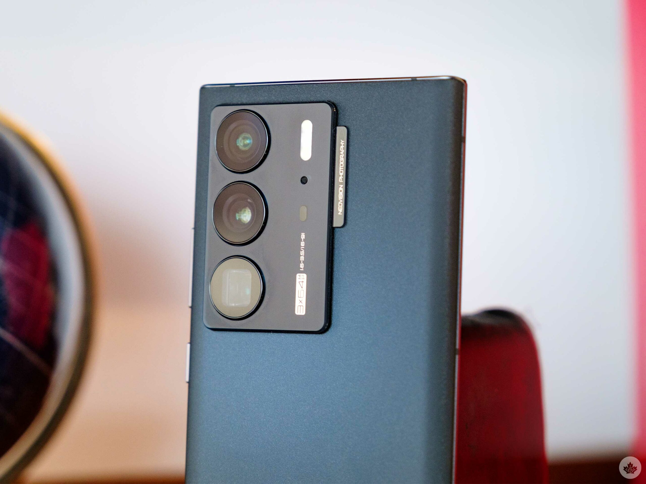
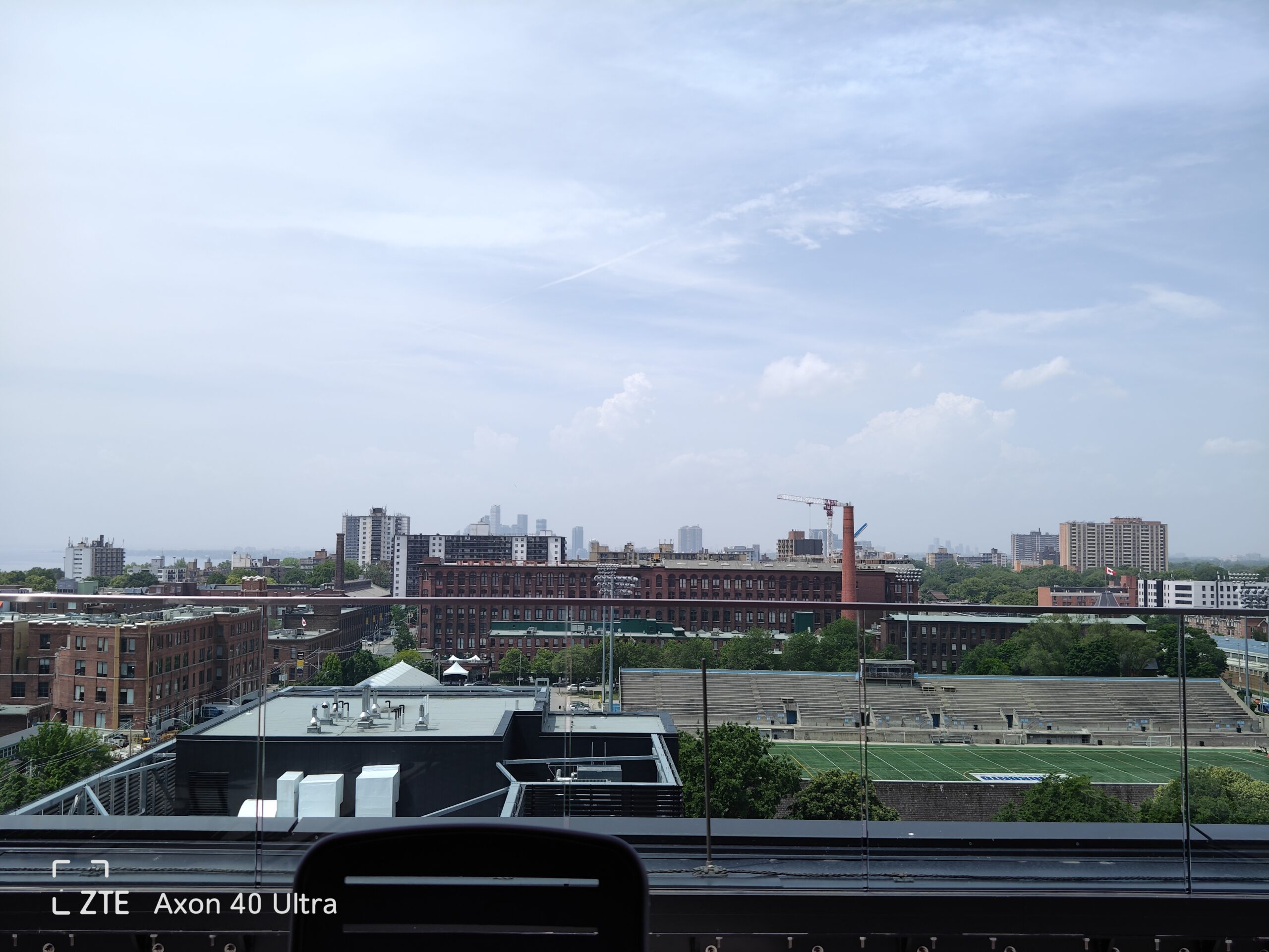
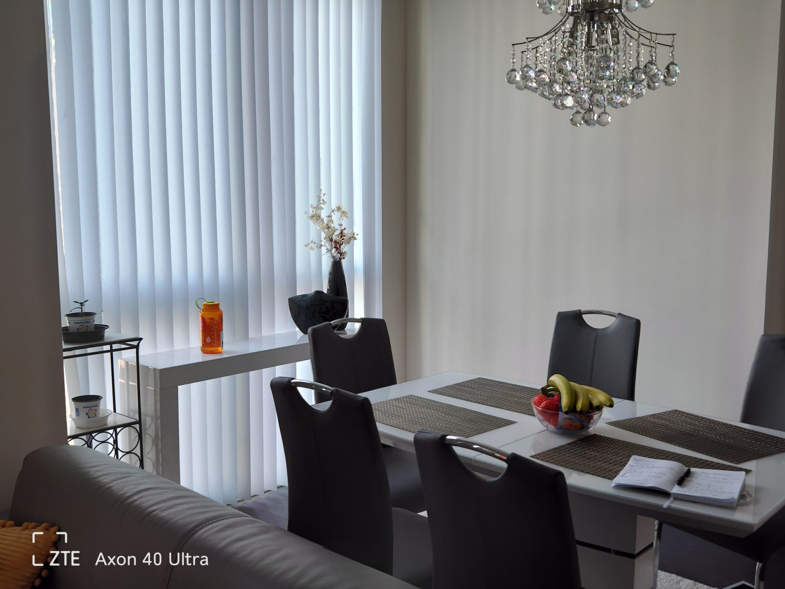
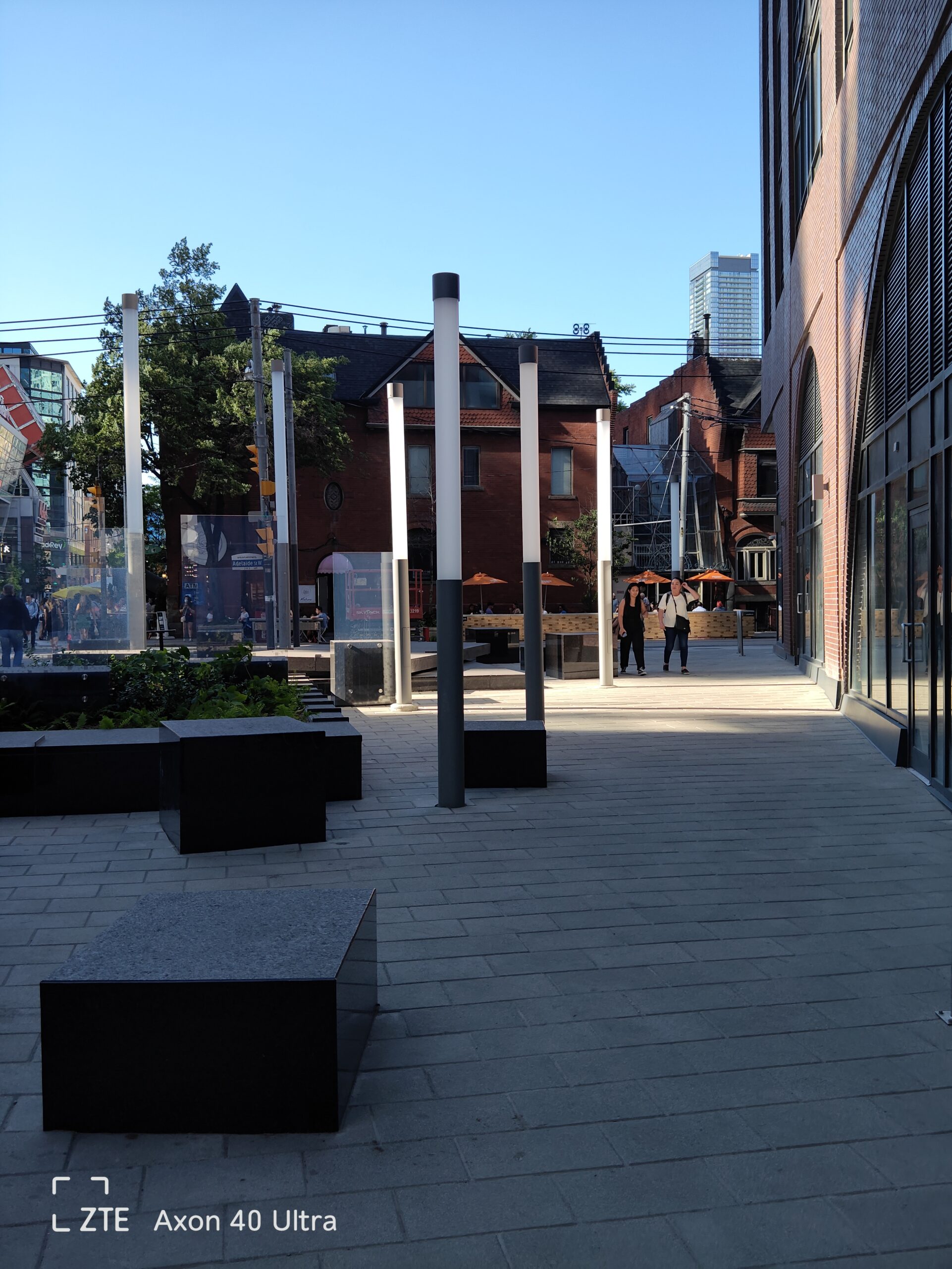
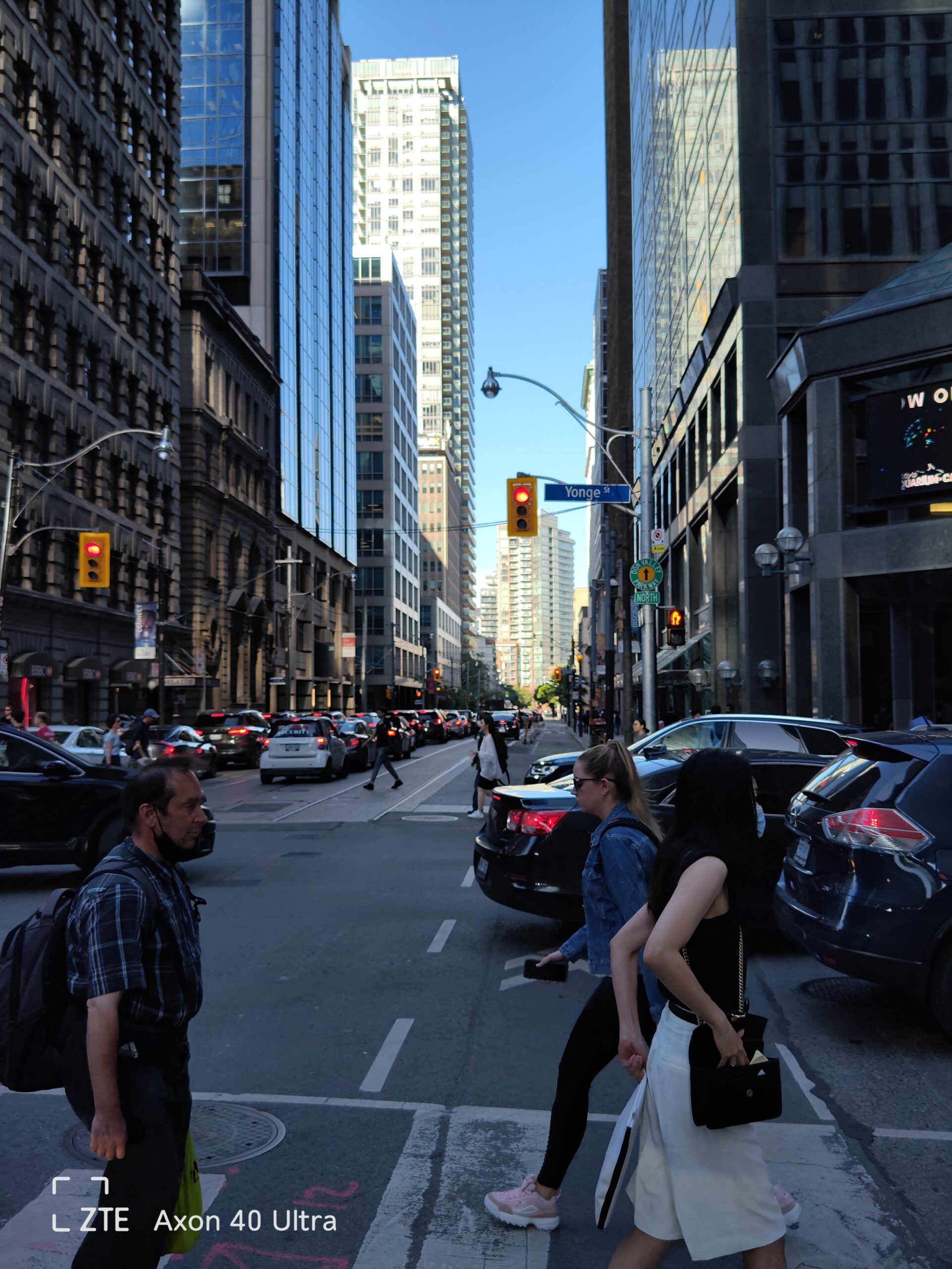
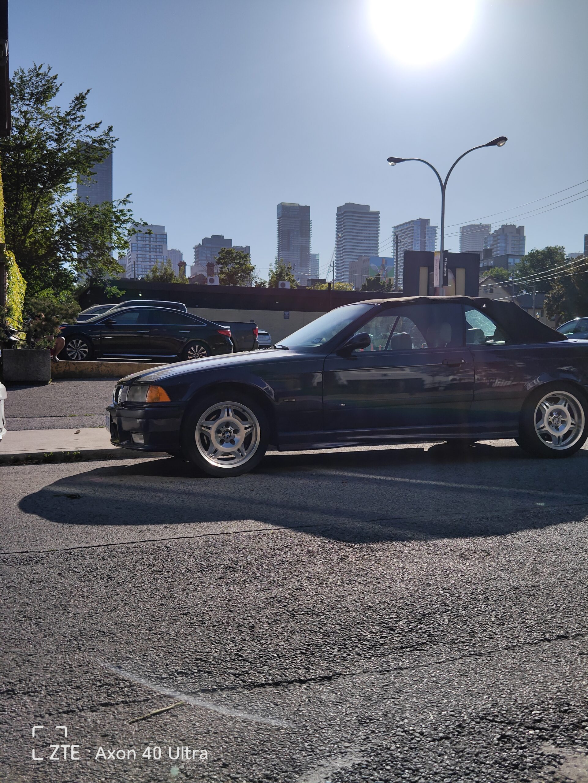
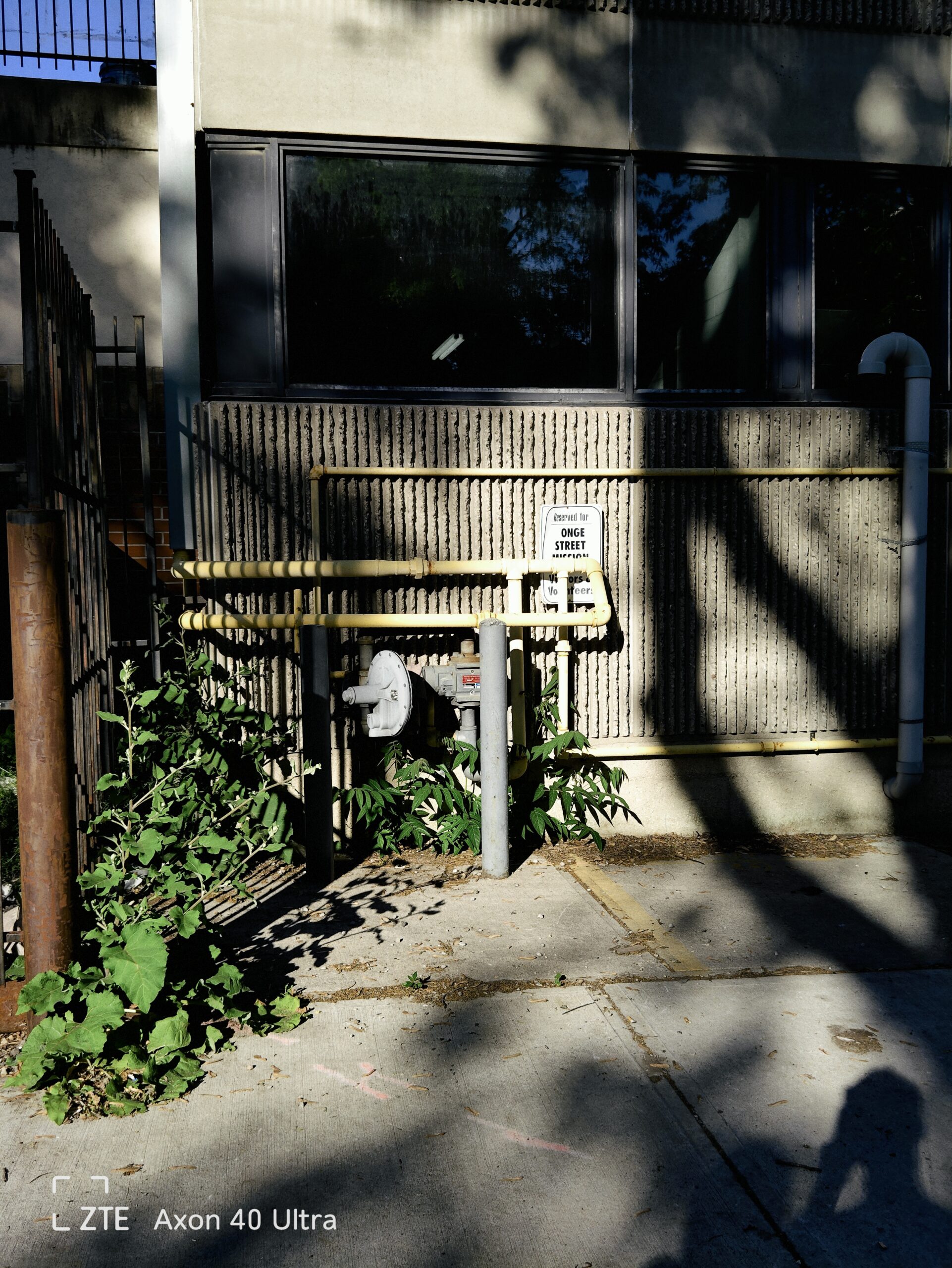
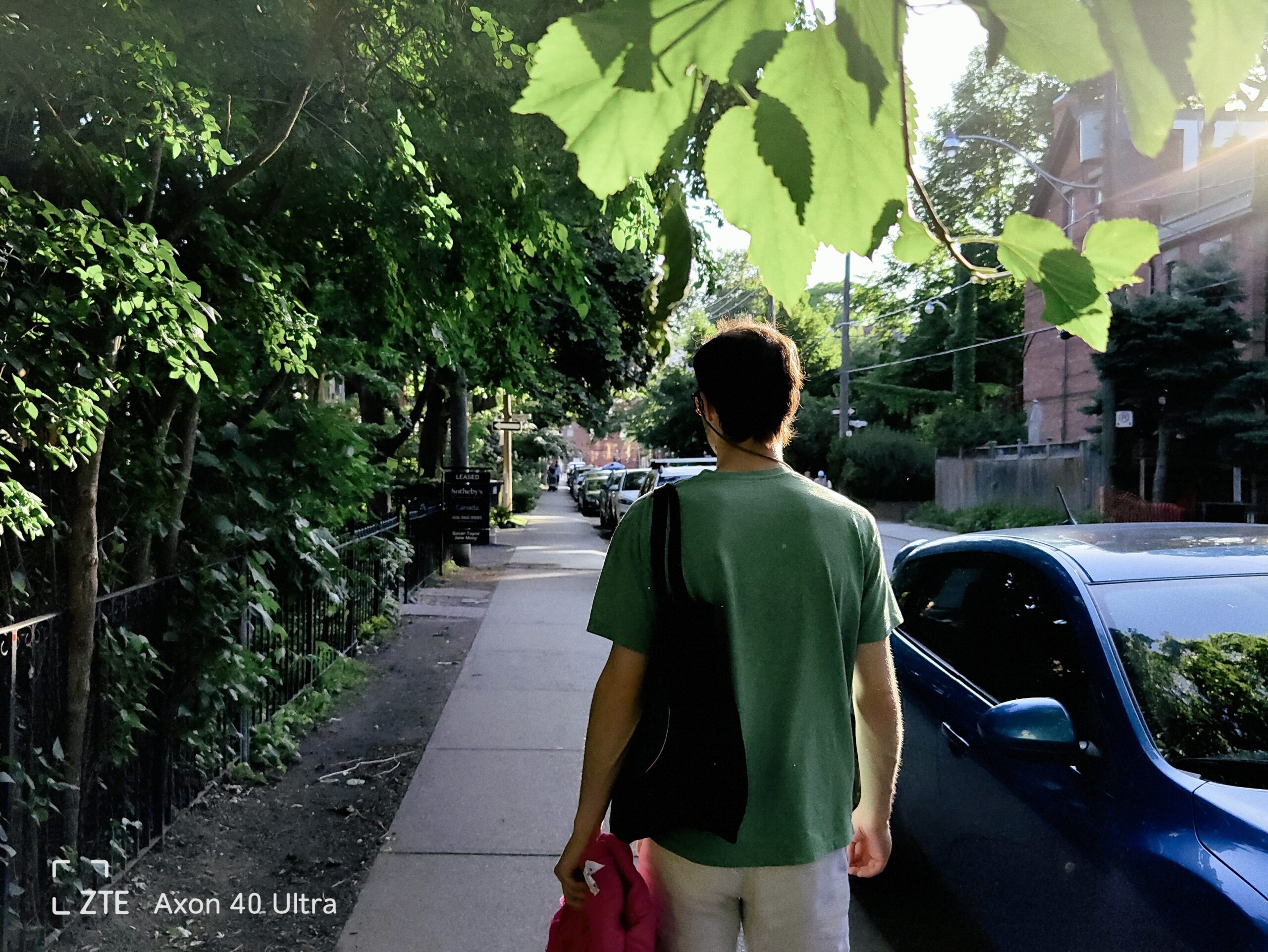
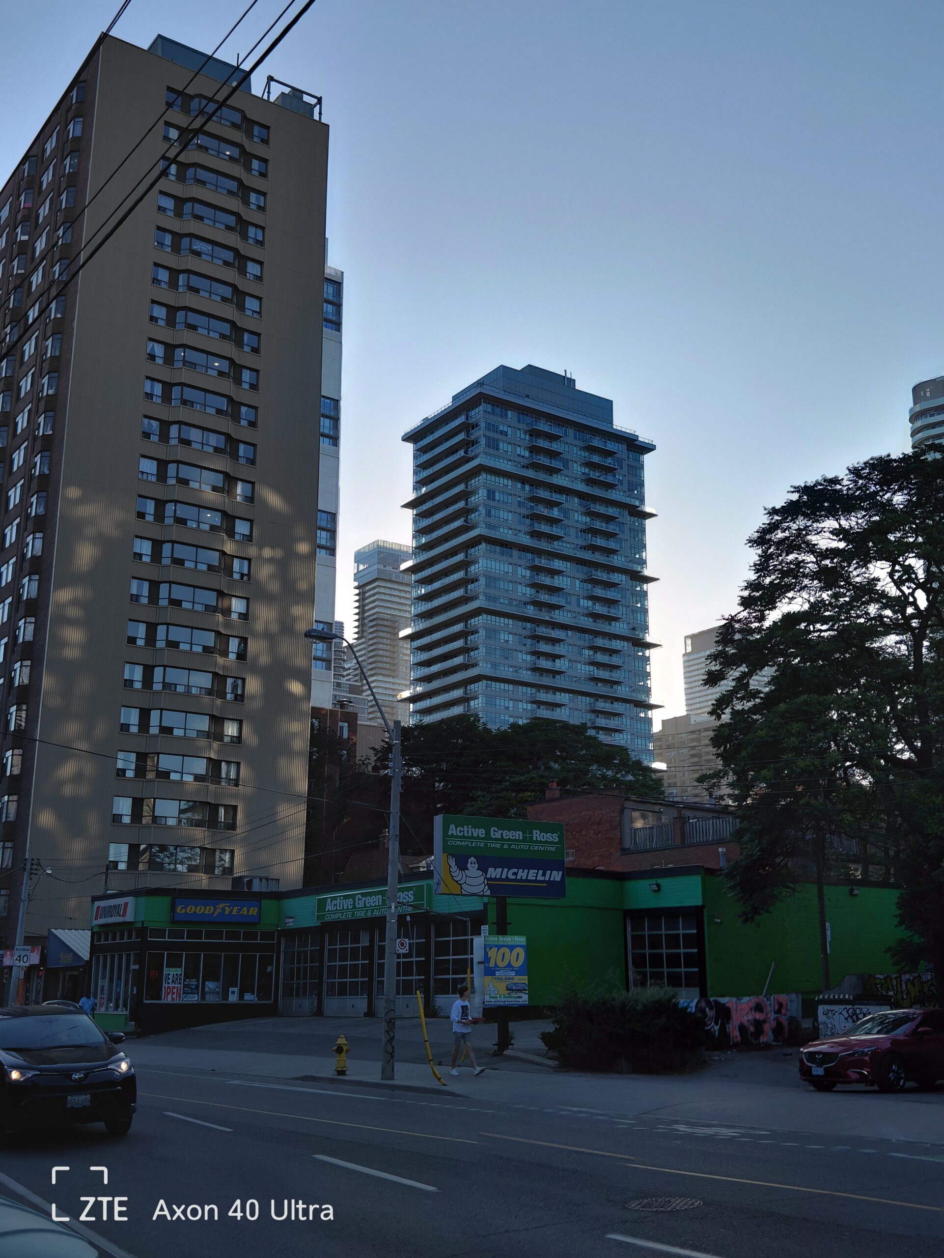
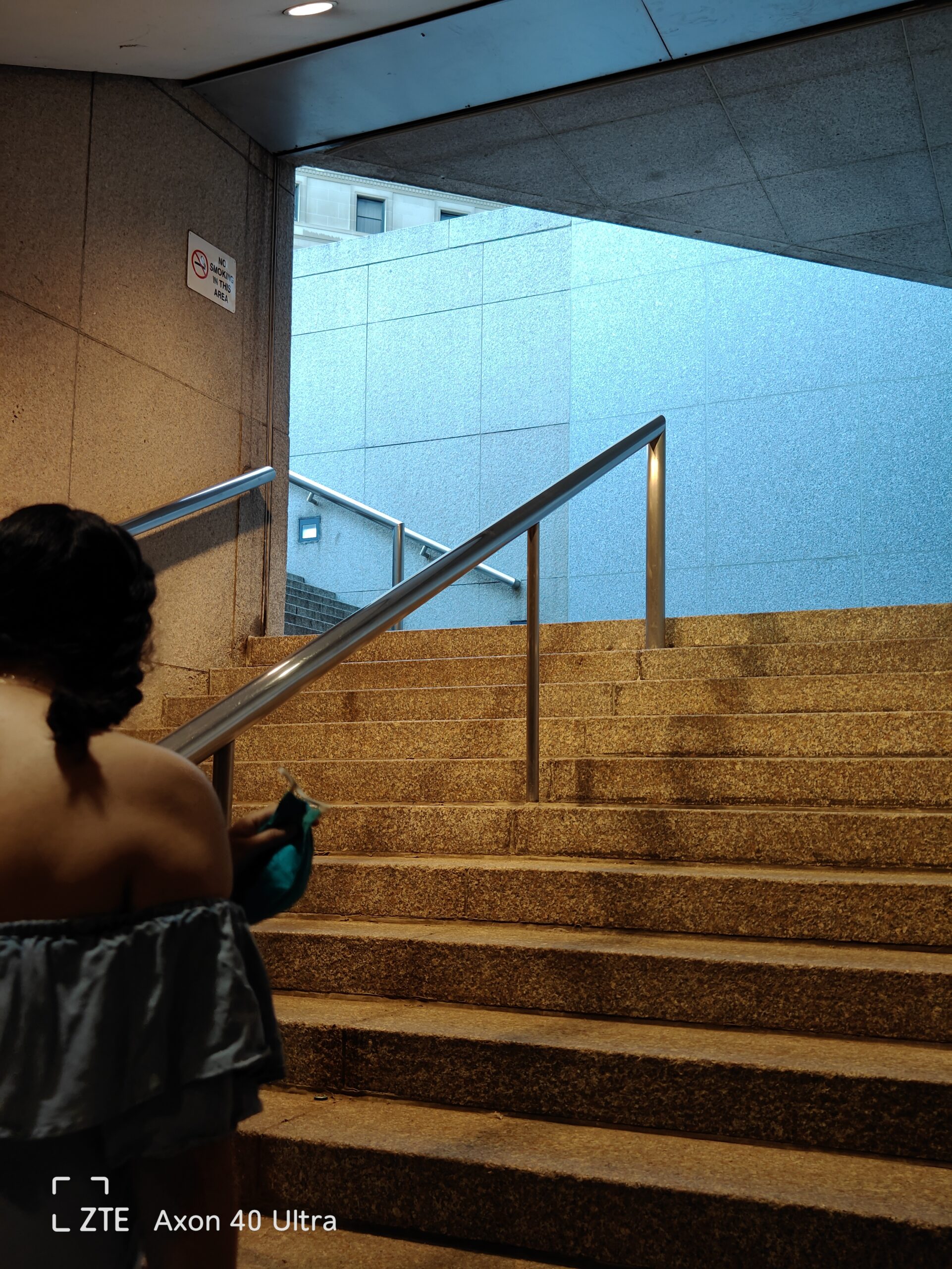
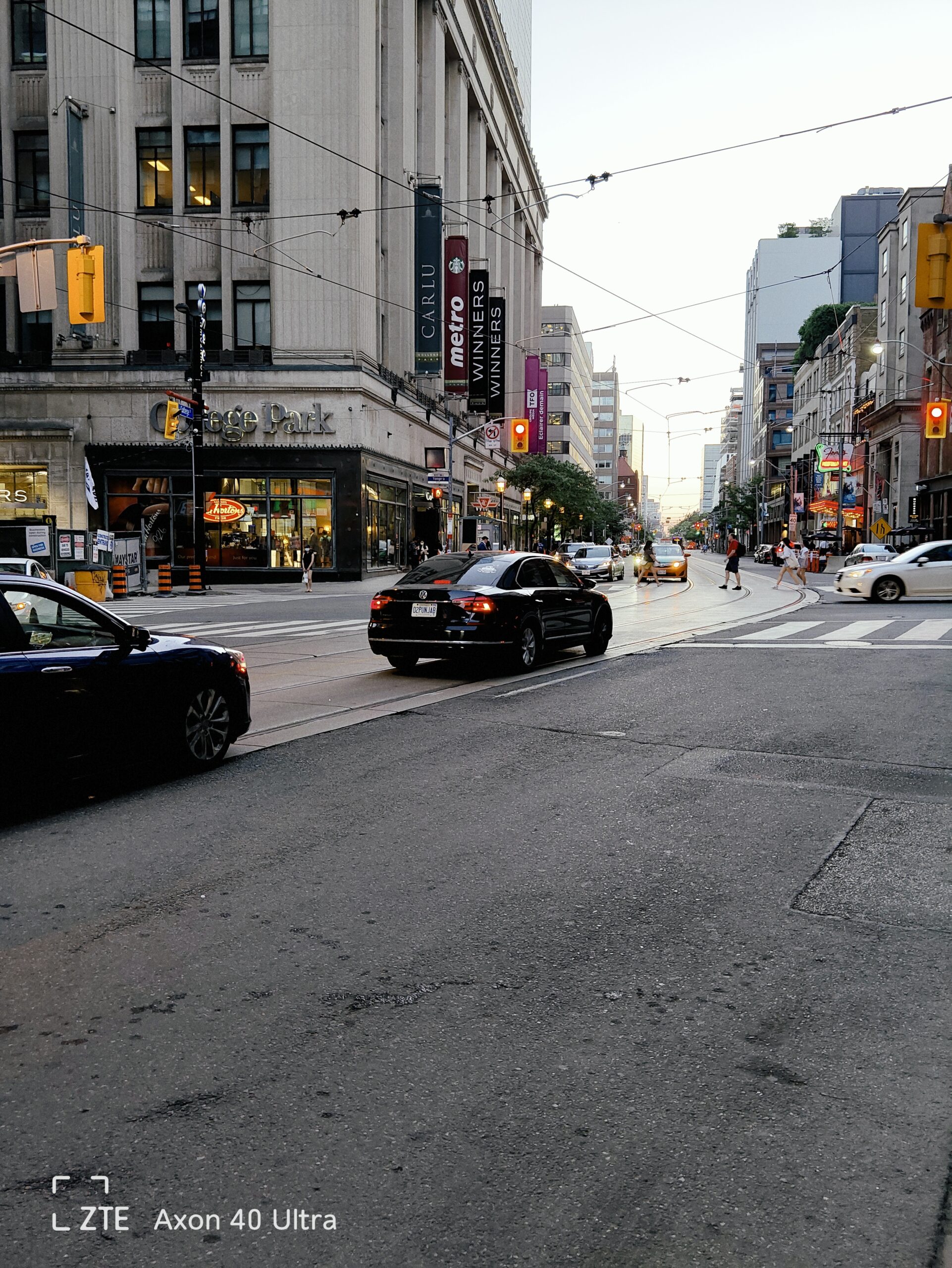
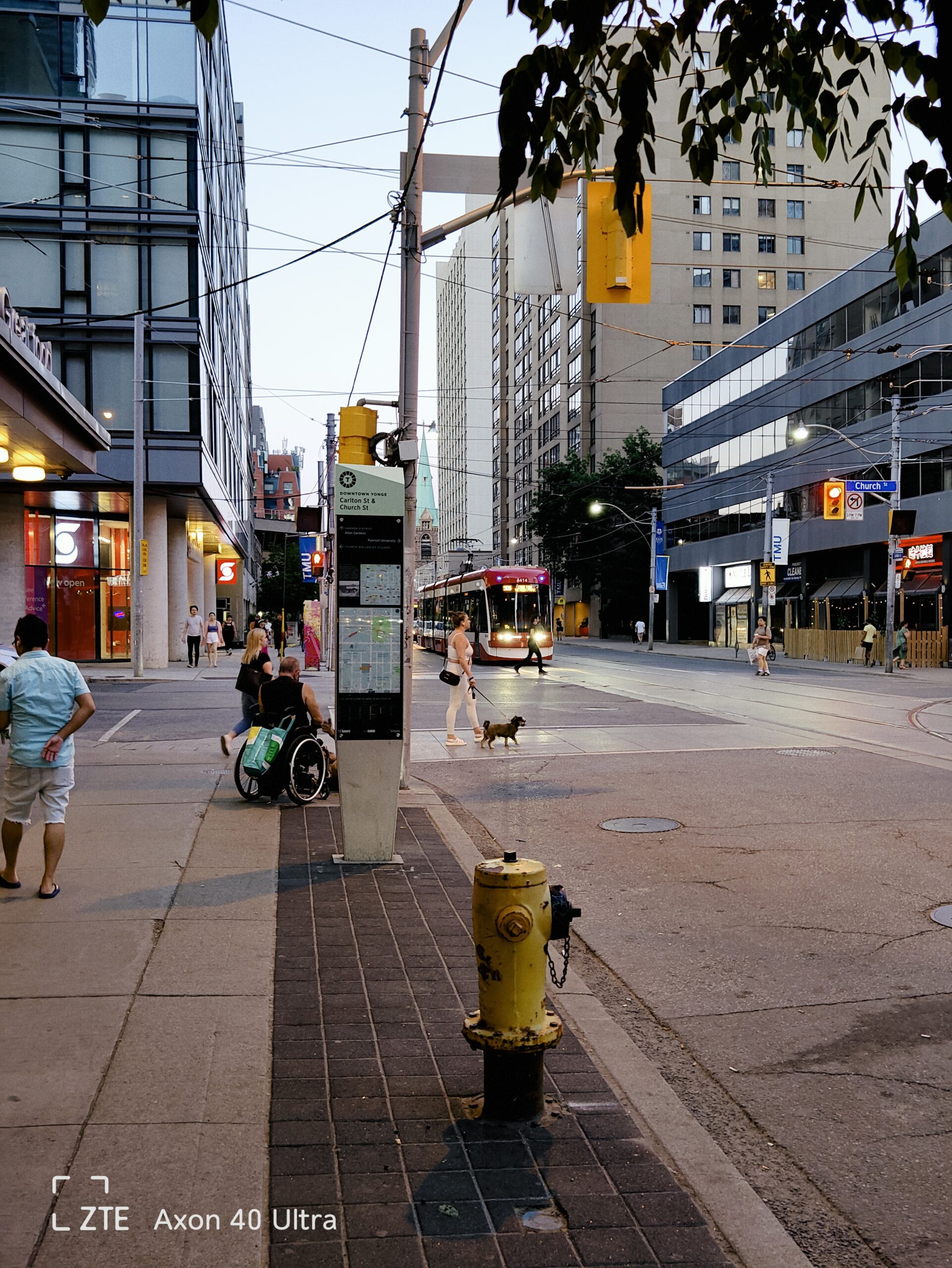
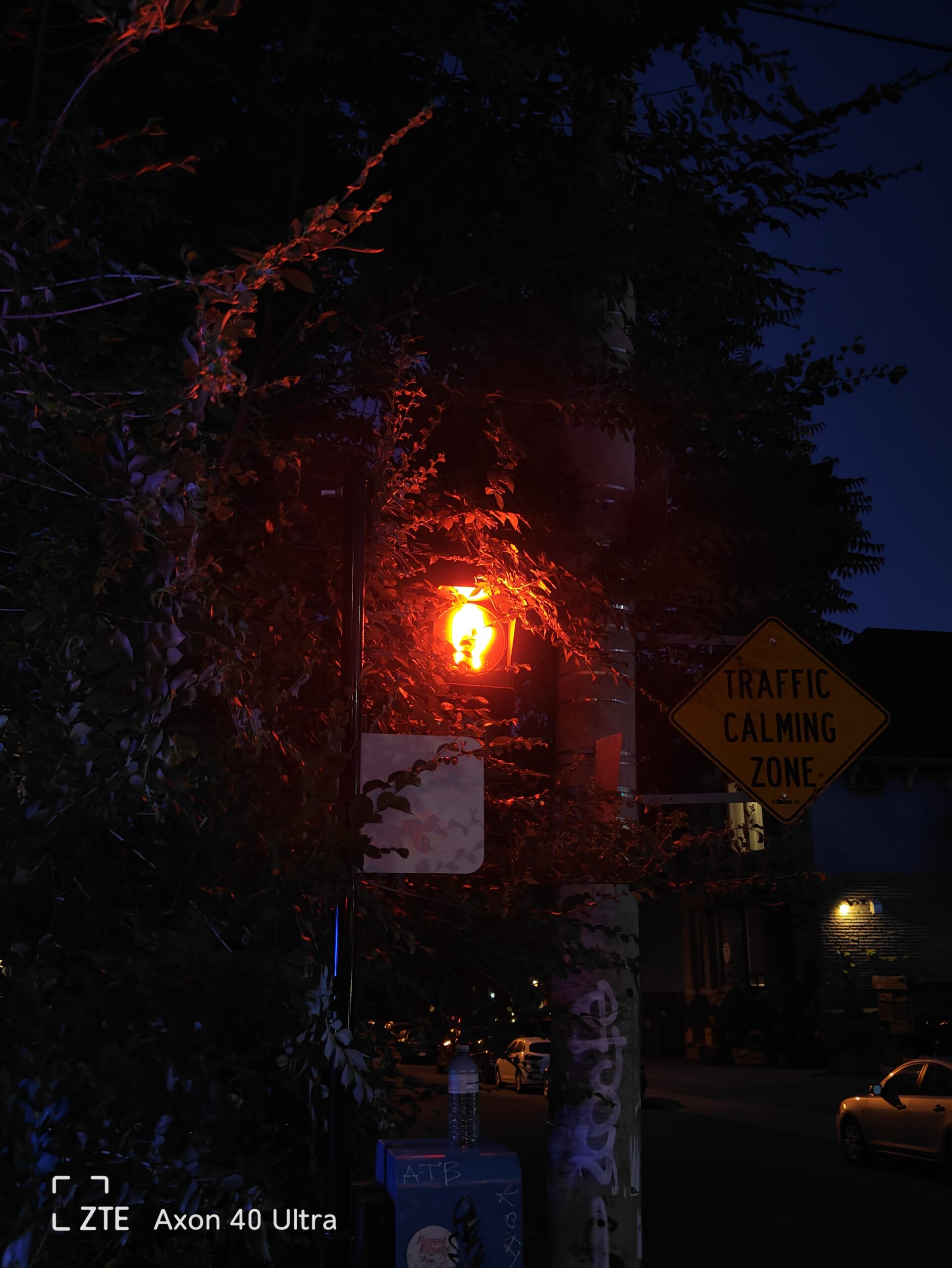
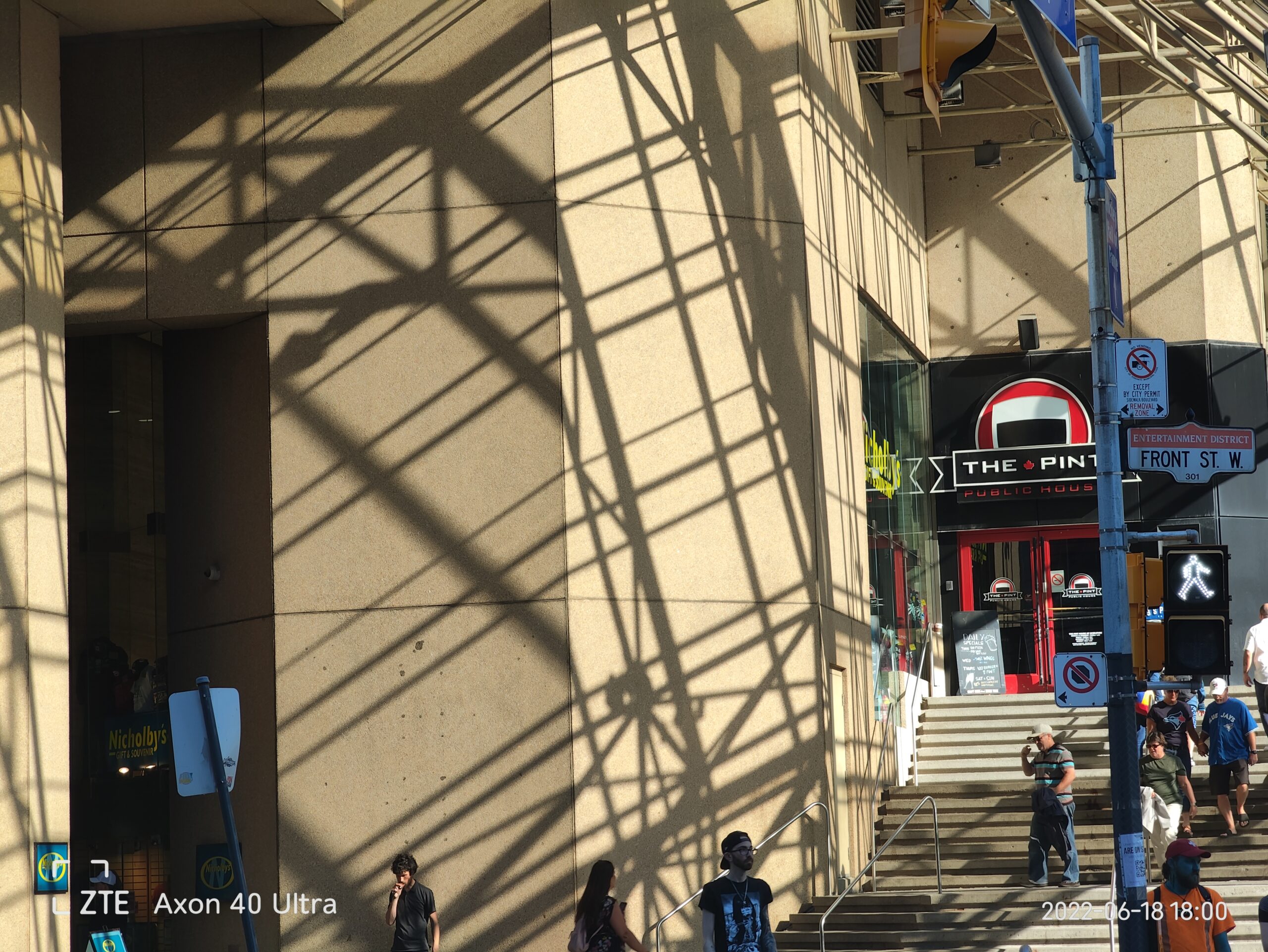
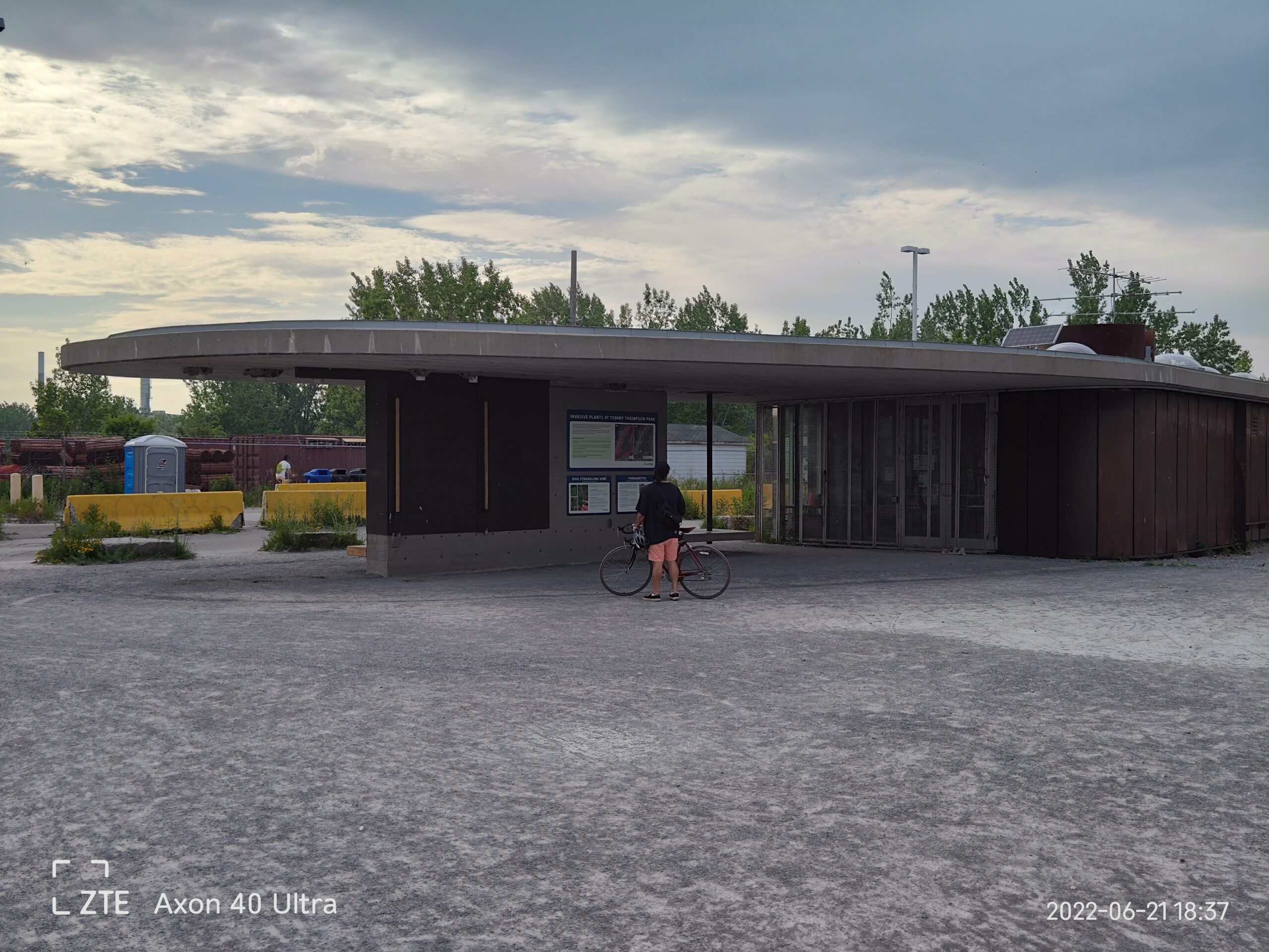
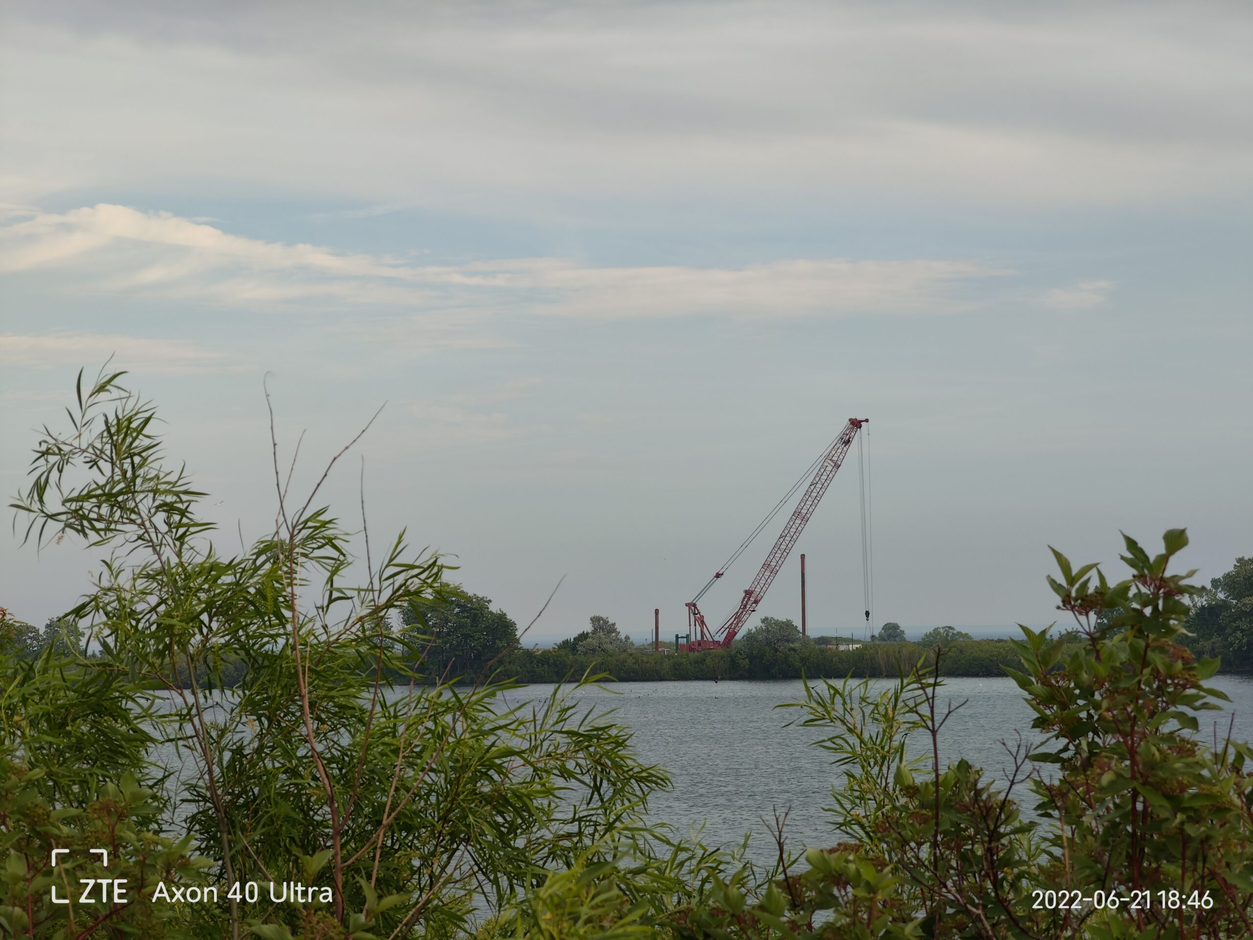
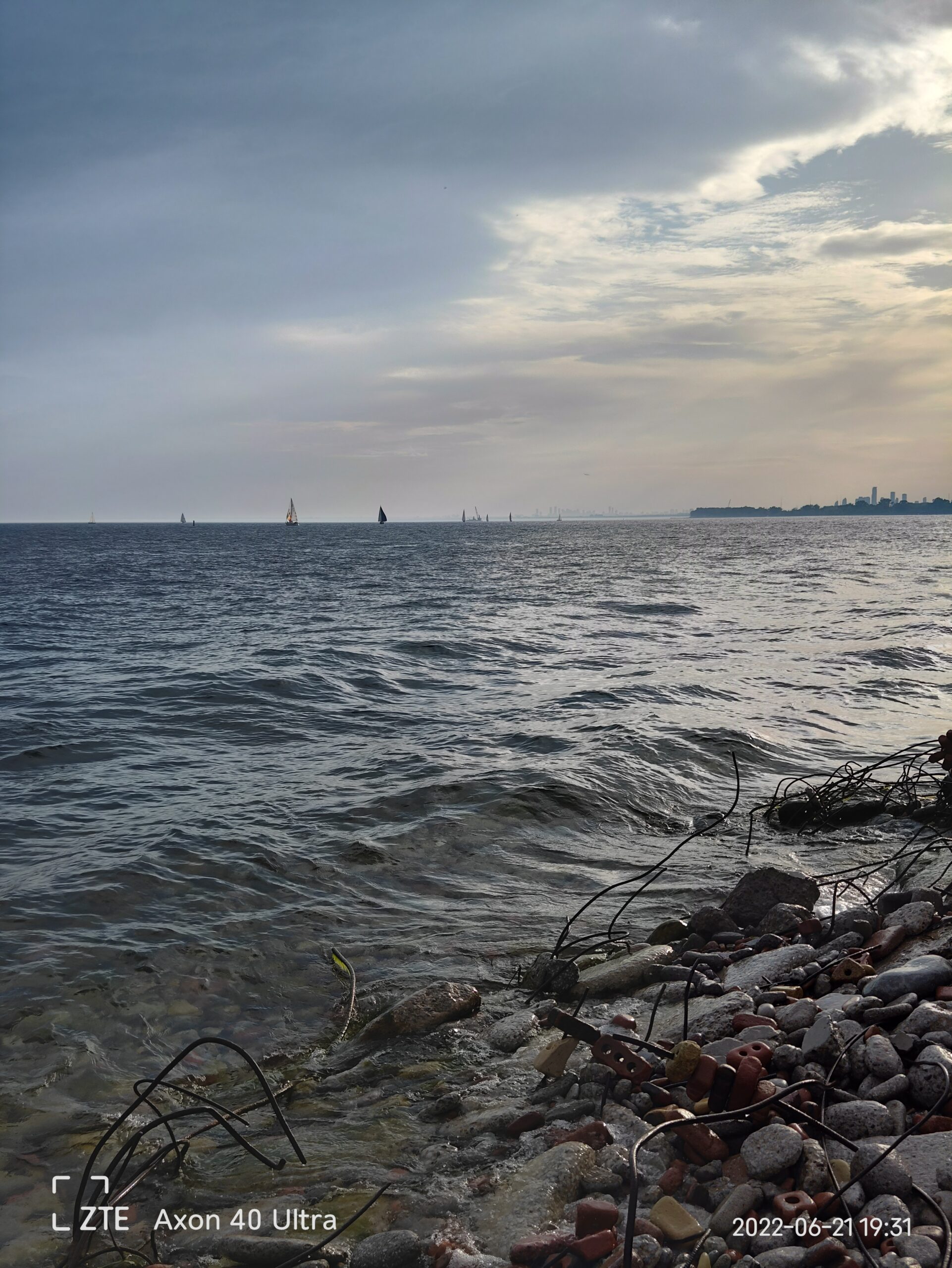
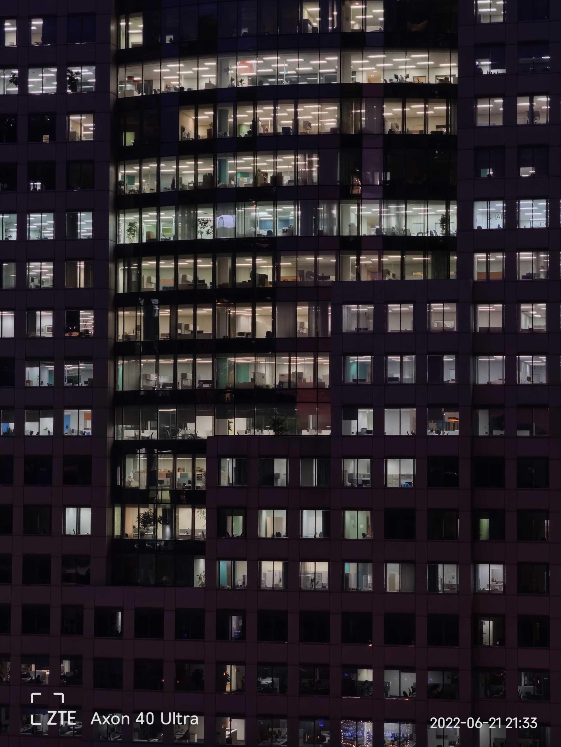
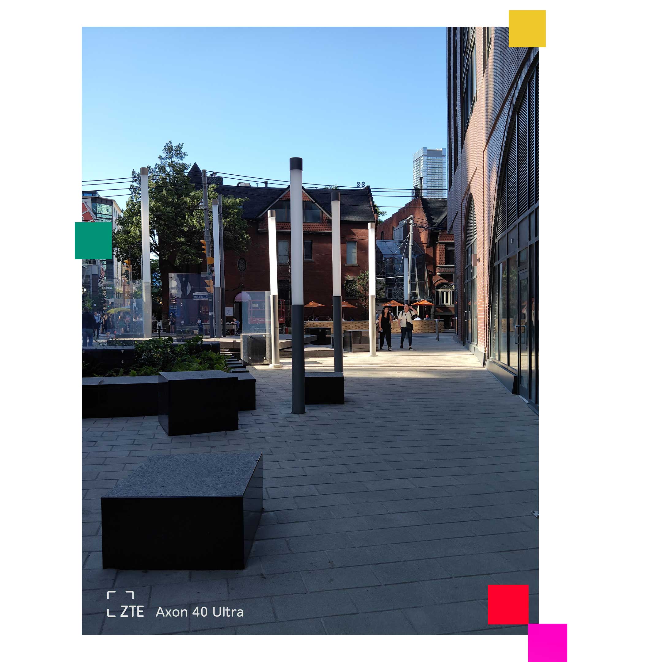
Regardless of the above issues, I still used the Axon 40 Ultra for a few days and took some great photos with it. The phone is interesting since it uses the new custom Sony IMX787 sensor attached to a 35mm equivalent lens. Most smartphones range somewhere from 23-26mm for their primary cameras, so the extra bit of zoom on the ZTE Axon 40 has been unique to shoot with.
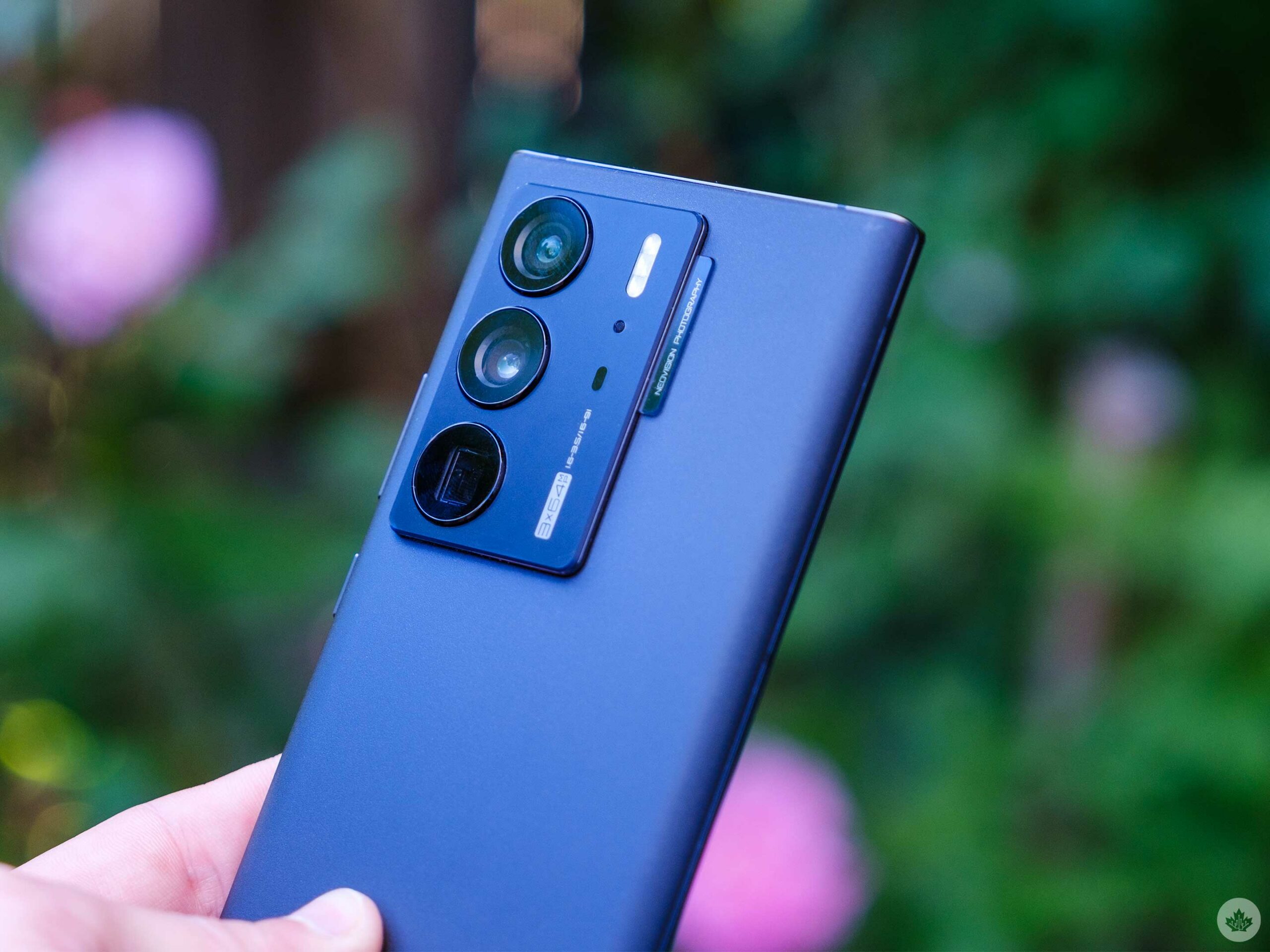
The Ultrawide lens has a more standard 16mm focal length and uses the same sensor as the primary camera. The telephoto punches into 91mm, but it’s a slightly downgraded sensor. All three sensors can take 64-megapixel images, but they’re binned down to 16-megapixels for sharing.
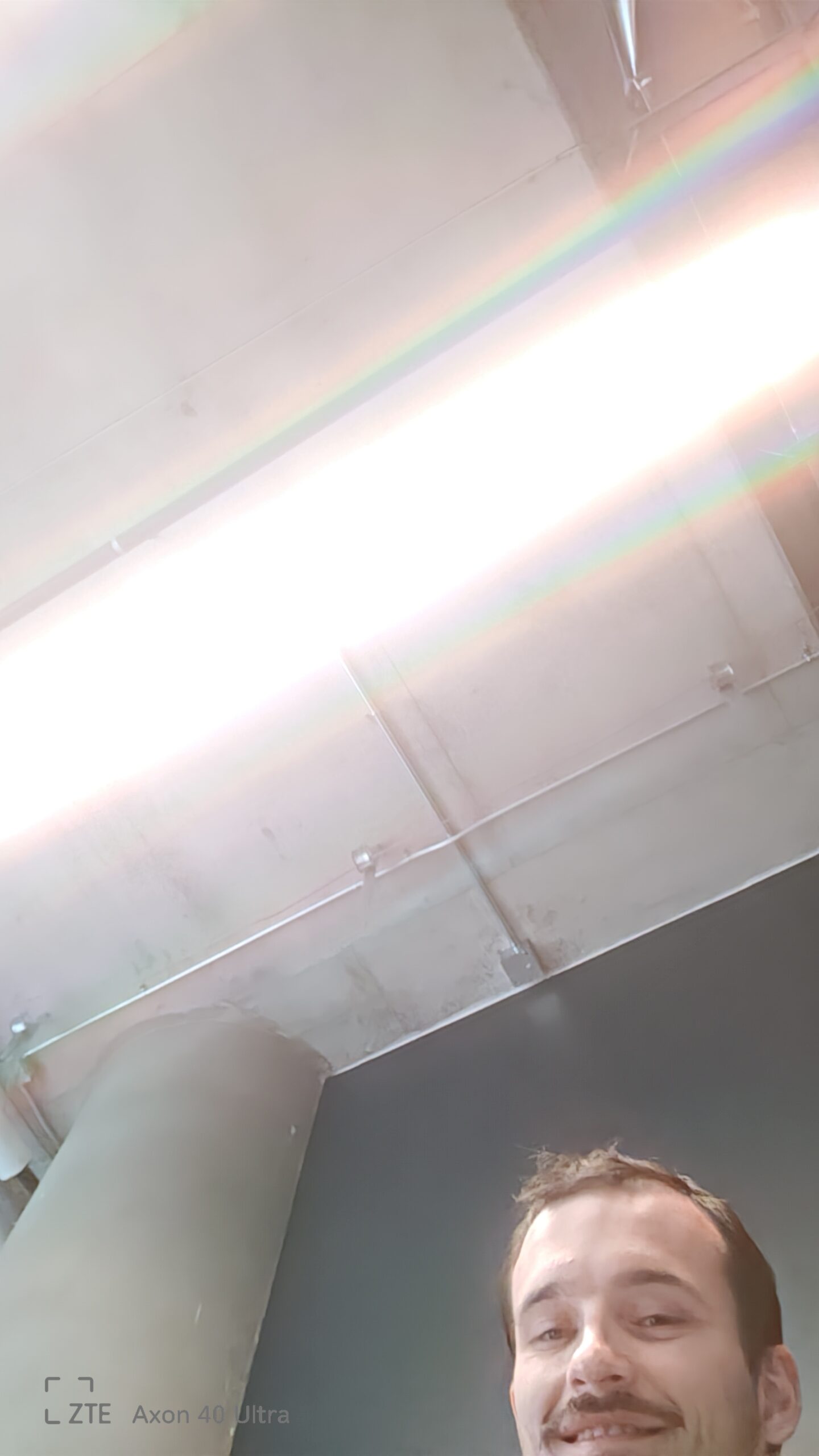
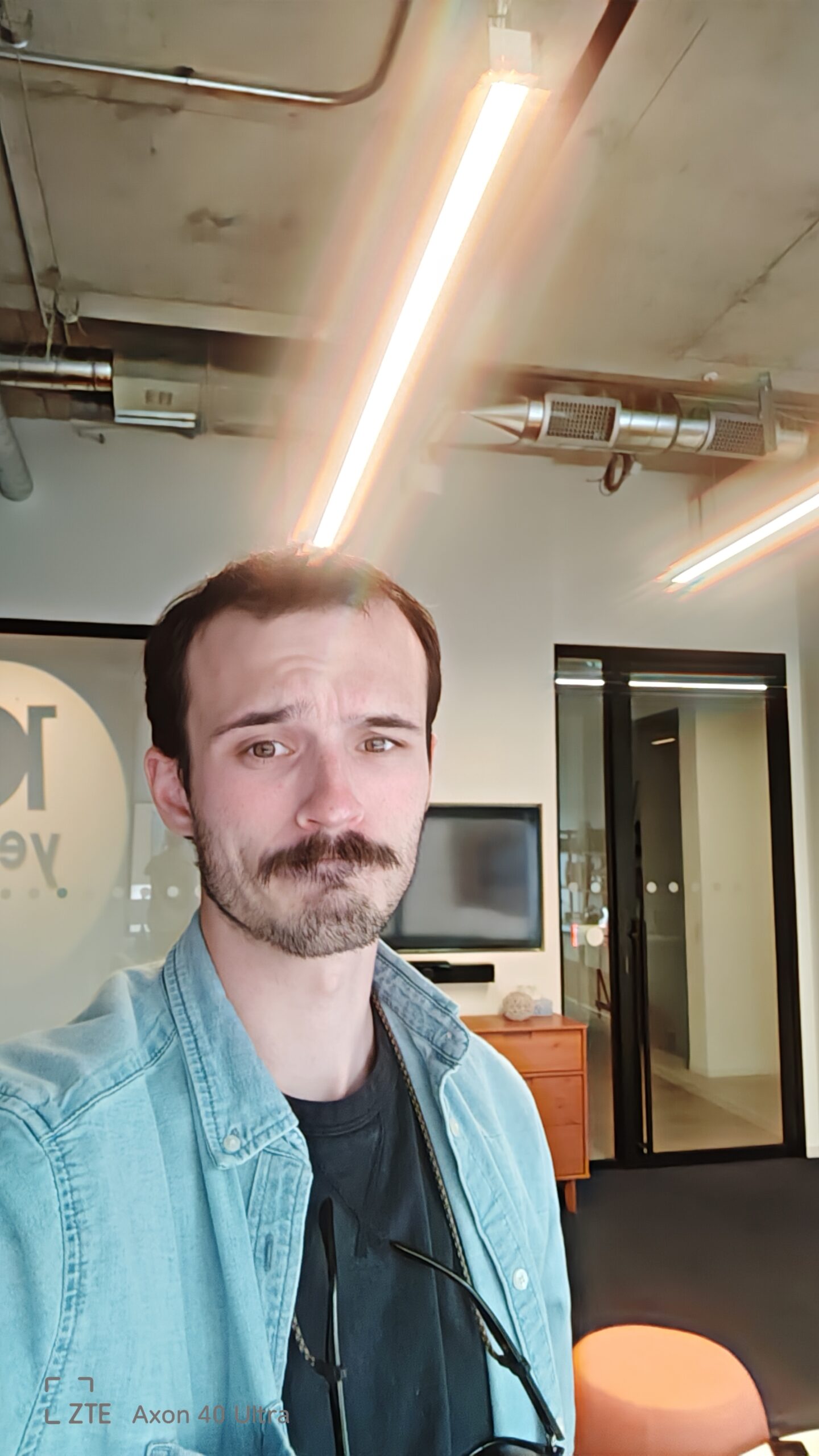
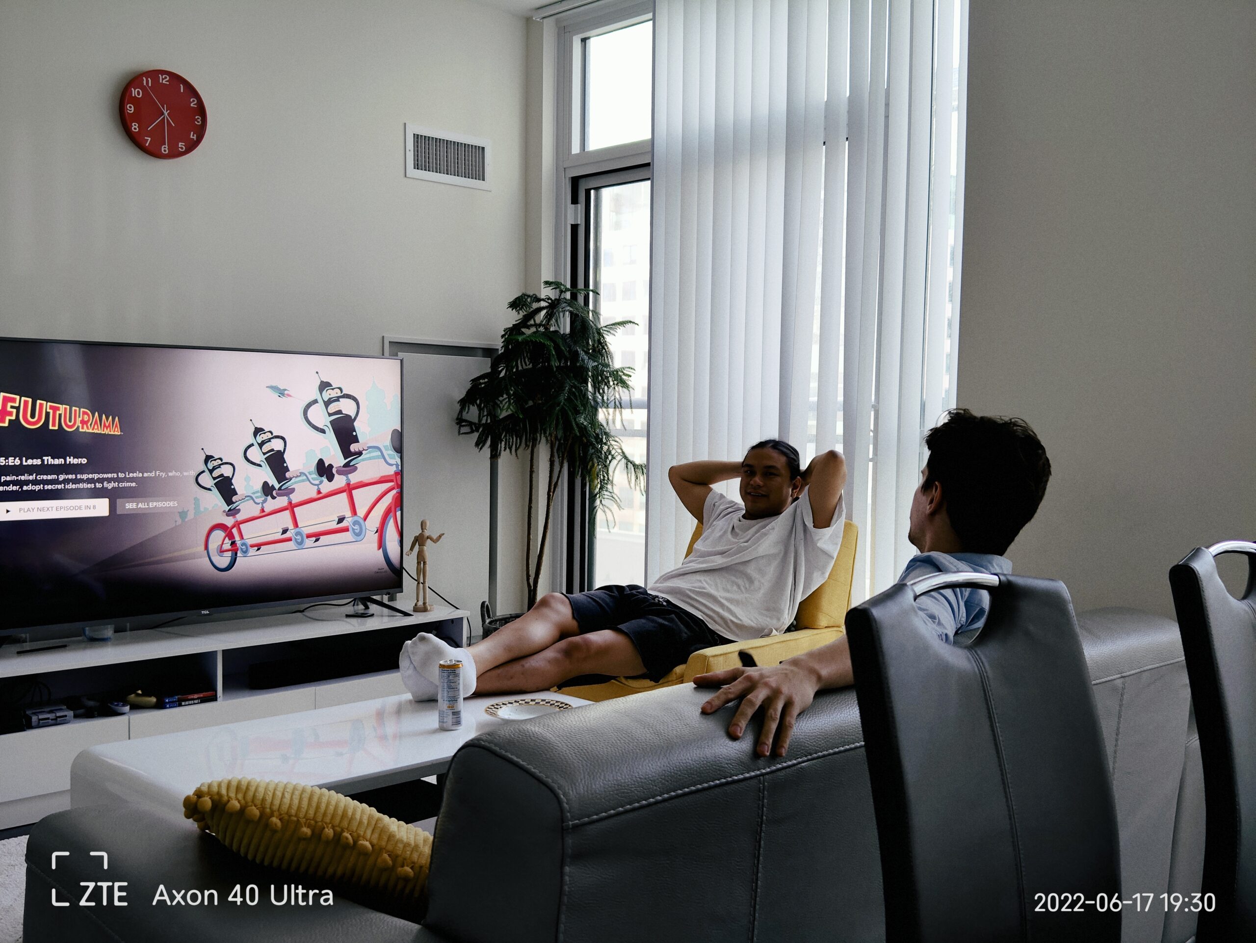
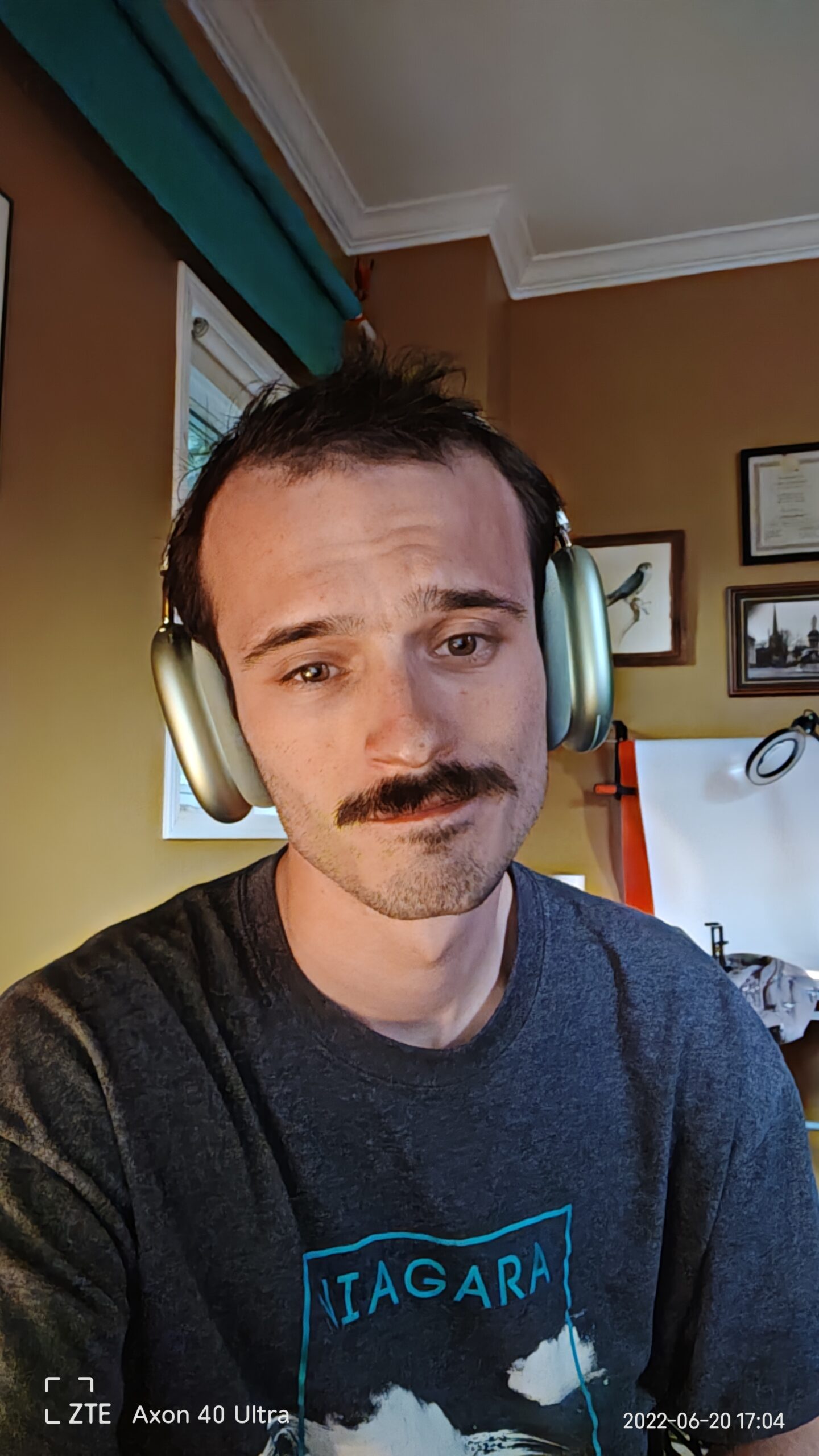
The selfie camera is more hidden than the Axon 30’s, but it’s like using a camera with 10 greasy fingerprints smudged across the lens. Even taking a selfie in my office resulted in insane rainbows being cast from each light. In perfect lighting, the camera is a bit better, but it’s easily the worst selfie camera to come out this year and even worse than last year’s Axon 30. Even with images where it’s not blowing out the highlights, there’s still strange editing going on to keep the photo from overexposing bright spots.
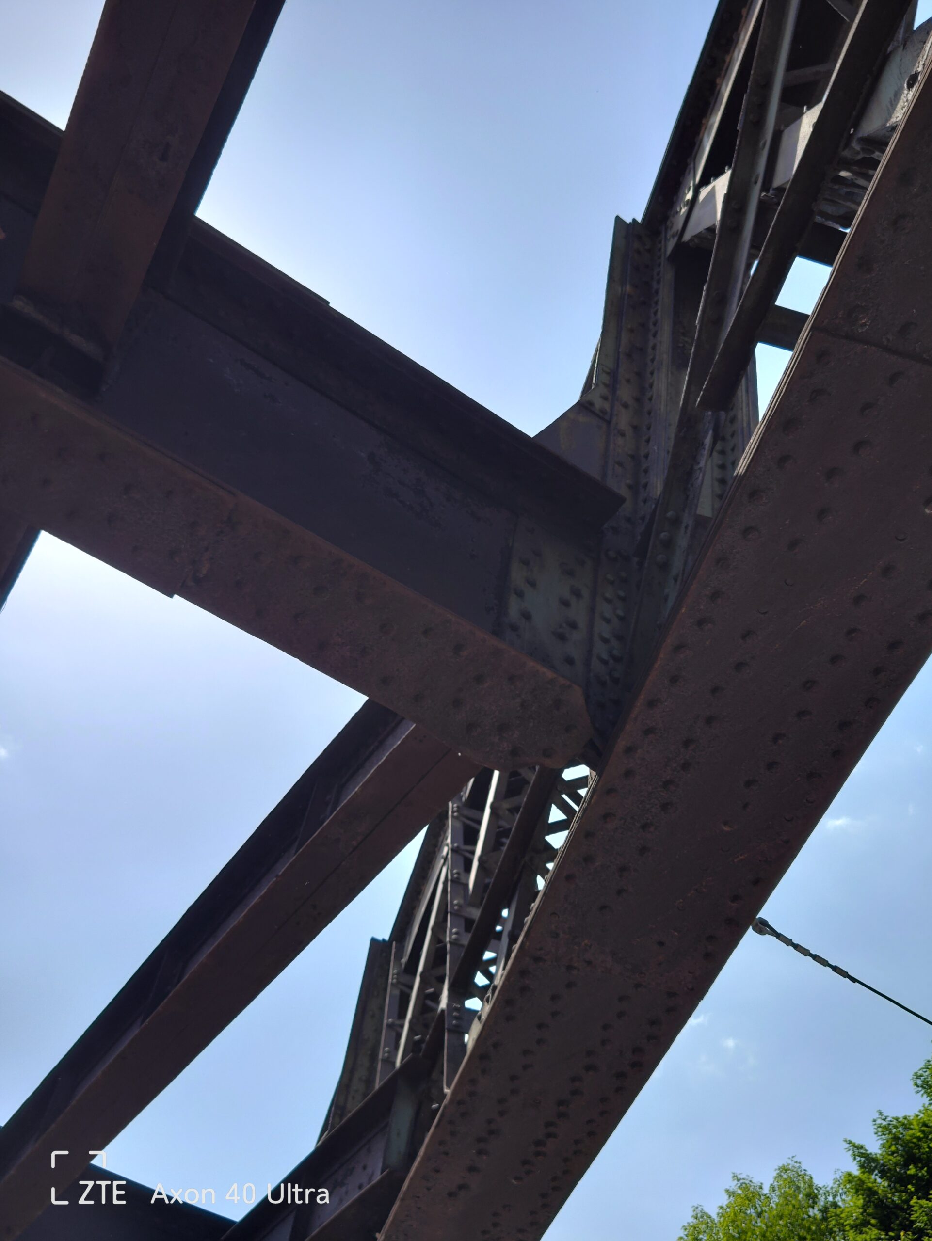
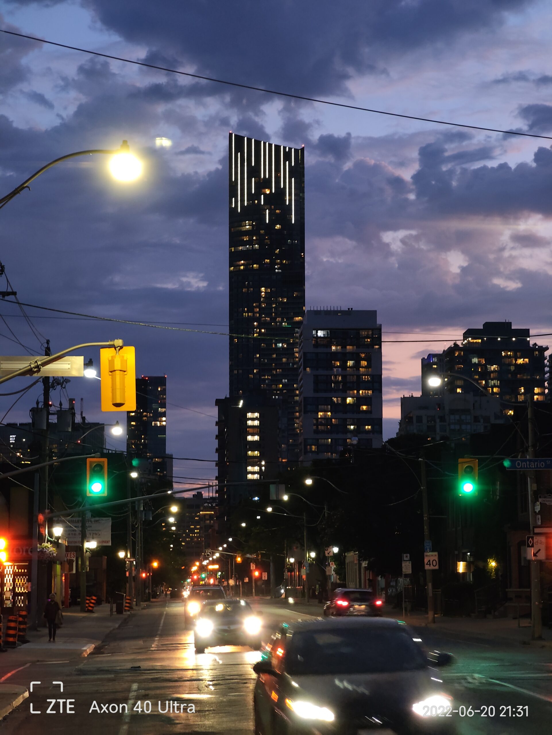
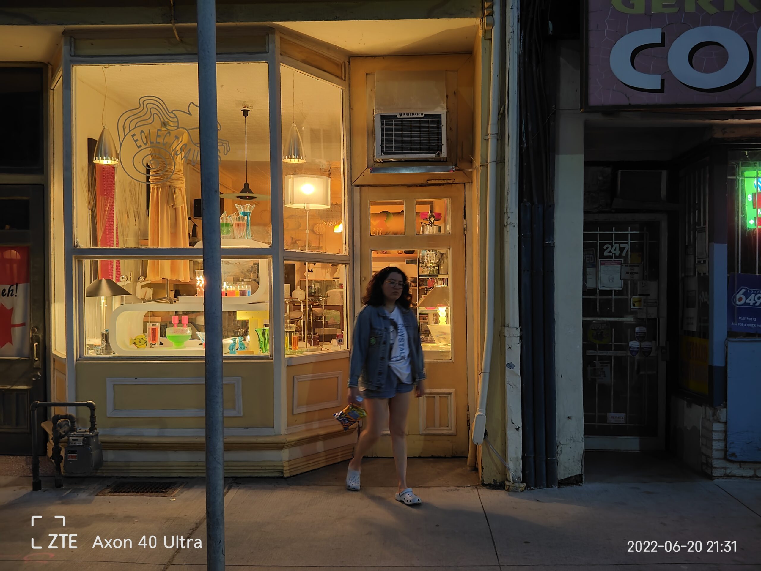
Photos from the primary camera are way better but still don’t offer the contrast or vibrancy I’ve come to expect from other smartphones. That said, since the Axon 40 Ultra utilizes a 35mm focal length, it captures an excellent amount of depth and blur to help make images more isolated, which helps make subjects pop more.
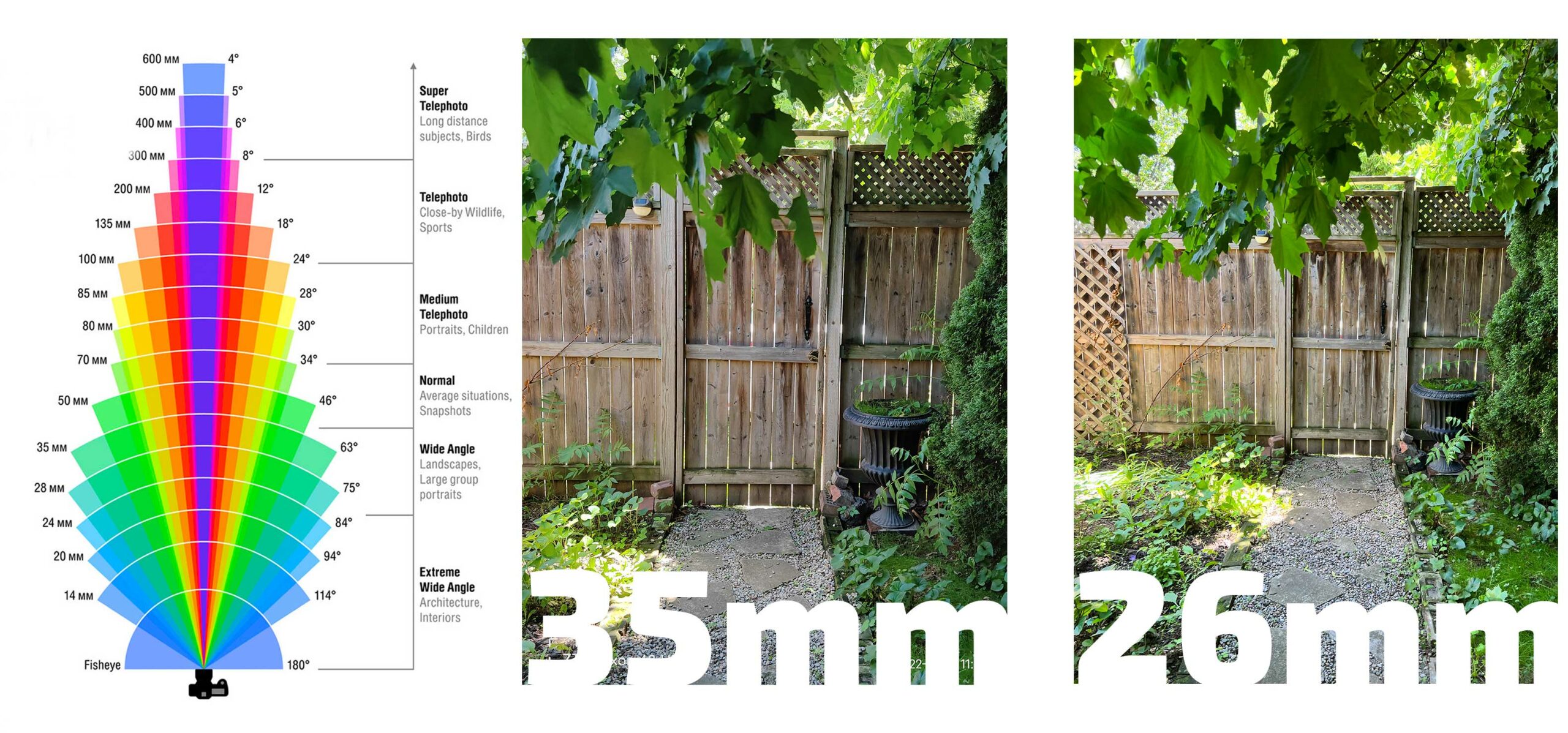
The 35mm example is from ZTE Axon 30 Ultra, and the 26mm example is from the iPhone 13 Pro. (Image credit: Vector Stock)
Most smartphone cameras shoot at around 23-26mm, which is considered near the widest angle for a standard lens before you start to encroach on ultra-wide territory. Thirty-five millimetres, by contrast, is the narrowest field of view to be still classified as a wide lens, but it offers more isolation and focus, which I’m fond of. I’d like to see OnePlus or even Apple adopt a slightly longer main lens in the future since this one is so much fun. Now that the quality of many ultra-wide cameras is on par with the primary lens, I think this is a smart compromise.
Speaking of that, the 16mm equivalent ultra-wide on the Axon 40 Ultra is sharp but delivers photos with poor contrast like the main lens. That said it doesn’t have terrible distortion and can look fine after a simple edit. The telephoto lens punches in all the way to 91mm which is fun, but it’s not a particularly stunning image sensor. However, it’s a nice length and is totally usable.
I would have liked to take RAW photos right from the main camera interface like I can on the Pixel 6 but on the Axon 40 Ultra you need to navigate into Pro mode to use this feature.
A fun ‘Street mode’ also gives photographers access to filters based on film stocks, a grain switch, manual focus and beauty filters right from the camera interface. This mode is fun, but there’s no way to set it as the default, which would have been a nice touch.
This phone feels like a prototype
Every year it feels increasingly strange that ZTE continues to try to compete at the near flagship level. Its OS is getting better, but it’s still incomplete and filled with random software instead of a smooth experience.
Considering the battery issues I faced last year, I wasn’t expecting great hardware this year, but the Axon 40 Ultra feels great in my hand. The screen could be better, but overall it’s passable.
The camera is pretty fun, and I love that 35mm focal length for photography. I’d like to see more companies adopt something similar in the future. The under-display camera, on the other hand, is terrible and ZTE should probably give that up.
You can pre-order the phone from ZTE for $799 USD (roughly $1,000 CAD).
MobileSyrup may earn a commission from purchases made via our links, which helps fund the journalism we provide free on our website. These links do not influence our editorial content. Support us here.

