Amazon is rolling out a new user interface for Prime Video. At long last, it seems the tech giant aims to clean up the interface and provide a better experience for Prime Video subscribers.
Prime Video offers an extensive library. However, Amazon mixes much of the included catalogue of shows and movies with content that requires additional payments or subscriptions. It often becomes difficult to find a movie offered through Prime Video versus one available via premium video-on-demand (PVOD).
With this in mind, Amazon is rolling out a new user interface to help solve this issue. Subscribers of the service will begin to see a newly redesigned experience on their devices. The updated interface will first come to Prime Video on living room and Android devices later this summer, available to all Prime customers worldwide. Following the successful release on the aforementioned devices, the new interface will arrive on desktop and iOS.
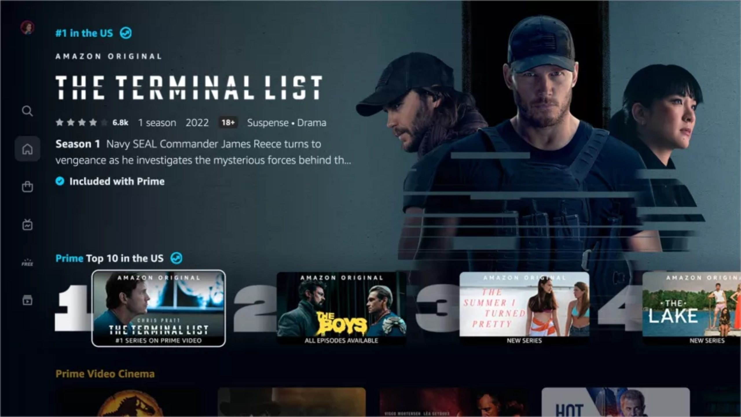
It appears as though Amazon is taking a page out of the book of Netflix. The redesigned Prime Video app will soon offer a more simplified side menu. This will include options to navigate between Home, Store, Find, Live TV, Free with Ads and My Stuff pages. Each provides its own catalogue of content.

For instance, if you’re hoping to rent Spider-Man: No Way Home, you’d merely have to navigate to the Store page and purchase the rental. Alternatively, once The Lord of the Rings: Rings of Power is available, it can be found via the Prime Amazon Originals sub-menu on the Home page.
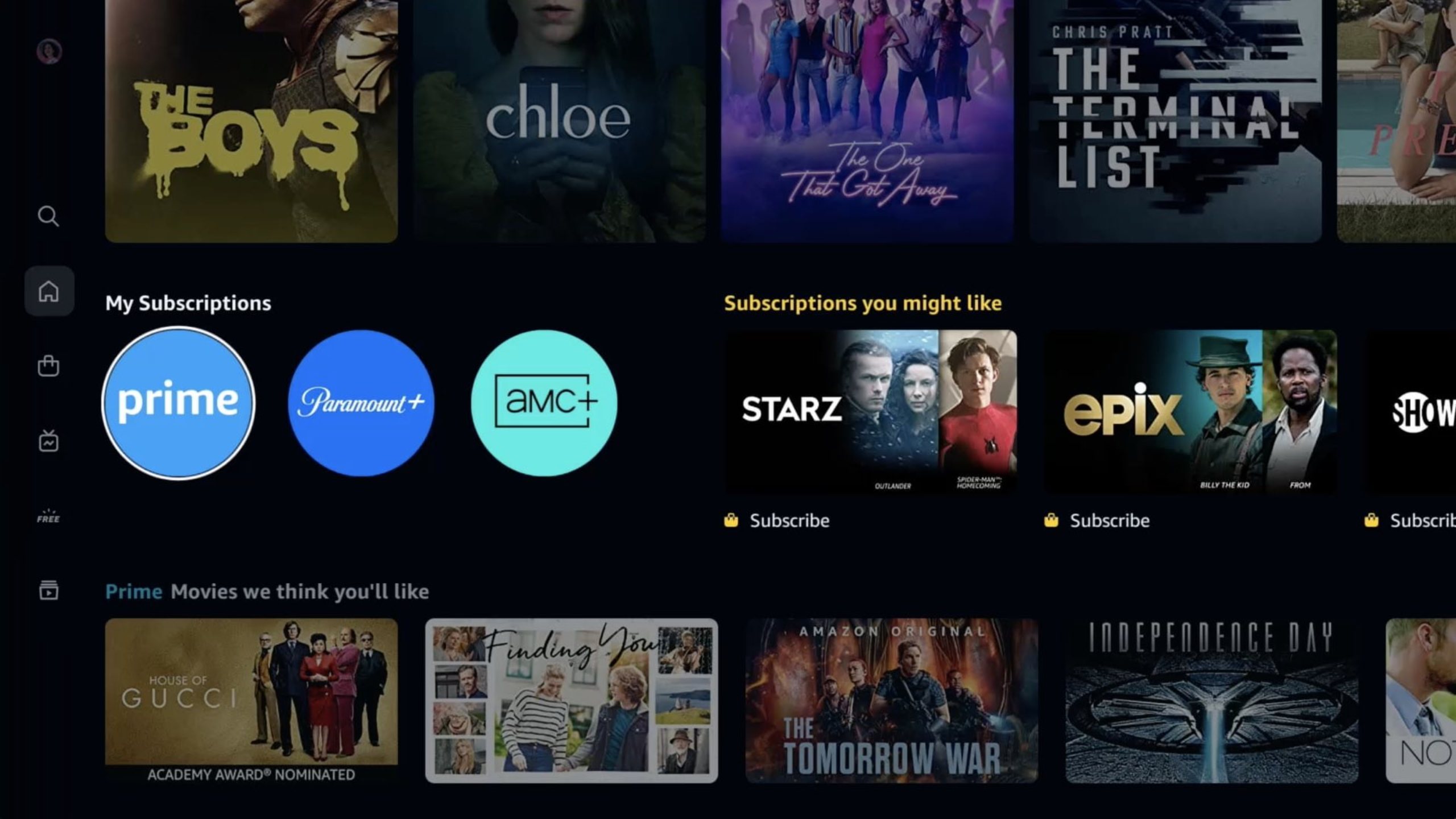
A big part of this new change is to help identify which piece of content is available via the Prime Video subscription and what isn’t. Pieces of content such as The Terminal List, another Amazon Original, have a blue checkmark next to them. Shows, movies, etc. that are available to rent or buy will have a shopping bag icon next to them.
Plus, Amazon is including a Top 10 Chart, mimicking Netflix. This will showcase the top 10 ranked titles at the time. Much like Netflix, this list will likely rotate each week, though that remains unclear.
Overall, this should help clean up the matter of what is included with a Prime Video subscription and what comes as an add-on or additional purchase. With live channel bundles like StackTV and AMC+ on top of PVOD purchases available, a Prime Video UI refresh was long overdue.
Amazon has not clarified when the desktop and iOS updates are due to arrive. Additionally, it’s not clear whether native smart TV apps will be updated.
Image credit: Amazon
Via: TechRadar
MobileSyrup may earn a commission from purchases made via our links, which helps fund the journalism we provide free on our website. These links do not influence our editorial content. Support us here.


