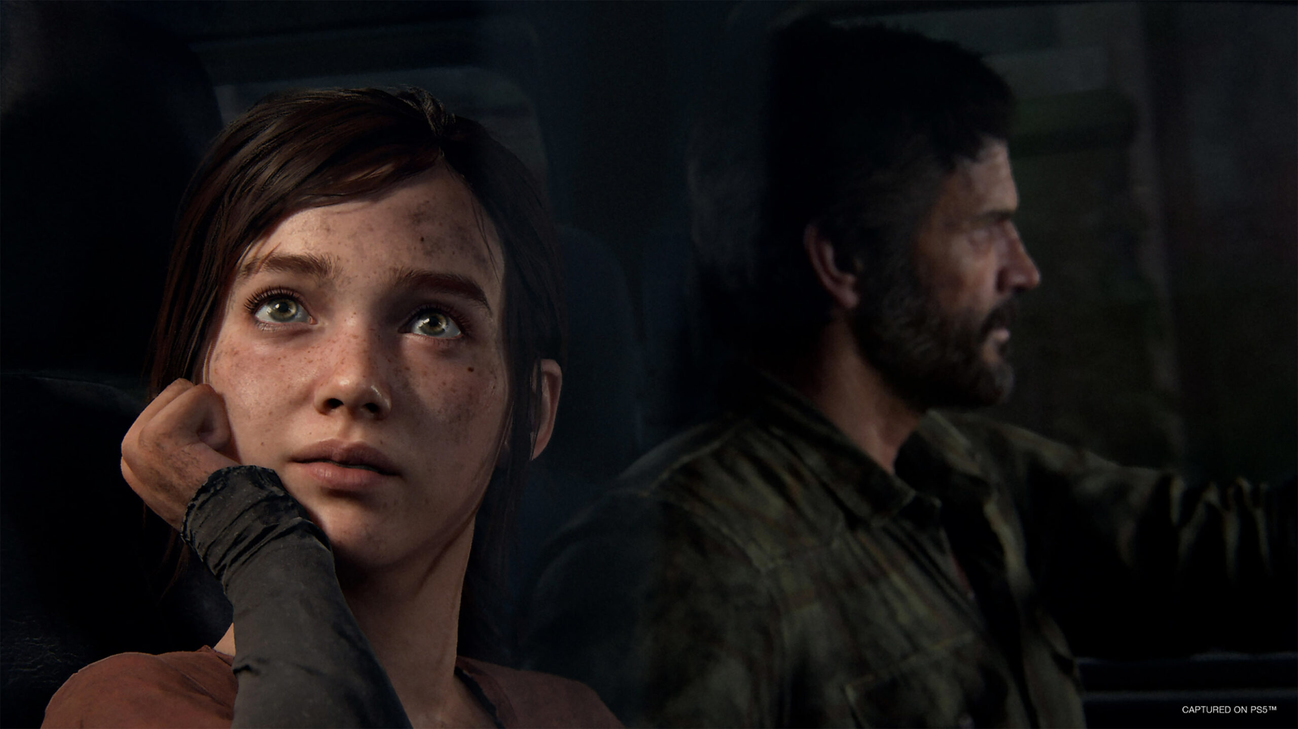
Since its original release on the PS3 in June 2013, The Last of Us has endured as one of — if not the — most beloved PlayStation games in history.
In the game, developer Naughty Dog told an unforgettable tale about a grizzled survivor and an earnest teenager as they fight to survive in post-apocalyptic America. Throw in stunning visuals, incredible performances, an engrossing score and punchy, tense third-person combat and The Last of Us is the complete package.
Now, nearly ten years later, Naughty Dog’s magnum opus has been given a PlayStation 5 remake in the form of the appropriately titled The Last of Us Part I, offering a slew of visual and mechanical tweaks to enhance the original experience. To learn more about the work that went into the remake, MobileSyrup sat down with Matthew Gallant, game director, and Shaun Escayg, creative director. They talked about the design philosophy behind remaking The Last of Us, the “push and pull” of adding and removing anything and the large suite of accessibility features. Gallant, a Montreal native, also shares a nice message for Canadian fans.
Question: The Last of Us is already a modern game, and there’s a PS4 remaster of it, and then we have the upcoming HBO show that is largely retelling the same story. With that in mind, why would you say The Last of Us warrants a PS5 remake?
Shaun Escayg, creative director: The Last of Us Part I is — I keep referring to it as this — our love letter to our fans and to the franchise, and to ourselves as developers. I mean, the original game was made on PS3 almost a decade ago with, you know, a decade of old technology, graphics, everything. And you’re right — it’s kind of a daunting endeavour as a team to take on a remake of this game — arguably one of the greatest games ever made. For me, personally, it was my first game. So there’s is this feeling of responsibility. But when we set out to remake it, there were some pillars that were part of the discussion. And one, in particular, was that we really, really wanted our players and fans, existing and new, to have the ability to play Part I and Part II continuously without this large gap in technology or visual fidelity. We also thought it was important to focus on our accessibility features, and bring what we knew and learned from Part II into Part I so that more fans could enjoy the game. And I think, ultimately, one of our core pillars was to stay faithful to the experience — preserve everything that we love from the original game, but just build on it, enhance it, and heighten sort of every aspect of the original.
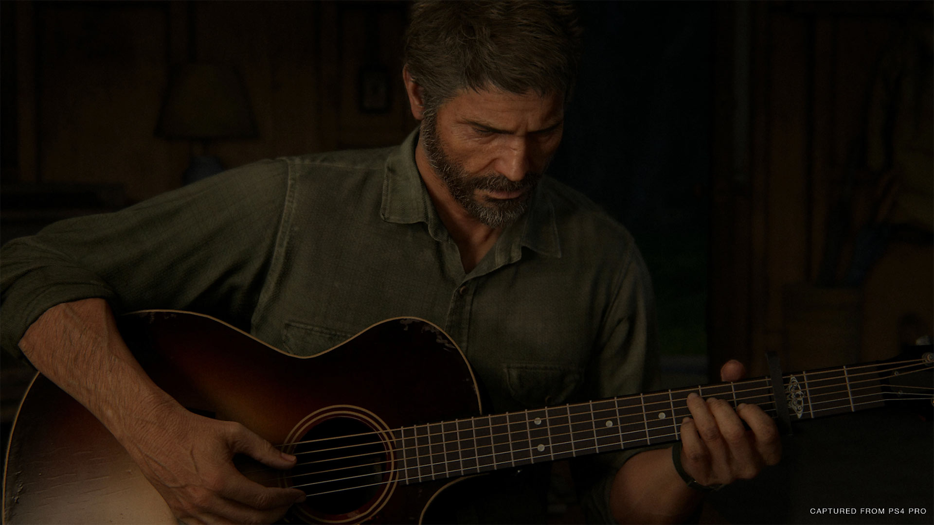
One of The Last of Us Part II’s flashback scenes with Joel shortly after the events of the first game.
Matthew Gallant, game director: One of the kind of genesis moments for The Last of Us Part I was making the flashback sequences from The Last of Us Part II. So there are these scenes that are going back to the events of the original game, and because we wanted seamless visual presentation in The Last of Us Part II as well, we remade the hospital, young Ellie, et cetera, et cetera. And watching those flashbacks, the studio kind of got the idea of just like, ‘imagine if we could make The Last of Us Part I, and the whole game looked as good as those flashback sequences, how exciting that would be.’
As Shaun said, we have a decade of engine improvements, tech improvements, craft improvements… all of this has gotten so much more advanced than was possible on the PlayStation 3. And it was really exciting to imagine what The Last of Us could look like with those integrated. And we also knew that we had a lot of audiences that might be playing the game for the first time, or as you said, people watching the TV show, new PS5 owners, new PC players… We had all these new audiences that we didn’t want their first experience with the video game series to be a game that — as much as it’s timeless in some ways, as much as that art style holds up surprisingly well in a lot of ways — is still, at its core, a PlayStation 3 game. And we wanted fans to be able to come in and play this ‘brand new, current-gen, all our latest tricks, all our latest techniques’ PS5 game — to go seamlessly with that onto The Last of Us Part II, and to be really, really getting the best experience possible right off the bat.
You mentioned being “faithful” to the original game. Part of what’s interesting about games is there are so many ways to handle remasters and remakes in this case. In recent years, we’ve had Final Fantasy VII Remake and 2019’s Resident Evil 2, which were more drastic departures and a lot riskier. Was there ever a thought of going that route with The Last of Us Part I or was it always the idea of staying faithful to that core experience and not making any significant story or gameplay tweaks?
Escayg: That’s a great question. I will say we’ve had our conversations and debates about what to add or subtract even — how to make select improvements. But we always came back to the preservation of the core. To truly remake The Last of Us, we have to overhaul almost every aspect of the art direction, redesigned characters, improved animation performances, seamless transition, which is a huge improvement. Before we were limited by tech — we had to cut to black and have some code underneath it. And we kept some of the transitions; not every transition is seamless. Because again, the ‘guiding light’ was ‘is this true to the original?’ — meaning there are some choices we made that have more dramatic impact if it was a hard cut and went to black, and we didn’t want to lose those parts, or where we could we make things seamless. And a good example of that is the seedy market in the quarantine zone. This space was formerly limited by tech — we couldn’t have that many NPCs running around. It was very hard to create this illusion that this world was a lot bigger than what you were experiencing on the stick. So we overhauled it, and now you’re transported there. You’re navigating this underworld — it’s stifling, it’s lived in, it’s dangerous. And there are layers and layers of activity. There’s a guy with what looks like a little gambling ring. And then below there’s a conversation. So you just fall into these environments. And then like the flooded streets near the Capitol building — it’s a juxtaposition. It’s wide open, it feels airy, and light. It’s lush and overgrown. The bugs swarm the tall grasses. The moss swirls around your leg. And now you’re just grounded in this space.
We even redesigned our characters to be more realistic and more expressive. And there are details — like exceptional details — down to the iris tech and the sunspots on the faces. And to see sort of all of this stuff just come together in one scene. And I’ll give you an example — light direction, animation, characters, environments, everything. This is the scene where Ellie and Joel are having an argument over at Tommy’s when she runs away. You can actually see Ellie’s eyes flutter and well up. Her face goes flush at the moment it dawns on her that Joel was about to abandon her at Tommy’s. And even when Joel’s angry and retorts and spit sprays from his mouth. And you’re enthralled by the moment — glued in that moment. And even the nuanced moments, really small moments, subtle moments, like Ellie and Riley dancing on the display unit in the mall. Ellie stops and stares at Riley all starry-eyed. And you can see sort of this internal conflict as her eyes start to back and forth in her head as she contemplates, and no words are spoken. And even in the original, if you compare the two scenes, the beat’s there and you feel it, but the layers and layers of depth — this thinking, feeling, almost breathing characters — I think that’s where you really appreciate how far we’ve pushed the emotional vessels.
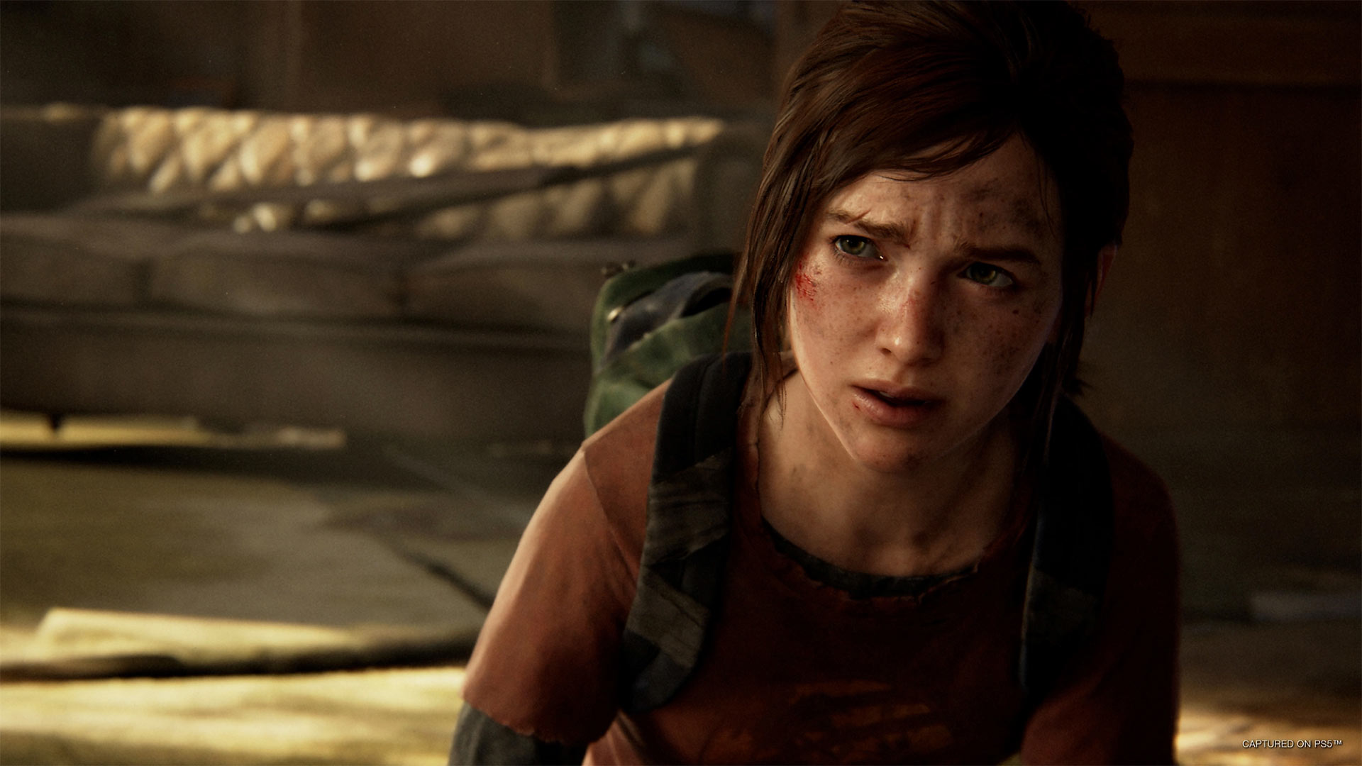
In the remake, character models have been significantly improved over the original game.
Gallant: And from the gameplay perspective — something that I really feel is that the core The Last of Us gameplay experience is extremely strong. And so when we were looking at what’s dated about The Last of Us — even The Last of Us Remastered on PS4 — “what about that doesn’t hold up?” The answer isn’t the story — the story is still incredible. The answer isn’t the core gameplay — the core gameplay is super duper fun, and you can still play those fights and they’re really, really great, and Joel’s toolkit is really fun. The balance between melee and gunplay and cover and stealth and all of that is still really, really great. What’s dated now is the technology that underlies it. It’s the way that the AI has to respond to various situations. It’s the way that we can blend in and out of animations or sometimes have to do hard cuts because of tech limits. In some of these fights, being limited on the variety of the enemy looks. The fidelity of the smoke bomb when you throw it — how good those effects look. It’s all in kind of that implementation of what can we do to go back and execute on a really, really modern feeling version that uses all of our latest technology, that uses motion matching for the character movement, that uses the expanded set that we have of runtime lights, and physics and lighting and everything. All of that detail, but to reach an experience that really honours the core of that gameplay, the core of that story that is beloved and timeless, and we want to give fans the best version of that experience versus a new experience that wouldn’t resonate with the original game — with the original creative vision — in the same way.
Naughty Dog is renowned for its attention to detail, and one of the neat aspects of the remake is how the environments don’t just look prettier — they also have added accoutrements. For example, in one of the official PlayStation videos you mentioned all these extra paintings of former presidents in the Pittsburgh building. When you’re approaching any given level, what’s the process like of determining what to enhance or add without going overboard and making it too different? How does that brainstorming go?
Escayg: You’re hitting a very key point in sort of this measured approach on how we address spaces. Because oftentimes, the impulse is to add — just throw stuff in there and make it prettier. And we’ve done it, trust me, we’ve done it as a team. And then we look at it and we go, ‘oh, let’s pull it back.’ Because then, ultimately, it distracts. So the approach is always, ‘what is this space about? How do we tell a narrative story in the world? And how do we ensure that that narrative story does not compete with whatever is happening in that scene?’ So it’s a very deliberate sort of measuring that we do whenever we approach a space and even the way we light the scene. Eric and Sebastian, our art directors, did a really, really, really good job in balancing that. Because there were things we wanted to fix, like, time of day and how to keep it consistent over the course of play, but still maintain the original. So there’s a balancing act, because sometimes if you stay consistent, you will break a space and what felt really dark and moody now has sunlight streaming through it. And there were all these challenges that the team faced when re-approaching these sets.
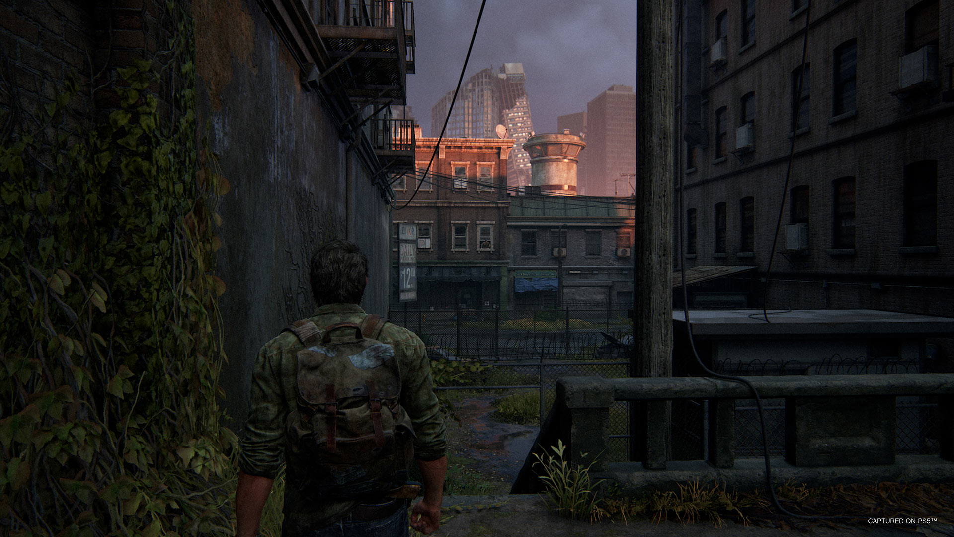
Just a small-town Joel, living in a lonely world.
If you put, for example, too much foliage in the military city, you break that feeling of when you are released from that city, and you’re out in the world and you get this lush sort of overgrowth that is beautiful, but deceptively dangerous, versus sort of the concrete jungle that is the military city. And little choices like that could affect how you experience that world. And that juxtaposition from being in a safe human stronghold that is a concrete jungle and looks depressing, to being outside in this beautiful expanse of lush overgrowth, but very dangerous spaces. So those are kind of the balancing acts that we are constantly doing as we approach the game.
Matthew, you mentioned briefly the new accessibility features. Of course, accessibility was something you were a key player on with The Last of Us Part II, and you received a lot of praise for that. Now, you’re bringing those features into The Last of Us Part I. For people who maybe don’t understand the significance of these features, why is it important to make games as accessible as possible?
Gallant: The Last of Us Part II, I think, was considered groundbreaking because it offered accessibility options that basically allowed the entire game to be finished by a player who is completely blind. And the way that was generally done was by taking any information that was only available visually and moving that into other channels that a blind player has access to. So if there’s a triangle prompt on-screen, you have to press a button to progress the story, a blind player can’t see that, so we added audio cues so they can hear that. And similarly, we added an audio cue for when you’re aiming at an enemy and your gun is over them. And we had some lock-on name options to let you do that. All across the board, an entire suite of options that made the gameplay accessible to blind players. We also had additional options to make the game accessible to deaf players, to players with motor accessibility needs, to all sorts of different disabilities or just adjustments the players wanted to make to make the game more comfortable for them. And thankfully, we’ve had the opportunity to bring that set of options to The Last of Us Part I as well.
And what I really take away from accessibility — I’m obviously super excited when I see a player who otherwise would have had barriers in their experience and not been able to progress, when they can beat the game. And it’s because their excitement is contagious; they’re so psyched to say ‘I beat this boss,’ ‘I overcame this challenge,’ ‘I Platinumed this game.’ Whatever they’re saying, that excitement — nothing makes me prouder as a game developer. But when I look at the bigger picture of accessibility, what I actually see is that accessibility is just good universal design. It’s just a game that has been designed to accommodate people with all sorts of different needs. And that doesn’t necessarily mean players with disabilities. The classical example is someone who’s playing the game late at night with a sleeping baby and they want to play it with subtitles on. Or a player who broke an arm and they have they’re going to play with one hand, but that’s a temporary situation for them and eventually, they’ll regain use of that arm.
One of the most surprising bits of feedback we got from the original game is we had this feature that was auto pickup, so when you walked by items, the character would just grab them. And that was designed with motor accessibility in mind. We didn’t want to have fatigue for players with motor accessibility needs. But that option, we actually heard journalists and players say ‘that option is great, this takes a repetitive action that I wasn’t that interested in and just automates it and that makes the game better for me.’ And so that was kind of true across the board — accessible design, having these options, letting people customize the gameplay experience, it just made the game better for everyone.
You’ve said about three years went into adding all of the accessibility into Part II. While Part I had a shorter turnaround time, there was still undoubtedly a lot of work that went into doing that for the remake. What sort of work goes into conceiving all of the accessibility options — including a few new ones in Part I, like descriptive audio cutscenes — and what does it take to implement them?
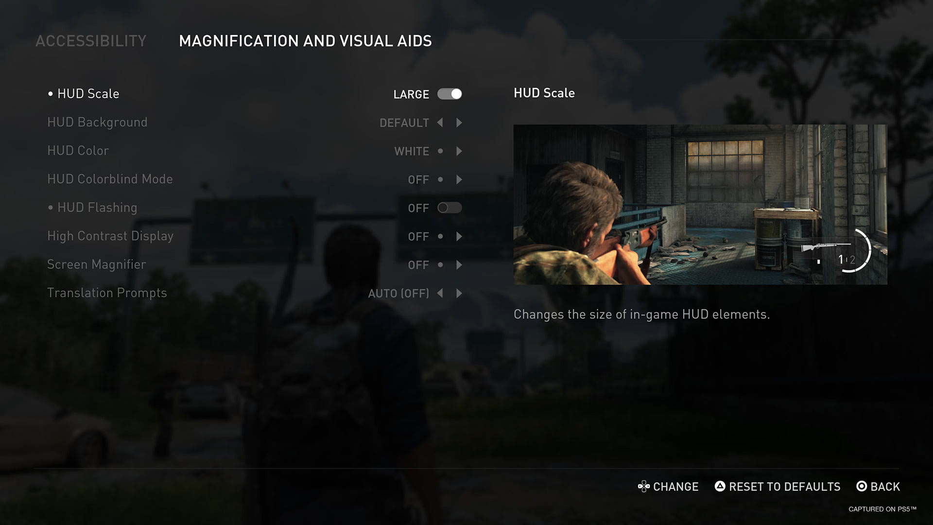
Some of The Last of Us Part 1’s many accessibility options.
Gallant: The great news about developing The Last of Us Part I was that we started with the game engine from The Last of Us Part II. Obviously, we had to port it to the PlayStation 5 and there’s a lot of upgrades involved there, but the core of that functionality — the text-to-speech, the button remapping, the enhanced listening mode, navigation assistance — that functionality we could carry forward very easily. And that’s one of the benefits, I think, of developing accessibility options generally — once you’ve made that engineering investment, you have that feature and you can hopefully carry that forward into your future games. So we started from a really, really strong starting point on The Last of Us Part I. Obviously, we had to implement some of those features in a way that was specific to the game and that took creativity and implementation time, and we brought in consultants to play the game and verify that our solutions were working well. But we’re also really excited to be able to go and see what’s something further we can push here.
And as you said, one of the biggest ones that we had a chance to do were the descriptive audio for cinematics. And what that means and the reason that’s challenging is that you have to fit in those terse little descriptions in the gaps in between the lines of dialogue. That’s how this is done in film and television; you have to be very creative and thoughtful about how do you describe what’s happening with scene and how do you insert that seamlessly in between the dialogue. And thankfully, we’ve partnered with Descriptive Video Works, a professional service who does this for television, movie and game trailers, that sort of thing. They have tons of experience that they’re bringing to bear to do this at the highest quality possible. So we were really, really excited to be able to do that in our games. And that was partly from a desire that we knew with The Last of Us Part II, we had made the gameplay accessible to blind players, but in talking with them and playtesting with them, we knew that there was a lot of story context, narrative, the environments they were moving through, the unspoken interactions between characters that are not, as of yet, accessible to blind players. And this is a first step in that direction of delivering more of the richness of the story and the world to all players.
You touched on the accessibility challenges. Speaking more broadly, game development is obviously very difficult in ways that a lot of people take for granted. When you set out on this remake, it’s obviously not as simple as ‘copying and pasting’ the PS3 game to PS5. What are the sorts of challenges that came up when you’re translating the experience that was originally designed for PS3 to hardware that’s from two generations later?
Escayg: There were so many challenges along the way. I think the biggest challenge we faced was making those choices of what to add, and what not to add, in an effort to preserve what we believe is the core experience of The Last of Us. And it was very difficult; it’s not just having all the technology and wanting to dump it all into this game. It’s an easy thing to do, but you can lose the essence of what made this game so great. And that was always kind of a push and pull, like we would add something and then it would be too much, and then we’d have to bring it back a little bit, or reevaluate it to the original to see if it felt the same way. That sort of self-imposed method of approach was a difficult thing. As artists, we want to make the best, the biggest, and change everything. And sometimes more isn’t better, and really having to kind of discern and be selective about what improvements we made and why. And make sure it stays true to our characters, true to that specific story and that world.
Gallant: I’ll completely echo what Shaun said. I think he nailed it. That was the core creative tension of this game: we wanted to add more. But everything we added, we wanted to make sure served that core creative vision, serve that really beloved experience, this beloved story. The worst thing that we could do for The Last of Us Part I is add a distraction, add a jarring element that didn’t gel with the rest of the experience. So we were constantly having to be like guardians of that, to be like, for every decision, ‘does this fit into this holistic vision? Is this serving this bigger picture, this greater vision of what this game could be? Or is it not?’ And one of the easiest, least controversial ways that we could do was taking something that we knew was a product purely of a limitation of the PS3 hardware, like the reason this area’s simplified or this vista is closed off, or why this fight has only four NPC looks in it — that’s how many we could load in memory on PS4 at the same time. So it was like that was the lowest hanging fruit of just taking those, but even then, when we knew the decision was a result of the PS3 hardware limitations, we still have to be extremely thoughtful about, like, ‘how do we make a version of this? How do we add something here that really fits the overall vision of the game?’ And it took an entire studio of people kind of always keeping that consideration in mind.
As somewhat of an aside, I have to ask, Matthew. It’s always cool to see Canadians like you in prominent roles at American developers like Naughty Dog. Can you talk a bit about your journey from Canada to Naughty Dog?
Gallant: I was born in Canada — I grew up in the suburbs of Montreal. I went to school at Concordia University in Montreal, I studied software engineering. And yeah, from there, I just happened to get my first job in the game industry in the States and moved from that job over to Naughty Dog. But my family’s still in Canada, I go home regularly. I miss Montreal dearly — it’s still my favorite city in the world. And I’m so thrilled to be talking to a Canadian publication and talking to the fans back home. I hope players in Quebec and all across the country find this to be the best experience of this game possible. I’m really excited to share this game with them.
This interview has been edited for language and clarity.
The Last of Us Part I launches exclusively on PS5 on September 2nd. A PC port will also release on a later date.
For more on The Last of Us Part I, check out our in-depth look at the game.
MobileSyrup may earn a commission from purchases made via our links, which helps fund the journalism we provide free on our website. These links do not influence our editorial content. Support us here.


