Another set of rumours about Apple’s upcoming iPhone 14 Pro suggests the company plans to move the microphone and camera indicators into the rumoured display cut-out that will appear on the new Pro iPhones.
In case you missed the ongoing stream of rumours, let me take a moment to catch you up. Yesterday, rumours began circulating about how iOS 16 would handle the rumoured display cut-outs on the iPhone 14 Pro. Based on previous reports, most thought that there would be two distinct cut-outs — one for the selfie camera and one for the Face ID sensors.
However, reports yesterday said this wouldn’t be the case, and the iPhone would fill the space between the two cut-outs to make it look like one large, pill-shaped cut-out. The details first emerged at MacRumors, which cited an anonymous tipster and warned it couldn’t verify the source. However, the somewhat sketchy leak gained credibility when Bloomberg’s reliable Mark Gurman chimed in on Twitter, backing up the claim.
MacRumors also reported that Apple could use the space between and around the cut-outs to display status icons and notifications.
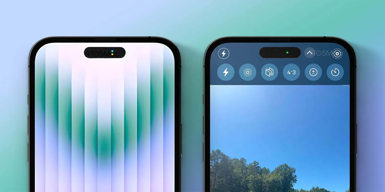
Now, 9to5Mac reports the “dead space” between the display cut-outs will be used for camera and mic indicators, citing a “source with knowledge of Apple’s plans.” For what it’s worth, I speculated this would happen yesterday, writing: “with knowledge of Apple’s plans.” The publication also created a mock-up of how this would look.

iPhone 14 Pro display cut-out mock-up | Credit: 9to5Mac
9to5Mac adds more to this based on information received from its source. Per the publication, the change will allow the iPhone 14 Pro line to show both camera and mic indicators at the same time (currently, iPhones just show the green camera indicator even if the microphone is also in use). Moreover, Apple plans to make the space interactable, allowing users to tap on the indicators to view a list of apps using the camera and microphone. Possibly, it could show a history of which apps recently accessed the camera and microphone too.
Finally, 9to5 says Apple plans to redesign the camera app and move the majority of the controls to the top of the screen:
“Controls such as the flash button and Live Photo button are now positioned in the status bar, while more granular photo and video settings are directly below the display cutouts. This change will give users a larger view of the camera preview by shifting the controls upwards and moving some of them into the status bar.”
With multiple sources corroborating this information, it seems increasingly likely that Apple does plan to implement software changes like this for the iPhone 14 Pro display cut-outs. That said, it’s important to note that these are software changes, which means they can change. 9to5 admits as much, noting that it was told the camera app redesign isn’t “entirely locked in.”
Source: 9to5Mac
MobileSyrup may earn a commission from purchases made via our links, which helps fund the journalism we provide free on our website. These links do not influence our editorial content. Support us here.


