iOS 16 has a ton of new features and capabilities, from crazy new lock screen customizations to scheduled emails and more. Along with the lock screen changes, Apple switched up how iOS displays notifications in the Notification Center with a new bottom-up design.
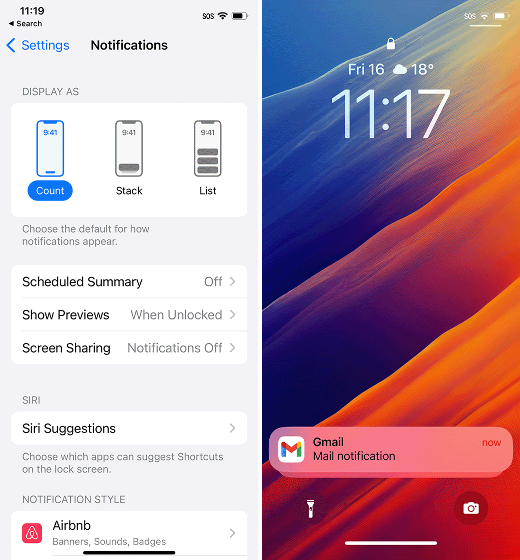
Fortunately, for those who aren’t big on the change, there are some customization options to tweak notifications, although you can’t get the old notification style back. If you head into Settings > Notifications on your iPhone running iOS 16, you’ll see three options for how iOS displays notifications: Count, Stack, or List.
Stack is the new default, which shows your notifications in, well, a stack at the bottom of the display. With this setup, you’ll see one notification with the rest layered underneath it, fading away into the background. Swiping up brings the notifications up into a list that you can scroll through. From there, you can also open notifications, manage them, clear them, and more, just like you would with the old notification view.
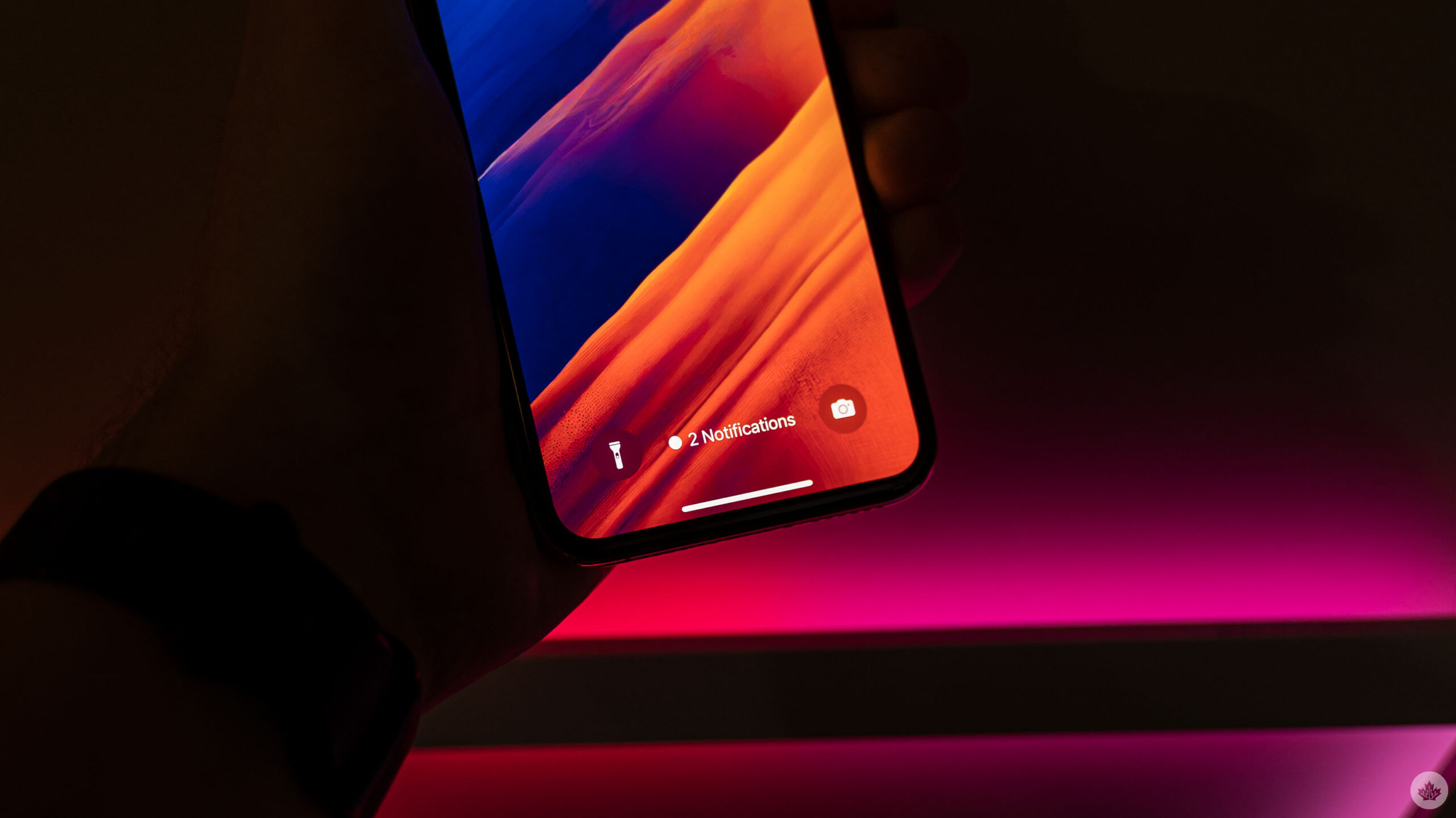
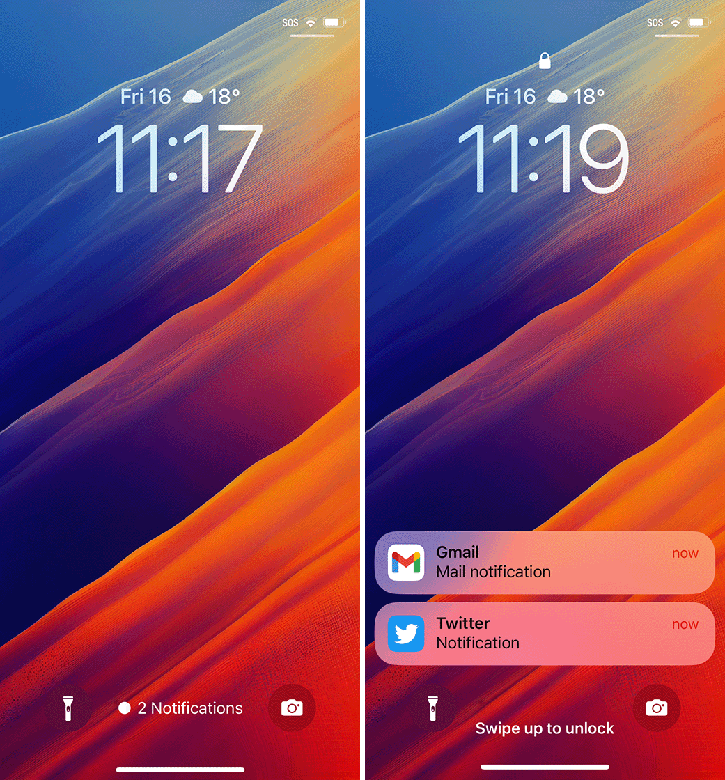
Next up, Count. This view collapses all the notifications into a single line of text that tells you how many notifications you have. It sits at the bottom of the screen between the flashlight and camera buttons. This gives you the best view of your lock screen and overall looks the cleanest but gives you the least amount of information. Once again, you can swipe up to view your notifications.
As an added bonus, if you’re using the other notification options and you want to collapse everything into the Count style, you can swipe down to minimize the notifications.
Finally, the List option is most like the old notification style. This shows a list of notifications that you can expand by swiping up. The list is still bottom-aligned to keep the fancy new lock screen widgets in view, but it’s still as close as you’re going to get to the old iPhone lock screen.
Via: 9to5Mac
MobileSyrup may earn a commission from purchases made via our links, which helps fund the journalism we provide free on our website. These links do not influence our editorial content. Support us here.


