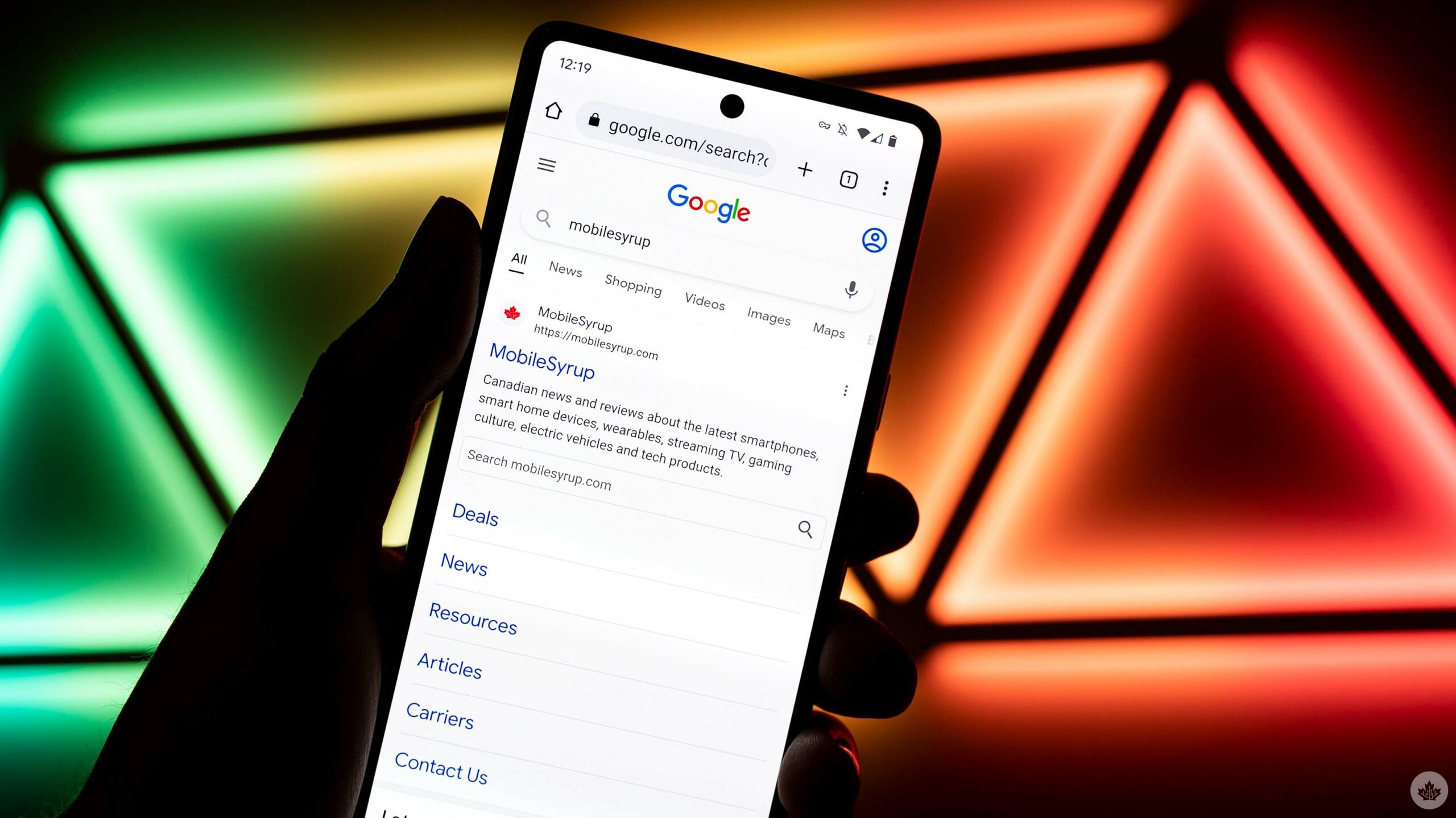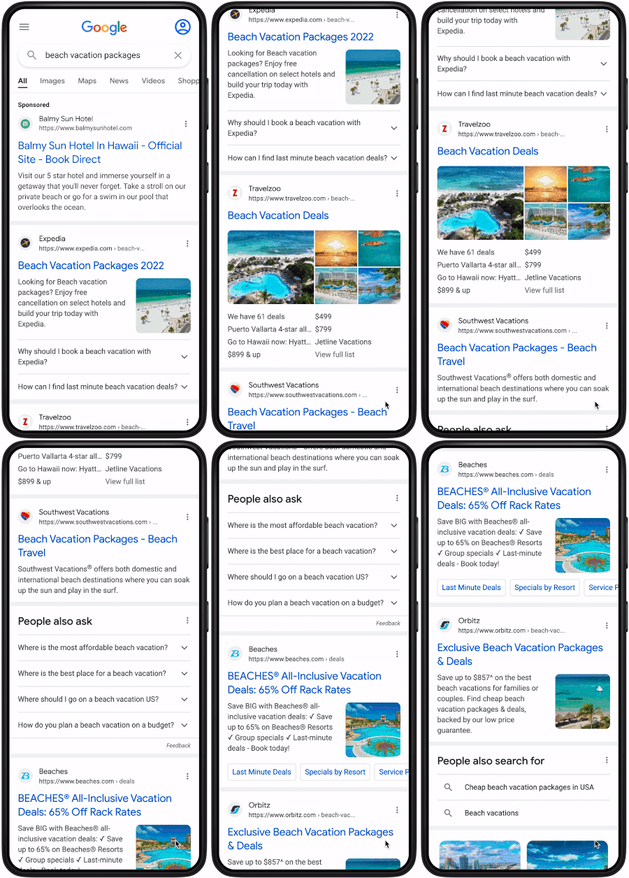
Google is rolling out yet another design refresh for mobile search results. However, this time around, the company is putting a larger ‘Sponsored’ tag on paid results, ditching the ‘Ad’ tag that’s been on results for a long time.
The new ‘Sponsored’ tag is larger and displayed more prominently, which should help people tell apart paid and unpaid search results. The tag appears above the paid result in bold font.

GIF credit: Google
As pointed out by other publications, including The Verge and TechCrunch, the change appears to be something of a course correction for Google. The search giant was widely criticized for changes to how it displays paid search results that some said made it difficult to spot paid results.
Those interested in seeing how Google’s paid results have changed over the years should check out the tweet below from the company’s Ads liaison, Ginny Marvin:
We've updated our visual history of Google ad labeling in Search to include the new black marker on mobile https://t.co/IRj6CsrOAJ pic.twitter.com/dC77XdeiGU
— Ginny Marvin (@GinnyMarvin) June 4, 2019
Along with the changes to paid search results, Google is updating how results look on mobile. First, each result now lists the website’s name first, and the favicon is larger and easier to see. These changes aren’t huge, but hopefully should make search results easier to read.
Finally, Google says it plans to test a similar experience for desktop search results “soon.”
You can learn more about Google’s search results updates here.
Source: Google Via: The Verge, TechCrunch
MobileSyrup may earn a commission from purchases made via our links, which helps fund the journalism we provide free on our website. These links do not influence our editorial content. Support us here.


