Microsoft is reportedly working on a redesign of its Edge browser that would — surprisingly — make it look more like Firefox.
As detailed by leaker WalkingCat on Twitter (via Windows Central), Microsoft’s ‘Project Phoenix,’ or Edge Phoenix, is an internal reimaging of the browser. Microsoft has been working on it since last summer and has been building it in pieces, some of which can already be enabled through experiemental flags in preview versions of Edge.
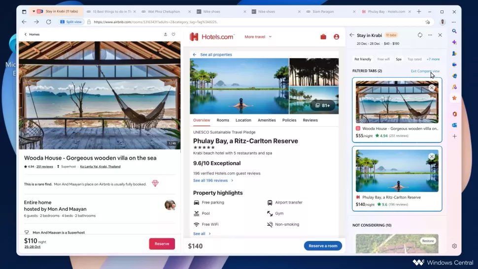
The most notable change visible in a preview video shared by WalkingCat and in images posted by Windows Central is the tab bar. Unlike the current Edge tab bar, Edge Phoenix features tab indicators that are seperated from the rest of the UI, such as the search bar and webpage (just like the current Firefox design). That tab style is somehwat divisive among Firefox fans, but I like it a lot.
'Phoenix' was an 'imaginary' version of Edge, appeared as an internal concept video from MS User Research team, with new UI/features, it's a project to collect feedbacks internally for Edge development directions/priorities, 'Split-Screen' was the most liked feature of Phoenix🤓 pic.twitter.com/DRrLwN8x01
— WalkingCat (@_h0x0d_) January 26, 2023
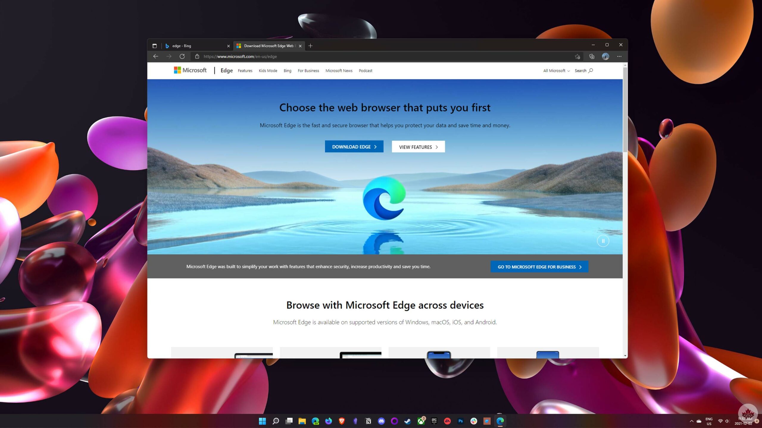
Beyond the button-style tabs, Edge Phoenix has a more Fluent-style design with several rounded elements. It looks much more at-home as a Windows 11 app then the current Edge browser, which just looks like Google Chrome with some Microsoft stylings.
Microsoft’s in-progress ‘split view’ tab feature is also heavily featured in the redesign, with WalkingCat describing it as the “spirit” of Edge Phoenix.
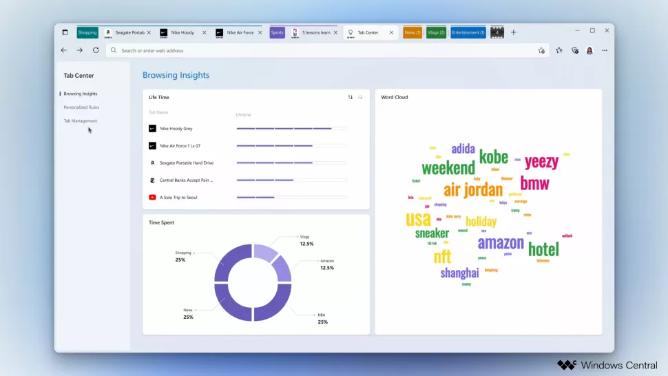
Windows Central also highlights a ‘Tab Activity Center’ with insights about browsing activity and usage stats, similar to the Screen Time or Digital Wellbeing features available on iPhone and Android.
While Edge Phoenix certainly looks nice, and some of the features are interesting, it remains unclear if we’ll ever see it ship. WalkingCat described it as an “imaginary” version of Edge, saying it was an internal concept used for development. Windows Central noted that we could see some of the features rolling out over time.
I’d love to see Microsoft roll out the Edge Phoenix design as it’s a significant departure from most other browsers out there and looks very at home on Windows 11.
Images credit: Windows Central
Source: WalkingCat Via: Windows Central
MobileSyrup may earn a commission from purchases made via our links, which helps fund the journalism we provide free on our website. These links do not influence our editorial content. Support us here.


