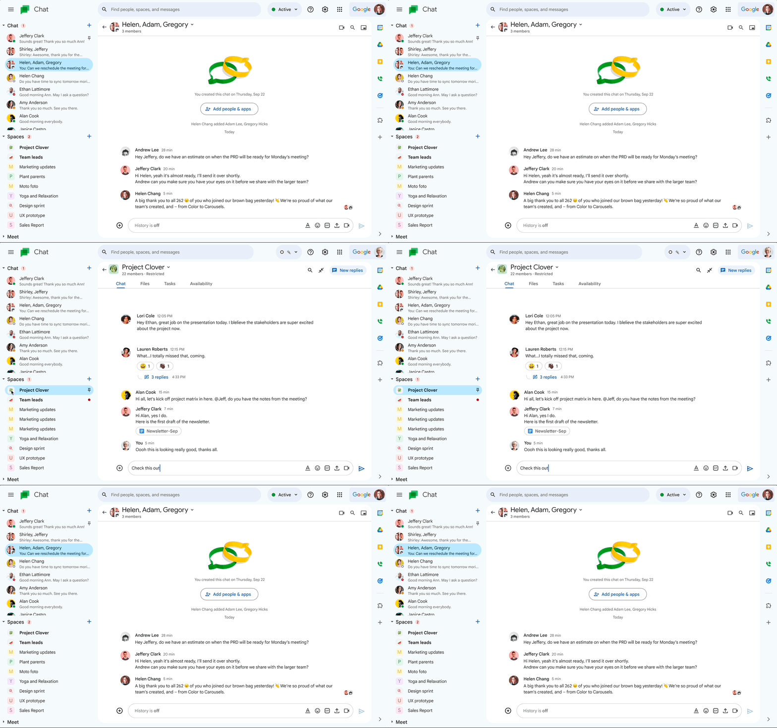
Google Workspace Updates has announced that Google Chat will be getting an updated look that won’t clash with the newly redesigned interfaces of Google Drive, Docs, Sheets, Slides, and Gmail.
The new cosmetic changes will feature a handful of new touches based on Google’s Material Design 3 system that rolled out on the company’s other Workspace apps. The entire interface is tweaked slightly with more rounded edges on the buttons and search bar and blue accents on certain widgets.
The majority of the changes are very slight, with updates also being rolled out on the main message view, new topic button, compose setup and thread panel. If users didn’t read the press release, some might not have even noticed the difference.
Google also announced a new Chat feature that allows Space Managers to create announcement-only channels, which looks like a welcome addition for those looking to keep all the members of a team on the same page (literally.)
The update did not bring any major software changes to Chat, meaning the next time you log in, you’ll still know how everything works, it just might look a little prettier.
Header GIF credit: Google
Source: Google Workspace Via: The Verge
MobileSyrup may earn a commission from purchases made via our links, which helps fund the journalism we provide free on our website. These links do not influence our editorial content. Support us here.


