While people seem to use the ‘phone’ part of their smartphone less and less, it’s still an important tool that, when tampered with, can really frustrate users.
Such is the case with Apple’s latest iOS 17 beta, which inexplicably moves the end call button. Instead of being the sole button occupying the lower centre of the screen, in iOS 17 beta 5, all of the buttons on the call screen join the end call button at the bottom.
On the one hand, the change does make the other buttons more accessible. On the other, it pushes the end call button to the side and crowds it with other buttons. That makes it more likely that people will accidentally hit the wrong button when trying to hang up.
Frustratingly, Apple also moved around various buttons, which is sure to trip some people up after using the same screen for years. You also lose access to the contacts button, though I think that won’t matter to most people.
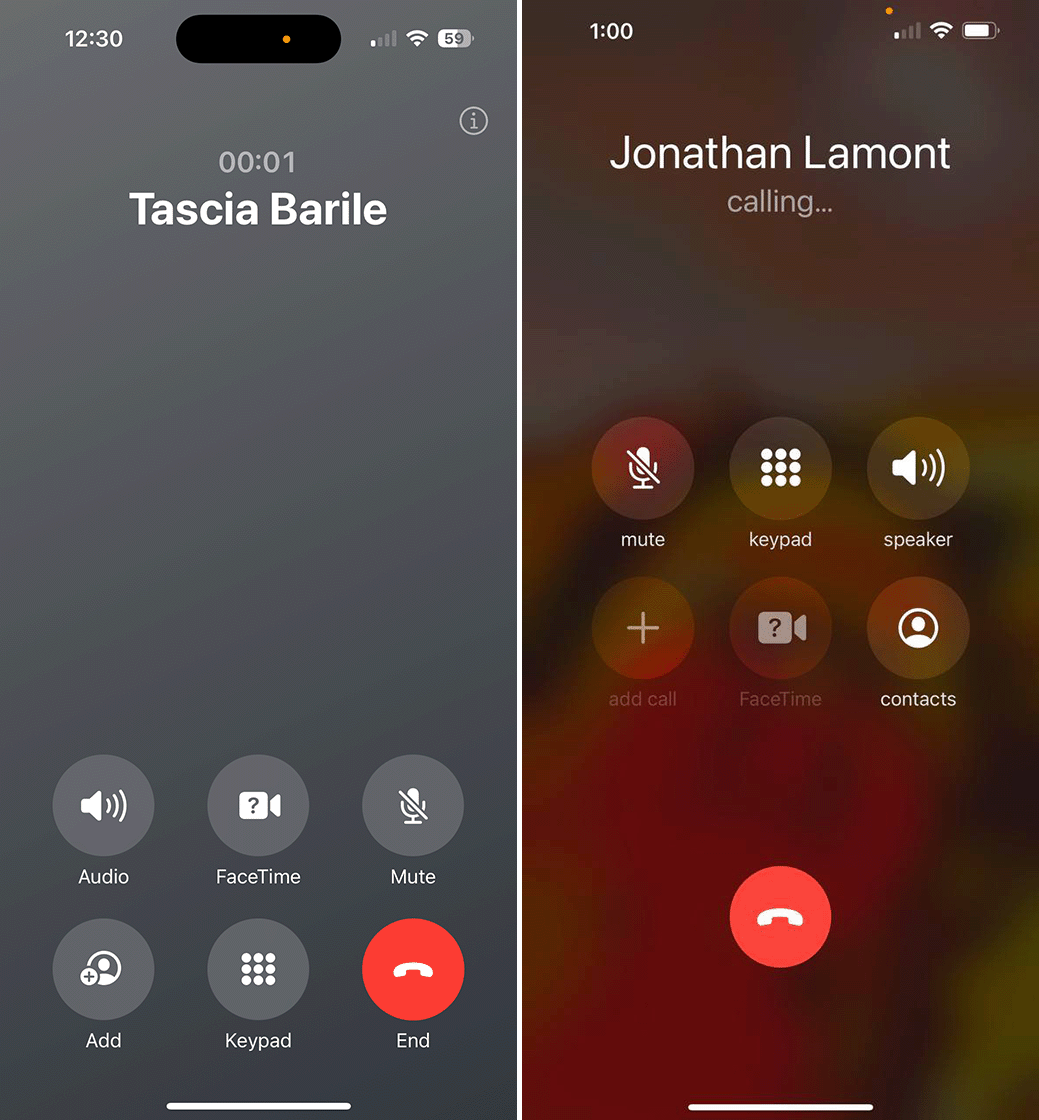
iOS 17’s call screen (left) vs. iOS 16’s call screen (right).
Thankfully, the end call button is still red, which helps it stand out, but overall I think this change isn’t for the best. If Apple wanted to make the various call buttons more accessible, all it needed to do was push them down toward the bottom while still keeping the end call button separate.
The good news, however, is that iOS 17 is still in beta. This change was added in the fifth beta release, but that doesn’t mean it’ll stick around. Apple has been fairly responsive to feedback so far, so maybe it will walk back the change before iOS 17 releases in the fall.
Via: Gizmodo
MobileSyrup may earn a commission from purchases made via our links, which helps fund the journalism we provide free on our website. These links do not influence our editorial content. Support us here.