Roku is testing out a small change to its home screen layout on smart TVs and streaming devices powered by its software.
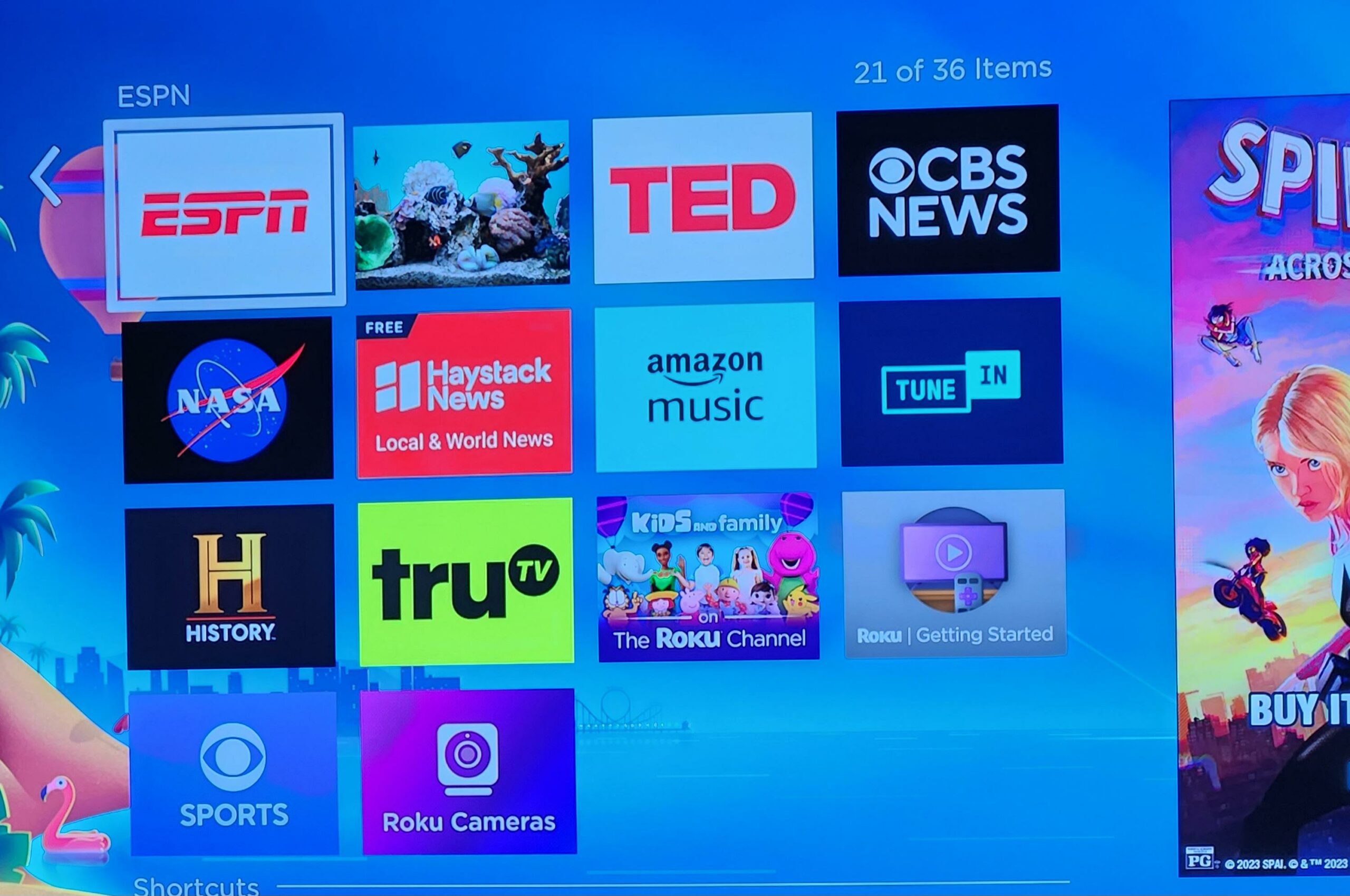
First spotted by some users on Reddit (via Cord Cutters), the change increases the number of tiles on the Roku home screen. Currently, Roku devices have a column that’s three tiles across, but the small change bumps it up to four across. Users can still add more tiles, expanding the column vertically.
Moreover, Roku confirmed to Cord Cutters that it’s testing the new layout. However, it’s not clear if the company will stick with it or if we’ll see wider adoption of the four-tile layout.

Roku’s new 4×4 layout | Image credit: Reddit
While a small update overall, it increases the number of tiles people can see on screen at once. At the same time, it makes the tiles slightly smaller, which could impact visibility.
The test comes after Roku detailed several new features coming to its TVs and streaming devices, including a ‘Continue Watching’ feature, a save list, and more.
Source: Reddit Via: Cord Cutters
MobileSyrup may earn a commission from purchases made via our links, which helps fund the journalism we provide free on our website. These links do not influence our editorial content. Support us here.


