Apple has once again moved the end-call button in the latest iOS 17 developer beta following surprisingly angry backlash from various tech publications over the button’s new position.
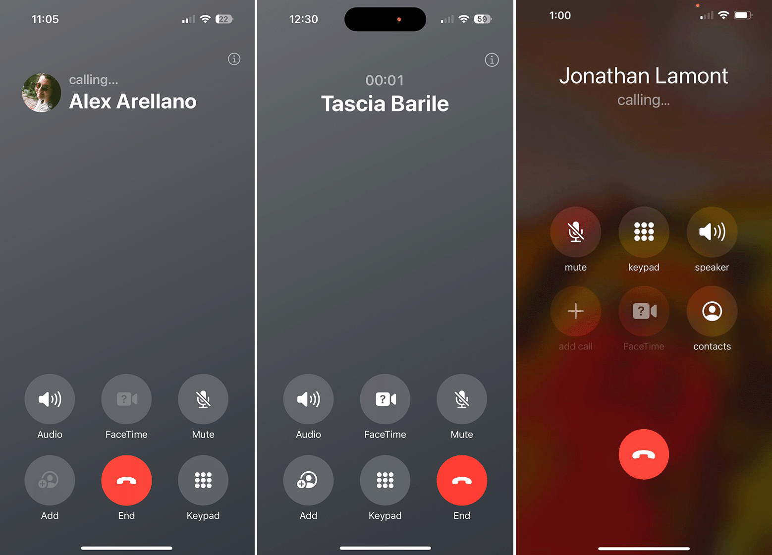
The end-call button previously resided in the centre of the display toward the bottom of the call screen. However, in the iOS 17 beta, Apple shifted all of the call screen buttons toward the bottom of the display. While that makes the buttons easier to reach (and makes room to display the fancy new Contact Posters), the company also moved the end-call button from the familiar centre placement to a right-aligned spot. The core issue with the new placement was that it disrupted years of muscle memory and increased the risk of people hitting other buttons by mistake.
As spotted by The Verge, iOS 17 developer beta 6 returns the end-call button to the centre position, but it still keeps all six call screen buttons near the bottom of the screen in two rows of three. The change is definitely an improvement over the right-aligned option. Personally, I’d like to see the end-call button separate from the other buttons, but I’ll take this layout over what it was before.
The end-call button change is one of the few in iOS 17 developer beta 6. As noted by MacRumors, other changes include a new shortcut in Messages to access the photo picker, improved mood-tracking animations, and a splash screen in Photos with details about new features.
Source: The Verge
MobileSyrup may earn a commission from purchases made via our links, which helps fund the journalism we provide free on our website. These links do not influence our editorial content. Support us here.


