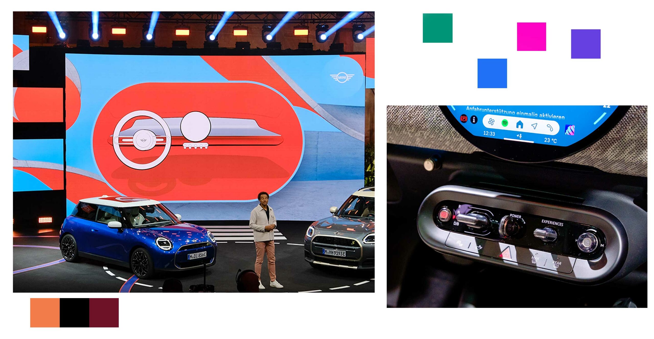
Ahead of IAA in Munich, Mini showed off the new electric Mini Cooper and Countryman cars with refreshed designs and an incredible take on infotainment.
The absolute star of the show was the new circular OLED screen. It sits prominently on the centre of the dashboard like the crown jewel of the car and runs the sophisticated Mini OS 9. It looks incredible and is packed with modern features. Time will tell if users react positively to it, but as a tech nerd who loves cars, I’ve been waiting for a company to take a bold step like this for years.
Mini says that it’s based on the same logic people use when operating smartphones, and in my brief time testing, it lived up to expectations.
The new Mini display
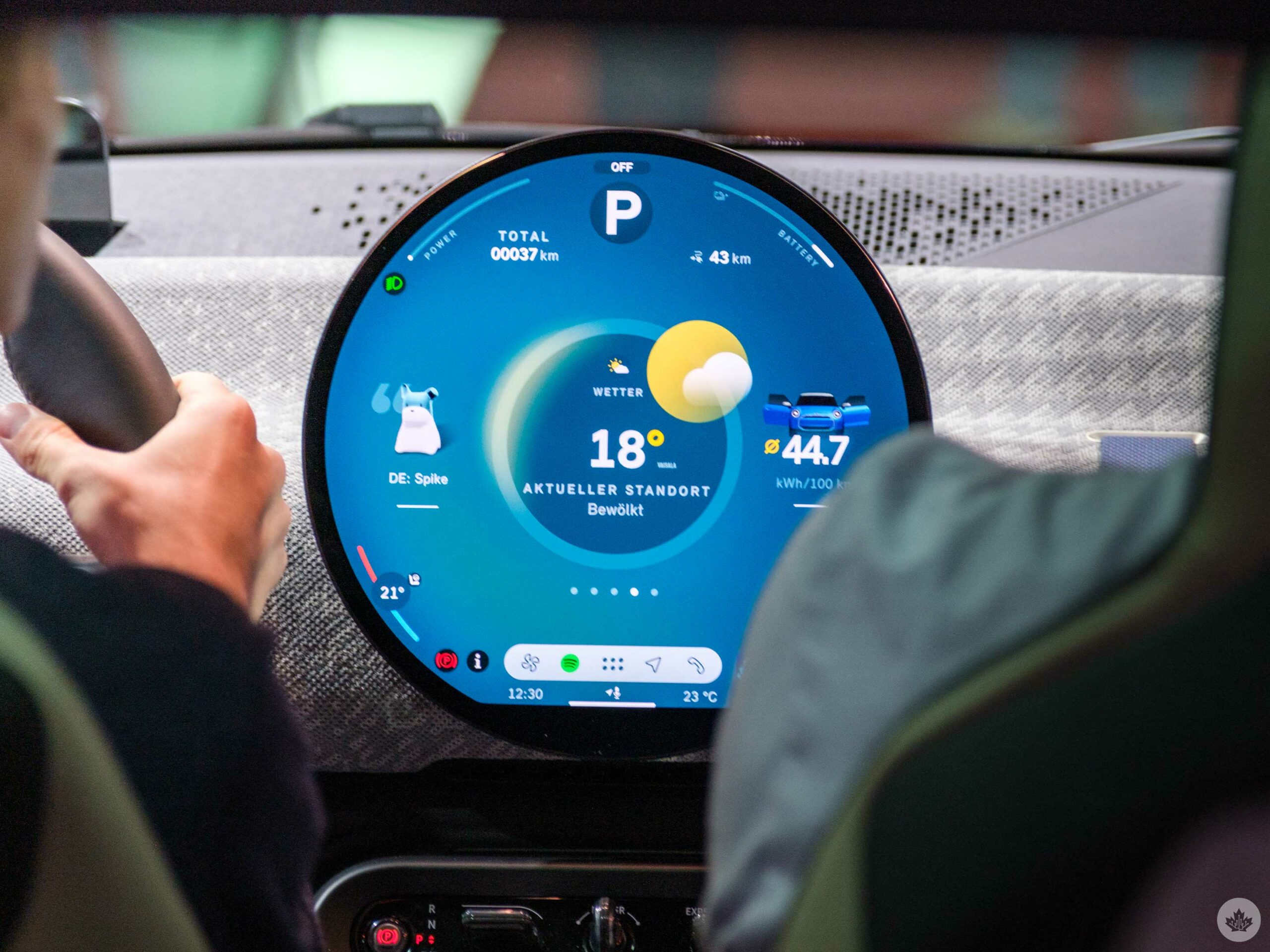
This round OLED panel is very colourful and has great contrast.
The glass screen is almost a full circle and has a diameter of 240mm. It has a flat bottom like older smartwatches such as the Moto 360, but at this scale, it’s less of an issue since there’s ample screen real estate for the car’s features.
The OLED panel looks very colour-rich, and it’s very responsive to the touch. It’s not as snappy as a phone, but it’s close. The software is designed with larger-than-you’d-expect touch targets, which make it easy to interact with the controls. For example if you miss the temperature controls by a little bit the software is smart enough to know what you’re trying to do. This is great since 90 percent of the car’s controls are digital. Yes, this includes climate controls, but thankfully, the defrost button is still physical.
This slideshow requires JavaScript.
In my brief hands-on time with the new system, it felt fairly straightforward, and swiping around the OS worked as expected. going left and right shifted between the main apps, or you could use the dock at the bottom of the screen to quickly pull up an app. My favourite part was being able to switch between the eight software themes. Each one is visually distinct and helps the car change its personality on the fly. Even the accent lights in the cabin switch to match the aesthetic of the screen.
The company has segmented the circular area with the top holding vehicle information like battery status and speed on the main screen. When you hit the accelerator, the screen morphs into a giant speedometer, and it looks fantastic. It does seem like it might take a bit of time to build enough muscle memory to use this new system appropriately, but I think buyers will be happy overall and will learn how to use it quickly. Plus, its friendly design almost begs to be played with, so I’m hoping people get less anxiety and more joy when confronted with the idea of learning how to use the new Mini OS.
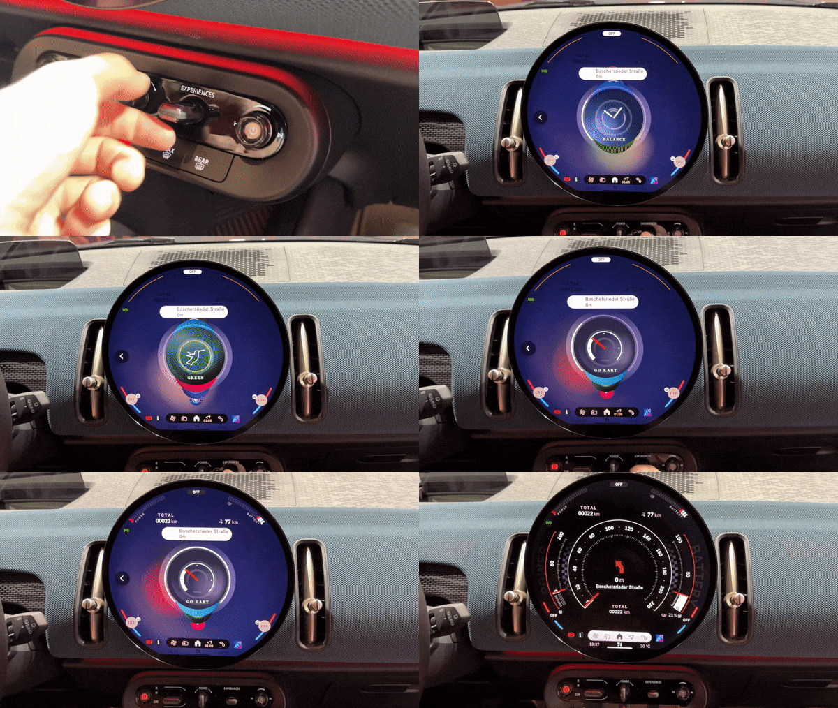 Swiping up from the bottom of the display reveals a few custom widgets on the screen. In my testing, these were all labelled in German, so I was unclear what they were doing, but it feels like an easy way to access some controls. You can pin things to this section using a little star button on the steering wheel.
In a strangely pleasing turn of events, Mini added a physical toggle that switches between its themes. It feels a little extra to have a hardware controller for this, but it’s really satisfying and fun to use. The company chose to leave it and a few other dials just below the screen to help modernize the original Mini dashboard from 1959. In the new Mini, that means a small toggle to change from park to drive, a power switch that you turn like a key, the experience toggle to change themes and a volume knob. Below that are two defrost controls, your emergency lights and access to the backup camera.
Overall it’s a really subtle system, but all of the buttons and knobs feel awesome and tactile alongside the new screen.
To bring this fully into the 2020s, BMW is also touting many improvements to the in-car voice assistant. You can choose between a cartoon Mini or a stylized dog named Spike. The event was too busy to allow for testing, but the company says it will learn from your behaviour and be proactive.
The new screen looks amazing, functions smartly and feels laid out like a typical dashboard, but without the satisfying button click that some people might miss. I’m a big fan of what Mini accomplished here and can’t wait to see how it gets refined over the next few years as people start using it daily.
The core design of a Mini
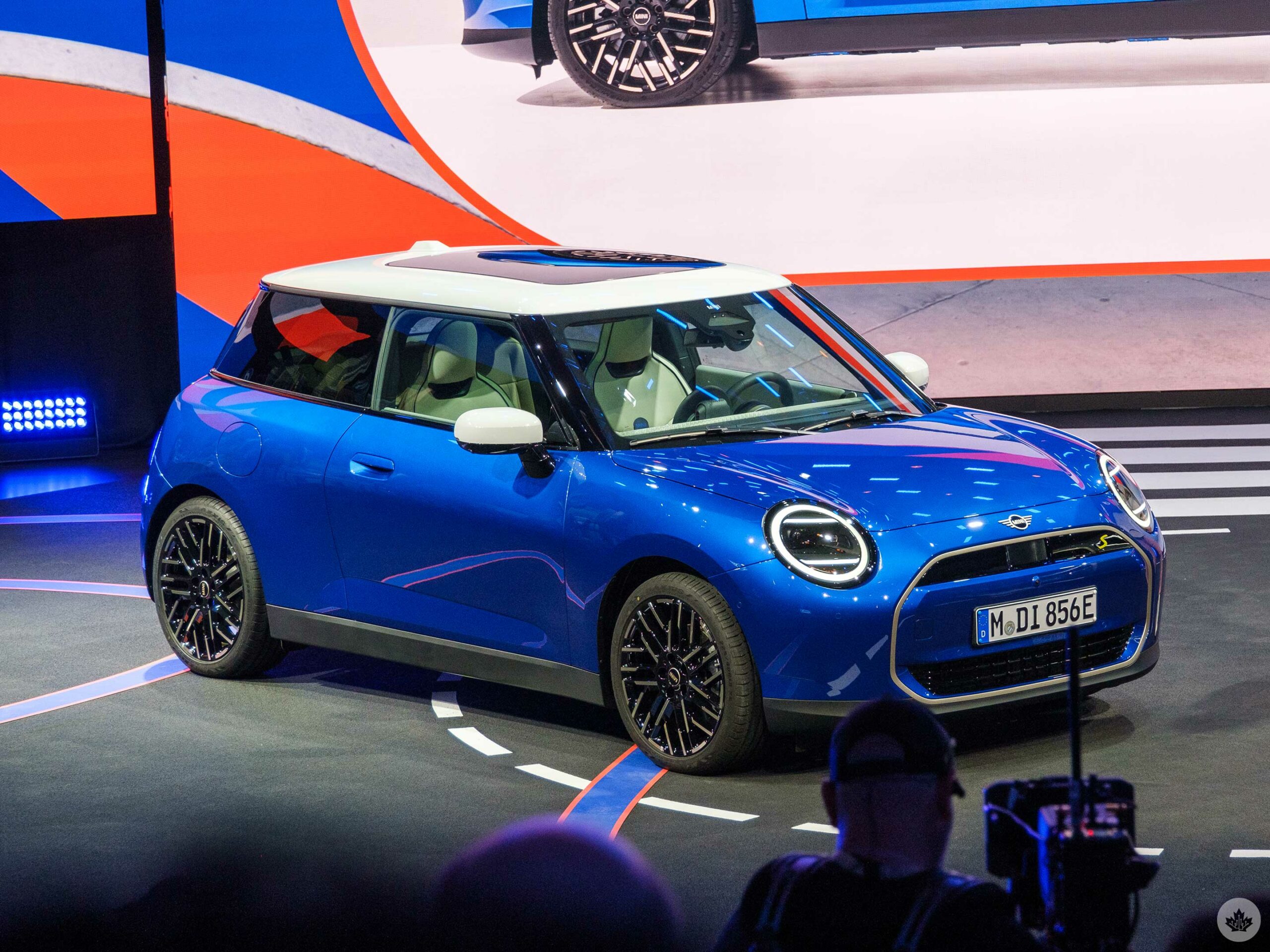
The new Mini is an exercise in editing and cutting things rather than adding new accents.
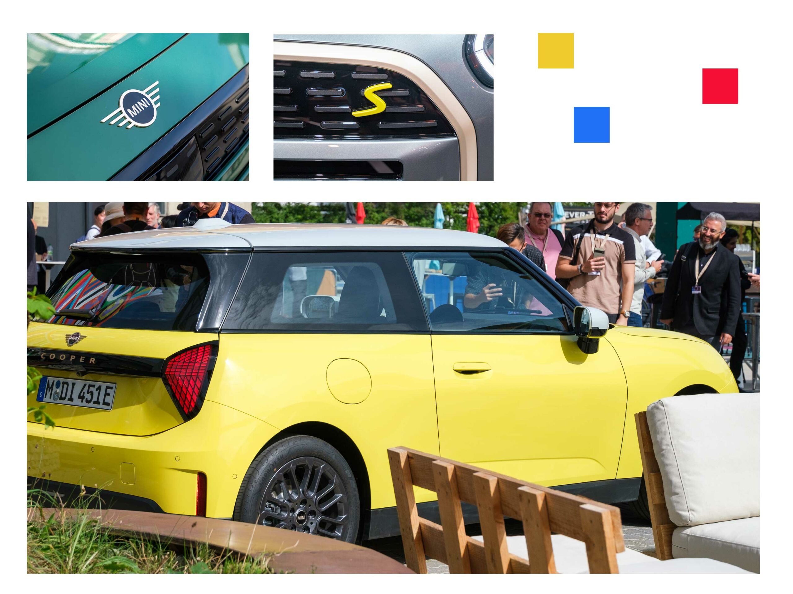
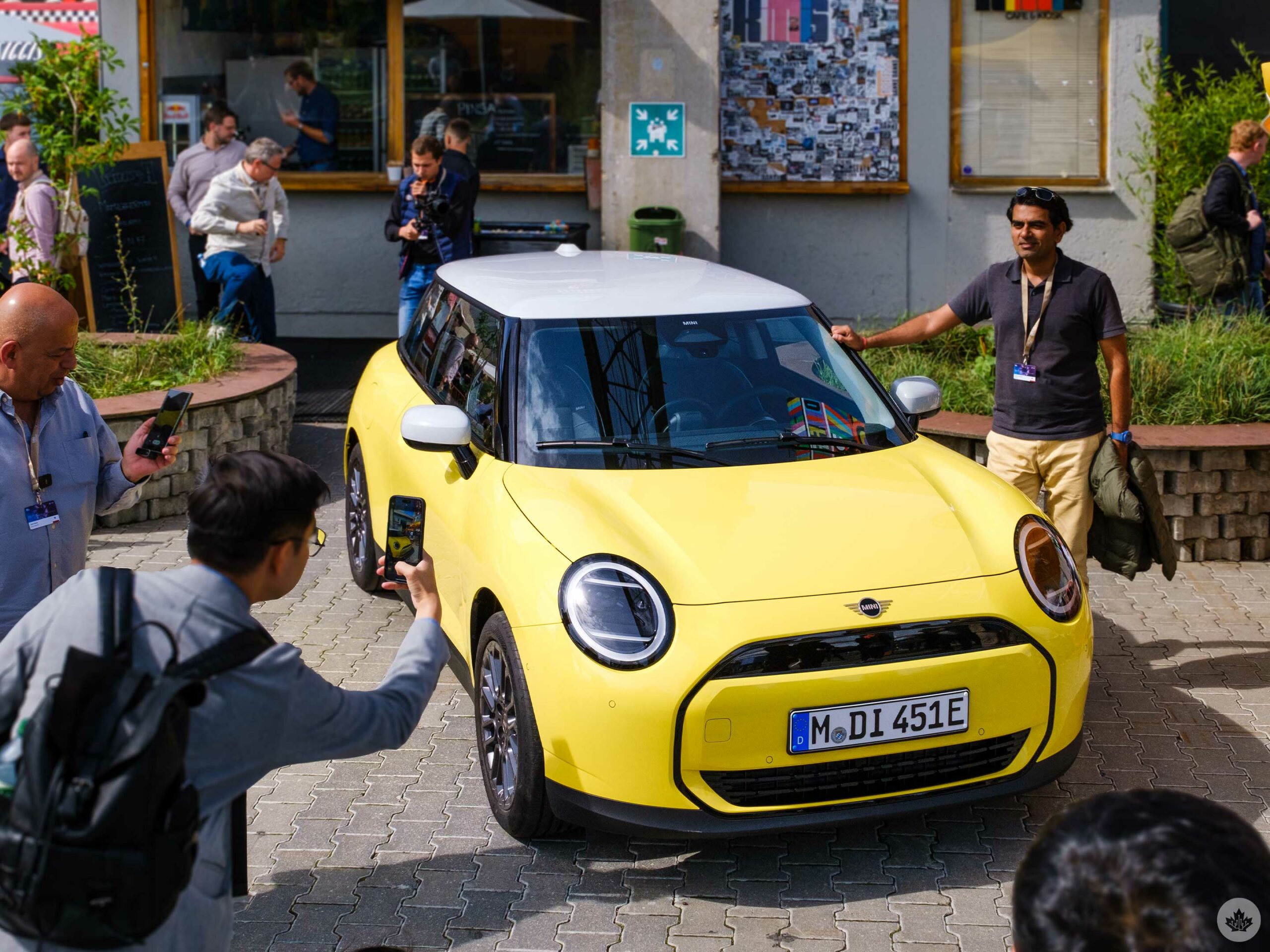
On the outside, the Mini Cooper and Countryman have both been simplified to their core elements, much like the dash. This means less detailing all around, giving the car a clean feeling. It’s a smart refresh for the brand, giving the company a clean slate to work from in the coming years while still retaining the iconic Mini off-colour roof and proportions.
In the hands-on areas, I was drawn to the taller stance of the Countryman, but up close, the Mini Cooper also looks very nice. It has very friendly headlights that still hold onto a lot of the Mini branding from the 2000s.
The new Mini Cooper front grill uses a subtle grey/silver colour instead of chrome, and it gives the car a slightly more robotic look that gels with its futuristic software. The company also dropped the iconic side accents (known as scuttles). I was worried that it would look too plain. However, in motion, it’s still a classic Mini with bright round headlights and a short go-kart-style stance.
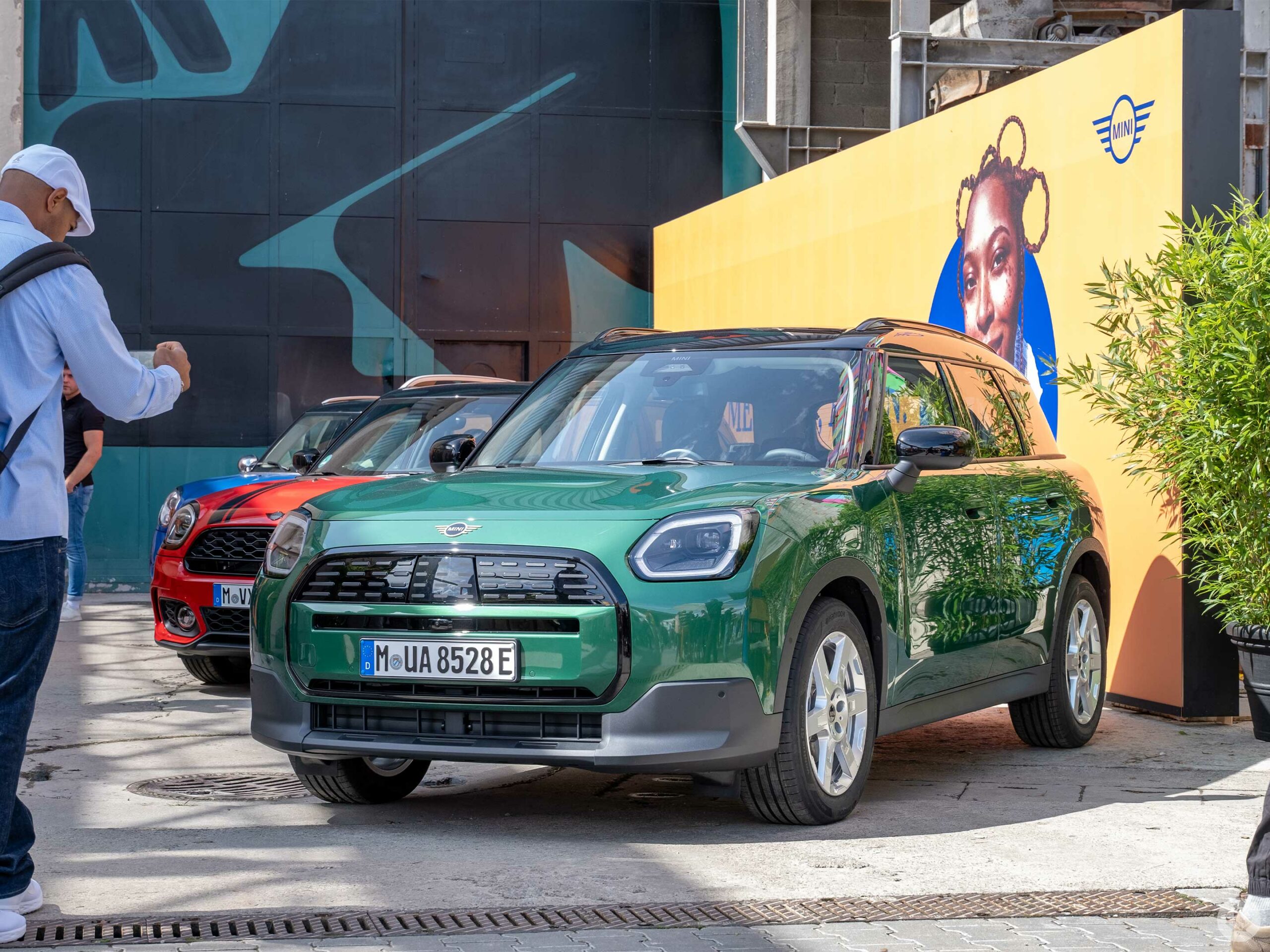
The Countryman, on the other hand, still retains some plastic detailing around the wheel wells. Combining that with its taller ride height gives the car much more of a crossover personality than ever before, and I have a feeling that will help it in North American markets.
On the rear of both cars, the company retooled the taillights, but this time, it added in a fun bit of customizability. Drivers can choose to have the lights take on the classic Union Jack flag design or two other looks that can help give your car a bit of personalization. Combining this with the custom infotainment screen and in-car lighting makes these extreamly appealing cars. I’m not sure if it’s just me, but the ability to even do subtle customization always helps me feel more ownership over my products, and I think Mini has hit it out of the park with its new design in that regard.
The rest of the interior is also very clean and minimal, with a tight woven fabric on the dash and door panels. There are different trim levels available, but both the Countryman and Cooper on display at the reveal event were comfortable and cool. The Mini even had some fun accent straps on the dash that helped this version feel moderately sporty.
The new Mini is a trendsetter
This is a big step for Mini, and these new vehicles are its most exciting electric options yet. Combining potential industry-leading infotainment with a new design should help capture more users around the world.
There’s no word on Canadian pricing yet, but perspective drivers can expect to learn more before the car’s full launch in 2024.
The Mini will start with a 402km range, and the Countryman will drive as far as 462km.
MobileSyrup may earn a commission from purchases made via our links, which helps fund the journalism we provide free on our website. These links do not influence our editorial content. Support us here.

