
I’ve been using an iPhone 15 Plus as my main device for a month, and coming from an iPhone 14 Pro, it’s been a startling experience. The camera doesn’t feel like a step backward, the screen looks amazing, and the lightweight design is deeply comfortable.
I’ve considered myself a Pro person since I stepped up to the iPhone 7 Plus years ago, but now, something has changed.
More than ever, the enhancements brought on by the Pro models are targeted at creative professionals. This is a nice way of saying that the Pro line doesn’t apply to as many people as before. Sure, we all like titanium, but LOG, ProRAW and new telephoto lenses are all enhancements targeted at content creators.
Even the parts of the phone that have garnered controversy are overblown as specs move past the average user’s needs. Phones have been exceptional for years, and just because a device doesn’t feature the most modern specs doesn’t make it bad. I still want Apple to keep upgrading the iPhone, but this year, there’s more than enough in the base models to get excited about.
Pro design is metal
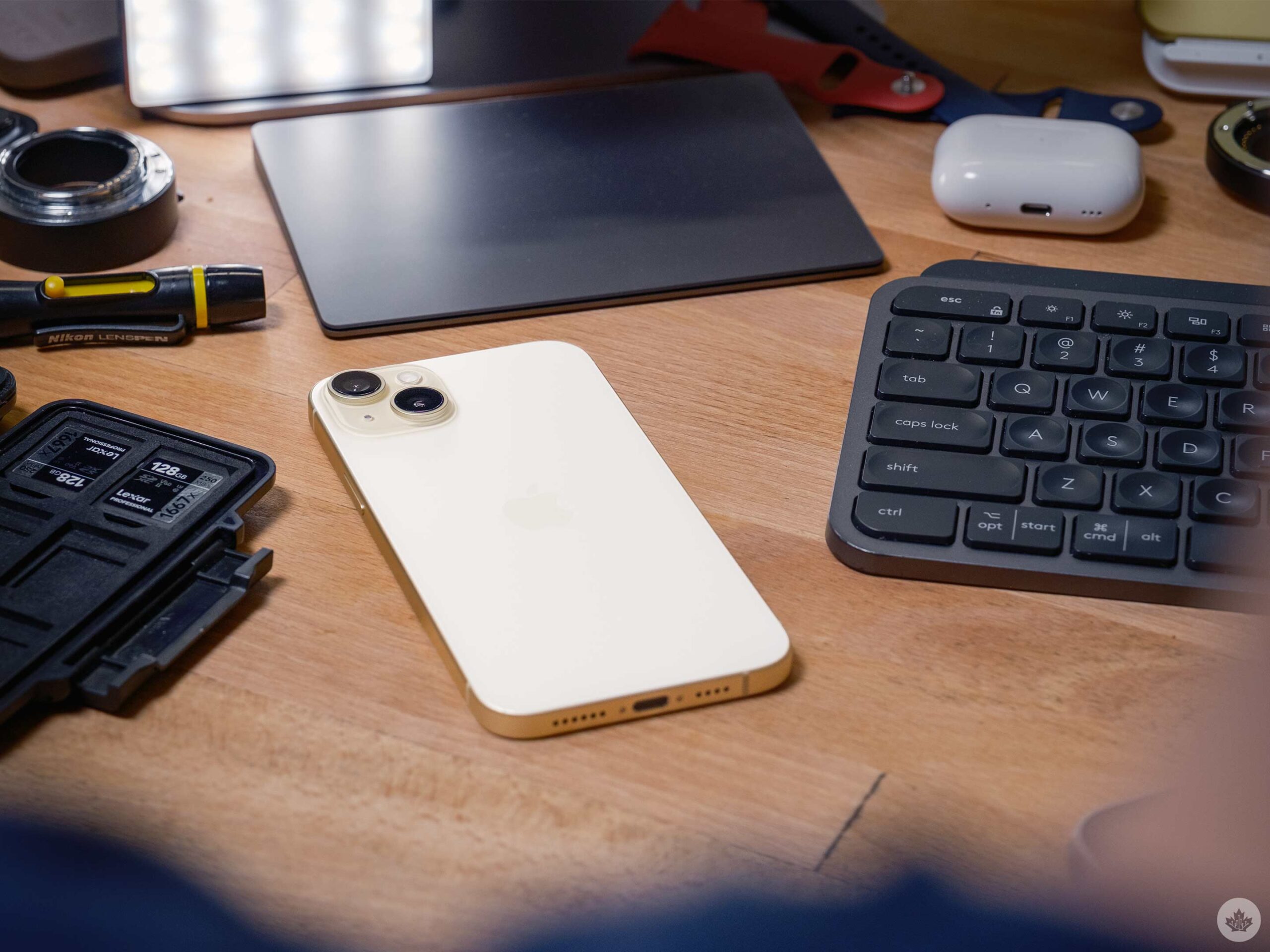
If you gave me a Natural Aluminum iPhone 15 Pro, I’d be all over it.
Apple’s Pro lineup always uses higher perceived value materials like stainless steel and titanium. They offer welcome benefits across a variety of industries, but the practical nature of aluminum in Apple products has always felt incredibly premium. Seriously, could you imagine a stainless steel Mac Studio? It would be dystopic, yet the aluminum version feels and looks very high-class.
At the end of the day, we’re talking about a phone. I want it to be lightweight and made of metal. Aluminum is the perfect material in that regard and the matte finish Apple adds to its products always feels clean, approachable and repels fingerprints better than steel or titanium.
Compared to the Pro iPhone models, the smaller camera unit allows the phone to maintain a tighter balance, which helps the large iPhone 15 Plus feel easy to use in one hand. There are moments where the bigger screen makes reaching the top corners more difficult than the 14 Pro I’m used to, but it’s less cumbersome than I expected. The new rounded edges help a lot with this. It’s an appealing compromise between the squared-off look of the iPhone 12,13,14 and the bulbous edges on the iPhone X, XS, and 11 models.
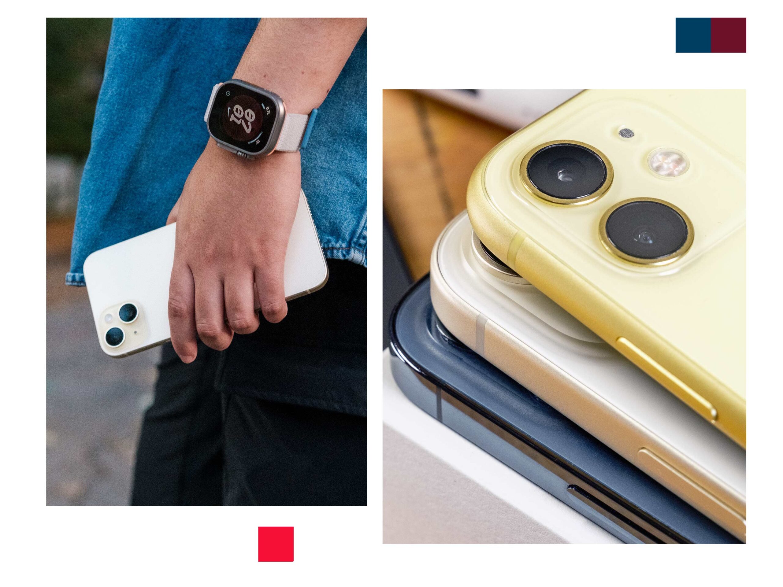
This year, more than most, I don’t want to use a case on my iPhone because it feels so nice. The left image features the edges of an iPhone 11, the 15 Plus and a Blue 12 Pro.
Combine that with the small bezels, the ‘Dynamic Island’ and 2,000 nit brightness, and this phone looks very slyly like the iPhone 14 Pro from the front. Under incandescent lights, my ‘Yellow’ 15 Plus even gives off subtle gold vibes, making it look kind of like a Pro. While I don’t find the Dynamic Island to be the game changer Apple made out to be last year, It’s still a fun visual element that makes the iPhone software feel premium. Ideally, it will continue to get better now that more iPhones have it, but for now, it doesn’t really do anything except put the 15 on par with the 14/15 Pro.
I know there’s been a lot of talk regarding the 60Hz display on the iPhone 15, but I don’t have a single complaint after using it for weeks. It seems like I’m weirdly in the minority with this, but I really feel like 60Hz is enough. It looks fine, and I’m far more concerned with my display’s colour reproduction, contrast and lamination. In those regards, the iPhone 15 excels. There are deep blacks, rich colours, and the thinness of the panel really makes it feel like there’s no glass between the screen and your finger.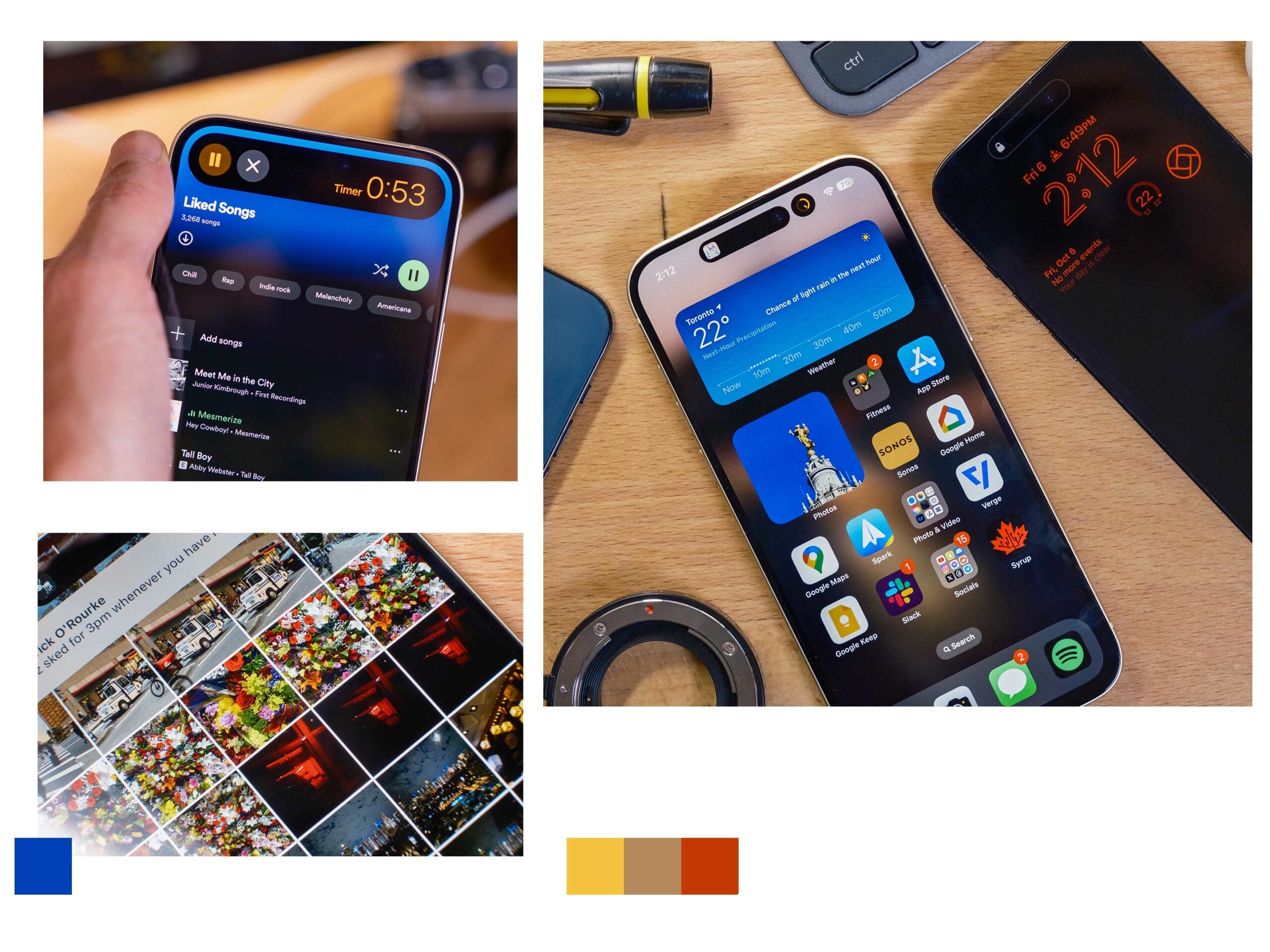 What I truly miss coming from the 14 Pro to the 15 Plus is the Always-on display (AOD) functionality. Having my iPhone 14 Pro with its red clock felt like a fun bit of personalization that I wish Apple would bring to all the modern OLED iPhones. In the end, it doesn’t noticeably detract from my iPhone experience and was likely cut to preserve maximum battery life.
I’m sure Apple could have easily slid in a 90 or 120Hz panel for the price of this phone, but who would have noticed? Not most people I know, and if the 60hz panel so much as saves an extra 30-45 minutes of battery, I’m in favour of the change. Again, 120Hz might look a little smoother, but it doesn’t add useful elements to your phone other than looking slightly more fluid.
The camera is my favourite step forward
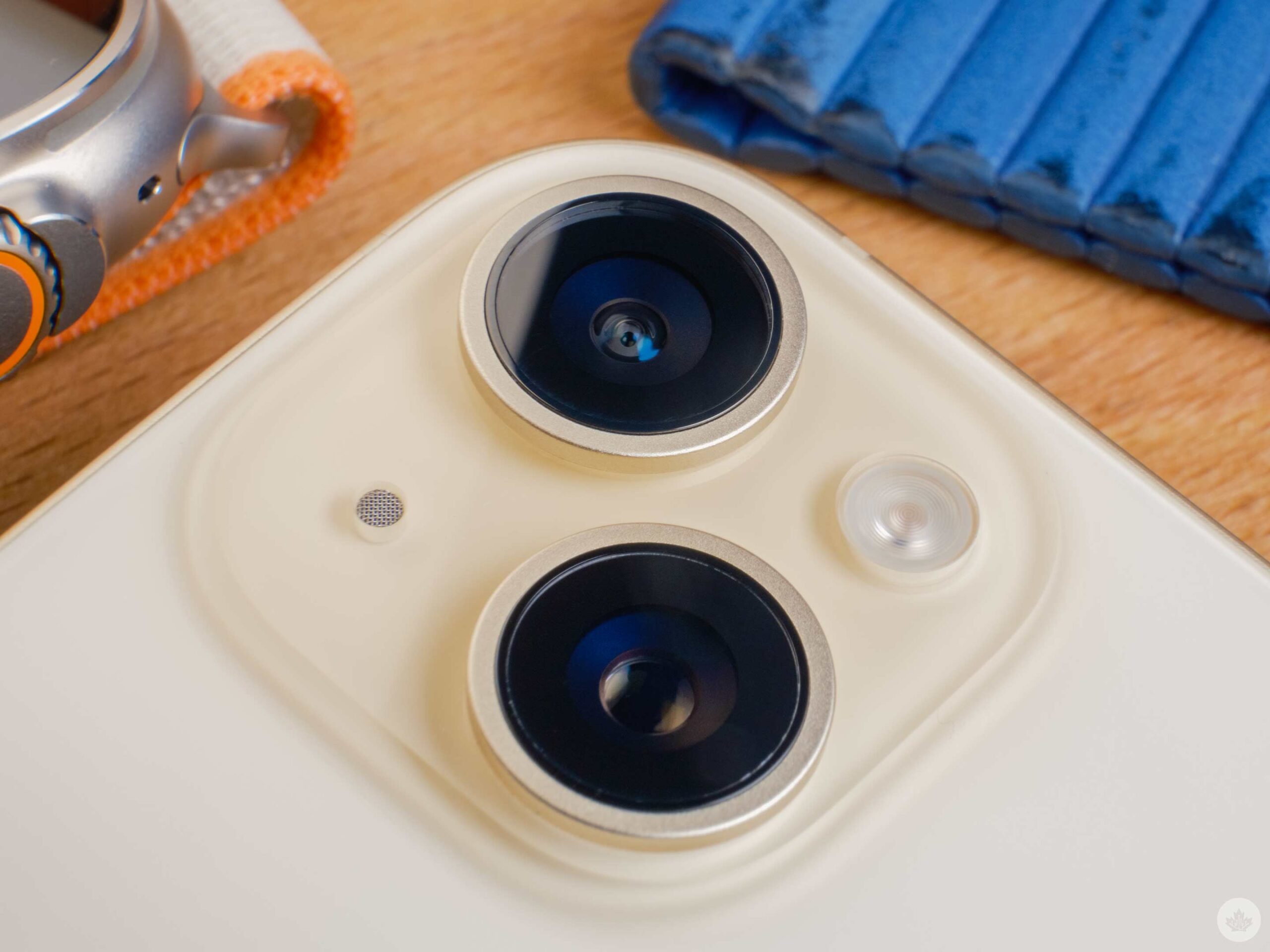 The new camera system is the most notable change over older iPhones. On the software side, the ‘Photonic Engine’ is dialled in this year. It handles shadows and highlights gracefully, resulting in slightly more contrast in scenes. This is good since the iPhone’s algorithm has been trending towards washed-out HDR photos over the last two years. These were good to edit from, but the changes make the iPhone 15 a better point-and-shoot camera. You can sort of remedy this in older phones with ‘Photographic Styles,’ but regardless, I’m happier the default engine has more colour, contrast and shadows this year.
It’s difficult to nail down, but it almost feels like Apple has taken notes from Renaissance painters by allowing light to sweep across scenes and create shadows and hotspots. Photographers often call this tonality, and when it’s implemented nicely, it can give photos a pleasing sense of depth. This is a good thing since it allows for more drama in scenes and can make a photograph stand out from a sea of washed-out modern images.
“In good lighting, all the photos easily stand up to a pretty aggressive 50 percent crop, giving you lots of space to edit.”
The new 48-megapixel sensor makes images crisply detailed, too. The smartphone doesn’t need to do as much sharpening and over-processing compared to the smaller 12-megapixel sensors from past iPhones. It’s a modest change, with an average of 10-25 percent improvement in my testing in common environments. It’s hard to notice on your phone’s screen, but images hold up way better on bigger screens like my laptop, or PC monitor. In low-light, the larger sensor helps the phone capture more light, which can help retain detail in edge-case scenarios. It’s not as strong as the iPhone 15 Pro series, but I’ve found it useful.
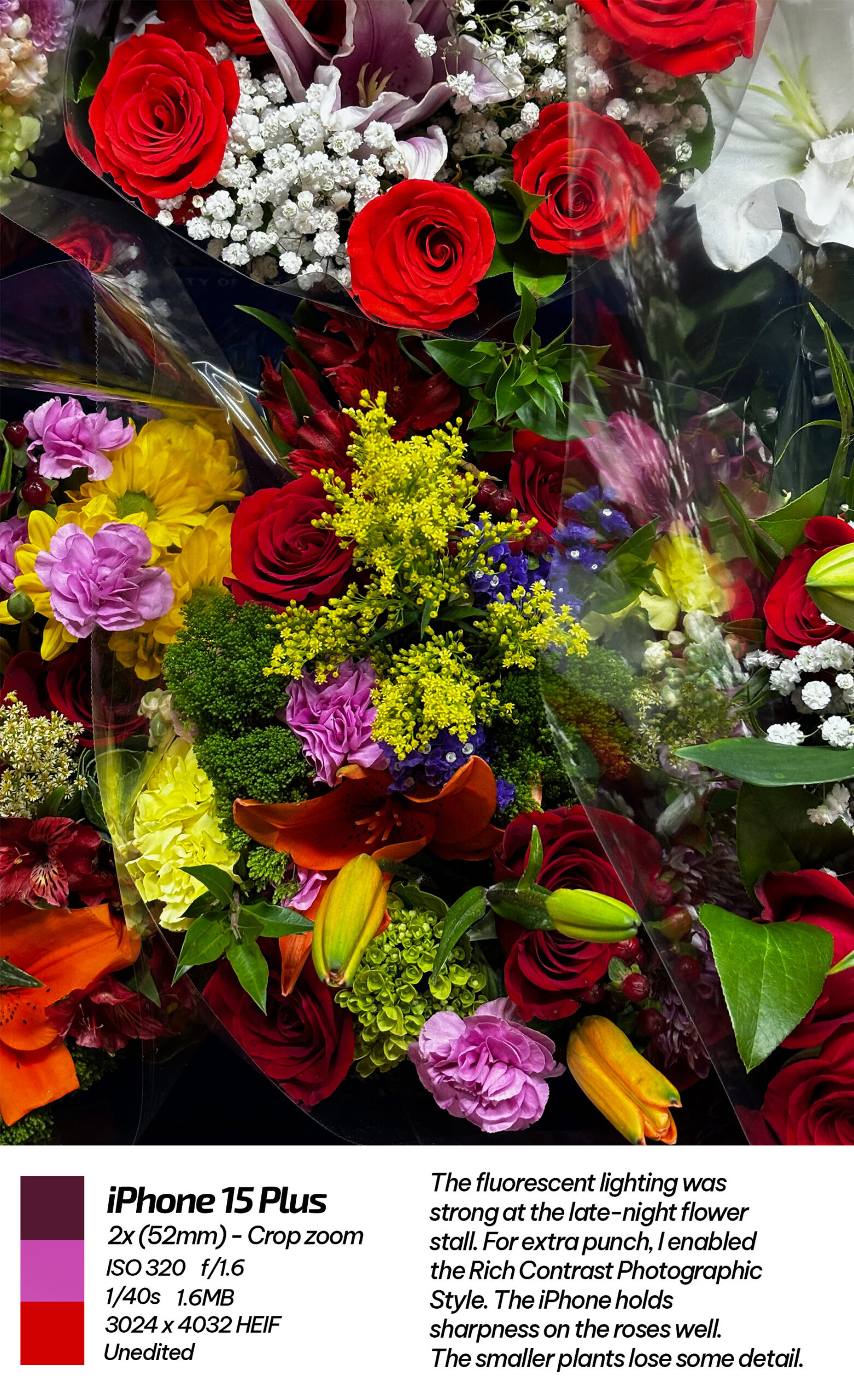 Under good lighting, all the photos easily stand up to a pretty aggressive 50 percent crop, giving you lots of space to edit. Apple also realized this and gave the iPhone 15 camera a 2x digital crop zoom. It sounds underrated since other phones can zoom further, but it’s a turning point within the iPhone ecosystem. Since the iPhone 7 Plus launch, Apple has kept its zoom features exclusive to its more expensive iPhones. This 2x crop might not be as exciting as the new 5x on the 15 Pro Max, but it’s essentially a new lens that was considered a Pro-only feature for the last eight years.
The 54mm focal length it offers on the iPhone 15 has been versatile in my tests, offering a little more depth compression for long shots or portraits. I‘ve even pushed it further to 3x with acceptable results, but 5x wasn’t impressive without perfect conditions and a tripod. You can see the iPhone Photonic Engine working hard to sharpen these images, and often, I find the 2x zoom slightly sharper than just cropping in on a regular photo. To see this for yourself, you can look at a finalized image and then compare to the Live photo. It’s an interesting example of how good the iPhone’s processing is at cleaning up a frame.
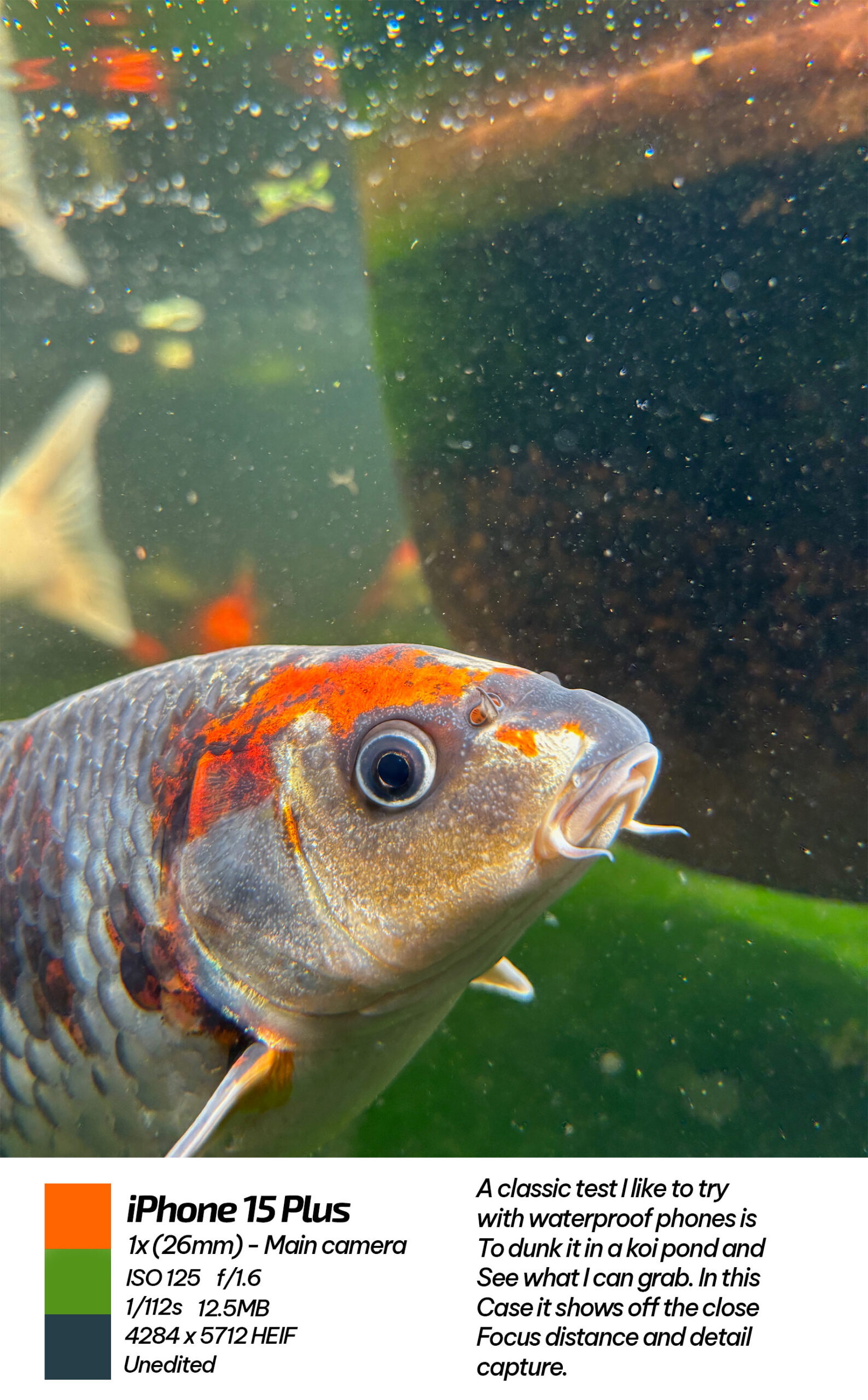 I wish there were macro capabilities like the Pro iPhones, but I will say the 15 I’m using demolishes the 15 Pro’s main camera’s minimum focus distance. The regular 15 can get about twice as close to a subject as the Pro model, allowing for creative shots. As a comparison, the 14 Pro I used last year automatically switches into macro mode all the time. Sometimes, even trying to take a picture out a window or of a receipt on my desk was close enough to trigger it. The 15 handles these shots much better, and its minimum focus distance is more fun to play with.
As a single-lens camera, I like the 15’s system much more than the iPhone 14 Pro. I would have liked to see the iPhone 15 Pro’s new default focal length selection come down to the regular iPhone 15 this year and backwards to the 14 Pro. If both of those phones can sensor crop a 2x zoom, Apple should allow us to have default focal length options. In that same vein, Automatic Portrait mode should also come back to the 14 Pro. Since the iPhone 14 Pro and 15 share the same chip/RAM, there’s no excuse other than marketing why the older phone was left in the dark.
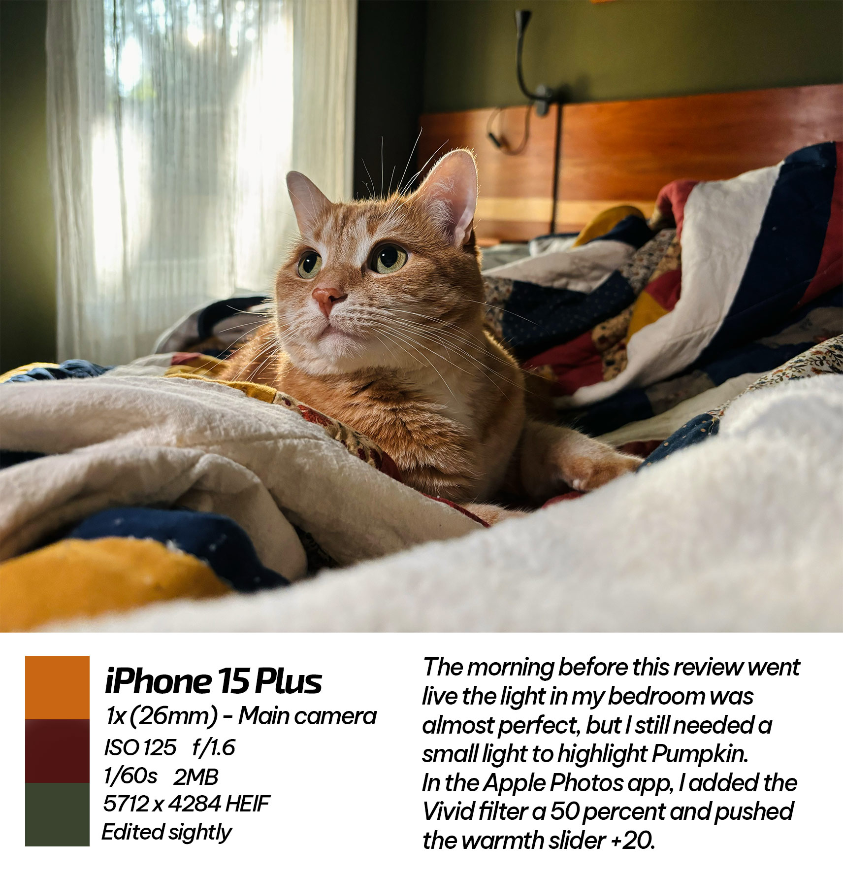 That said, the single most important change in the camera is the new ‘Automatic Portrait’ feature. It doesn’t magically turn every image into something that looks like it was shot with an interchangeable lens camera, but it’s taking innovative steps in that direction.
Whenever you take a picture of a person, cat or dog with the iPhone 15, the phone is smart enough to capture the scene’s depth data. Then, you can add blur when you’re editing to make the photo replicate the characteristics of a large camera lens. It’s a powerful system, and it means that all your photos of your pets, friends and family have at least a 50 percent chance of looking amazing. It’s a very enticing proposition that I was initially surprised Apple didn’t highlight more during the event. After testing, its hit-and-miss nature explained the brief overview on stage, but I still think it’s an important step on the computational photography roadmap.


When you’re in the camera interface, tapping to focus on a subject retains this depth data. When It works well, you get photos that don’t look like they came from an iPhone at all. In theory, the iPhone 15 Pro should be able to do this slightly better (especially in low-light) because of its included LiDAR sensor, but for the most part, both phones seem to rely on algorithms. They’ve improved this year with good fall-off and fun bokeh circle reproductions that can look very real in some regards. The cutouts still get confused by intricate backgrounds or things that are the same colour as the subject, but since the Portrait mode effects are marketed as an add-on to make regular photos look better, it doesn’t feel as detrimental when a shot messes up. Since you still have the original you took without blur, it feels more like a win-win than selecting Portrait mode and having it fail.
It might not appear as a big deal, but it’s going to shift how people think about fake blur. Portrait mode was inherently named after one style of photography, but now, the technology is starting to be applied to all photos. When I think about how smartly Cinematic mode applies bokeh, I have faith that Apple can pull off great blur in photos of everything very soon. And if that all lives in the main camera app, it gives the iPhone camera’s output the possibility of reaching interchangeable lens camera levels. Again, not every photo will hit, but when they do, it’s hard to believe they came out of a phone camera.
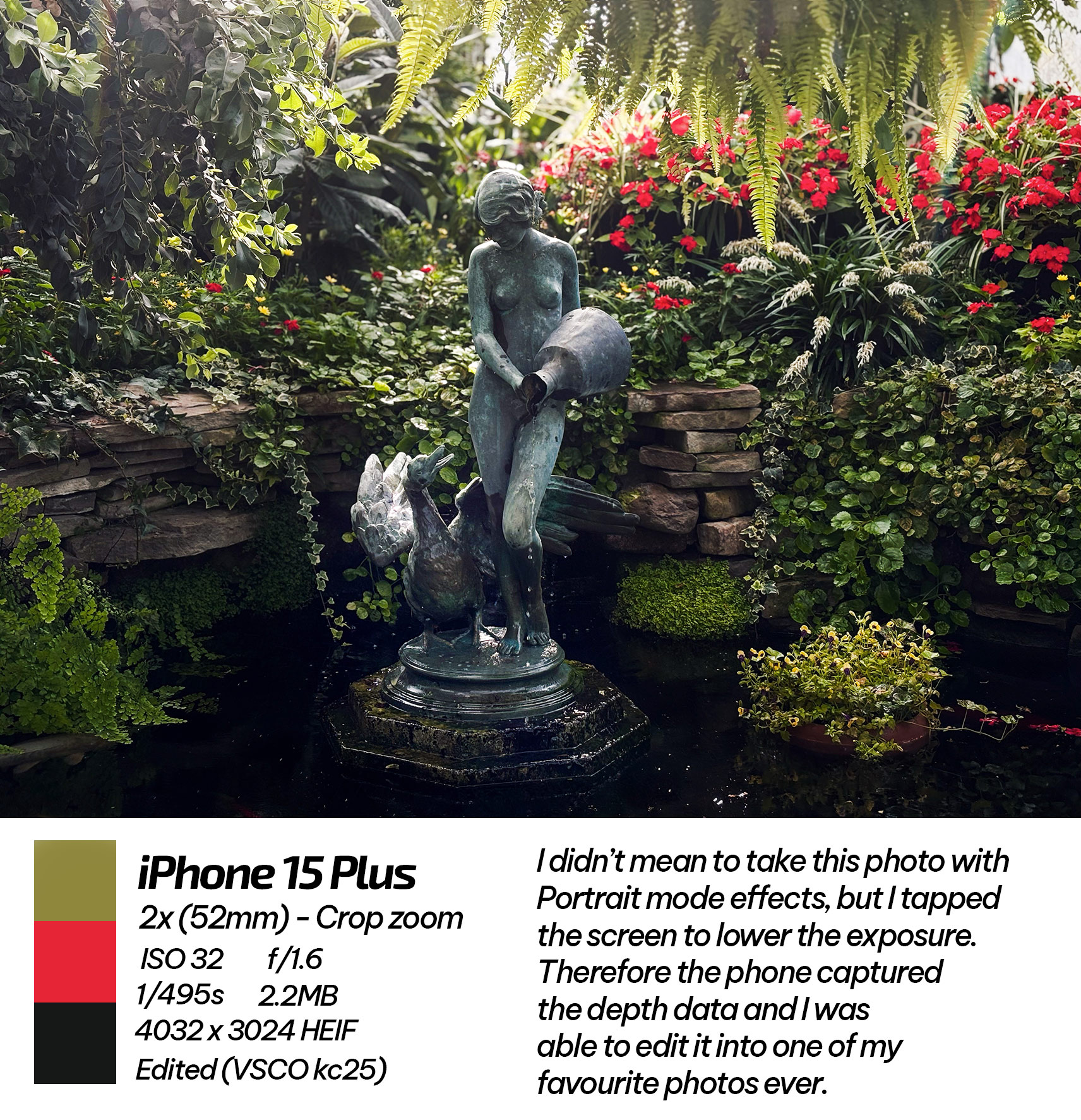 Since this new feature is applied after taking a photo, it slyly pushes you to open up the Apple Photos editing suite, which I rarely did before. It’s a minor tweak but a smart move from the company to get more users involved in editing. People are generally happier with their photos once they edit them. It gives you a sense of ownership of your image and helps you become more attached to a camera system. Apple did this with ProRaw on the Pro iPhone models, starting with the iPhone 12 Pro, so it’s interesting to see a similar strategy at play here.
You can see all of the unedited photos in high-quality here
My edited versions are located here.
The iPhone 15 didn’t get ProRAW, but it did get a similar feature in concept, the ‘HEIF/JPEG MAX’ toggle. It doesn’t produce RAW images, but it gives you a choice that ultimately boils down to; do you want a better photo or not? It’s a smart move that will help people fall in love with the new iPhone camera system regardless of whether they’re getting the Pro or the standard phone. Sure, it’s not as editable as ProRAW, but it’s all about how it triggers a user to put in a little extra effort to get the maximum potential from their product. Even if the end photo looks the same, it leads to a rewarding feeling. I know it happens to me.
Pro enough
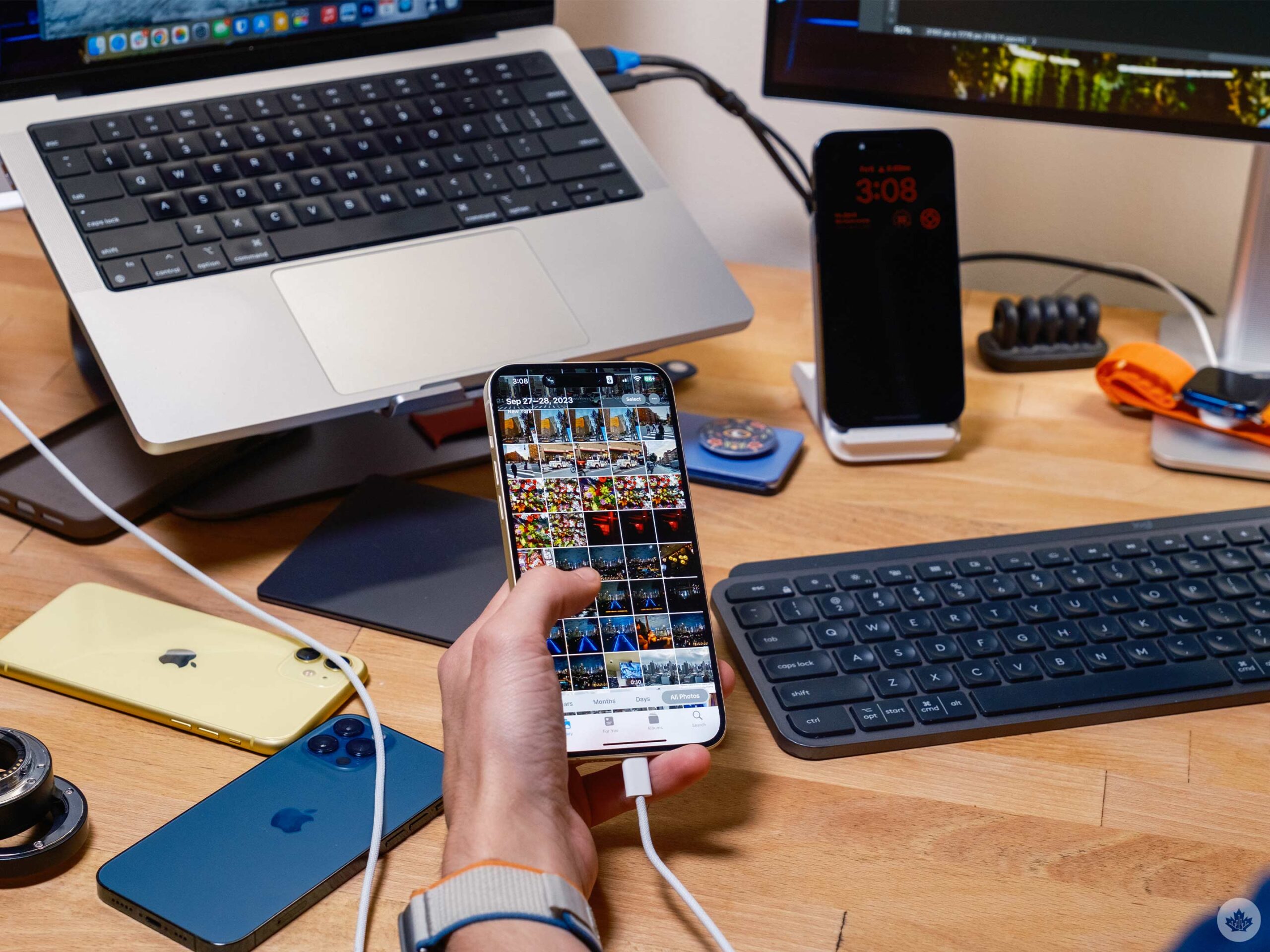 There has been controversy regarding the iPhone 15’s USB 2.1 port. This isn’t a fast port, but you’ll never notice the difference unless you plan to take advantage of RAW photos or ProRes videos. And while those modes are exciting, you need third-party apps to record in them, and it’s not something I expect most people will do, considering the default photos and videos are already so good.
The simple fact that it’s a USB-C port is convenient, but it hasn’t changed the game. I don’t have a lot of need to plug a display, ethernet, or really anything into my phone. So it’s nice to have, but since I’m not shooting ProRAW or ProRes footage, I don’t need to plug in a hard drive or SD card either. Ideally, Apple could add some form of ‘Stage Manager‘ or stopgap solution, dare I say, like Samsung’s Dex. This would make plugging into a display more reasonable, but for now, the change to USB-C doesn’t do much for functionality.
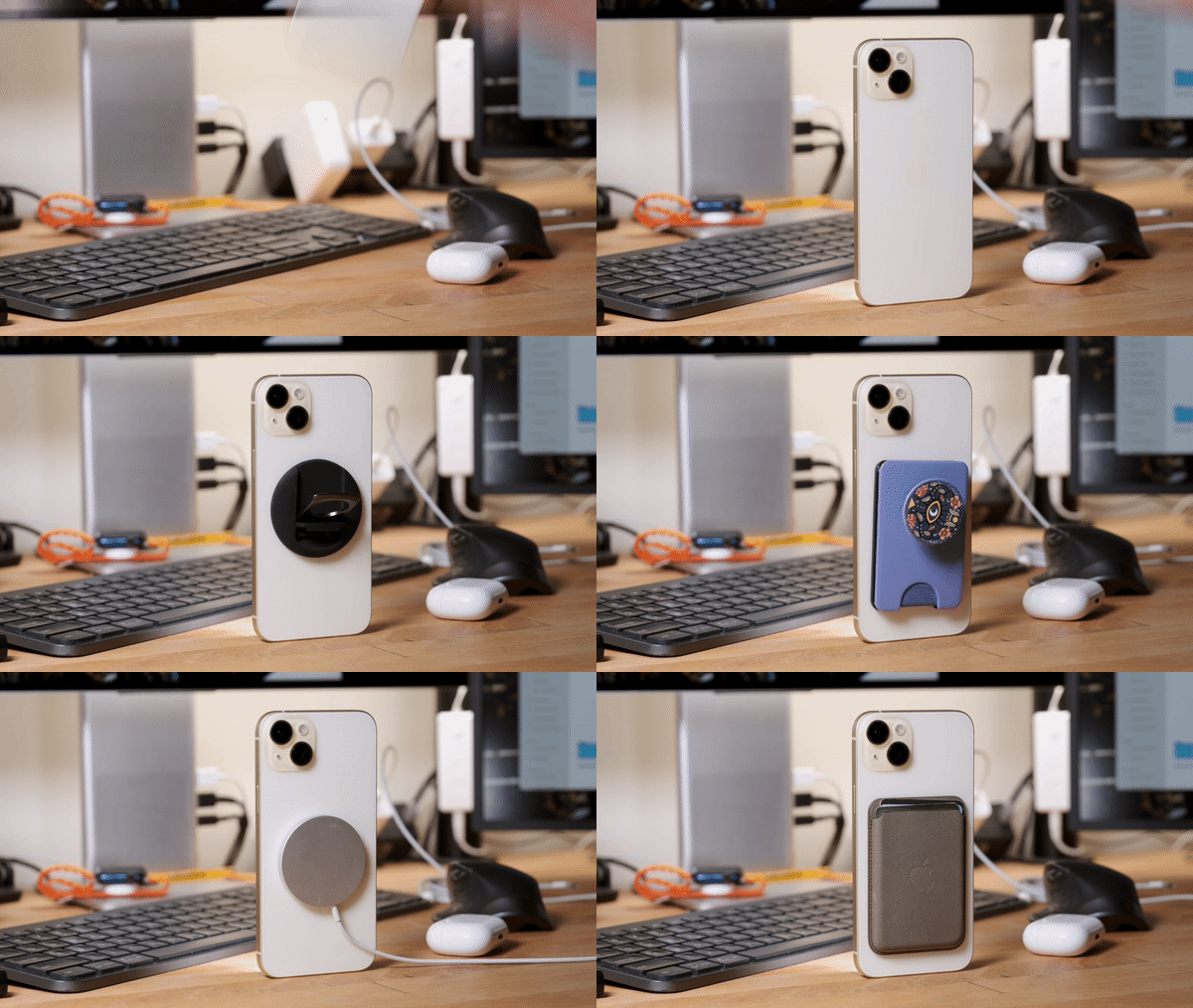
I still love Magsafe. From wallets to chargers and mounts, the magnetic ring is the best.
What could have been a more admirable addition would have been faster charging. As a secret OnePlus fan, I’ve always wished I could top up an iPhone in 45 minutes or less. That said, the battery life on the 15 Plus has been good and easily lasts three to four hours longer in day-to-day use than my one-year-old 14 Pro. On average, I would even end days with five to seven hours of screen-on time.
While the chipset and RAM are more than enough for all the iOS games you might want to throw at it, the unfortunate thing is that Apple made big gaming improvements with the new A17 Pro chipset in the iPhone 15 Pro. If you’re not a mobile gamer, this won’t mean much to you, but if you plan to keep your phone for a few years, and want to play AAA games on mobile, this might be something to consider. I’ve been crushing Call of Duty mobile and a game called Warped Kart Racing, and both titles ran flawlessly. Even doing over a thousand spot corrections on an image didn’t really push the iPhone 15 Plus.
 At the end of the day, the A16 is top-tier, and compared to anything Android has to offer, it’s super-powered. I don’t expect there to be many console-level games on iPhone for at least two to three more years, and even that’s being generous. Therefore, I think early adopting the A17 Pro chip isn’t worth it right now.
At the end of the day, there’s a lot to love about the iPhone 15 and 15 Plus. As far as I’m concerned, it’s last year’s iPhone 14 Pro with a nicer body. Even as a photographer, I barely use ProRaw, so living without it hasn’t been an enormous change. On the contrary, Automatic Portrait mode excites me more than ProRAW ever.
For years, I’ve leaned towards the Pro iPhones, and this year’s video features are tempting, but now more than ever, I think most people who end up with an iPhone 15 will live the Pro iPhone experience without even knowing it.
MobileSyrup may earn a commission from purchases made via our links, which helps fund the journalism we provide free on our website. These links do not influence our editorial content. Support us here.


