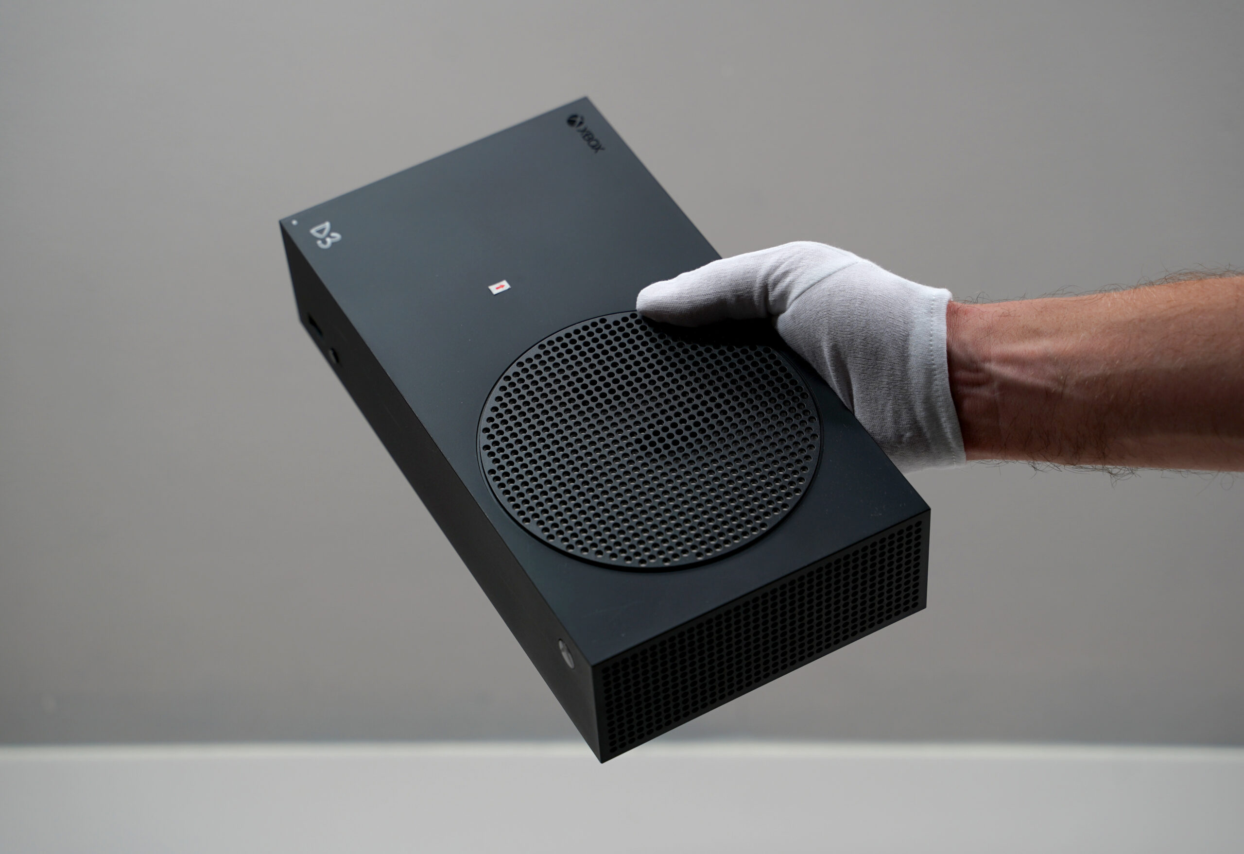
Microsoft unveiled the fancy ‘Carbon Black’ Xbox Series S with 1TB of storage back in June, and the console has since become available. But it turns out there’s a lot more to the refreshed Series S than turning it black.
I recently sat down with Chris Kujawski, a principal designer at Microsoft, to learn the inside story of the trials and tribulations of going zero-dark thirty on the Series S. Kujawski has worked on a variety of Microsoft hardware, ranging from Surface to Xbox (his favourite project? The Xbox Adaptive Controller, though the Series S was also a favourite). Most recently, Kujawski led the Xbox Series S ‘Carbon Black’ refresh.
He started off by walking me through the decision to refresh the Series S, which stemmed from its popularity and a major piece of feedback the company received about the console.
“The Series S has been a really popular product for us,” said Kujawski. “Fans love it because it’s small — it’s the smallest Xbox we’ve ever made. It’s a great way to get into next-gen gaming at a really affordable, great-value price point.”
But Kujawski acknowledged that the company received a lot of feedback about the storage; the original Series S had just 512GB.
“Modern games are pushing 100GB, and that can fill up your drive pretty quickly. We wanted fans to not worry about anything other than playing games […] extending to a terabyte of storage on the Series S was a really natural and logical thing to do.”
Throughout our chat, Kujawski repeatedly told me how much he and others at Microsoft liked the Series S design, so much so that they didn’t feel a need to change it. However, the team wanted to give the 1TB Series S a “fresh spin.”
“Black tends to have a bit more of a performance vibe; it feels a bit more serious,” Kujawski said. “We’ll just make it black. No big deal.”
It was a pretty big deal, after all.
Black plastic is difficult to work with

Series S prototype showing a blemish from the gate. Image credit: Microsoft
The biggest hurdle the design team had to deal with was making the black Series S look good. Kujawski explained that white plastic is easier to work with because it doesn’t show blemishes like black plastic does. And there are a lot of ways that blemishes can be introduced.
“We had actually pretty much every type of cosmetic issue you can have on a plastic part,” Kujawski said.
The design team was aware of this thanks to working on the Xbox Series X, which also comes in black. However, on the Series X, the team started knowing it would be black and took steps to mitigate problems introduced by working with the material. For example, Kujawski detailed how the team used the Series X’s power button to hide a major source of blemishes.
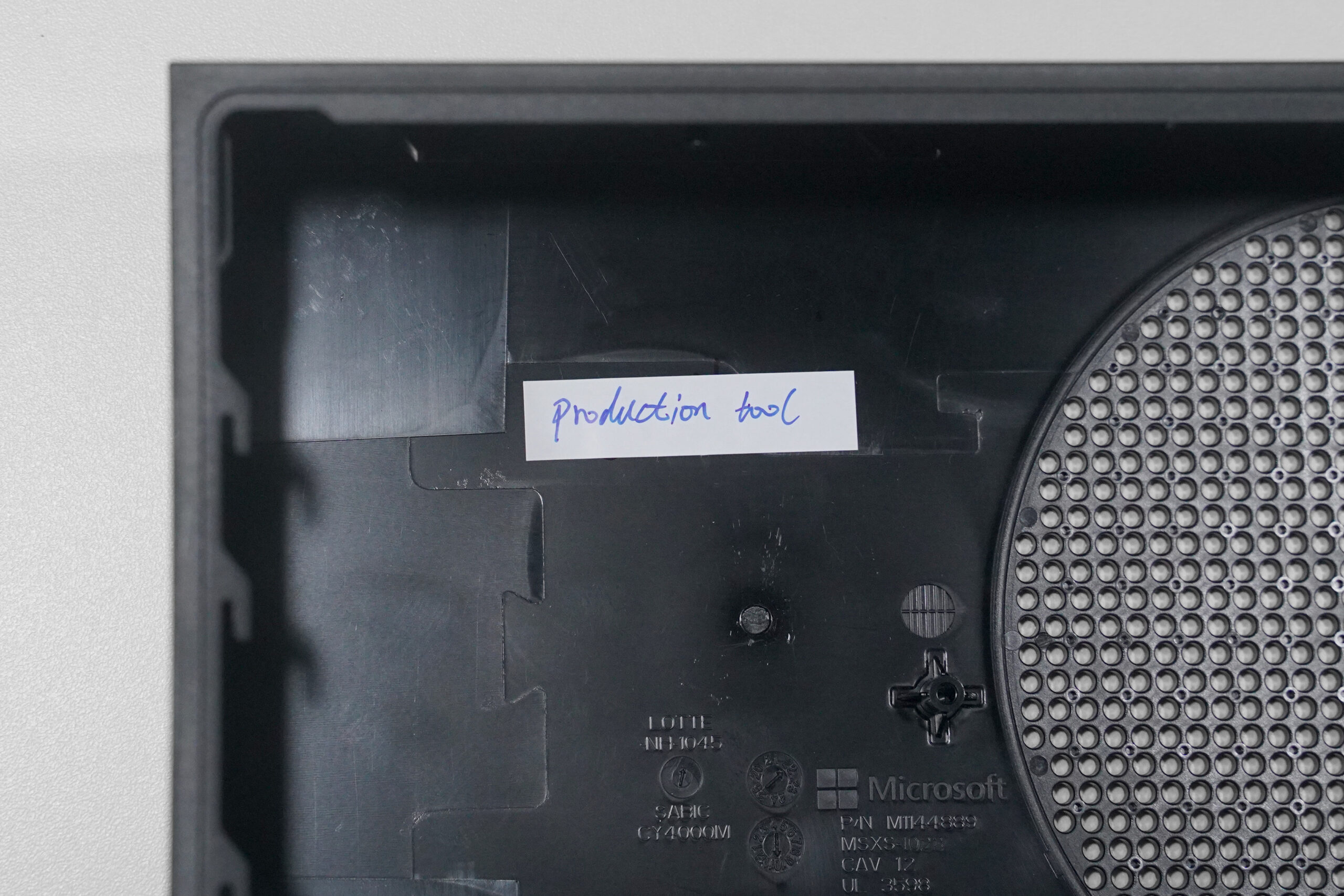
To make the outer shell of the console, Microsoft uses injection moulding, which involves heating the plastic to a higher temperature and injecting it into a mould to create the shape. The spot where the plastic enters the mould is called the ‘gate,’ and it often leaves blemishes like discolouration or weird spots. They designed it so the Series X’s gate would be where the power button would go, which meant any issues would be removed after the fact when adding the hole for the button.

View of the gate blemish from inside the prototype. Image credit: Microsoft
With the Series S initially shipping in white, the team didn’t need to take the same precautions to prevent blemishes. The gate ended up being on the top of the console near the middle, invisible in white but very visible in black.
Moreover, because the team wanted to keep the Series S design and just change the colour, it meant they couldn’t just tweak the tools.
“Because of the complexity of the tool, it would have been way too expensive to redesign it and more this gate,” Kujawski said. “We just had to power through these problems.”
The little details

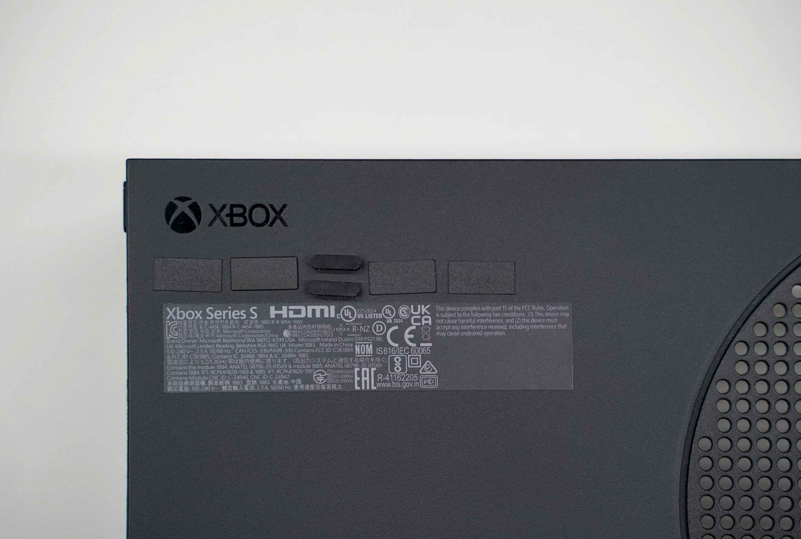
Microsoft had to match the colours of all the little pieces to the new Carbon Black enclosure. Image credit: Microsoft
Kujawski went on to detail various other cosmetic issues, from weld lines that looked like tiny cracks in the plastic to certain parts coming out shiny instead of matte because of the way the mould was shaped and how the plastic cooled.
“So this really easy project that we were just going to turn things black ended up going pretty badly from the start.”
But the design team persevered, and Kujawski said they were eventually able to tune and adjust all the parameters, things like plastic and tool temperature, how long a part stays in the tool, to get it right.
“It took more engineering builds and cost more money than it typically would or than we had initially scoped,” said Kujawski. “But there was no pushback, no complaints about that. It was understood… we have to get it right.”
Getting it right meant paying close attention to small details, some that the average person might not even notice. For example, the team initially thought there were only three parts of the Series S they needed to turn black, but it turned out there were 13 pieces, including small ones like the rubber feet and the product label on the back. The power button also needed to be revamped to match the new colour.
Nowhere to hide

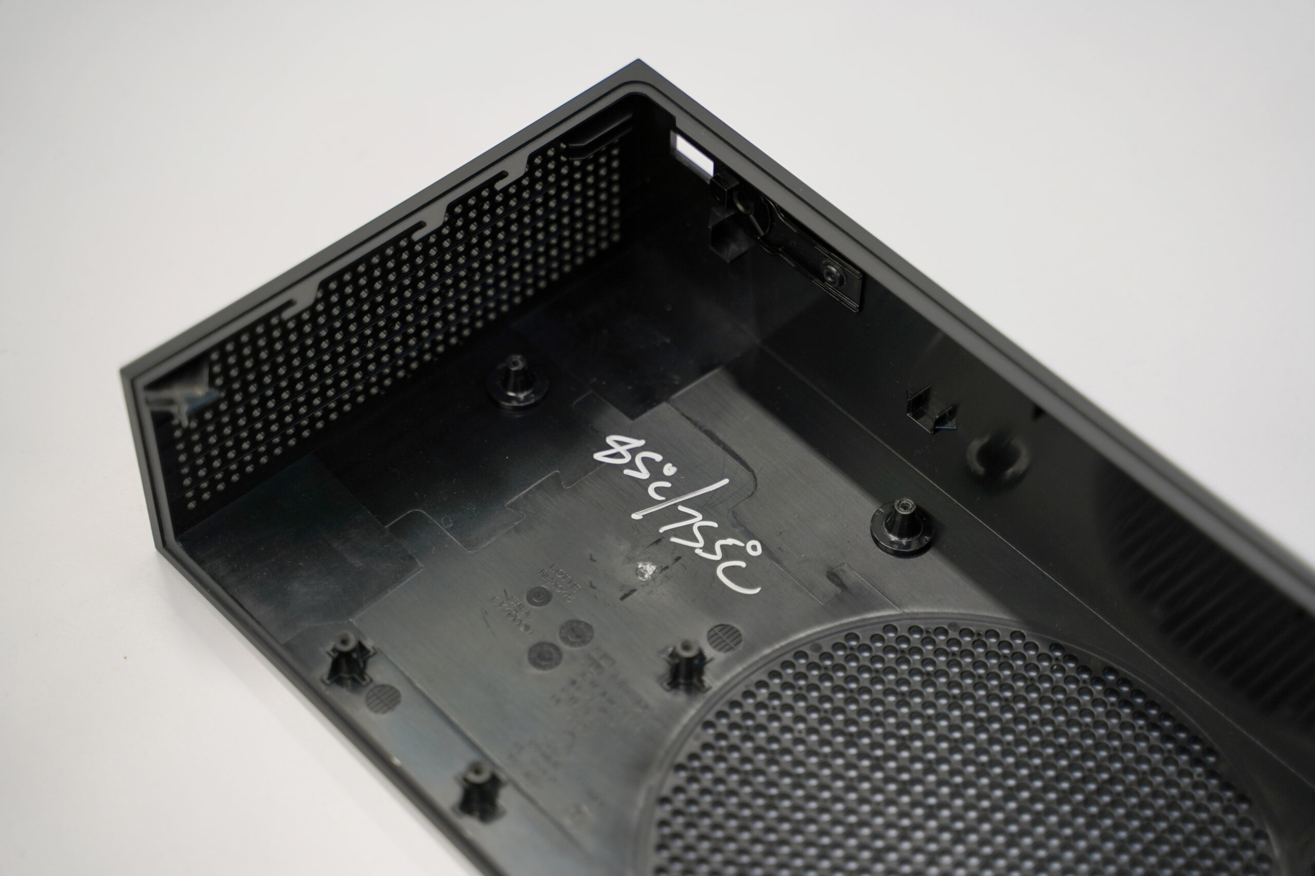
Temperate notes written inside an enclosure prototype.
Speaking of little details, I asked Kujawski if there was anything unique about the Series S that most people might not notice. He pointed to the gird of holes on the vent.
“Designing, an Xbox is, for the most part, designing around a thermal system inside,” he said. “So the venting becomes an important design element. The alignment of these vent holes actually translates all the way around the console.”
If you have a Series S and you haven’t given it a close look (or if you get one in the near future), go give it a close look. The vent holes do align, forming a grid of sorts all around the console. And as Kujawski pointed out to me, nearly every element on the console lines up on the grid.
“It’s not a major design element, but I think what it does is it takes what looks like a very simple product and just it makes it feel right.”
Kujawski also explained that, from a design perspective, simple designs can be more difficult because there’s nowhere to hide.
The future
Naturally, I couldn’t have this conversation without asking two burning questions. First, I wanted to know if other colours were in the works, but it doesn’t seem likely.
“Can’t talk about future stuff,” Kujawski said. “We have a pretty good history of doing white and black on the consoles… they’re great neutral colours that tend to fit in well.”
The other question was about console wraps for the Series S.
“We don’t have anything to announce now, is my official PR line. And it’s true,” he said. “But I will say when we launched the wraps on the Series X… I was encouraged to see so many people asking for the Series S… I was happy to see that the fans were looking for that.”
While wraps for the Series S may or may not happen, at least fans of the tiny console now have a stylish Carbon Black option. And maybe next time you boot up your Xbox, take a minute to admire the design — a design that likely took more effort than one might expect for a plain, black box.
“I’ve worked at Microsoft for 16 years as a designer,” said Kujawski. “I think this is the simplest, most complicated project that I’ve ever worked on.”
We’ll have more on the Carbon Black Series S in the coming weeks.
Image credit: Microsoft
MobileSyrup may earn a commission from purchases made via our links, which helps fund the journalism we provide free on our website. These links do not influence our editorial content. Support us here.


