I love web browsers.
It’s an incredibly nerdy thing to say, but it’s true. I find them fascinating and, perhaps because I rely on a browser to do most of my job, I pay a lot of attention to what’s going on in that sphere. As such, I’ve been following the development of the Arc browser and eagerly waiting for it to come to Windows since I’m not a Mac user. Needless to say, I was very excited when I got access to the Arc beta on Windows in mid-February and I’ve been using it ever since.
Granted, Arc on Windows is still very much in beta. I’ve encountered a few hiccups, crashes, bugs and other glitches, to be expected in beta software. Plus, many of Arc’s more notable features are missing, like the AI features. But so are several basic items, like syncing if you want to use Arc across multiple devices.
I wouldn’t exactly recommend Arc for Windows users in its current state (not that it’s readily available yet), but it is steadily improving. Still, even in the early beta stage, there’s a lot that I really like about it, and I’m already finding it tough to go back. Read on for my thoughts on some of the features I like most in Arc.
Tab management
First up, I really like Arc’s approach to managing tabs. It can take a little getting used to, but once I figured it out, it worked wonders for me. Most web browsers give you two options when it comes to tabs — regular tabs and pinned tabs. Some browsers let you get a little fancy with it, such as grouping your tabs, but that’s about the extent of it.
With Arc, you have a few more options. You can ‘favourite’ a tab or pin it. Tabs that don’t get pinned or favourited are dubbed ‘Today’ tabs and get cleared out after a set period of time — the default is 12 hours. Before moving to Arc, I had a weird amalgamation of pinned and grouped tabs representing different areas of my life — for example, I had some important tabs like my email pinned and a bunch of tabs I frequent for work stashed in a group. And to keep those things open, I set my browser to pick up where I left off, although that meant unimportant tabs wouldn’t get cleared out unless I did it myself.
With Arc, tab management feels more flexible. Instead of a tab group, I have a folder of pinned work tabs that I can collapse when I’m not working so they’re out of the way. My most important tabs, like email and a Notion page I use to track to-dos, my weekly meal plan and various other things, and my calendar, live up in favourites where they’re easily accessible everywhere in Arc. And all those random tabs I open throughout the day? They get banished after 12 hours, meaning I start each day with a clean slate.
Sure, you can do most of that with any browser, though maybe with a little more effort. However, there are a few small things that make tab management feel a little bit better on Arc. For one, when you pin a tab, you also pin the specific URL you’re looking at. This went from a weird annoyance to one of my favourite features really quickly. For example, one of my pinned tabs is the MobileSyrup homepage, which I visit frequently for obvious reasons (it’s badass, duh). I also use it to look up prior coverage when I’m working on stories and I don’t always remember to go back to the homepage when I’m done. Because of how Arc’s pinned tabs work, the browser tab shows a little ‘/’ icon when I’ve navigated away from the pinned URL and I can quickly return to that URL by clicking the tab’s favicon. It seems small, but this tiny little feature makes Arc’s pinned tabs feel extra useful and I use it constantly across my pinned tabs.
Another interesting tab thing that Arc does is it does away with the whole new tab page. Instead, when you click the new tab button or ‘Ctrl+T’ to open a new tab, you get a search bar. I find this super handy since I usually do one of two things when I open a new tab — search for something or go to a specific website. Skipping the new tab page makes the process feel a lot snappier. The search bar can also pull in your open tabs, making it a handy tool for switching between my tabs without needing to reach for my mouse.
Peek and Split View are blessed
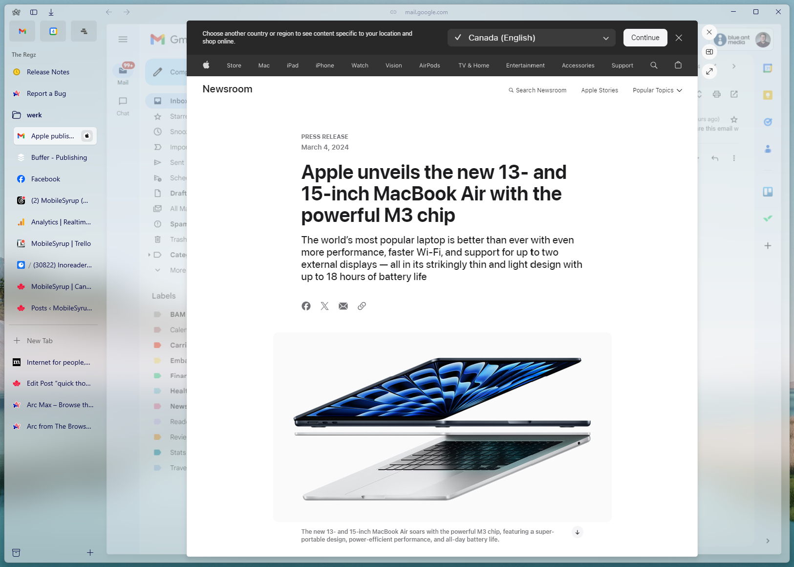
While arguably both tab management features, I think Peek and Split View deserve their own spotlights. Peek wasn’t in Arc for Windows at launch but did arrive in a recent update and once again, it surprised me how useful it is. Peek works automatically in tabs you favourite or pin in Arc. When you click a link in one of those tabs, Arc opens the link in a ‘Peek’ within the tab itself. For example, if you get an email with a link, you can click the link to open it in Peek within the tab your inbox resides in.
On the surface, it doesn’t sound that helpful — after all, you can just open links in a new tab. But I really appreciate how far this goes to reduce tab clutter and keep things contained. I also find it helps my brain, at least with how I approach doing things. Going back to the email example, I like to treat my inbox like a to-do list so being able to open a link, do a thing in that link, and close it all without leaving the tab I’m in helps with that flow.

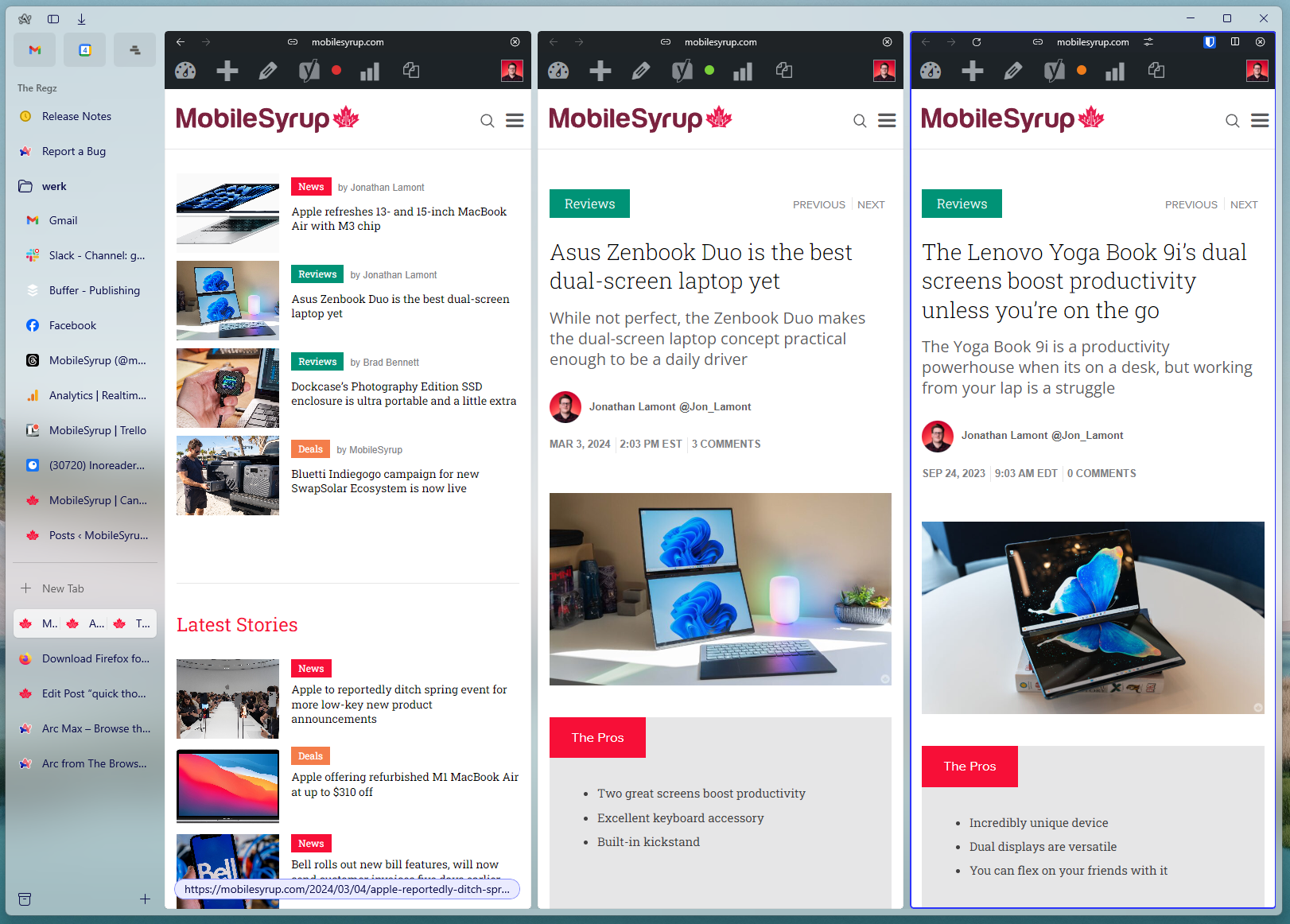
Arc’s Split View in action.
‘Split View,’ on the other hand, is a very handy way to open multiple web pages side-by-side. This feature certainly isn’t unique to Arc — off the top of my head, both Microsoft Edge and Vivaldi offer similar features — but I prefer Arc’s implementation. Namely, the handy keyboard shortcuts for using Split View. Tapping ‘Ctrl+Shift++’ activates Split View on the tab that you’re currently viewing. This moves the tab to one side and calls up the same search bar you get when opening a new tab. From there, you can navigate to a website or search another open tab and Arc will place it next to the tab you started with. Alternatively, you can drag a tab and drop it on another tab to put them into a Split View. You can have up to four pages open in Split View at once.
I find Split View super helpful when I’m working on a story for MobileSyrup because it allows me to have my draft open alongside my research for easy referencing. And while you can achieve something similar using multiple browser windows, having everything in one window helps reduce clutter. It’s especially helpful when I’m working on a laptop where I don’t have as much screen real estate to dedicate to multiple browser windows.
Other little things
Ultimately, much of what makes Arc click for me comes from little nuggets scattered throughout the browser, stuff that might not make a huge difference to most people. For example, I love that there’s a keyboard shortcut for copying a URL (Ctrl+Shift+C). That alone saves me from constantly grabbing my mouse and clicking the URL bar.
In fact, there are tons of little shortcuts nestled into Arc that, if you like using your keyboard, make the browser feel really good. I already talked about being able to manage Split View using keyboard commands, but there are also keyboard shortcuts for a bunch of features. It makes for a bit of a learning curve, but it helps Arc feel much faster once you figure it all out.
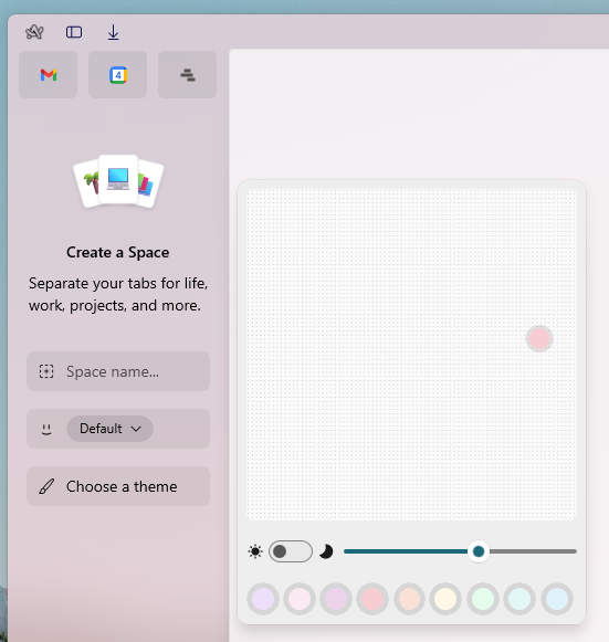
 There are also things I haven’t touched on much because I don’t use them, though I can see how they’d be useful. For example, Arc puts a significant focus on its sidebar — that’s where your tabs, pinned tabs and favourites live. You can have different ‘Spaces,’ which are different sidebars with different pinned tabs, which can be helpful for stuff like splitting up your work tabs and personal tabs (favourites persist across Spaces). Additionally, you can go deeper with profiles, which act like separate instances of Arc with their own history, extensions and logins. Unfortunately, I don’t use either feature much — I haven’t found a fit for Spaces in my current workflow, and profiles just don’t work for me the way I’d like. And of course, there are tons of other Arc features that haven’t come to Windows yet.
Oh, and Arc looks phenomenal. I’m a sucker for the semi-transparent glass effect Arc uses, I’ll admit it. But it looks very pretty.
All this is to say Arc potentially could be a productivity powerhouse of a browser, at least if you have a workflow that fits with what Arc’s trying to do. I found my workflow meshed pretty well with Arc, once I learned how to use the various features of the browser. It’s got me excited to see how Arc for Windows developers over the next few months. Despite the glitches and missing features in the beta, I don’t think I’ll stop using Arc anytime soon.
Those interested can join the Arc for Windows waitlist here.
MobileSyrup may earn a commission from purchases made via our links, which helps fund the journalism we provide free on our website. These links do not influence our editorial content. Support us here.


