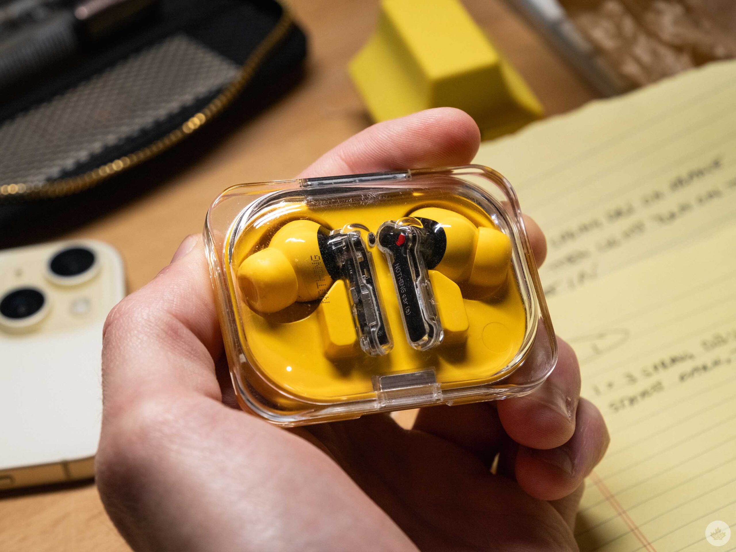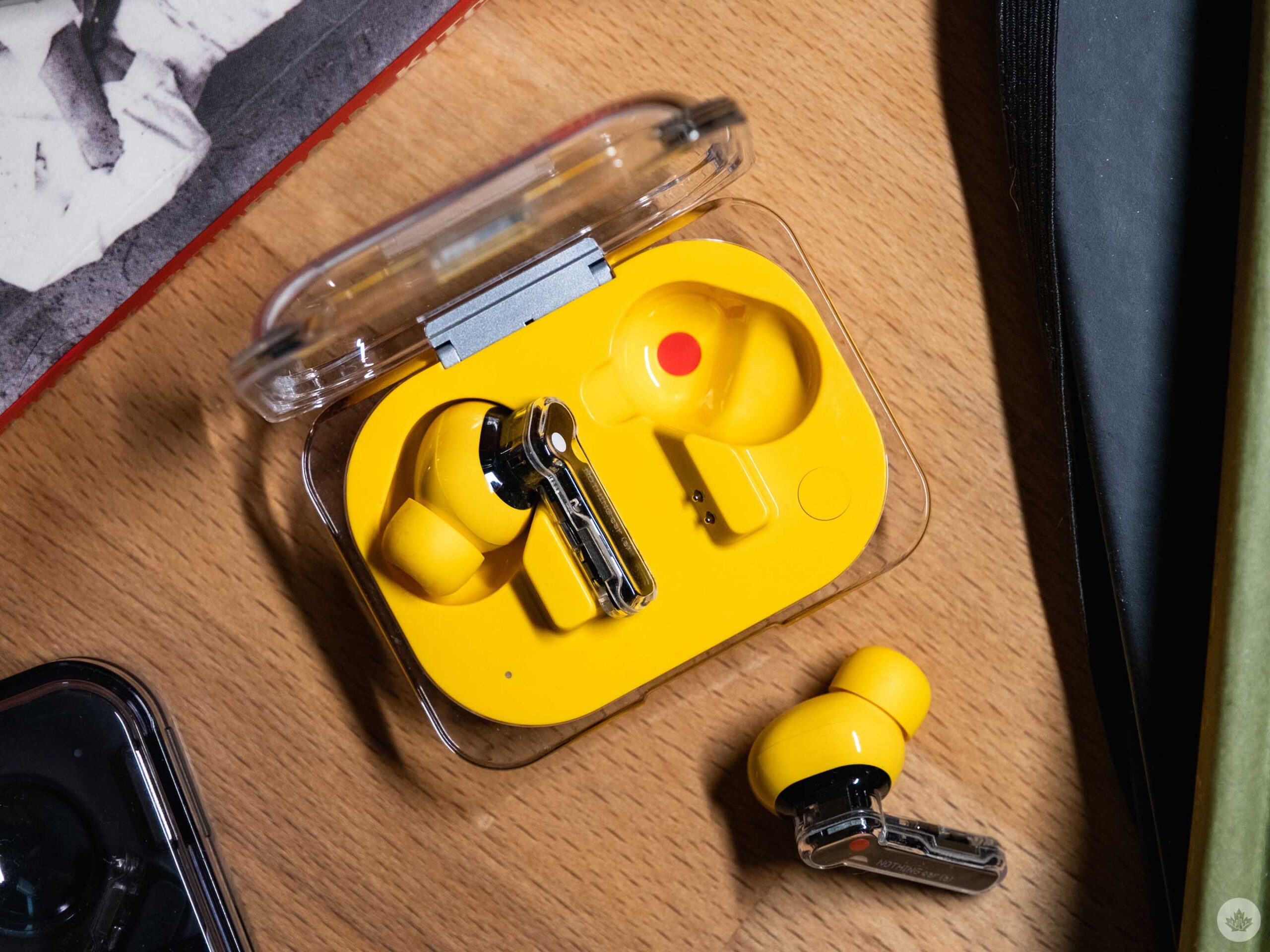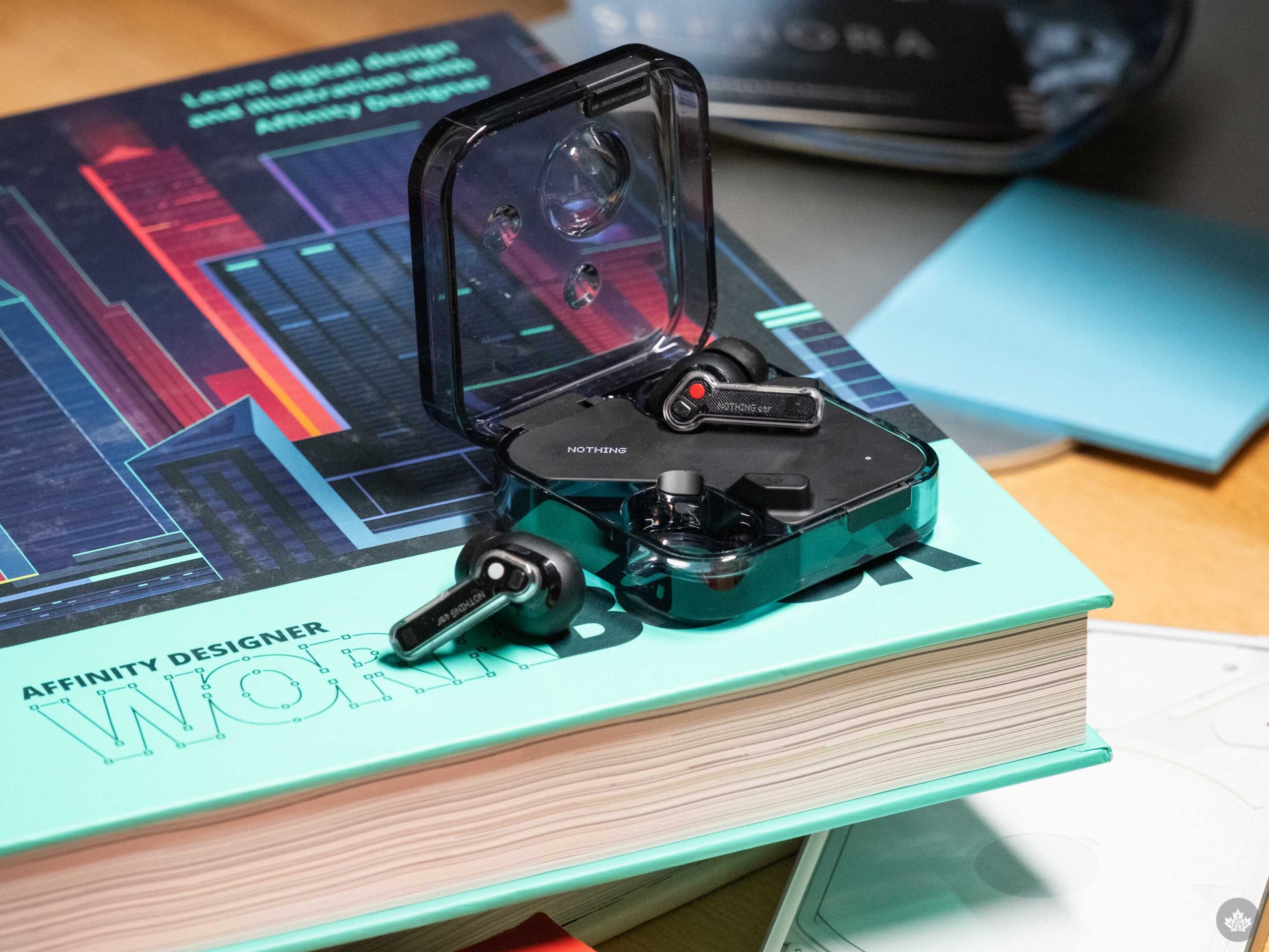
At first glance, Nothing’s latest and greatest earbuds seem perfect. I mean, look at them! The company refuses to be beaten when it comes to hardware design, and three years in, they’re just as expressive as day one.
This year there are two models – The top-end Nothing Ear and the cost-efficient Ear (a). Both improve on previous Nothing earbuds in key ways like battery life, noise-cancelling and microphones, but when it comes to sound quality, the changes are less notable compared to the Nothing Ear (2). But don’t take that as a slight, Nothing came a long way with with sound tuning last year, so there’s little to scoff at with the new buds.
The first few days of the Ear (a)
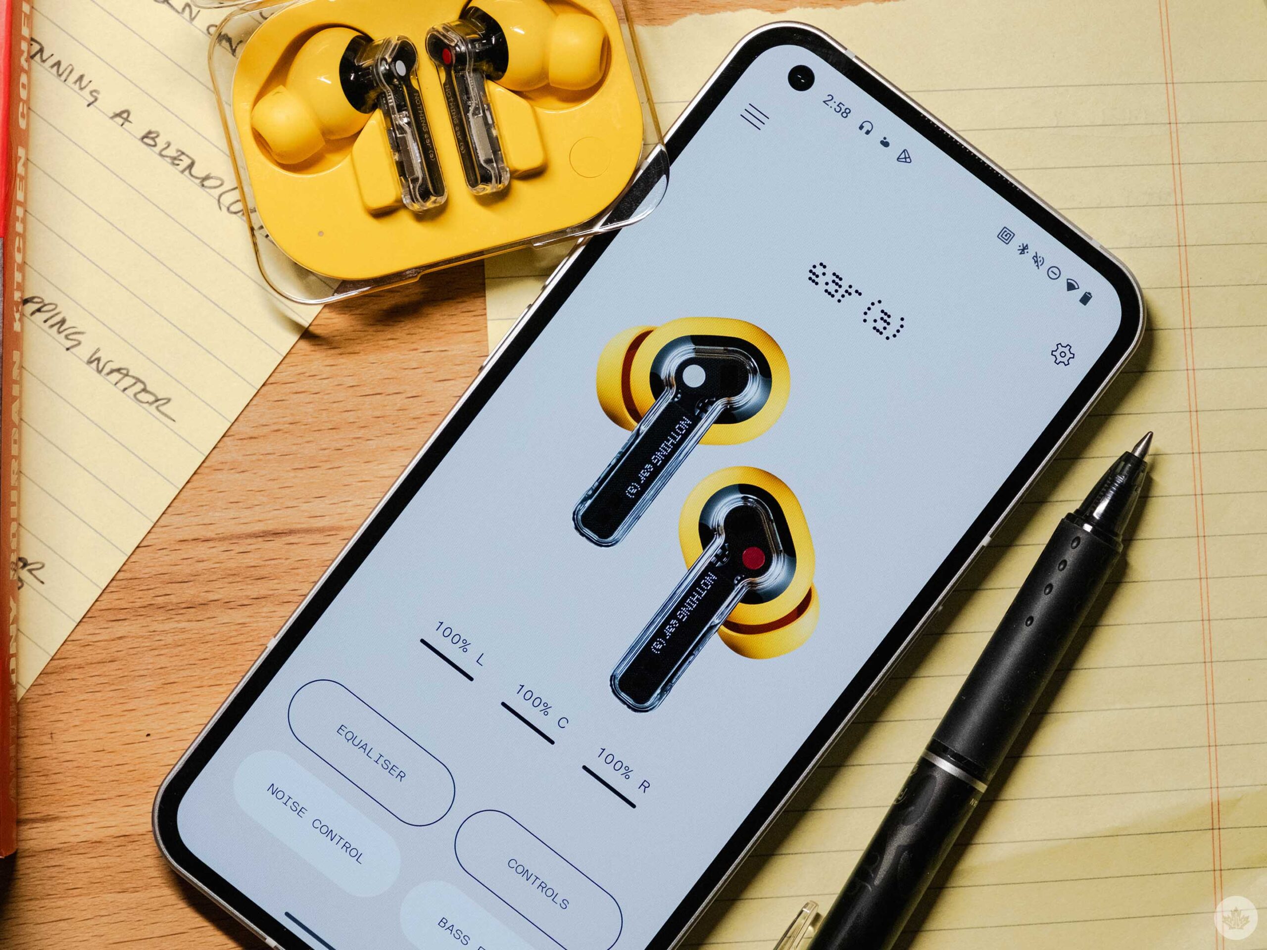
After unboxing both of the new earbuds, I was of course, drawn to the new Nothing Ear (a) and its exciting yellow colour. Who can blame me?
Once I inserted them into my ears, I was impressed with the sound quality. Music sounded full and robust with strong mids. After a little more listening I ended up switching to the smaller ear tips that were included in the box. After that, the earbuds fit much more snugly in my ears. This surprised me a little bit since I’ve typically been fine with medium earbud tips from most brands, including Nothing in the past. On top of that, the Nothing Buds are pretty much the same dimensions as my AirPods Pros, but all I can say is that the small option but less pressure on the insides of my ears.
The Ear (a) has a new case which Nothing says is inspired by the packaging for pills. It’s a cool bubble effect, and at the same time, it slims down the earbuds to make the whole package a little more pocketable than existing Nothing earbuds with square cases. The trade-off of course, is that the Ear (a) doesn’t get a wireless charging pad. That said, I don’t think this is a big deal since a quick ten-minute charge will give you ten hours of battery life.
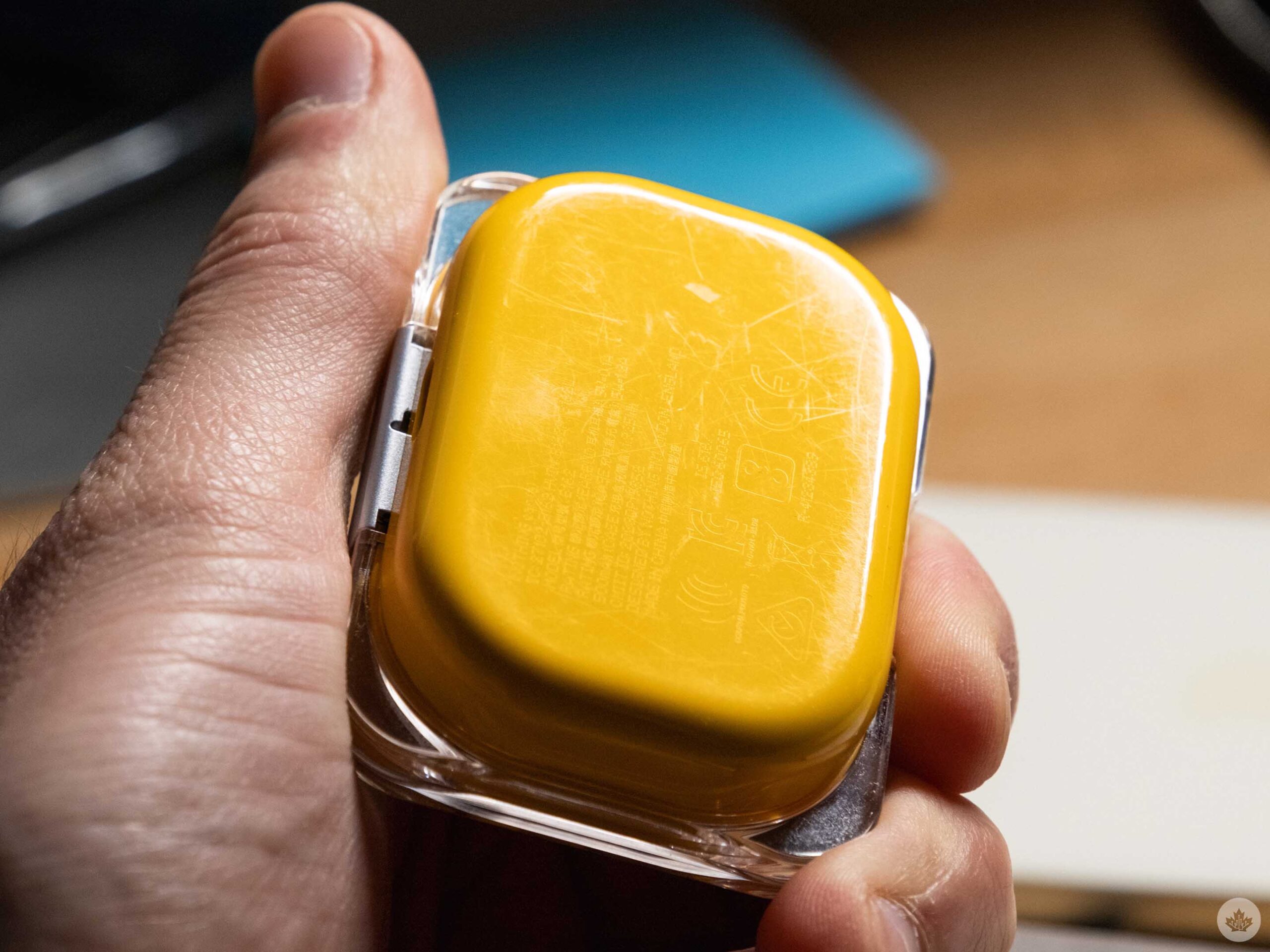
One last thing to note is that the plastic for the Ear (a) will scratch if you take off the clear sticker it’s packaged with. I quickly removed the sticker because it made the design look cheap. That said in my time testing the buds, the clear plastic on top held up pretty nicely. The yellow plastic on the bottom got way more scratched, but it’s something I noticed less. I’ll also mention that opening the Ear (a) with one hand is easier than the Ear.
Overall, the simplicity of the case highlights the buds and even though these might be the cheaper of the two Nothing buds, I think these look better even if the other Nothing buds offer more features.
Moving up to the Ear
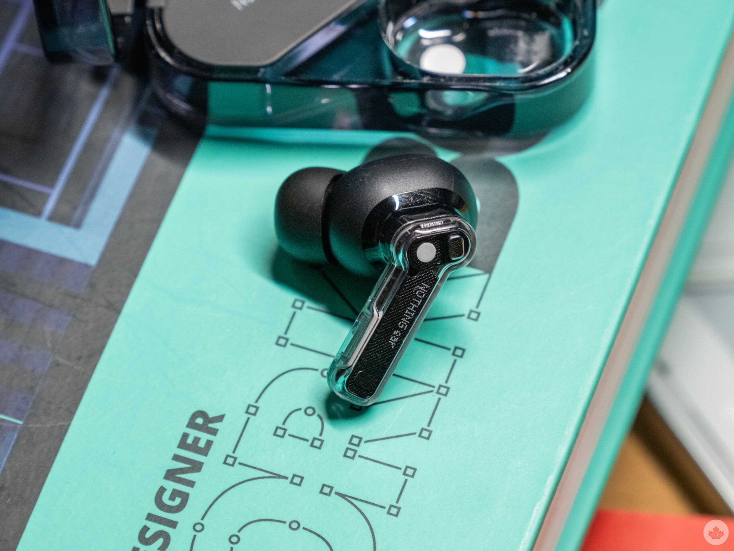
The Nothing Ear is the less flashy of the two new buds, but it retains Nothing’s award-winning design and adds in the most features. Most notably, these include wireless charging, a ceramic speaker driver and IP55 water/dust proofing on the case.
The Nothing Ear sounds marginally better than the Ear (a), but I don’t expect the difference to be noticeable for most people. They’re ever so slightly crisper due to the ceramic driver as opposed to the hard plastic one in the Ear (a), but without directly comparing them, it’s really hard to spot differences.
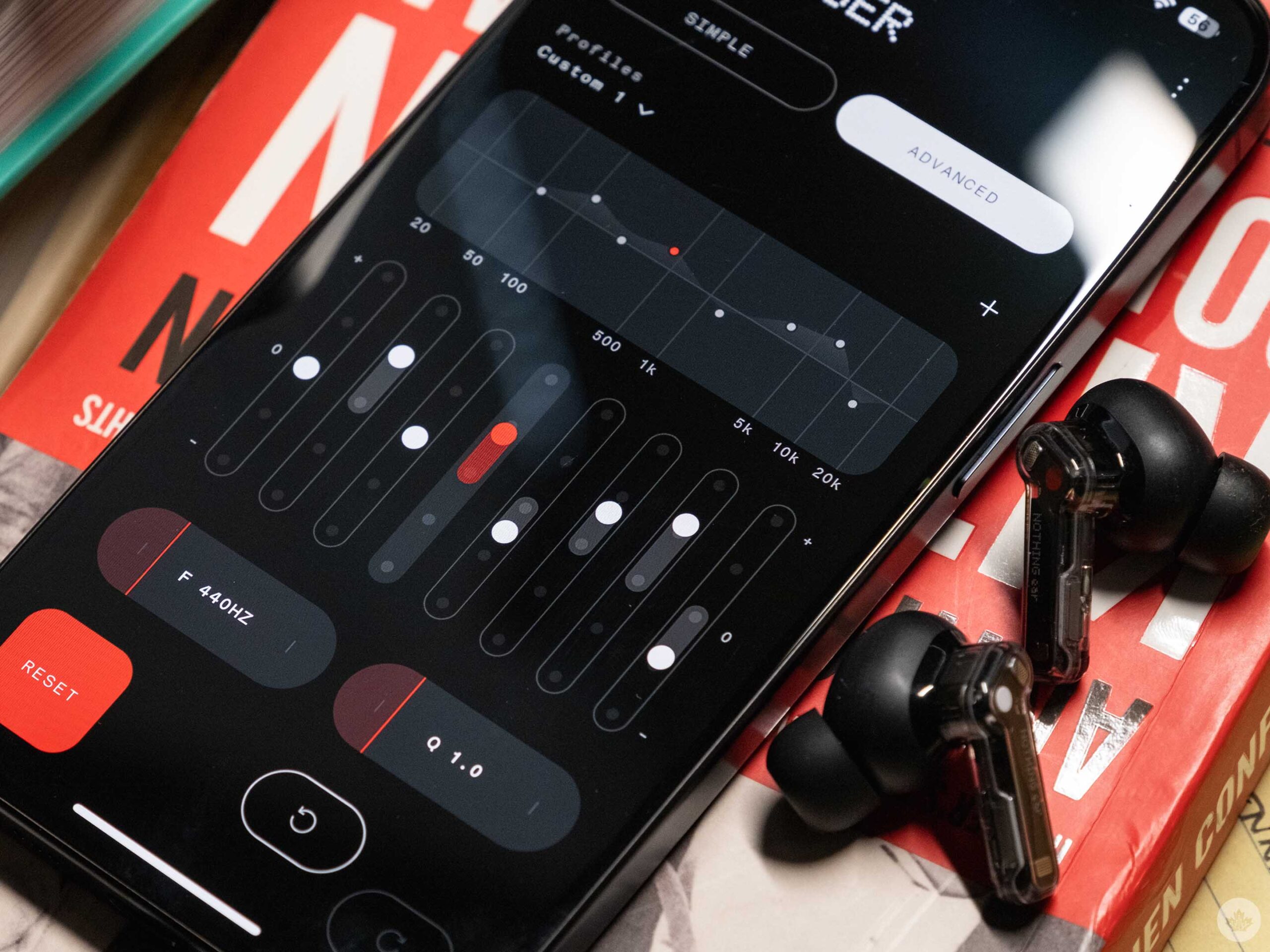
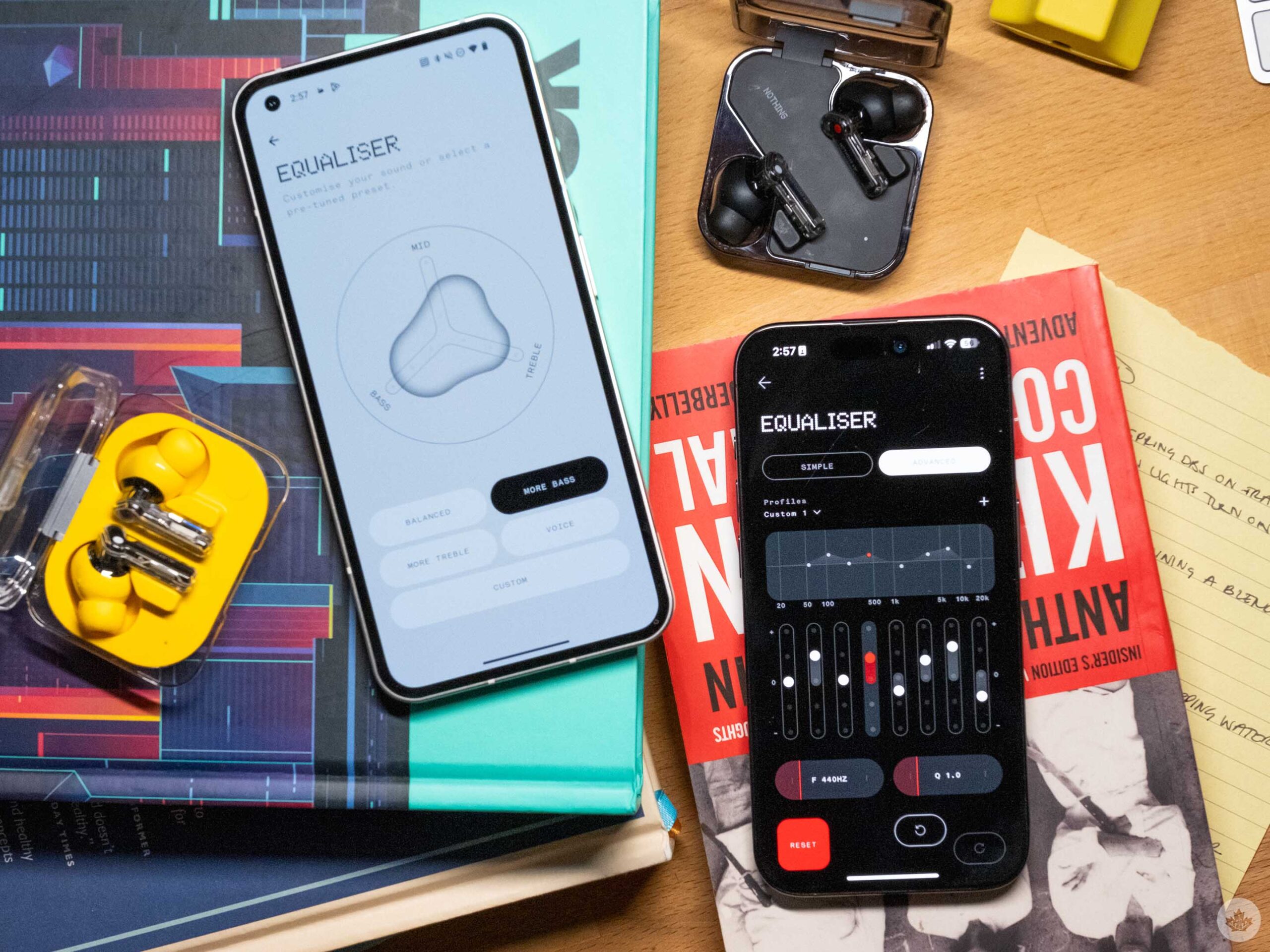
Where the Ear really sets itself apart is with software. In the Nothing X app, you can get much more control over the EQ, and there is even software built into the app to help personalize the sound profile to your hearing. This mode basically plays sounds at lower and lower volumes, and once it figures out what frequencies you struggle to hear, it boosts them. It’s subtle but a nice touch.
At the end of the day, most of what makes the Nothing Buds good is the solid sound quality and great design, which can be found on the Ear (a) for cheaper.
The Nothing app and software
One aspect of the Nothing X app (iOS/Android) I’d love to see improved is adding controls right on the main screen. Sure, it looks cool to have a giant image of my own earbuds taking up most of the app, but if it was four times smaller, we could probably fit most of the options hidden behind the menus on one page. Most of the time, I open the app to toggle noise-canceling or EQ anyway, so it’s annoying those controls are buried under a menu.
Speaking of active noise cancellation (ANC), both earbuds have the same ‘Adaptive’ mode that the Nothing Ear (2) launched with. This means it can intelligently modulate from low to high ANC, which might help you save a tiny bit of battery life. However, stacked up against Apple’s smart adaptive noise canceling, it’s not nearly as effective or smart. This led me to mainly just keep the buds on ‘high’ ANC pretty much the whole time I used both buds.
One small note is that Nothing has great attention to detail and the sounds to signify transitioning between ANC and transparency mode are pretty cool and do a good job of signifying what mode you’re in. There’s a deep drum thud for ANC and a deep breath sound for when you enter into transparency.
You can also customize the pinch controls in the app, but out of the box, they’re setup as you’d expect. The only one that needs to be added is a double-pinch-and-hold gesture that can be used to trigger Google Assistant or Siri. If you have a Nothing Phone, you can also set this to work with Chat-GPT, but you can only ask it general questions. If you want an assistant that can play music or interact with your phone, you’re better off with Siri or Google.
A few weeks later
Overall both, the Nothing Ear (a) and the Nothing Ear held up really well over my long term testing and in the end, it’s honestly really hard to tell them apart. I sometimes feel like the sound from the Nothing Ear is a little fuller, but at the same time, I have no complaints about the Ear (a) and day-to-day, I like its smaller case size.
As expected both Nothing buds were extremely functional and well-tuned. However, compared to my AirPods, I still found the Nothing buds sometimes disconnect when I’m wearing them out and about in the city. It’s not something that happens all the time, but the few times it did were quite frustrating. It wouldn’t fully disconnect either. In most cases, the audio would lag or get distorted for a bit, then come back normally. At first, I thought this was because I had a backpack on with my laptop or iPad in it, but it’s happened many other times so at this point, it just feels like the connection isn’t as strong as I need it to be.
This didn’t stop me from using the buds since a quick pop back in the case often fixed the issue and at the end of the day this is a sometimes common earbud issue. It’s happened less, but sometimes even my AirPods bug out and need a soft reset in the case. Nothing released a software update that has improved the transparency mode considerably. During my first week of testing,it was really low-res and had consistent static, but post-update, both earbuds are much better at relaying the world around me through their mics. Hopefully, Nothing can continue to update these buds so the connection gets stronger too.
Most will be more than happy with the Nothing Ear (a). The overall quality of the earbuds and case feels very similar to the Ear, while costing $50 less in Canada. It’s a good trade-off that’s easily worth it for most people. If you have Tidal or Apple Music and you want to try and get the most out of your subscription, the Ear promises a slightly better listening experience.
You can buy Nothing earbuds on the company’s website. The Ear (a) is $150 and the Ear is $200.
MobileSyrup may earn a commission from purchases made via our links, which helps fund the journalism we provide free on our website. These links do not influence our editorial content. Support us here.

