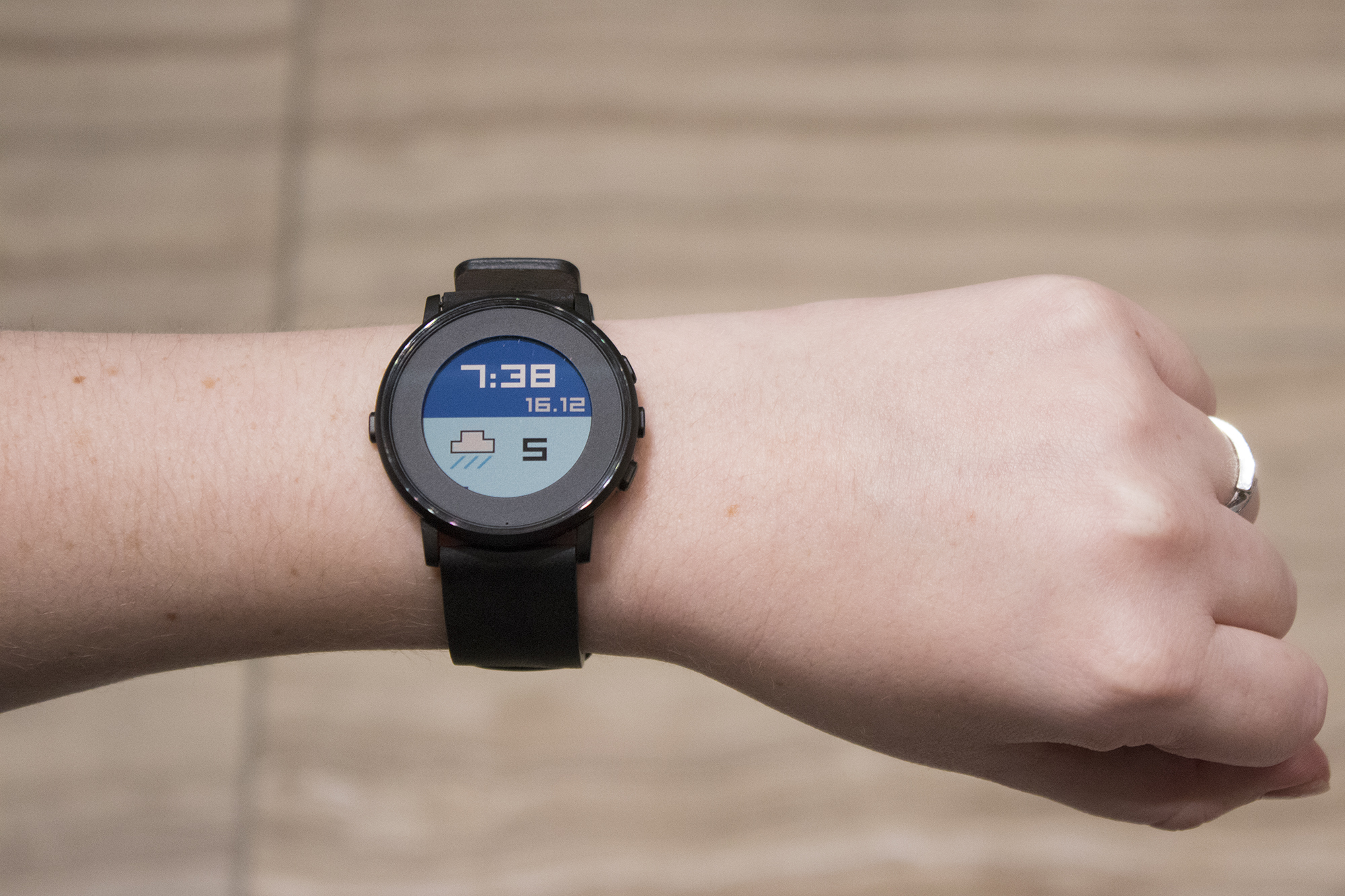
While discussing the future of smartwatches during a recent interview at MobileSyrup’s office, Pebble’s founder and CEO Eric Migicovsky made a statement that repeatedly ran through my mind during my time with the Pebble Time Round.
“We’re lacking that idea of a killer app or series of apps,” said Migicovsky, discussing the smartwatch industry in general. “But maybe we need to stop thinking of it like that. Maybe we need a killer system.”
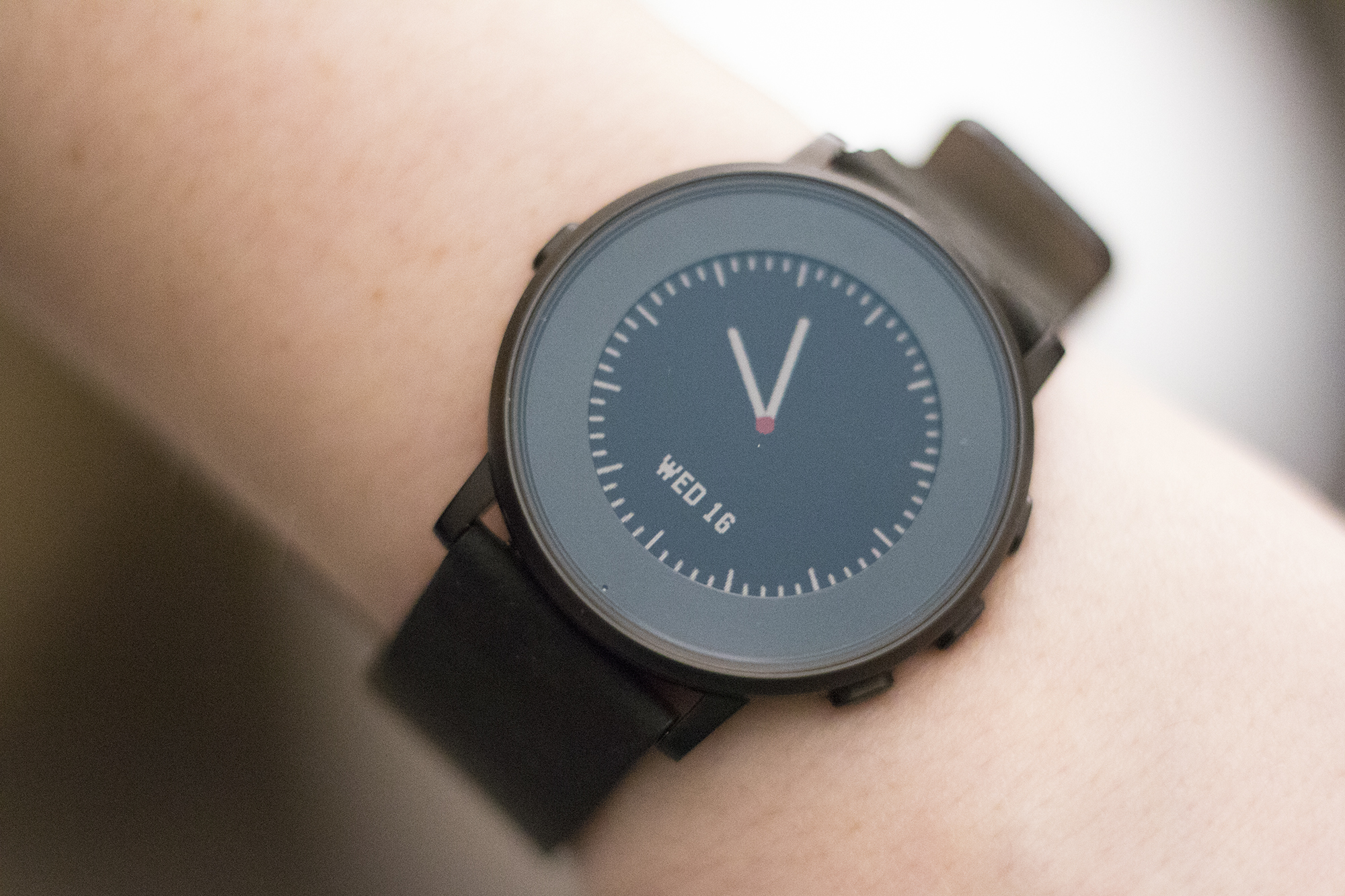
Pebble’s latest smartwatch, the Pebble Time Round, embodies Migicovsky’s proclamation. This is a smartwatch that knows exactly what it wants to be, and in most ways, is a clear upgrade over the Pebble Time and Pebble Time Steel. The Pebble Time Round’s unique operating system features few applications worth using beyond Uber, Misfit, and a handful of single-purpose apps (the recent addition of Pebble Health is certainly welcome).
But unlike Android Wear smartwatches and the Apple Watch, the niche Pebble has carved out for itself doesn’t require the support of apps. Even though the ecosystem has improved considerably over the last few months, Pebble’s Timeline user interface and the overall simplicity of its operating system are its killer app.
Technical specifications
- 180 x 180 pixel round e-paper display
- 2-day battery life
- Accelerometer and compass
- Four buttons
- Microphone
- Smart accessory port
The ultimate notification smartwatch
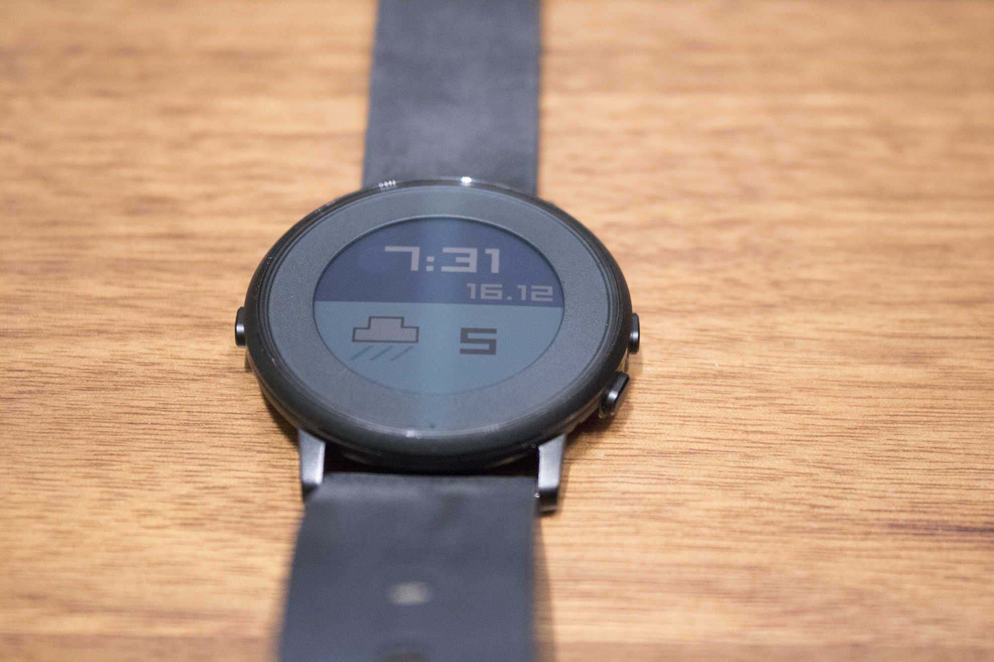
Deciding whether or not the Pebble Time Round is the smartwatch for you will depend on a variety of factors. If you already own the Pebble Time, the Time Round is essentially the same smartwatch, only in a more attractive body.
That aesthetic improvement comes at a considerable cost, though: The two day battery life featured in the Pebble Time Round is considerably less than Pebble Time’s approximately week of uptime, and it’s less water resistant than its rectangular brother.
But the Pebble Time Round makes up for these shortcomings with its look. The wearable is the company’s thinnest and most impressive smartwatch yet, and a response to the criticism previous Pebble smartwatches have received.
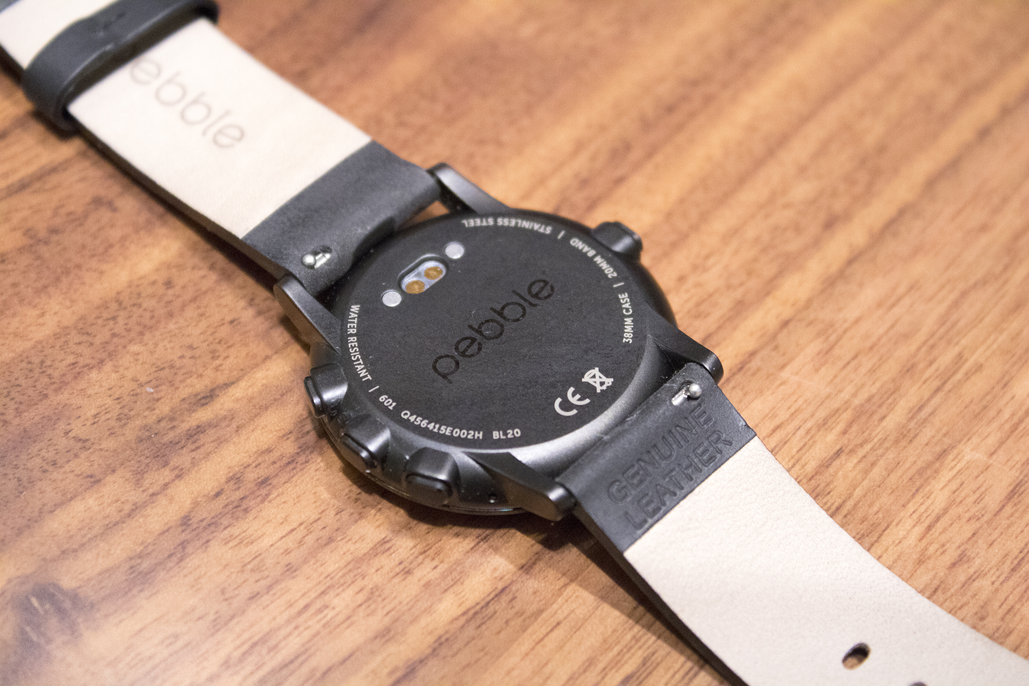
In an industry full of bulky wearables that often look more like tiny smartphones strapped to your wrist, the Time Round’s 7.5mm thickness and 28 gram weight is refreshing. Unlike the Apple Watch, Moto 360 2nd Generation, and even the Pebble Time, it feels like there is nothing strapped to my wrist when I’m wearing the Round. To me, this is exactly how a smartwatch should feel. The Pebble Time Round is far from a “flat tire.”
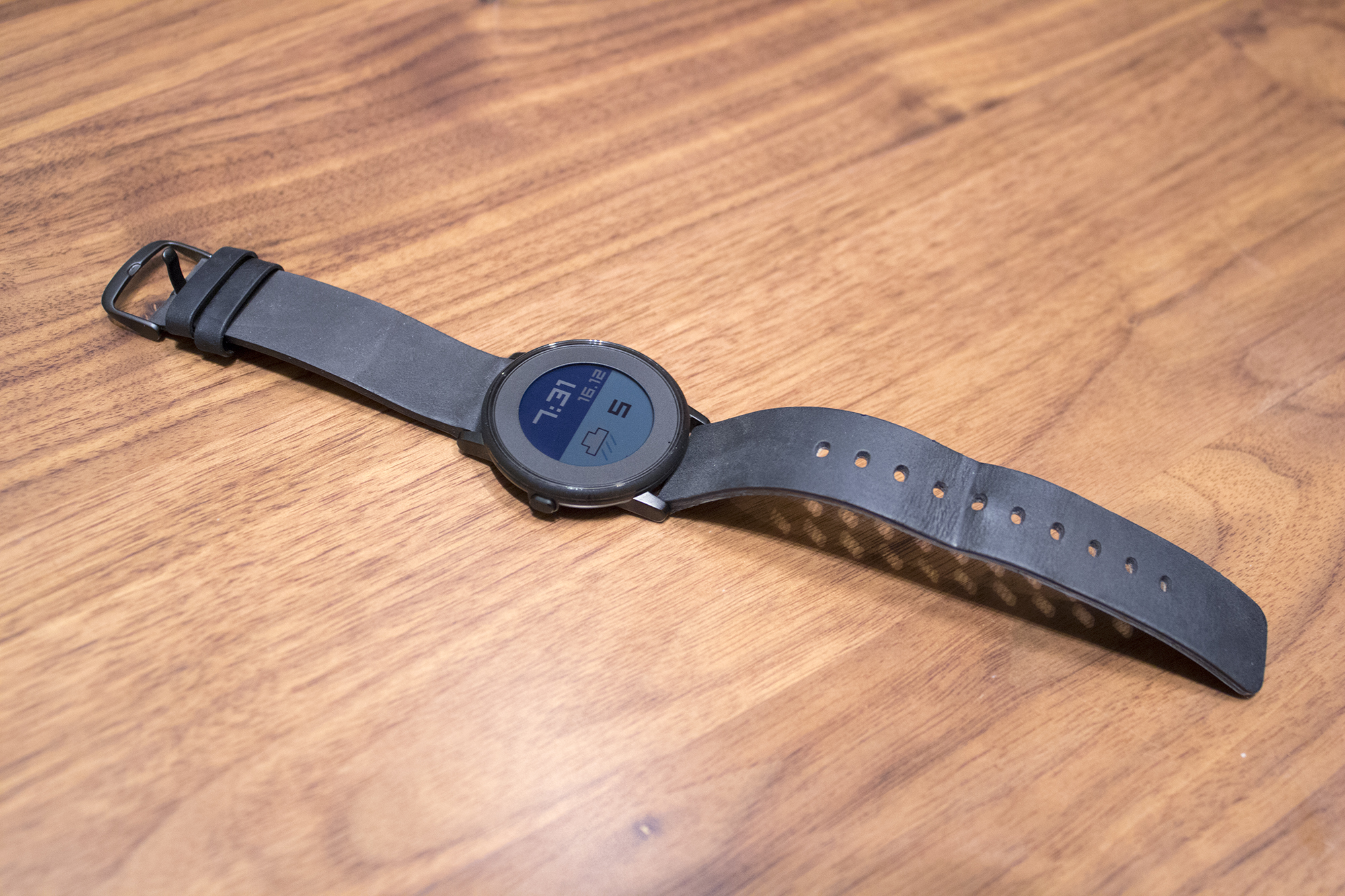
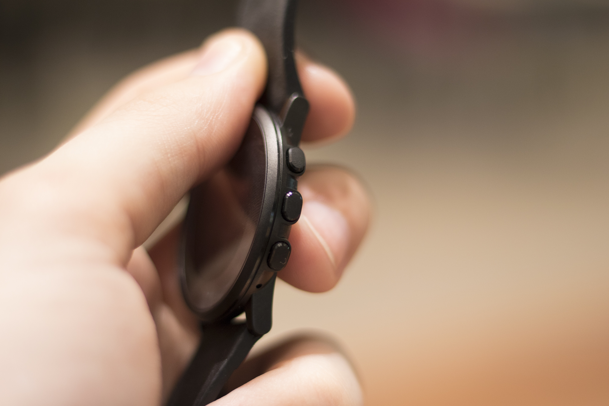
With the Time Round, Pebble has dropped the geeky “tech wearable” look the company has become known for since the launch of the original Pebble. Both the Time Round’s body and leather strap evoke the feeling of a premium device. My only complaint is a small crevice that runs across the circumference of the body that attracts dust and other debris. The smartwatches navigation buttons also have a small amount of wobble to them. Thankfully neither of these issues ruin the overall experience.
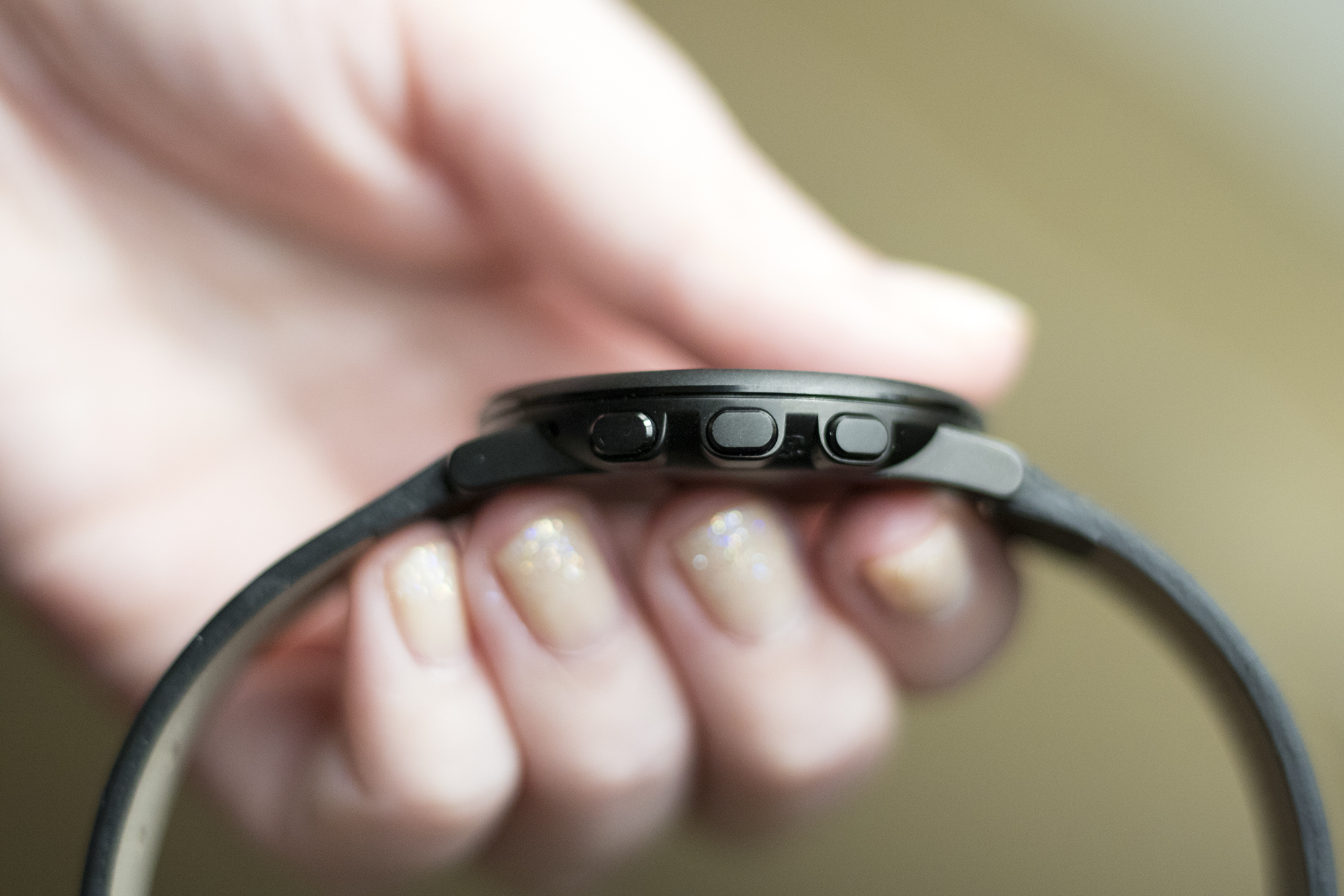
Pebble’s latest smartwatch also features the same voice recognition technology included in the Pebble Time and Pebble Time Steel, allowing wearers to take quick notes voice notes and reply to messages, but only with supported apps.
While the concept of speaking to my wrist continues to feel foreign, it’s great to see Pebble modernize its smartwatch’s capabilities, moving in line with what Android Wear and the Apple Watch offer. Voice recognition with the Pebble Time Round generally works well and I experienced few technical hiccups.
Whether the Pebble Time Round is worth the purchase largely depends on how you use your smartphone.
If you’re into fitness and companion apps that compliment tasks you already accomplish with your smartphone, the Apple Watch is likely the device for you. If you opt into Google’s predictive strategy that closely links Android Wear with Google Now, a smartwatch like the Moto 360 is probably your best bet.
But if you’re like me and want a highly customizable notification-focused smartwatch that performs a few tasks extremely well, then the Pebble Time Round is the device you’ve been waiting for. It’s worth noting that like all smartwatches, the apps that send notifications to the Round need to be curated through Pebble’s app, otherwise your wrist will be constantly vibrating.
Unfortunately, that isn’t possible on iOS, since the Pebble merely mirrors notifications sent to your iPhone. On Android, the notification list is much more granular.
Lacklustre e-paper display
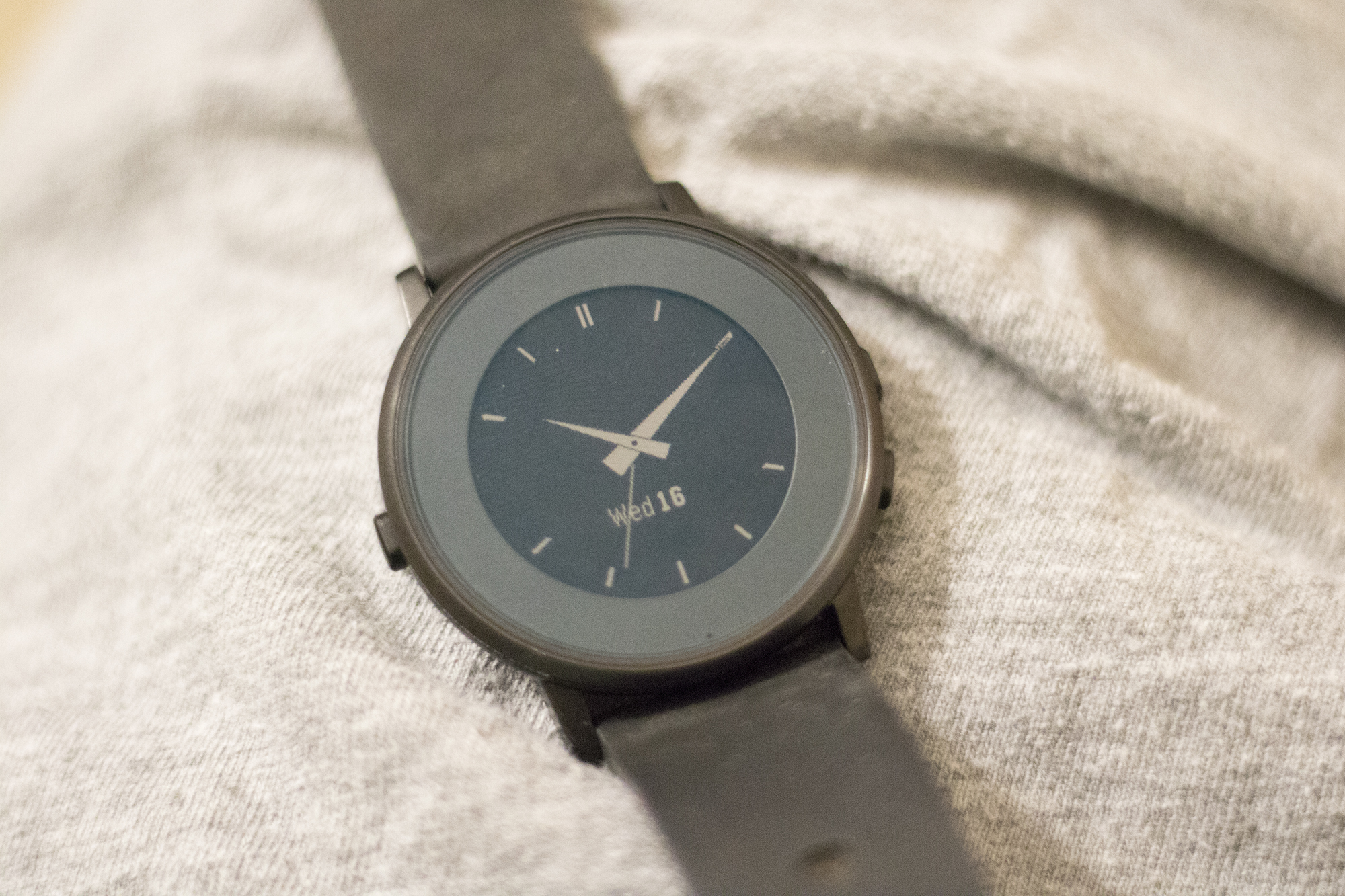
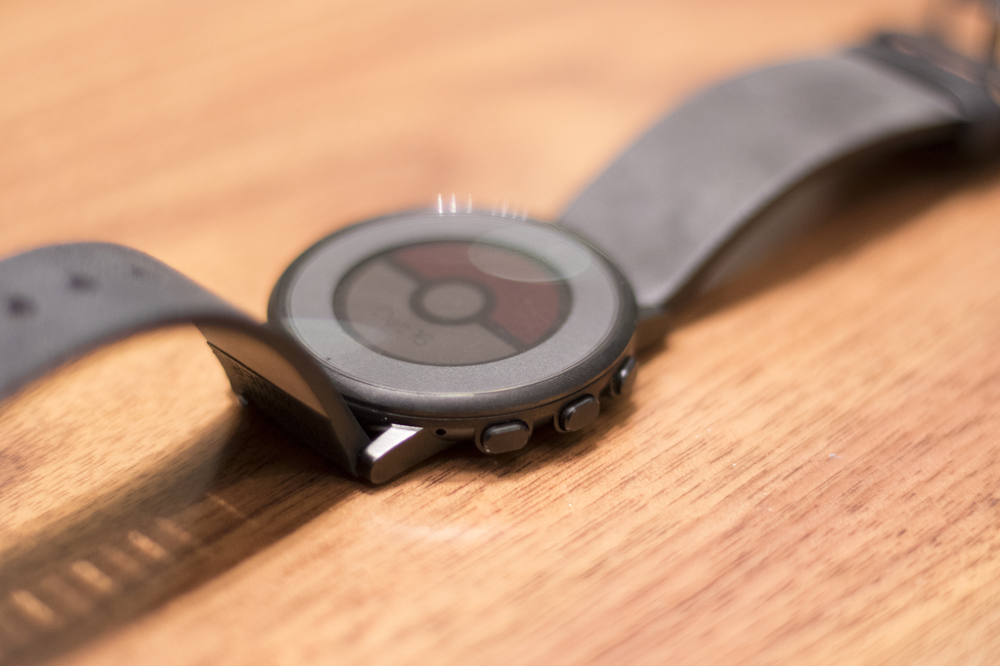
I prefer the Time Round’s 180 x 180 pixel circular display over the Pebble Time’s 144 x 168 screen. Circular displays continue to make more sense in the context of a watch, and the Apple Watch’s rectangular screen has never felt natural to me. However, the Round’s bezel is large and off-putting at first, although, similar to the Moto 360’s flat tire, after a few days of use,I forgot it was even there.
The Pebble Time Round’s screen, just like the Pebble Time, lags considerably behind the competition in terms of quality. While its various creative watch faces are elegant at first glance, the smartwatch’s colour e-paper display has a crude, outdated feel to it, especially when placed next to the Apple Watch, Moto 360 or Samsung Gear S2. Love it or hate it, the Pebble Time Round’s screen comes across as a holdover from the era of LCD watches.
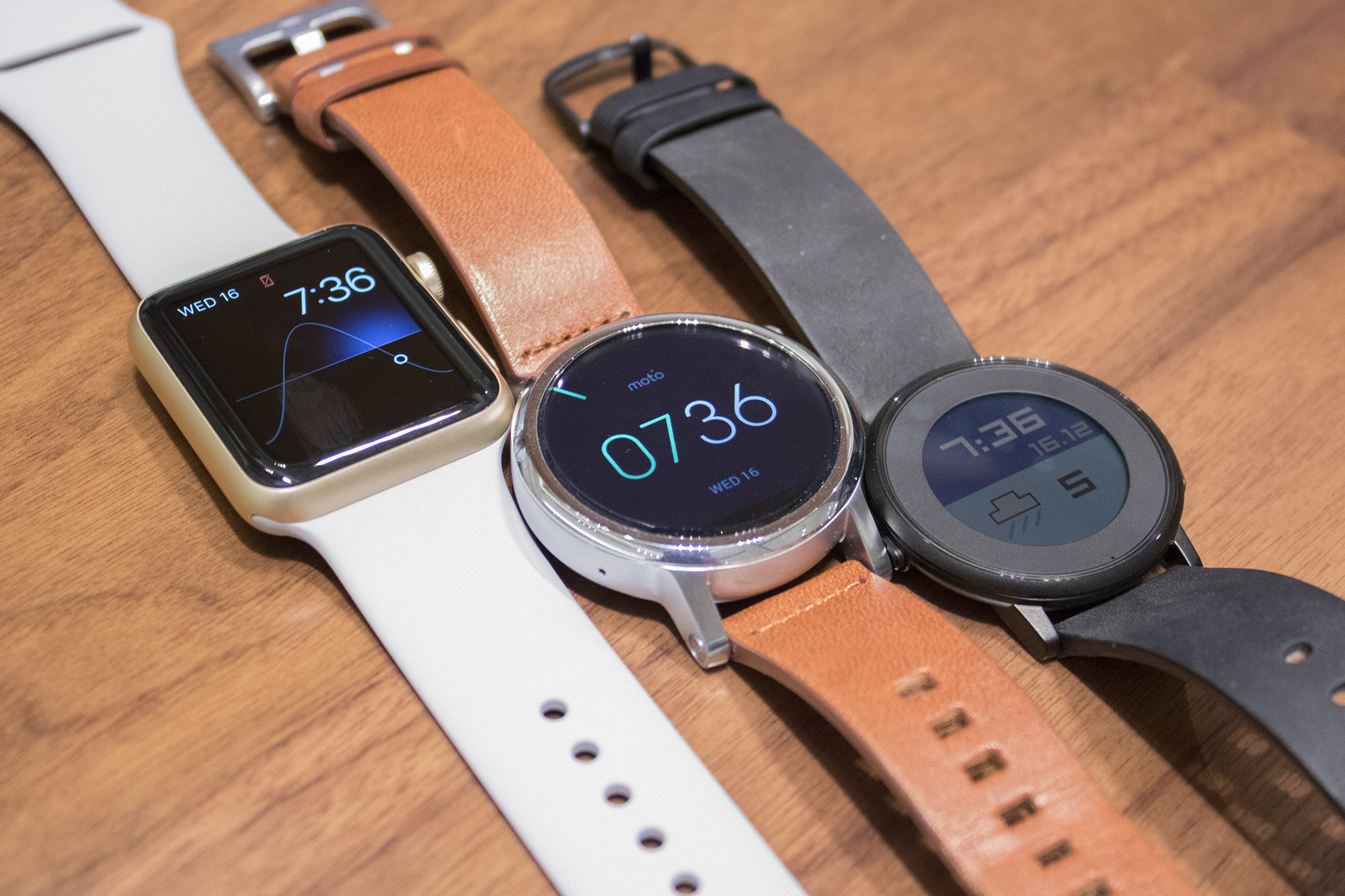
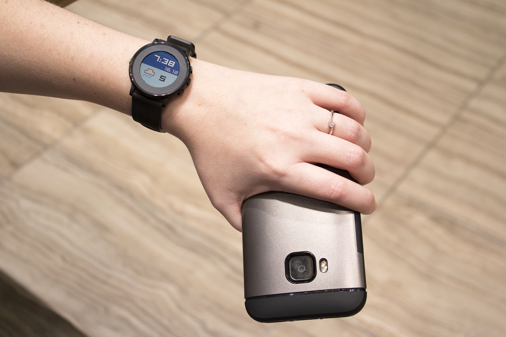
The Time Round’s poor display has a variety of benefits, though. Since its screen is constantly on, thanks to its battery-saving e-paper technology, it functions so well as a watch. And for someone who primarily uses their smartwatch to receive different notifications — Gmail, phone calls, WhatsApp Messages and Google Chat — the smartwatch’s lacklustre display is a worthwhile tradeoff. It can also be seen in direct sunlight, something that LCD and OLED displays still struggle with.
I frequently experience issues with the Apple Watch and Moto 360’s display not flipping on when I want it to, and have in some cases, have repeatedly raised my wrist to get their screens to switch on. With the Time Round this is not an issue. Its screen never turns off, giving me at-a-glance, instant access to the information I need. This is exactly what I want from a smartwatch: a wearable that’s connected to my phone but is still primarily a watch.
Why Timeline works so well
 Unlike Android Wear and the Apple Watch, two smartwatch platforms that suffer from identity crises, largely because they try to be all things to everyone, the Pebble Time Round knows exactly what it is and what it’s good at. In many ways, this is due to its elegant Timeline user interface, which was first introduced with the launch of the Pebble Time.
Pressing the bottom button on the watch face shows the next event in your Timeline. For example, if you have an upcoming meeting, or receive a phone call/text message you might have missed, these notifications appear in sequential order. The top button on the Pebble Time Round displays upcoming calendar events, as well as other information including the next day’s temperature and weather. While simple, Timeline ensures I never miss a notification or scheduled appointment in a way other smartwatches fail to do.
Impressive but pricey
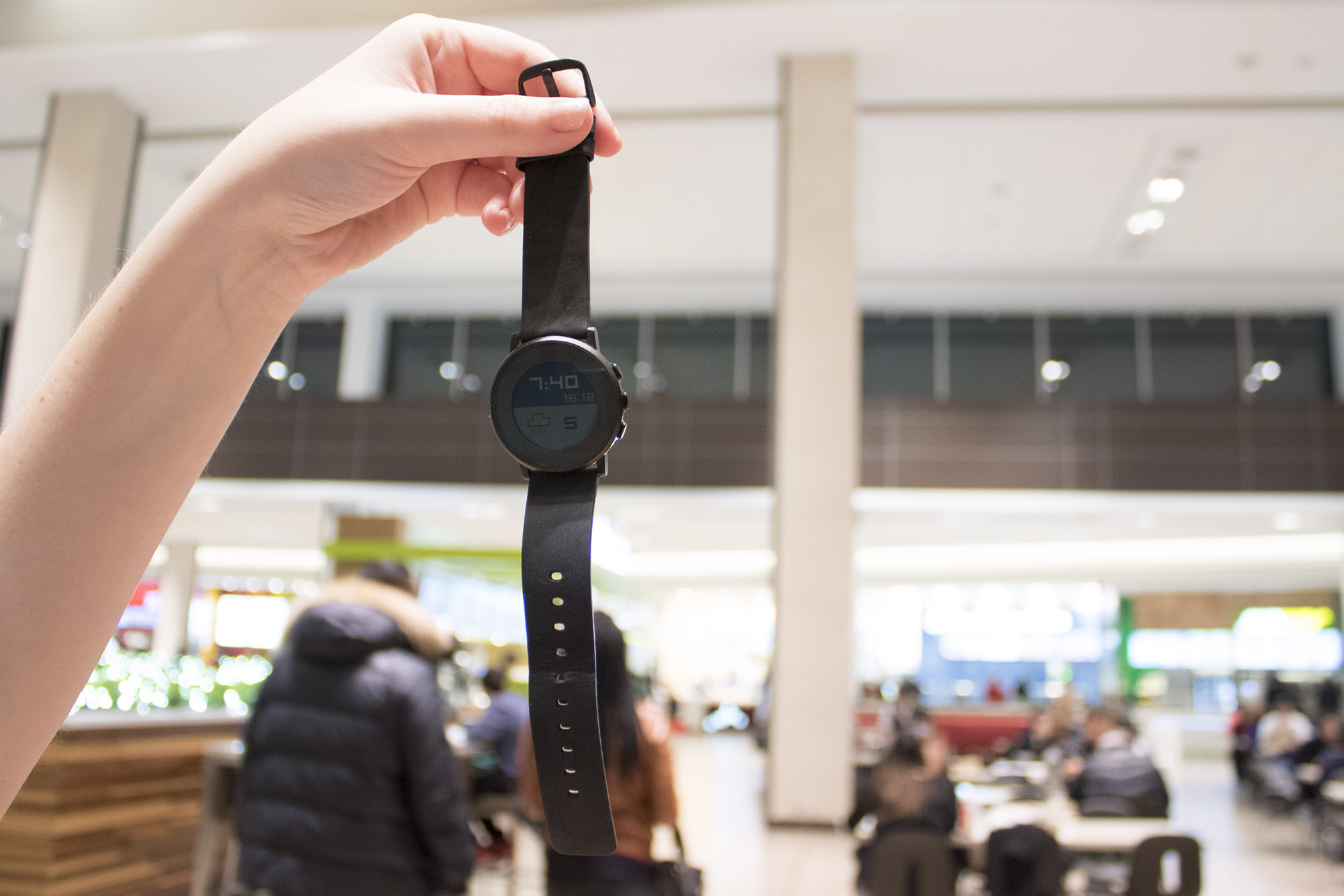
What holds The Pebble Time Round back is its hefty price tag. Pebble has always marketed itself as the burgeoning smartwatch industry’s most affordable wearable, but at $299.99 CAD, the company’s latest smartwatch is approaching high-end territory. It still undercuts the $379 Moto 360 and $399 Samsung Gear S2, but it may be too much for those looking to dip their feet into the smartwatch genre. Perhaps it’s good, then, that the company still sells its original Pebble, along with the Pebble Time and Time Steel, for significantly less.
Still, despite its hefty price tag and lacklustre display, if given the choice between the above smartwatches and the Pebble Time, I’d pick Pebble’s circular wearable every time.
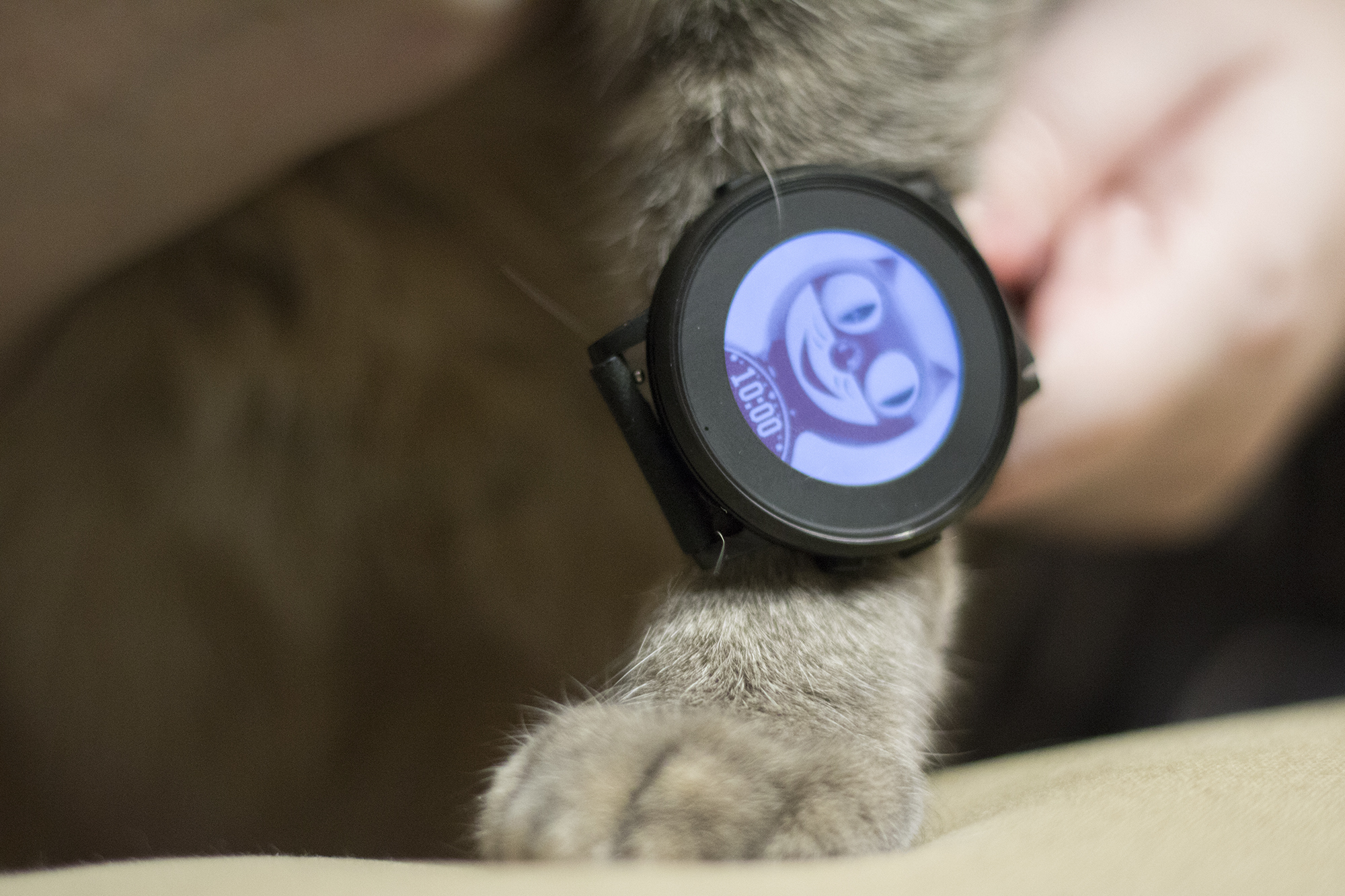
But this is the type of smartwatch that’s only going to appeal to a person with a very specific wearable use case in mind, as well as those who aren’t iPhone users since the Time Round’s functionality is limited with the iPhone.
If you’re only interested in receiving notifications on your wrist, the Pebble Time Round is the best smartwatch around.
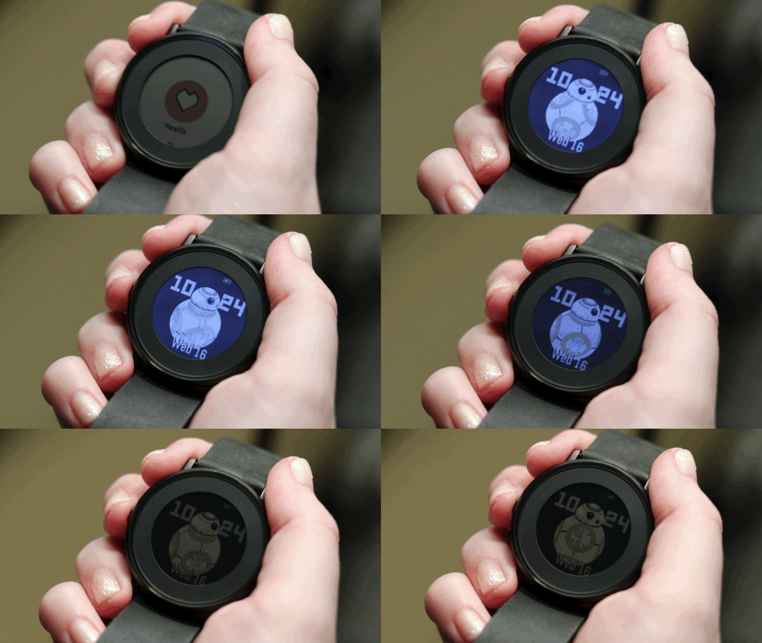
The Pebble Time Round comes in two variants, a black stainless steel case with 20mm black leather band, and a silver stainless steel case with a 14mm stone leather band, for $299.99 CAD.
Pros
- Small and compact
- Top notification-focused smartwatch
- Battery life beats most smartwatches
- Highly customizable
Cons
- Battery life lags behind the Pebble Time
- Screen is lacklustre and outdated
- Not many useful apps
- Pricey
Related reading: Pebble today and in the future: a conversation with CEO Eric Migicovsky
MobileSyrup may earn a commission from purchases made via our links, which helps fund the journalism we provide free on our website. These links do not influence our editorial content. Support us here.


