This may be a controversial opinion, but I like Apple’s Touch Bar and believe that those who question its utility, haven’t had a chance to try it yet.
However, as it stands right now, the Touch Bar doesn’t work exactly how Apple envisions it, and some apps, especially first-party developed ones, don’t use the Bar in a way that will work for all users.
Glow bright
Most onlookers will see Apple new MacBook Pros as the company’s way of competing with the likes of Microsoft and its Surface lineup, even if the company is doing so on its own terms. The Touch Bar does not turn Apple’s MacBook Pro line into a laptop-tablet hybrid like the Surface. Instead, it maintains the wall of separation between iOS and macOS that Apple says it will never tear down, even as it adds a new wrinkle to how macOS works.
Sure, this feature has been attempted before by companies like Razer, which should come as a surprise to no one given Apple rarely comes up with completely original ideas. What the tech giant does do, however, is take concepts other companies have already attempted, and improves and builds upon them. In the case of the Touch Bar, this is exactly what Apple has done.
The advantage Apple’s Touch Bar presents over past iterations of this idea is that it’s built into all of the company’s higher-end Pro offerings. More importantly, the software that powers the Touch Bar is baked directly into macOS. This gives developers a viable platform to build from, which means if the concept of a contextual, always-changing touchscreen is going to prove successful, just like it did when the iPhone revolutionized how we interact with our mobile devices, Apple’s new MacBook Pro line has the best shot at doing so.
How it works
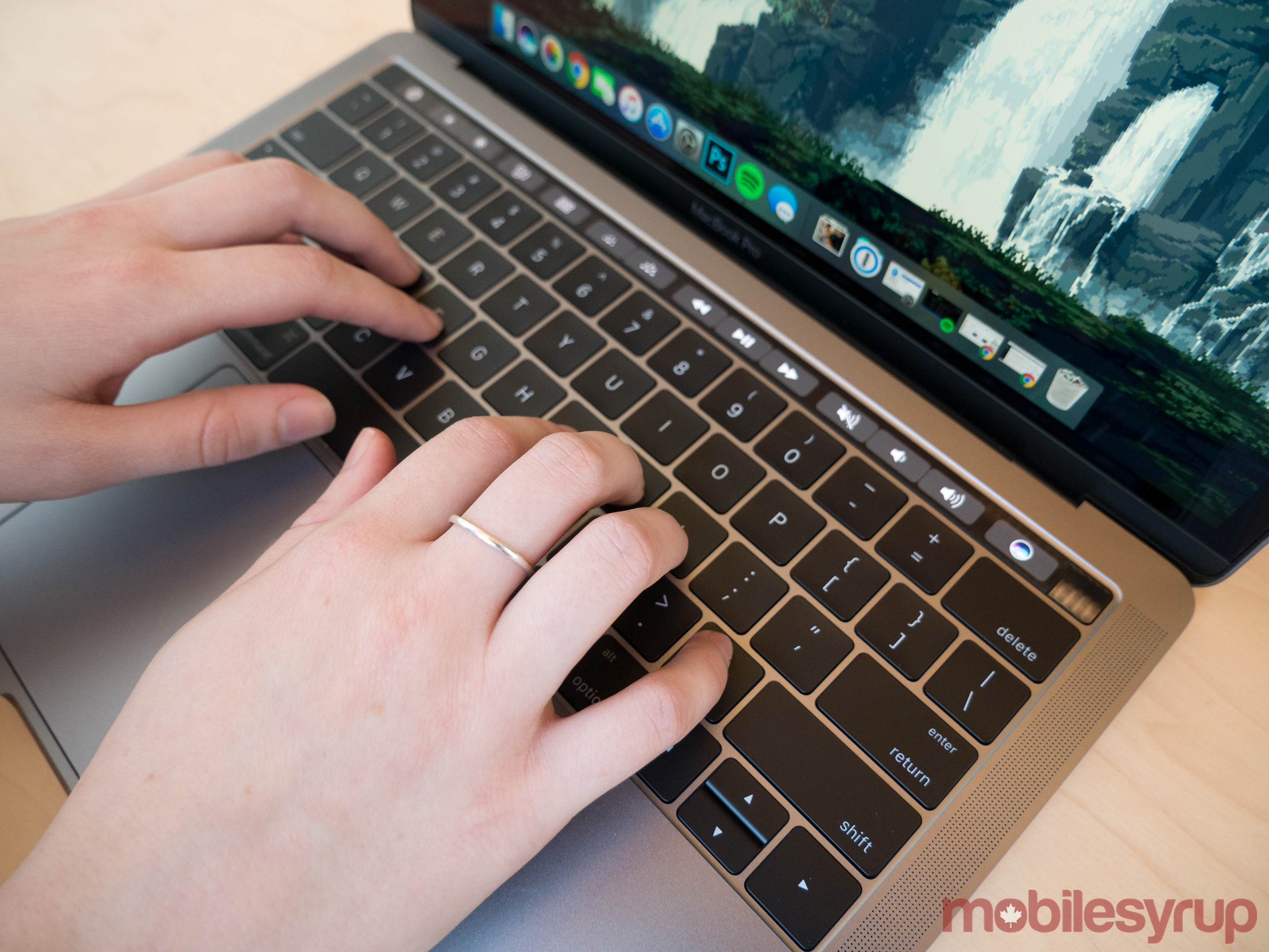
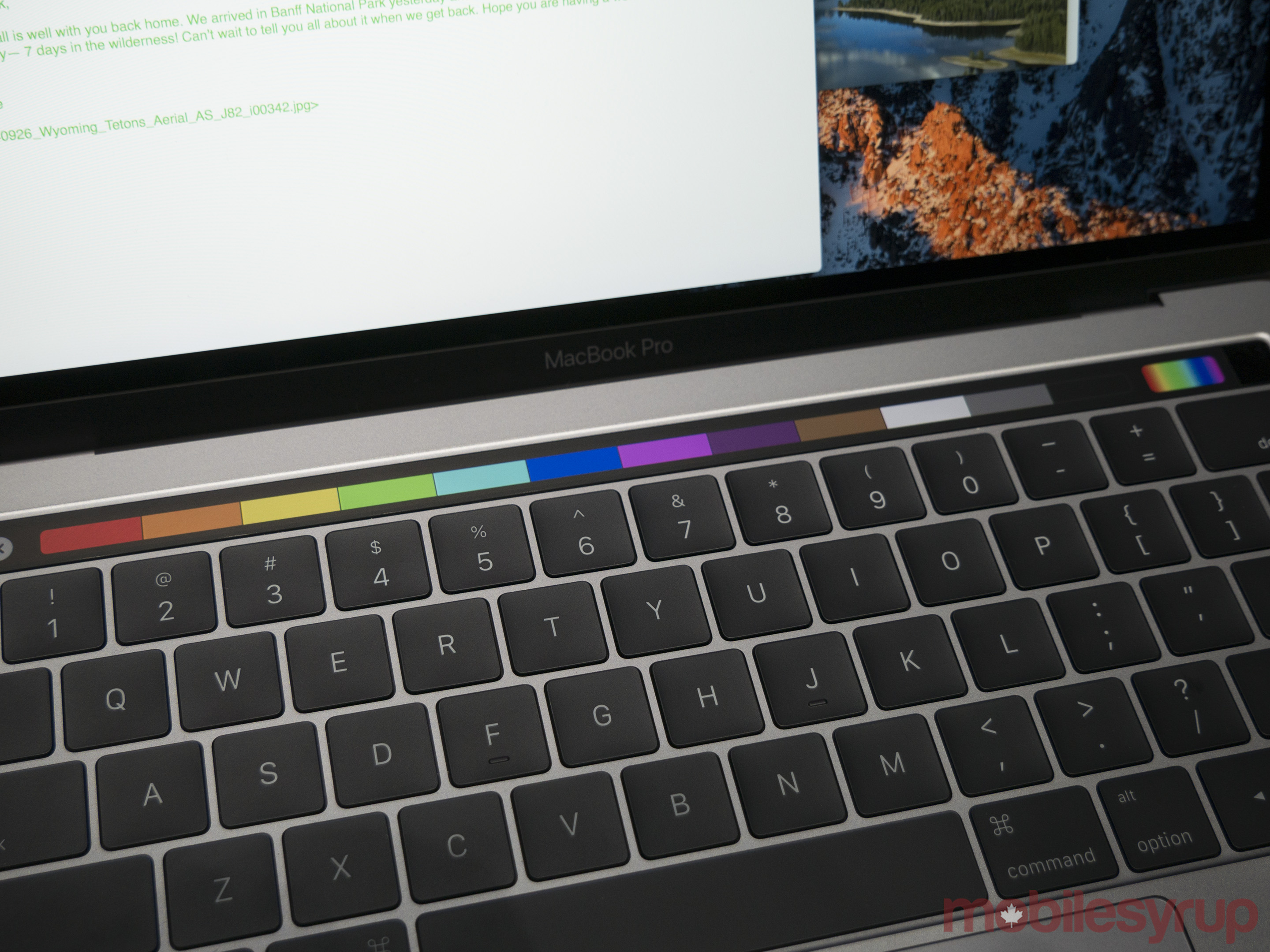
While the Touch Bar features a 2170 x 60 OLED panel, it doesn’t look or feel like a traditional touch screen. My finger slides across its surface with ease, moving from left to right with a slight glide. In fact, the Touch Bar is so slick that it almost feels greasy, which I found off-putting at first, though after spending a few days with the 13-inch MacBook Pro equipped with the Touch bar, it grew on me.
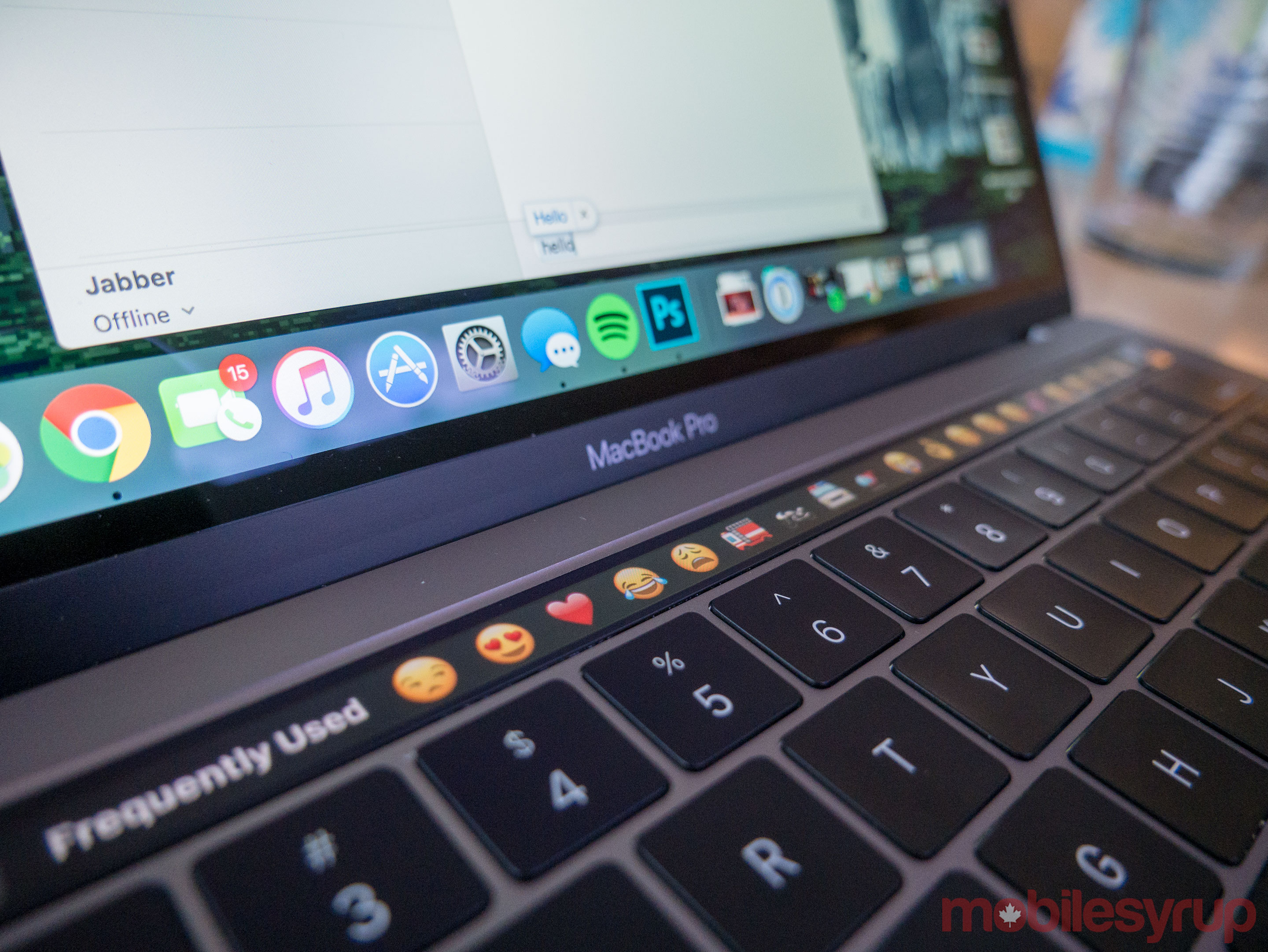
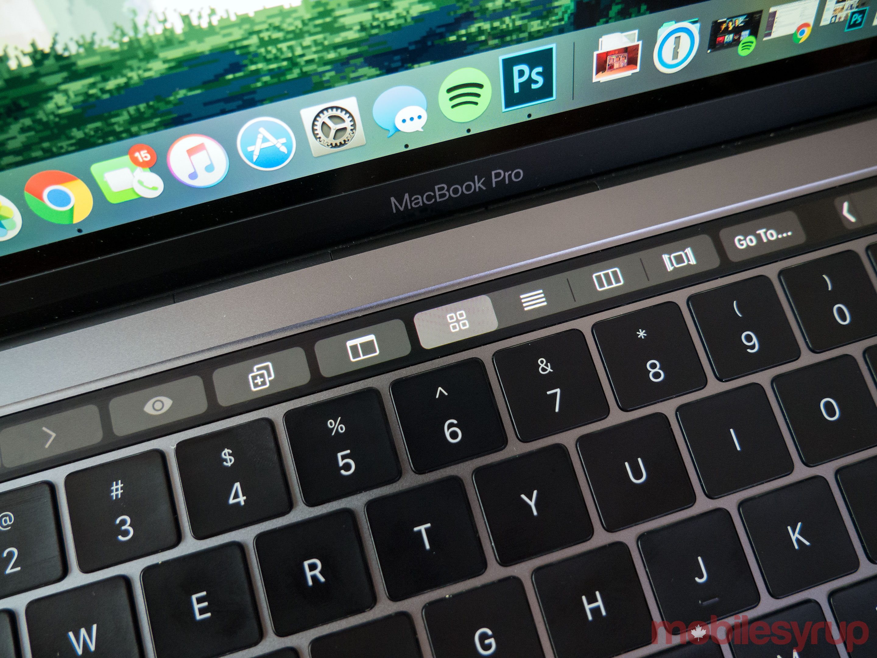
Depending on which app you’re using and what is going on within that app, different options display across the Touch Bar. As expected at launch, few third-party apps support the Bar, though this creates more problems than it probably should.
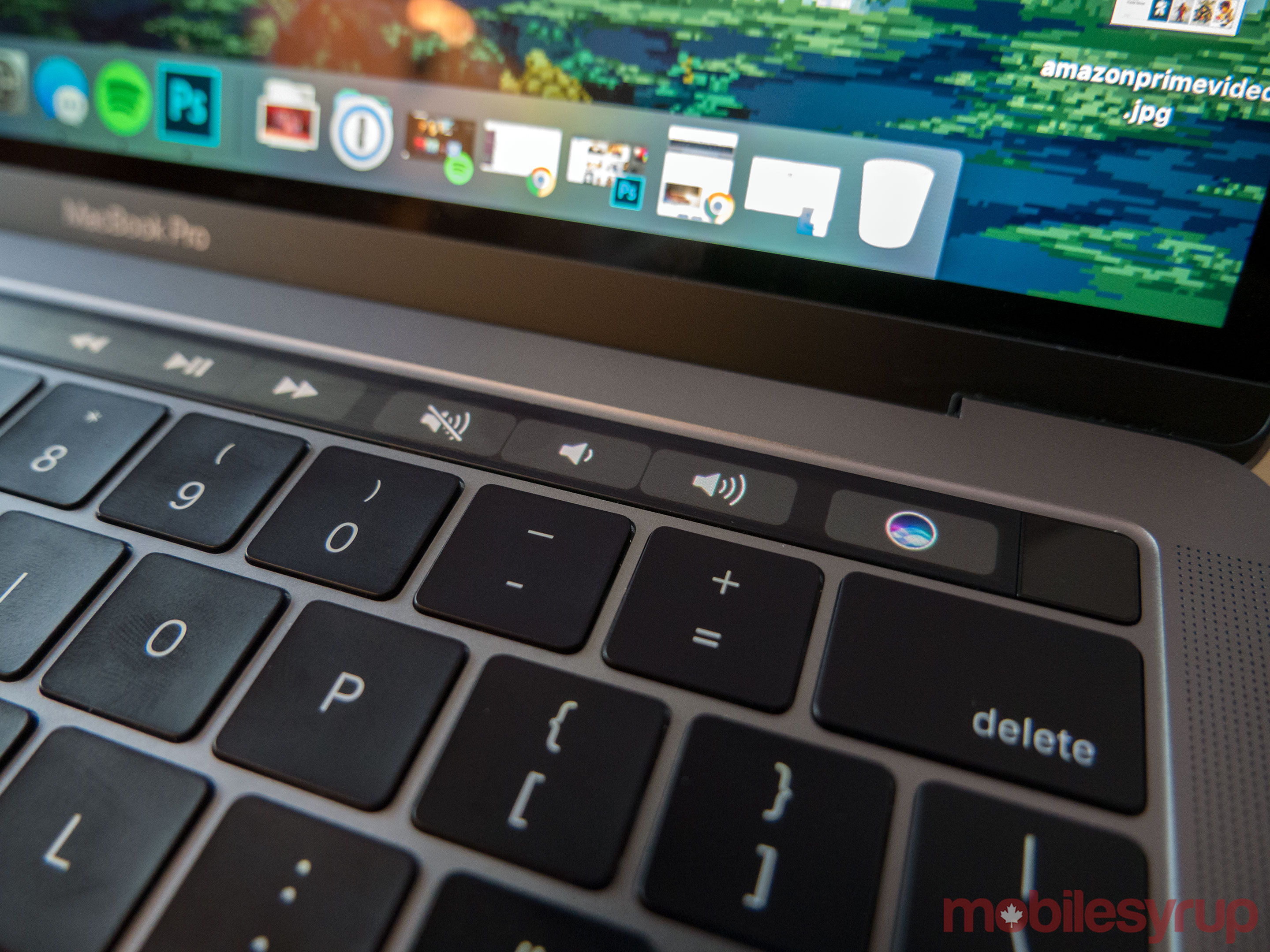
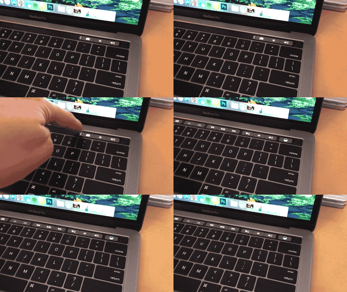
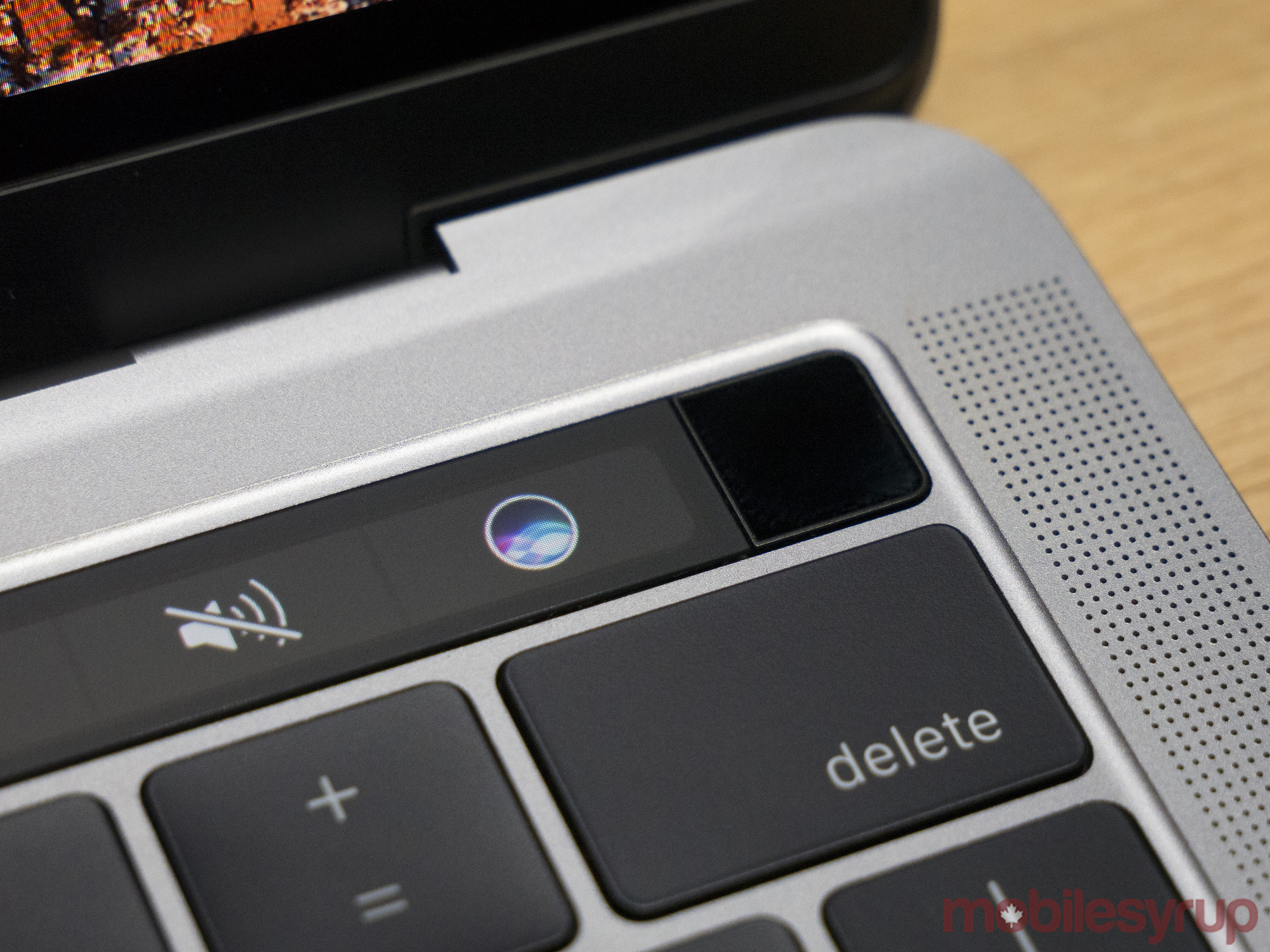
In its standard configuration, the Touch Bar is mostly a blank canvas with the exception of shortcuts that provide control over the computer’s sound volume, brightness and quick access to Siri, all located on the far right side of the screen. I customized this feature to include the ability to snap a screenshot, shift screen brightness and alter sound volume (not sure why you would add those when the options are already there?). Tapping an expand arrow on the left-hand side of the screen opens up the full set of standard Mac function keys many will find familiar, including one’s that control media playback backlit key brightness.
The issue here stems from the fact that the additional step of pressing the arrow key is always required for the full function bar to show up, even when you’re using an app that doesn’t currently feature Bar functionality like Chrome or Spotify. Apple should have given users an option to always display the full Touch Bar, rather than this limited version. It’s possible to make the full Touch Bar the default, but doing so removes the ability for the screen to shift to contextual buttons when the user is in an app that supports the functionality, defeating the purpose of the Touch Bar altogether.
When more developers begin supporting the Touch Bar, this problem will become less of an issue. Currently, however, the system feels convoluted. For example, if I’m listening to Spotify and don’t have the Touch Bar’s function keys expanded, I don’t have the ability to skip tracks or pause music directly at my fingertips.
The level of customization present in the Touch Bar in its current iteration is impressive, allowing users to pin the functions they want in specific locations, especially when Finder is open. The ability to set the Bar for specific needs for every app, however, is necessary, especially in this interim period where few apps support the Touch Bar. Hopefully, this functionality is added in a subsequent macOS software update.
Where it works
Where the Touch Bar really comes alive is when you use it with one of Apple’s own apps. Currently, that list includes Mail, Notes, Photos, iMovie, Garage Band and Final Cut Pro X. This means that in order to take advantage of the Touch Bar right now you need to have bought into both Apple’s hardware ecosystem and its software ecosystem.
In my case, this creates issues. While I often find myself using an iPhone or Mac as my primary computing devices, I live in a Google services ecosystem. This means that, for example, Gmail and Keep are my preferred programs rather than Mail and Notes. This will likely change in the future once Google updates Chrome as well as its other apps to support the Touch Bar, but the current situation is less than ideal.
In Mail, the Touch Bar offers users a number of options for common actions, most of which weren’t that hard to reach in the first place. Replying to emails and navigating by week or month can easily be performed with the Touch Bar, though these tasks can just as easily be accomplished with the keyboard.
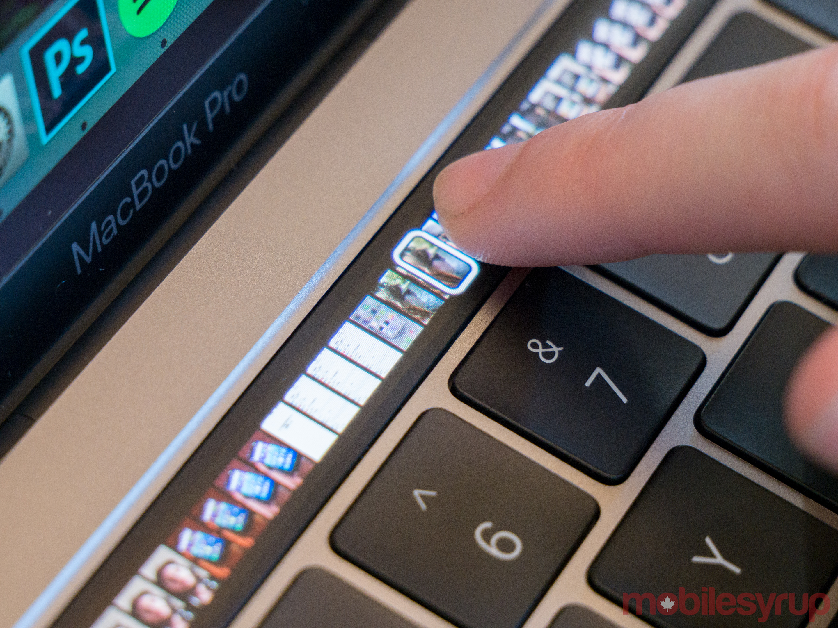
Where the Touch Bar makes more sense is when it comes to Final Cut Pro X, creating a natural more fluid scrubbing experience. Rather than scrolling with a mouse or trackpad, using the touch bar to slide left or right through a video’s timeline is intuitive and useful.
The same can be said about the shortcuts present in Photos and Pixelmator which relate to cropping and altering colour hue. Again, however, most of my creative applications come from Adobe, which currently doesn’t support the Touch Bar — the company has already stated it is committed to supporting the Touch Bar.
Touch ID finally hits the Mac
Despite the fact that adding a fingerprint sensor is Apple playing catchup, I’ve been thrilled with the addition of Touch ID in the 13-inch MacBook Pro with Touch Bar I’ve been testing for the last few days.
Rather than having to enter my password each time I need to perform a system function or to even log into the Mac, all I need to do is tap my finger on the sensor that doubles as a power button. The process overall is incredibly fast and seamless and in the probably 50 times so far that I’ve used the Touch ID sensor it hasn’t once been unable to detect my print.
If you’re a Safari user, Touch ID can be used to purchase products via Apple Pay, removing the need to enter credit card details on supported websites. While I haven’t tried this feature, the general impression I’ve gathered from other technology critics indicates that it works as advertised, though Apple Pay support doesn’t seem to be very widespread.
Not ready for prime time
While Apple’s Touch bar is far from the revolution the company has made it out to be, the concept of a constantly shifting, contextual screen on a traditional laptop is compelling. Unfortunately, as it stands right now, beyond Apple’s first-party offerings and a few standout third-party apps, there are few apps that take advantage of the Bar’s unique functionality.
While that will likely change over the course of the next few weeks now that the Touch Bar’s development API is out in the wild, Apple has let consumers down in the past when it comes to devices with untapped potential, with the 4th Generation Apple TV and its ample gaming potential being the most prominent example.
Will the Touch Bar become more than just a fascinating gimmick? Only time will tell. As it stands right now Apple’s print-sized contextual touchscreen is just a fascinating, expensive experiment.
MobileSyrup may earn a commission from purchases made via our links, which helps fund the journalism we provide free on our website. These links do not influence our editorial content. Support us here.

