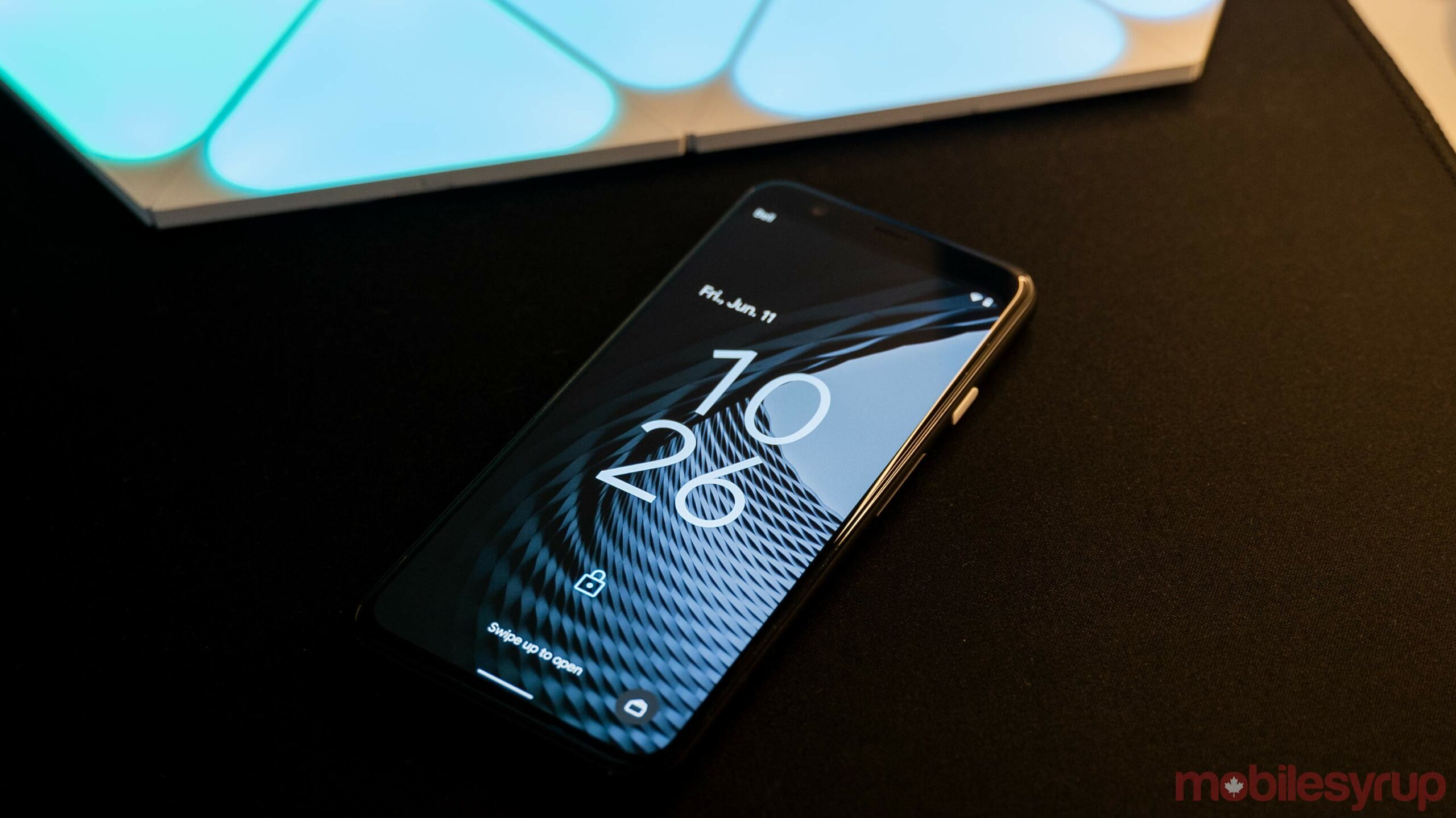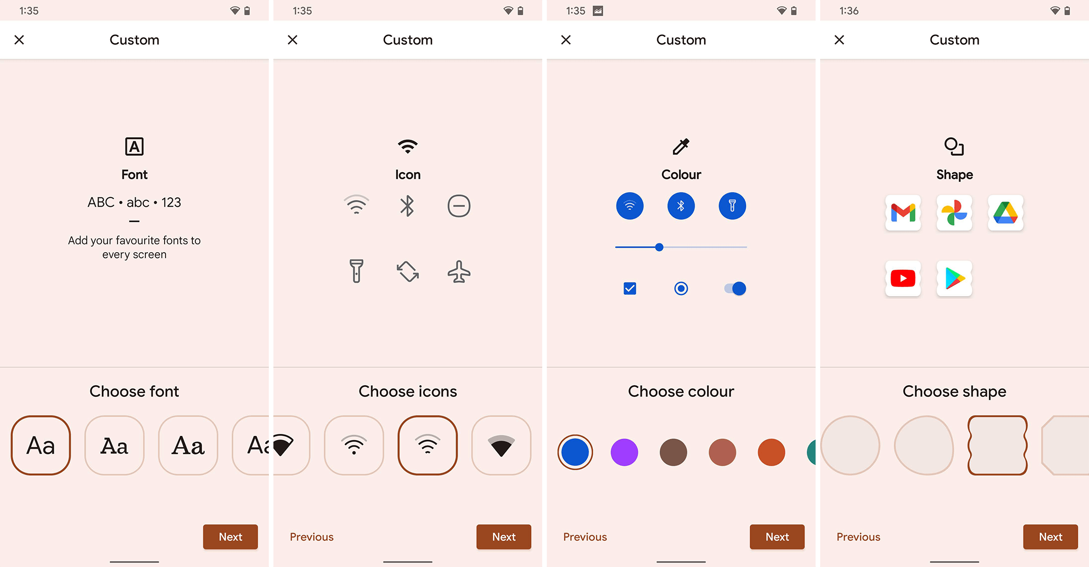
Starting with Android 10 on the Pixel 4, Google added a theme app accessible to users through the ‘Wallpaper & style’ shortcut. The theme app allowed people to customize the font, iconography, shapes and colours throughout Android.
Unfortunately, it appears Google is removing most of that functionality in Android 12 in favour of its fancy new ‘Material You‘ theme engine. And unsurprisingly, people aren’t happy about it.
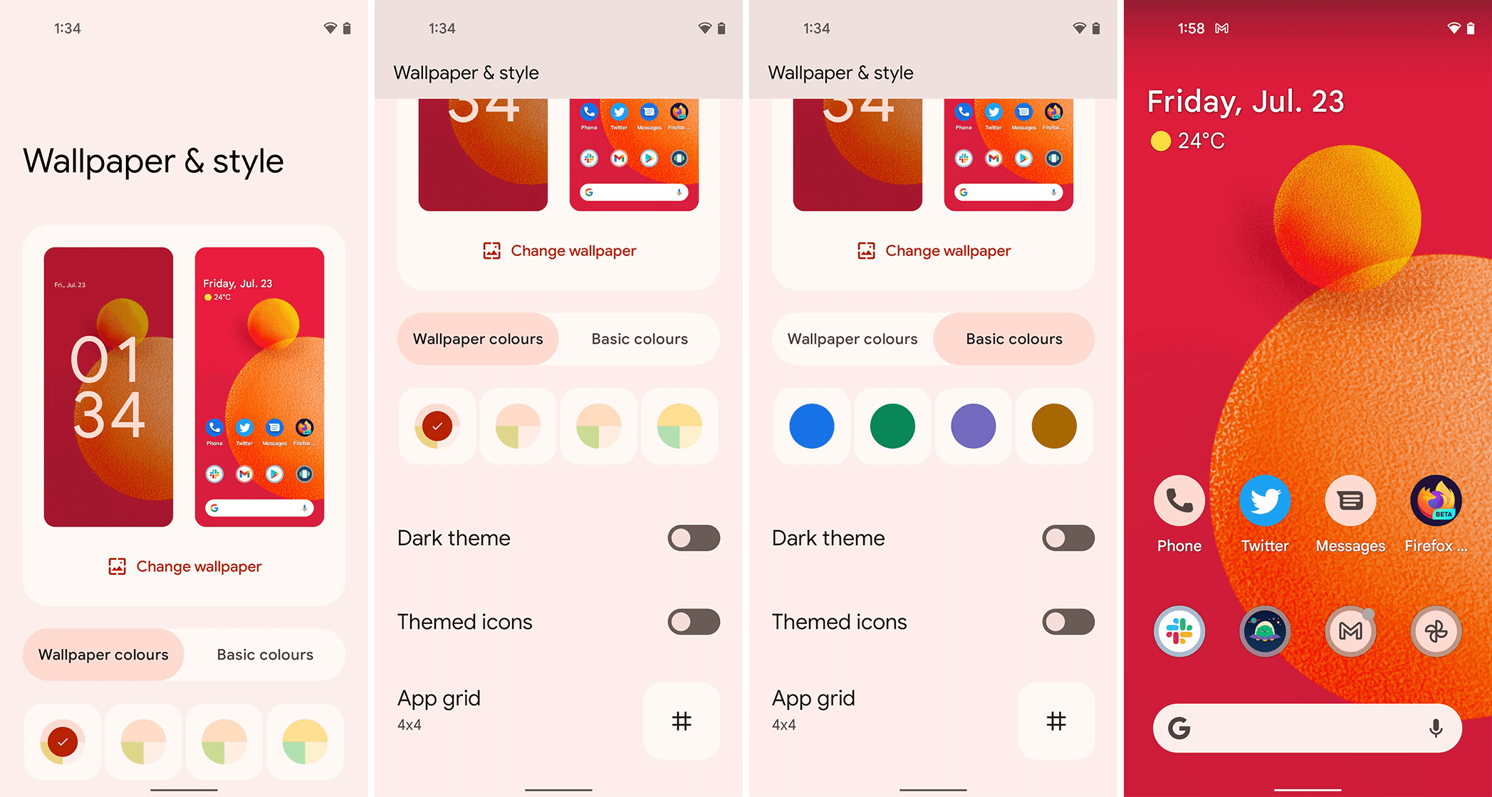
In Android 12 Beta 3, pressing-and-holding on the home screen calls up the shortcut menu with the ‘Wallpaper & style’ option like before. However, tapping it now opens a redesigned menu that better fits with the rest of the Android 12 aesthetic. Further, the new menu offers options for customizing the wallpaper, colours and theme. There’s a new ‘Themed icons’ option as well, and finally, the ability to choose the app grid type.

Android’s old ‘Wallpaper & style’ menu (captured on Android 12 Beta 2, which is why it looks weird)
Toggling the ‘Themed icons’ option changes some app icons to match the colours of your theme. For example, if you have a red wallpaper, Themed icons changes the Phone and Messages app icons from blue to a light orange-ish colour instead. At the time of writing, it didn’t impact all app icons, making for a weird mix of theme-matching app and regular app icons.
For colours, users can toggle between using colour palettes generated from the current wallpaper and ‘Basic colours,’ which offers four choices: blue, green, purple and brown. That’s a far cry from the 14 colours available with the old theme engine.

Android 12’s new ‘Wallpaper & style’ menu
The other theme options aren’t available at all in the revamped Wallpaper & style interface. There is no option to change the font, the status bar icons like Wi-Fi or battery or the app shapes (Android 12 sticks you with the plain old circle shape, ditching the several basic and frankly odd choices from before).
Google Issue Tracker confirms the dropped features are intentional
A Google Issue Tracker page has popped up with complaints about the removal of these options. A comment from a Googler marked the issue as ‘Won’t Fix (Intended Behaviour)’ with the following explanation:
“The custom style features (font, icon shape, icon pack, and accent color) in R are being replaced by the new dynamic theming feature that we are introducing in S.
“We see the new dynamic theming feature as more modern and intelligent. A simple and delightful experience that we hope all users can get to enjoy.”
That comment makes it sound like the theme options won’t be available in Android 12 at all. Since Android 12 was still in beta, I had hoped that Google was simply in the process of moving the options over to the new theme engine. That doesn’t appear to be the case.
While I seldom used the other style options because, frankly, I didn’t like them, Google’s decision to remove them entirely seems to go against the company’s own claims about Android 12 being a more personal version of the mobile OS. Taking away customization options doesn’t help make Android more personal, regardless of whether Google adds fancy new colour options at the same time.
It also seems quite silly that Google is taking away icon shape options after all of its effort to create (and get developers to use) adaptive icons that work with different shapes. That said, it wouldn’t be Google if it didn’t remove loved features from its software for no good reason.
Source: Google Via: XDA Developers
MobileSyrup may earn a commission from purchases made via our links, which helps fund the journalism we provide free on our website. These links do not influence our editorial content. Support us here.


