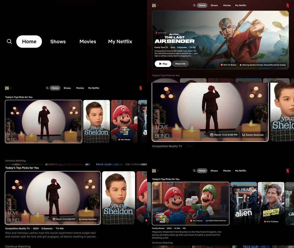
In a new test that’s live for some people, Netflix appears to be changing how the TV version of its app works.
I’ve been unable to test it, but the new version has fewer shows or movies per page, as it increases the space that the trailer and the title’s description take up. Netflix told The Verge that this new design is to help people’s eyes from flicking across the screen every time a new show reveals a new trailer.

GIF credit: Netflix, via The Verge
The new design also removes the hidden side bar where you could choose the search function or to filter by just movies or TV. Now, these options are placed along the top of the interface. This new organization structure also adds in the ‘My Netflix’ area from the mobile app, which lets users find things recommended to them.
Again, this redesign is only in a test phase, so it may change before it reaches most people.
Source: The Verge
MobileSyrup may earn a commission from purchases made via our links, which helps fund the journalism we provide free on our website. These links do not influence our editorial content. Support us here.


