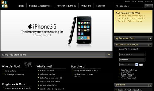
 Fido revamps its website just in time for the upcoming launch of the Apple iPhone 3G. Done in black and gold it certainly does catch the eye. On the promo page it says they have made it easier to use, find info faster and have the ability to “customize” the site how you want to view it… also you can now find info faster.
We believe change is always good and did feel that it is easier to find the products you want faster and yes it is organized better. However, it feels they just crammed everything from the past site into to the left hand side and made room for to manage your account and send a text message on the right hand side.
See the site here www.fido.ca
What are your thoughts?
MobileSyrup may earn a commission from purchases made via our links, which helps fund the journalism we provide free on our website. These links do not influence our editorial content. Support us here.


